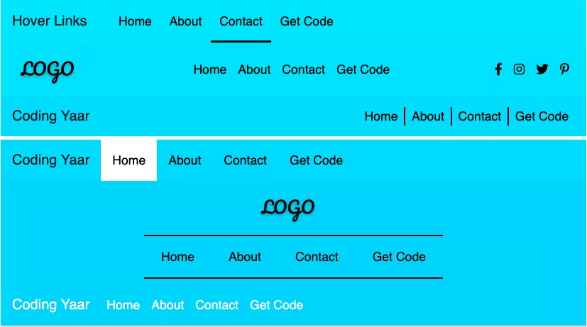
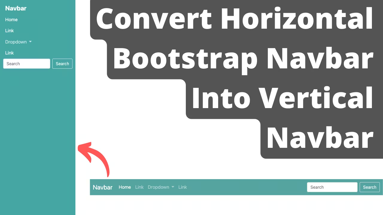
How to create a simple responsive Bootstrap full-screen navigation menu using a Bootstrap navbar.
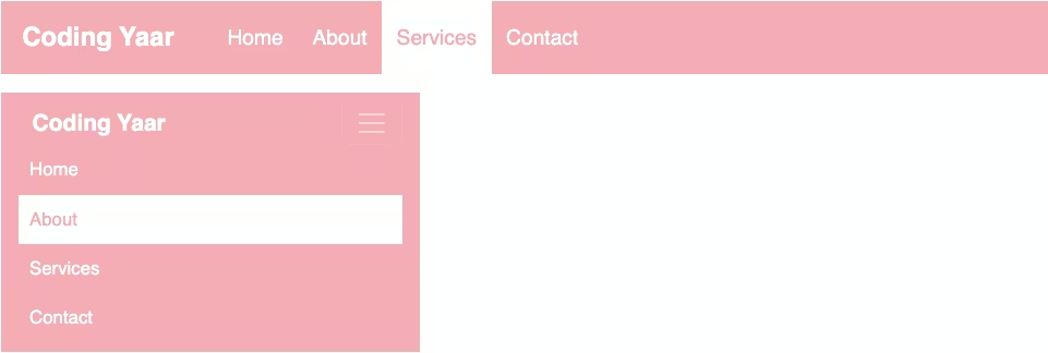
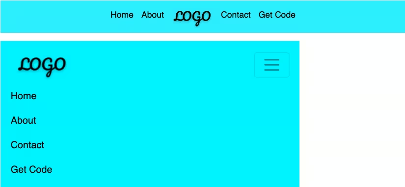
Final output:
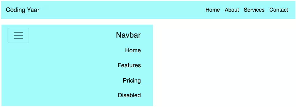
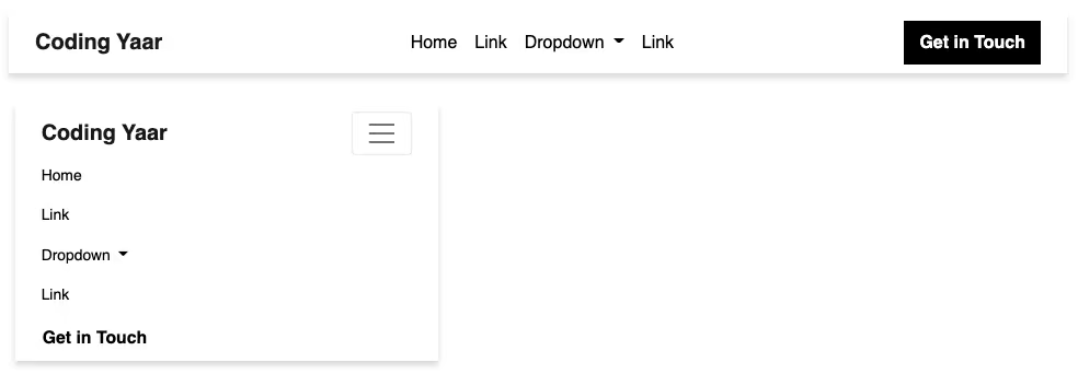
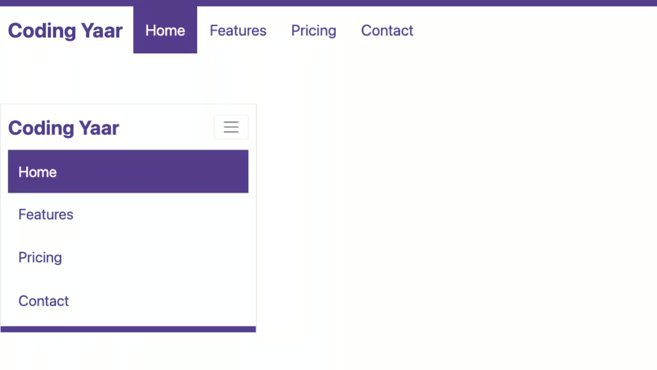
1. Let’s start with this navbar from the official Bootstrap Navbar page.
<nav class="navbar navbar-expand-lg bg-body-tertiary">
  <div class="container-fluid">
    <a class="navbar-brand" href="#">Navbar</a>
    <button class="navbar-toggler" type="button" data-bs-toggle="collapse" data-bs-target="#navbarNav" aria-controls="navbarNav" aria-expanded="false" aria-label="Toggle navigation">
      <span class="navbar-toggler-icon"></span>
    </button>
    <div class="collapse navbar-collapse" id="navbarNav">
      <ul class="navbar-nav">
        <li class="nav-item">
          <a class="nav-link active" aria-current="page" href="#">Home</a>
        </li>
        <li class="nav-item">
          <a class="nav-link" href="#">Features</a>
        </li>
        <li class="nav-item">
          <a class="nav-link" href="#">Pricing</a>
        </li>
        <li class="nav-item">
          <a class="nav-link disabled">Disabled</a>
        </li>
      </ul>
    </div>
  </div>
</nav>
Output:
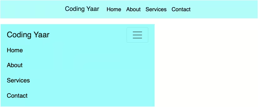
2. Add class fixed-top to the navbar. Remove the class navbar-expand-lg since we want the navbar to be collapsed initially on all screen sizes.
Remove the bg-body-tertiary class and add the attribute data-bs-theme=”dark”.
For the webpage content, I am adding a hero section below the navbar with a background image and a height of 100vh.
<nav class="navbar fixed-top" data-bs-theme="dark">
    ...
</nav>
<div class="hero-section">
</div>
.hero-section {
background: url("hero-image.jpg") no-repeat;
background-size: cover;
height: 100vh;
overflow: hidden;
}Output:
3. Add a background color for the navbar-collapse div.
.navbar-collapse {
  background-color: #3e4149;
}
Right now it opens like it would on smaller screens. For full-screen navigation, set its position to absolute. And height to 100vh.
.navbar-collapse {
  position: absolute;
  top: 0;
  left: 0;
  right: 0;
  height: 100vh;
}
All the nav links stick to the top left corner. To align it horizontally and vertically in the center, use CSS flexbox properties.
.navbar-collapse {
  display: flex;
  align-items: center;
  justify-content: center;
  text-align: center;
}
Output:
4. Place the navbar-brand or your logo and the hamburger menu icon over the navbar-collapse div by setting the z-index to 1.
.navbar-toggler,
.navbar-brand {
  z-index: 1;
}
Let’s style the links.
.navbar-brand {
  font-size: 1.8em;
}
.navbar-collapse .nav-link {
  font-size: 1.5em;
  letter-spacing: 2px;
  color: #fff;
}
Change the color for the active and hovered nav link.
.navbar-collapse .nav-link:hover,
.navbar-collapse .nav-link.active {
  color: darkseagreen;
}
Output:
5. Lastly, add a transition.
.navbar-collapse.show {
  transition: all 0.5s;
}
Output:
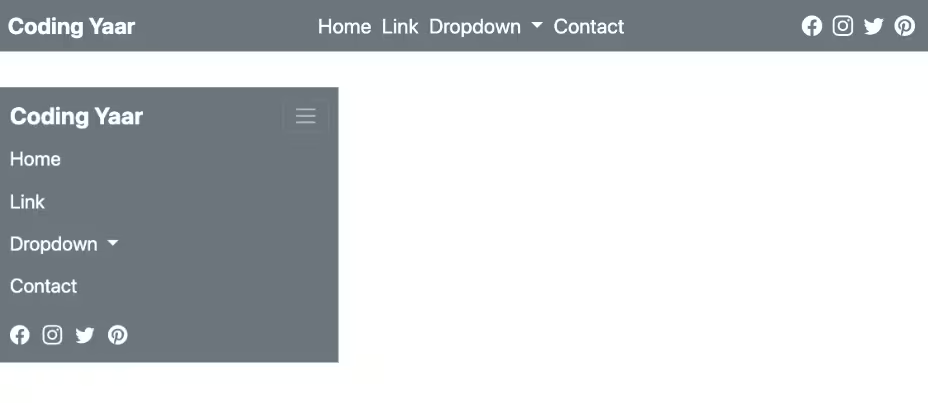
Final Output Code for Responsive Bootstrap full-screen navigation menu:
HTML
<nav class="navbar fixed-top" data-bs-theme="dark">
    <div class="container-fluid">
        <a class="navbar-brand" href="#">Navbar</a>
        <button class="navbar-toggler" type="button" data-bs-toggle="collapse" data-bs-target="#navbarNav5"
            aria-controls="navbarNav5" aria-expanded="false" aria-label="Toggle navigation">
            <span class="navbar-toggler-icon"></span>
        </button>
        <div class="collapse navbar-collapse" id="navbarNav5">
            <ul class="navbar-nav">
                <li class="nav-item">
                    <a class="nav-link active" aria-current="page" href="#">Home</a>
                </li>
                <li class="nav-item">
                    <a class="nav-link" href="#">Features</a>
                </li>
                <li class="nav-item">
                    <a class="nav-link" href="#">Pricing</a>
                </li>
                <li class="nav-item">
                    <a class="nav-link disabled">Disabled</a>
                </li>
            </ul>
        </div>
    </div>
</nav>
CSS
.navbar-collapse {
  position: absolute;
  top: 0;
  left: 0;
  right: 0;
  height: 100vh;
  display: flex;
  align-items: center;
  justify-content: center;
  text-align: center;
  background-color: #3e4149;
}
.navbar-toggler,
.navbar-brand {
  z-index: 1;
}
.navbar-brand {
  font-size: 1.8em;
}
.navbar-toggler:focus {
  box-shadow: none;
}
.navbar-collapse .nav-link {
  font-size: 1.5em;
  letter-spacing: 2px;
  color: #fff;
}
.navbar-collapse .nav-link:hover,
.navbar-collapse .nav-link.active {
  color: darkseagreen;
}
.nav-item:not(:last-child) {
  border-bottom: 1px solid gray;
  padding: 0.2em 4em;
}
@media screen and (min-width: 768px) {
  .nav-item:not(:last-child) {
    padding: 0.5em 8em;
  }
}
.navbar-collapse.show {
  transition: all 0.5s;
}
Video tutorial for Bootstrap full-screen navigation menu:
If you have any doubts or stuck somewhere, you can reach out through Coding Yaar's Discord server.


