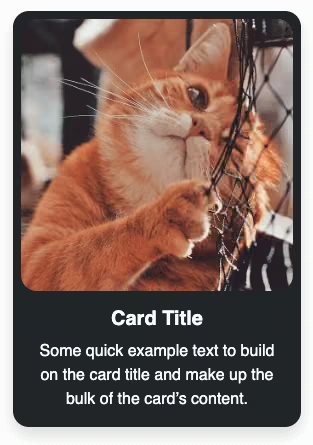
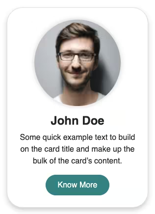
How to create a simple responsive Bootstrap 5 card design using the basic Bootstrap 5 card with a hover effect. You can use this card in the features or services section of your website.
Final output:
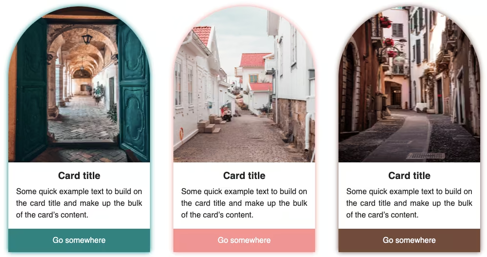
Card title
Some quick example text to build on the card title and make up the bulk of the card’s content.
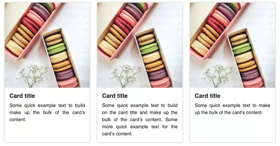
Card title
Some quick example text to build on the card title and make up the bulk of the card’s content.
Card title
Some quick example text to build on the card title and make up the bulk of the card’s content.
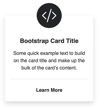
1. Let’s start with the first card from the official Bootstrap Card page. Replace the image with an icon. I am using Bootstrap icons.
I’m also removing the button for this one.
<div class="card" style="width: 18rem;">
  <div class="icon">
    <i class="bi bi-cloud-drizzle-fill"></i>
  </div>
  <div class="card-body">
    <h5 class="card-title">Card title</h5>
    <p class="card-text">Some quick example text to build on the card title and make up the bulk of the card's content.</p>
  </div>
</div>
Output:
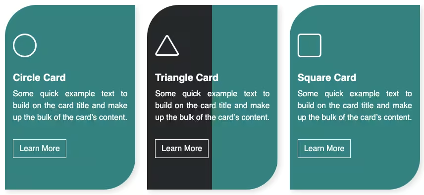
Card title
Some quick example text to build on the card title and make up the bulk of the card’s content.
2. Increase the font size for the icon and change its color.
.card .icon {
  font-size: 3rem;
  color: lightseagreen;
}
Align items to the center(text-center), remove the border(border-0) and the border-radius(rounded-0). Add a box-shadow(shadow) and some padding(p-4). Instead of the fixed width, set a max-width up to 22rem.
<div class="card text-center border-0 shadow rounded-0 p-4" style="max-width: 22rem;">
    ...
</div>
Output:
Card title
Some quick example text to build on the card title and make up the bulk of the card’s content.
3. Use h4 instead of h5 for the card title and set its font-weight to bold(fw-bold).
<h4 class="card-title fw-bold">Card title</h4>Change the card-text color to gray.
.card-text {
  color: gray;
}
Output:
Card title
Some quick example text to build on the card title and make up the bulk of the card’s content.
4. On card hover, change the background and font color. Also, add a transition for the animated hover effect.
.card:hover {
  background-color: lightseagreen;
  color: #fff;
}

.card {
  transition: all 0.5s;
}
Change the icon and the card-text’s font color as well.
.card:hover .icon,
.card:hover .card-text {
  color: #fff;
}
Output:
Card title
Some quick example text to build on the card title and make up the bulk of the card’s content.
Final Output Code for Responsive Bootstrap 5 card design:
HTML
<div class="card text-center border-0 shadow rounded-0 p-4" style="max-width: 22rem;">
    <div class="icon">
        <i class="bi bi-cloud-drizzle-fill"></i>
    </div>
    <div class="card-body">
        <h4 class="card-title fw-bold">Card title</h4>
        <p class="card-text">Some quick example text to build on the card title and make up the bulk of the card's
            content.</p>
    </div>
</div>
CSS
.card .icon {
  font-size: 3rem;
  color: lightseagreen;
}

.card-text {
  color: gray;
}

.card {
  transition: all 0.5s;
}

.card:hover {
  background-color: lightseagreen;
  color: #fff;
}

.card:hover .icon,
.card:hover .card-text {
  color: #fff;
}
If you have any doubts or stuck somewhere, you can reach out through Coding Yaar's Discord server.