Another Bootstrap card hover effect! (check out the previous one: Bootstrap card hover effect (zoom)) This one’s simple too. Just 3 lines to be precise. Follow these steps to learn how to apply the bootstrap card hover effect shown in the final output below.
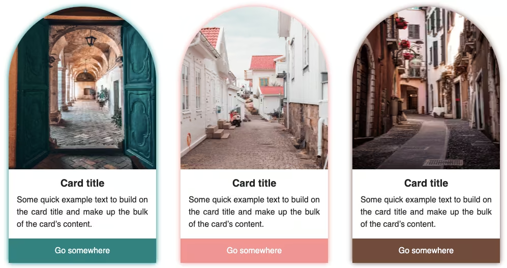
Final output:
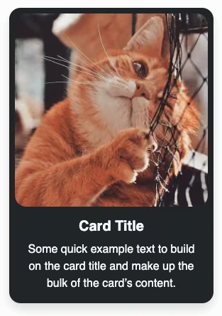
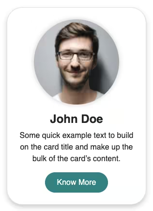
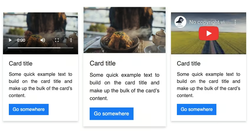
Card title
Some quick example text to build on the card title and make up the bulk of the card’s content.
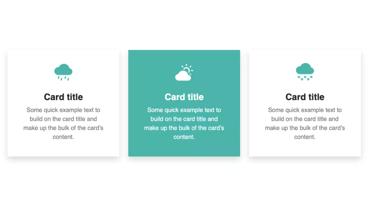
Go somewhereCard title
Some quick example text to build on the card title and make up the bulk of the card’s content.
Go somewhereCard title
Some quick example text to build on the card title and make up the bulk of the card’s content.
Go somewhere1. For this example, I am using my Bootstrap video card.
<div class="card" style="width: 18rem;">
  <video src="https://codingyaar.com/wp-content/uploads/video-in-bootstrap-card.mp4" autoplay loop></video>
  <div class="card-body">
    <h5 class="card-title">Bootstrap video card</h5>
    <p class="card-text">
      Some quick example text to build on the card title and make up the bulk of
      the card's content.
    </p>
    <a href="#" class="btn btn-primary">Go somewhere</a>
  </div>
</div>
Output:
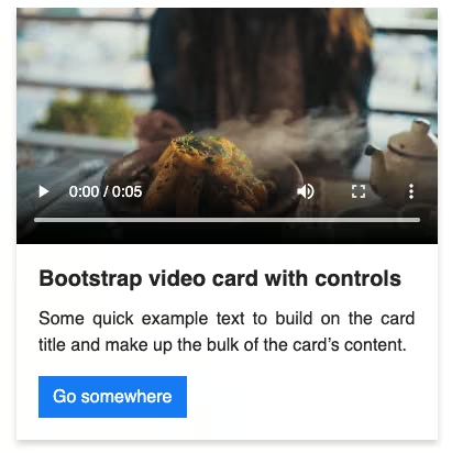
Bootstrap video card
Some quick example text to build on the card title and make up the bulk of the card’s content.
Go somewhere2. To add the hover effect on card, I am using the button color for border as well as the box-shadow when hovered.
FYI box-shadow: offset-x | offset-y | blur-radius | spread-radius | color
.card:hover {
  border-color: rgb(13, 110, 253);
  box-shadow: 0px 0px 10px 2px rgb(13, 110, 253);
}
Output:
Bootstrap video card
Some quick example text to build on the card title and make up the bulk of the card’s content.
Go somewhere3. The color looks too bright, so modify the opacity. (You can keep it as is or change the color instead.)
.card:hover {
  border-color: rgba(13, 110, 253, 0.7);
  box-shadow: 0px 0px 10px 2px rgba(13, 110, 253, 0.6);
}
Output:
Bootstrap video card
Some quick example text to build on the card title and make up the bulk of the card’s content.
Go somewhere4. To have a more smooth feel to the hover effect, let’s add a transition.
.card{
  transition: border-color 1s, box-shadow 0.5s;
}
Bootstrap video card
Some quick example text to build on the card title and make up the bulk of the card’s content.
Go somewhereFinal Output Code for Bootstrap card hover effect (glow):
HTML
<div class="card" style="width: 18rem;">
  <video src="https://codingyaar.com/wp-content/uploads/video-in-bootstrap-card.mp4" autoplay loop></video>
  <div class="card-body">
    <h5 class="card-title">Bootstrap video card</h5>
    <p class="card-text">
      Some quick example text to build on the card title and make up the bulk of
      the card's content.
    </p>
    <a href="#" class="btn btn-primary">Go somewhere</a>
  </div>
</div>
CSS
.card{
  transition: border-color 1s, box-shadow 0.5s;
}
.card:hover {
  border-color: rgba(13, 110, 253, 0.7);
  box-shadow: 0px 0px 10px 2px rgba(13, 110, 253, 0.6);
}
If you have any doubts or stuck somewhere, you can reach out through Coding Yaar's Discord server.