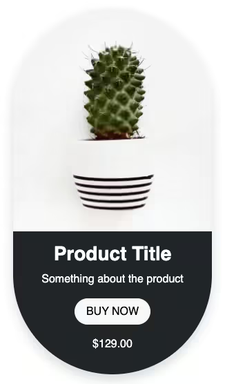
How to create a Bootstrap 5 product card/ Bootstrap horizontal card using the basic Bootstrap 5 card.
Final output:
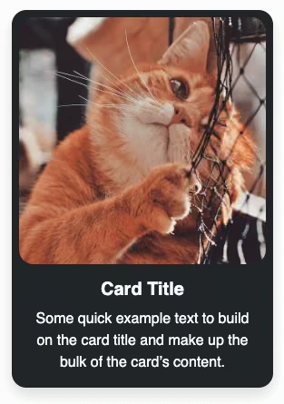
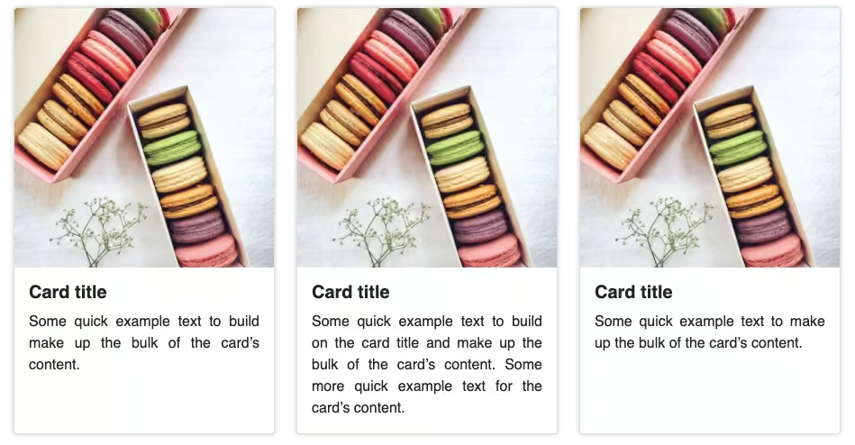
1. Let’s start with the first card from the official Bootstrap Card page.
<div class="card" style="width: 18rem;">
  <img src="..." class="card-img-top" alt="...">
  <div class="card-body">
    <h5 class="card-title">Card title</h5>
    <p class="card-text">Some quick example text to build on the card title and make up the bulk of the card's content.</p>
    <a href="#" class="btn btn-primary">Go somewhere</a>
  </div>
</div>
Output:

Card title
Some quick example text to build on the card title and make up the bulk of the card’s content.
Go somewhere2. Reduce the image width and add some styles.
.card img {
max-width: 25%;
margin: auto;
padding: 0.5em;
border-radius: 0.7em;
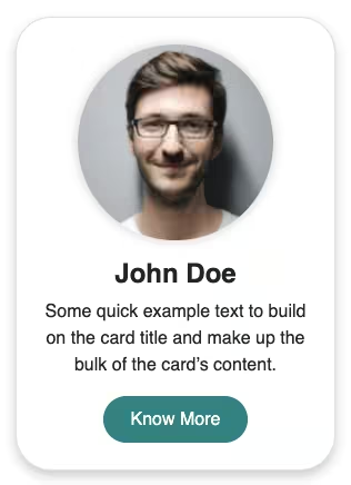
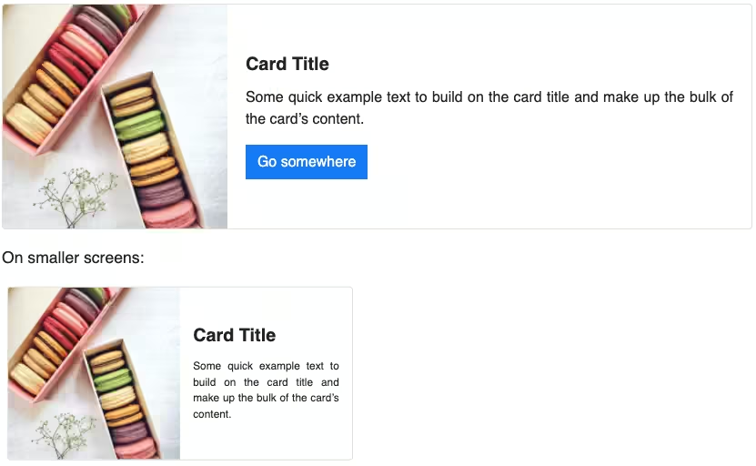
}For a horizontal card, set the flex-direction of the card to row. Remove the fixed width and add max-width in CSS.
.card {
  flex-direction: row;
  max-width: 30em;
}
<div class="card">Output:
Card title
Some quick example text to build on the card title and make up the bulk of the card’s content.
Go somewhere3. Let’s split the card-body into two sections. Place the button in the second section.
<div class="card-body">
    <div class="text-section">
        <h5 class="card-title fw-bold">Card title</h5>
        <p class="card-text">Some quick example text to build on the card's content.</p>
    </div>
    <div class="cta-section">
        <div>$129.00</div>
        <a href="#" class="btn btn-light">Buy Now</a>
    </div>
</div>
Output:
Card title
Some quick example text to build on the card’s content.
4. Create two columns inside the card body using CSS flexbox for the two sections and set some max-width for each of them.
.card-body {
  display: flex;
  flex-direction: row;
  justify-content: space-between;
}
.text-section {
  max-width: 60%;
}
.cta-section {
  max-width: 40%;
}
Align the price and button to the right and use justify-content space-between to place them at the ends vertically too.
.cta-section {
  display: flex;
  flex-direction: column;
  align-items: flex-end;
  justify-content: space-between;
}
Output:
Card title
Some quick example text to build on the card’s content.
5. Some more styling for the card, text, and button.
.card {
  border: 0;
  background-color: #696969;
  color: #fff;
  box-shadow: 0 7px 7px rgba(0, 0, 0, 0.18);
}
.card-text {
  letter-spacing: 0.1em;
}
.cta-section .btn {
  padding: 0.2em 0.5em;
  font-size: 1em;
  color: #696969;
}
Output:
Card title
Some quick example text to build on the card’s content.
6. Here’s a light version of the horizontal card.
<div class="card bg-info-subtle">
    <img src="..." class="card-img-top" alt="...">
    <div class="card-body">
        <div class="text-section">
            <h5 class="card-title fw-bold">Card title</h5>
            <p class="card-text">Some quick example text to build on the card's content.</p>
        </div>
        <div class="cta-section">
            <div>$129.00</div>
            <a href="#" class="btn btn-light">Buy Now</a>
        </div>
    </div>
</div>
.card .cta-section .btn {
background-color: #696969;
border-color: #696969;
color: #fff;
}Output:
Card title
Some quick example text to build on the card’s content.
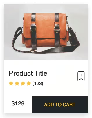
Final Output Code for Responsive Bootstrap 5 Product Card:
HTML
<div class="card dark">
    <img src="..." class="card-img-top" alt="...">
    <div class="card-body">
        <div class="text-section">
            <h5 class="card-title fw-bold">Card title</h5>
            <p class="card-text">Some quick example text to build on the card's content.</p>
        </div>
        <div class="cta-section">
            <div>$129.00</div>
            <a href="#" class="btn btn-light">Buy Now</a>
        </div>
    </div>
</div>
CSS
.card {
flex-direction: row;
max-width: 30em;
border: 0;
background-color: #696969;
color: #fff;
box-shadow: 0 7px 7px rgba(0, 0, 0, 0.18);
}
.card img {
max-width: 25%;
margin: auto;
padding: 0.5em;
border-radius: 0.7em;
}
.card-body {
display: flex;
flex-direction: row;
justify-content: space-between;
}
.text-section {
max-width: 60%;
}
.cta-section {
max-width: 40%;
display: flex;
flex-direction: column;
align-items: flex-end;
justify-content: space-between;
}
.cta-section .btn {
padding: 0.2em 0.5em;
font-size: 1em;
color: #696969;
}
.card-text {
letter-spacing: 0.1em;
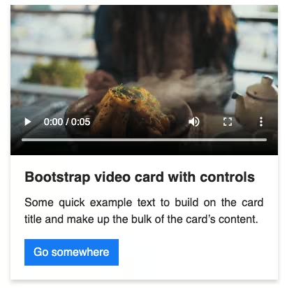
}Video tutorial for Responsive Bootstrap 5 Product Card:
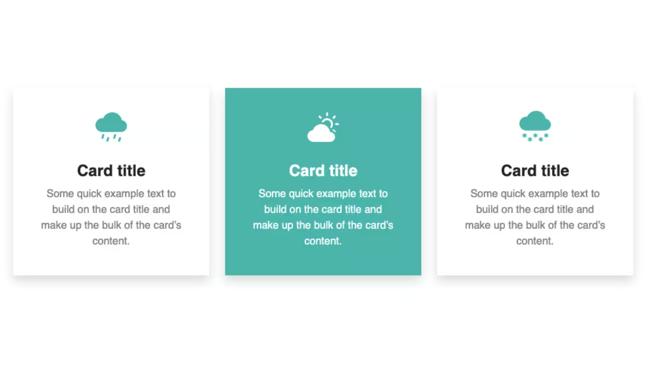
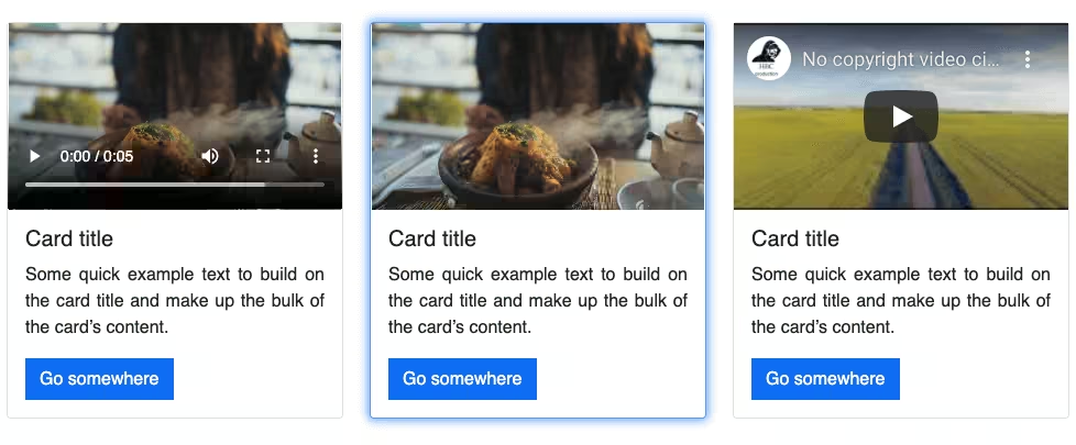
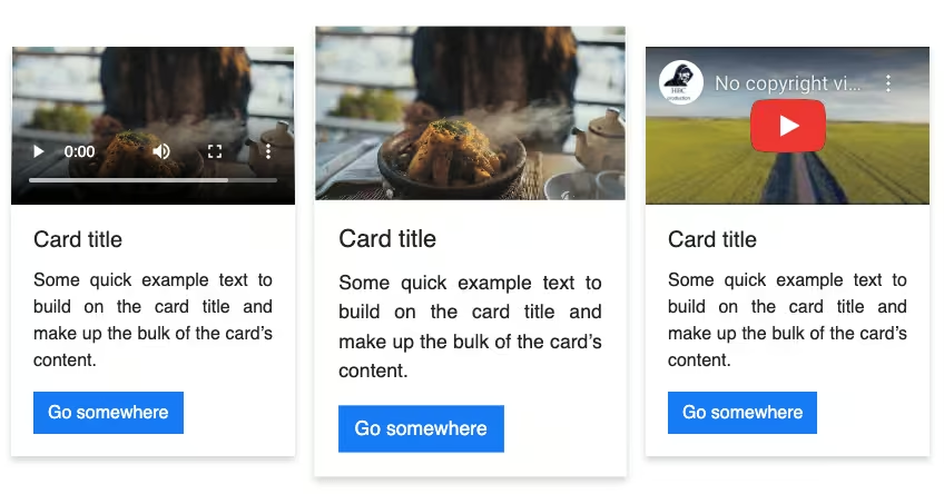
More colorful versions of Bootstrap 5 Product Cards:
See the Pen Bootstrap 5 Product Card (Bootstrap Horizontal Card #2) by Coding Yaar (@codingyaar) on CodePen.
If you have any doubts or stuck somewhere, you can reach out through Coding Yaar's Discord server.