Here’s how you can create another Bootstrap card hover effect as you see below.
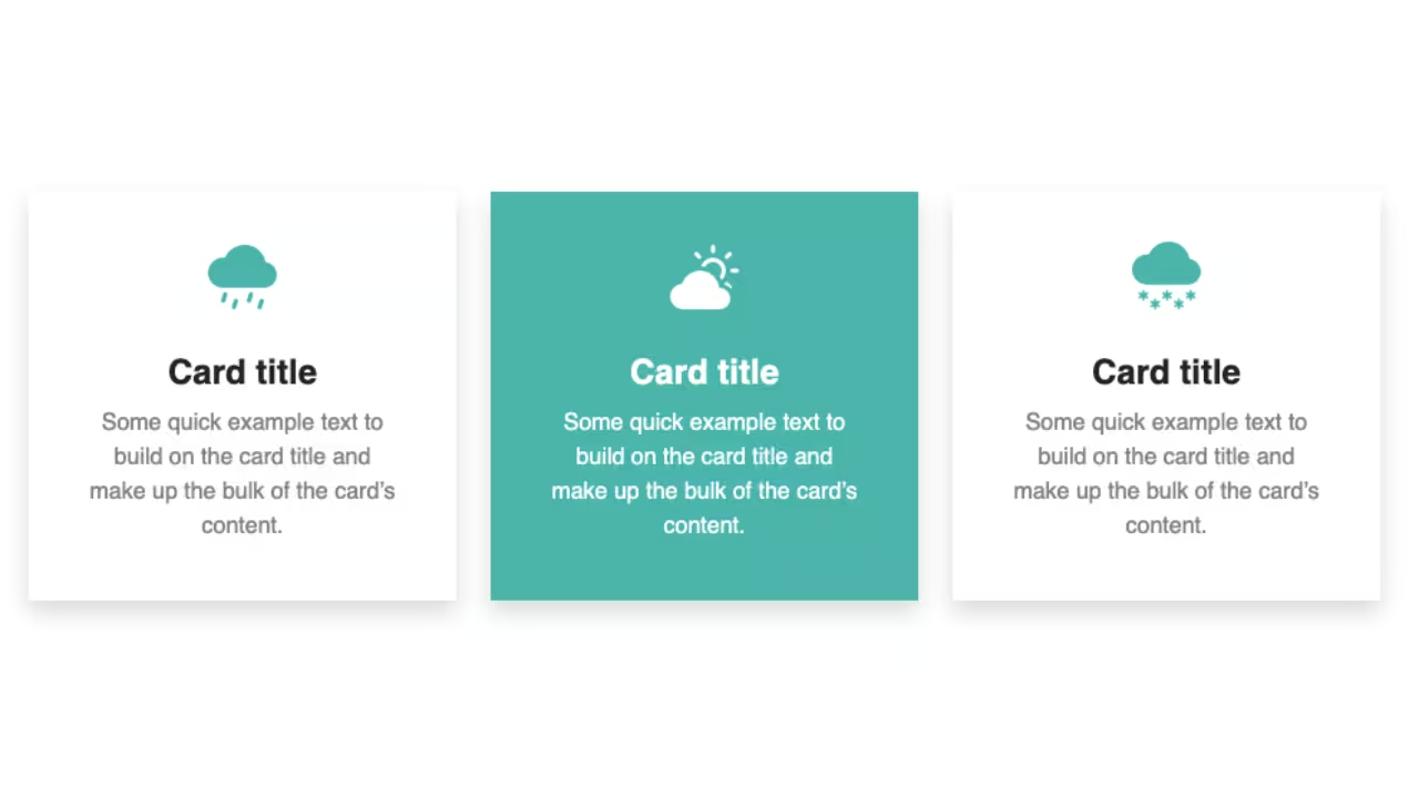
Final output:
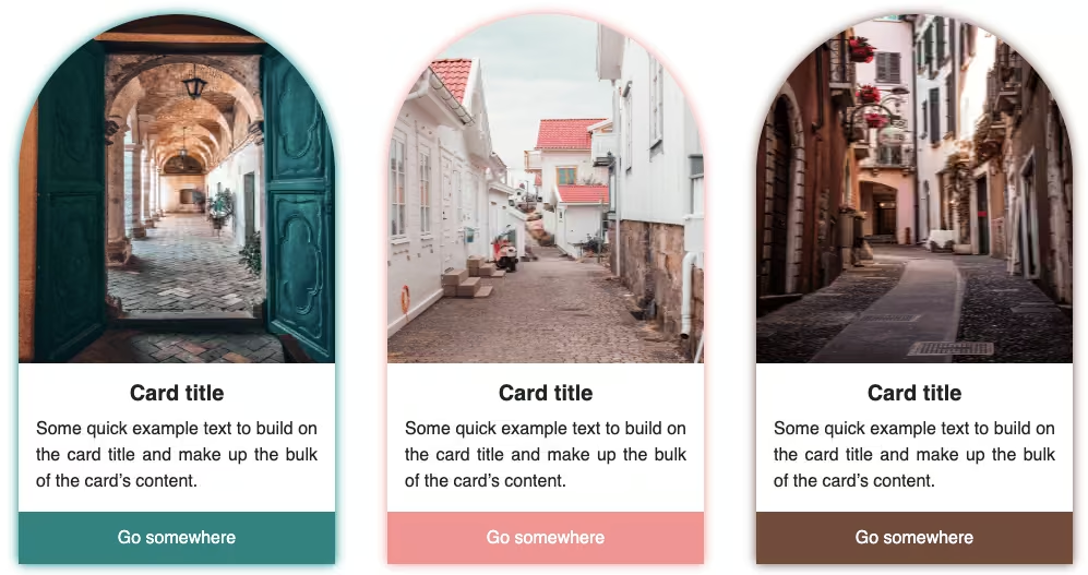
Circle Card
Some quick example text to build on the card title and make up the bulk of the card’s content.
Learn MoreTriangle Card
Some quick example text to build on the card title and make up the bulk of the card’s content.
Learn MoreSquare Card
Some quick example text to build on the card title and make up the bulk of the card’s content.
Learn More1. Let’s start with this Bootstrap card example. I am using a Bootstrap icon instead of an image and changing the button a bit.
<div class="card" style="width: 18rem;">
    <div class="card-icon"><i class="bi bi-circle"></i></div>
    <div class="card-body">
        <h5 class="card-title">Card title</h5>
        <p class="card-text">Some quick example text to build on the card title and make up the bulk of the card's
            content.</p>
        <a href="#" class="btn btn-outline-light">Go somewhere</a>
    </div>
</div>
Add some styles for the card and the icon.
.card {
  border: 0;
  border-radius: 0;
  padding: 3em 0;
  background-color: teal;
  color: #fff;
}
.card-icon {
  margin: 0 1em;
}
.card-icon i {
  font-size: 3em;
}
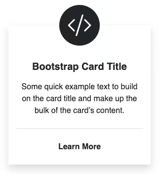
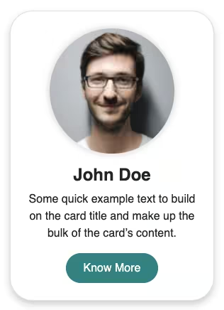
Output:
Card title
Some quick example text to build on the card title and make up the bulk of the card’s content.
Go somewhere2. Let’s make two of the card’s corners round and add a box shadow.
.card {
  border-bottom-right-radius: 4em;
  border-top-left-radius: 4em;
  box-shadow: 5px 5px 10px #e1e1e1;
}
Output:
Card title
Some quick example text to build on the card title and make up the bulk of the card’s content.
Go somewhere3. Now for the background color change hover effect, you could directly change the color on :hover. But, in order to see the transition from left to right, we will use a linear gradient.
.card {
  background: linear-gradient(to left, teal 50%, #26282b 50%);
}
Output:
Card title
Some quick example text to build on the card title and make up the bulk of the card’s content.
Go somewhere4. I mean, you could use it like that as a card design, or add some angle and make it a cool-looking card.🤔
But let’s make it look like something we saw in the final output. To do that, set the background size to 200% so that only one color would be visible as we set each color to 50%.
And then you can choose which would be the default color and the one you would like to show on hover by setting the background-position to left or right.
.card {
  background-size: 200%;
  background-position: right;
}
Card title
Some quick example text to build on the card title and make up the bulk of the card’s content.
Go somewhere5. Finally, add a hover effect by setting to background-position to the opposite of what you did before. You could also use top and bottom.
.card:hover {
  background-position: left;
}
Card title
Some quick example text to build on the card title and make up the bulk of the card’s content.
Go somewhere6. It’s happening so fast, that you can’t really see a proper hover effect as expected. So let’s add a transition to see it in slow-mo.
.card {
  transition: background-position 0.5s ease-out;
}
Card title
Some quick example text to build on the card title and make up the bulk of the card’s content.
Go somewhereFinal Output Code for Bootstrap card hover effect #3 (background color change left to right):
HTML
<div class="card" style="width: 15rem;">
    <div class="card-icon"><i class="bi bi-circle"></i></div>
    <div class="card-body">
        <h5 class="card-title">Card title</h5>
        <p class="card-text">Some quick example text to build on the card title and make up the bulk of the card's
            content.</p>
        <a href="#" class="btn btn-outline-light">Go somewhere</a>
    </div>
</div>
CSS
.card {
  border: 0;
  border-radius: 0;
  color: #fff;
  box-shadow: 5px 5px 10px #e1e1e1;
  padding: 3em 0;
  border-bottom-right-radius: 4em;
  border-top-left-radius: 4em;
  background: linear-gradient(to left, teal 50%, #26282b 50%);
  background-size: 200%;
  background-position: right;
  transition: background-position 0.5s ease-out;
}
.card-icon {
  margin: 0 1em;
}
.card-icon i{
  font-size: 3em;
}
.card:hover {
  background-position: left;
}
Video explanation for Bootstrap card design with hover effect #3 (background color change left to right):
If you have any doubts or stuck somewhere, you can reach out through Coding Yaar's Discord server.