Bootstrap cards are widely used across responsive websites. You can add your own creative touch to it. But this post is not about creating a Bootstrap card. It’s about adding a hover effect to the Bootstrap card to enhance the user experience. You will learn how to add a simple yet cool zoom hover effect by using some CSS.
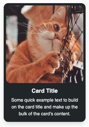
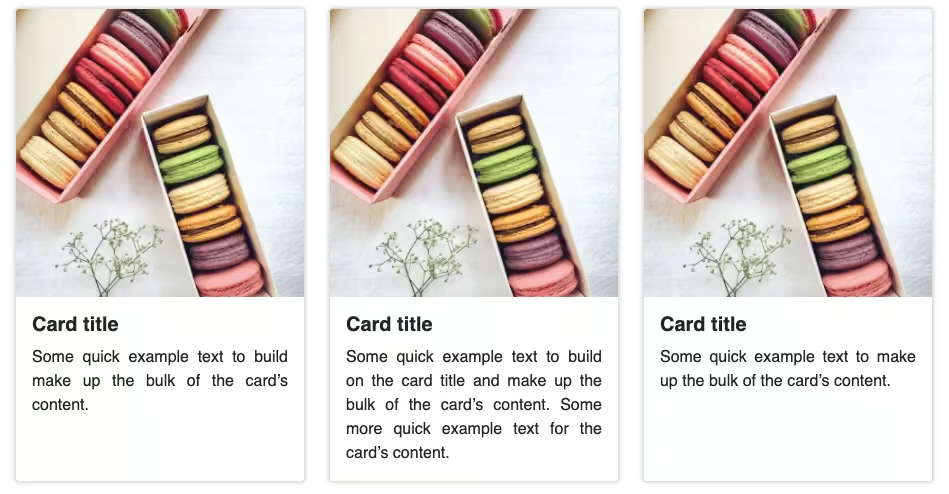
Final output:
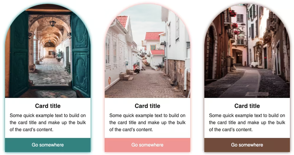
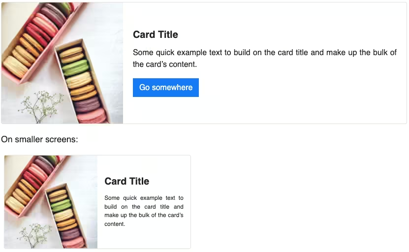
Card title
Some quick example text to build on the card title and make up the bulk of the card’s content.
Go somewhereCard title
Some quick example text to build on the card title and make up the bulk of the card’s content.
Go somewhereCard title
Some quick example text to build on the card title and make up the bulk of the card’s content.
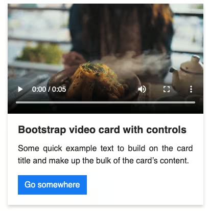
Go somewhere1. For this example, I am using Bootstrap video card.
<div class="card" style="width: 18rem;">
  <video controls="" src="https://codingyaar.com/wp-content/uploads/video-in-bootstrap-card.mp4"
    class="bs-card-video"></video>
  <div class="card-body">
    <h5 class="card-title">Bootstrap video card with controls</h5>
    <p class="card-text">
      Some quick example text to build on the card title and make up the bulk of
      the card's content.
    </p>
    <a href="#" class="btn btn-primary">Go somewhere</a>
  </div>
</div>
video {
max-width: 100%;
}Output:
Bootstrap video card with controls
Some quick example text to build on the card title and make up the bulk of the card’s content.
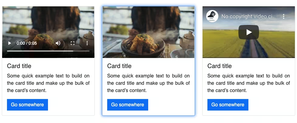
Go somewhere2. To add to zoom hover effect, add transform scale property. Adjust scale value as you want.
.card:hover {
transform: scale(1.1);
}Output:
Bootstrap video card hover effect
Some quick example text to build on the card title and make up the bulk of the card’s content.
Go somewhere3. Now, to have a smooth animation feel to the hover effect, let’s add a transition.
.card {
transition: transform 0.2s ease;
}Output:
Bootstrap video card hover effect
Some quick example text to build on the card title and make up the bulk of the card’s content.
Go somewhere4. There you go! There’s your Bootstrap card zoom hover effect. To make it look more like the final output shown earlier, I have removed the border properties and added a box-shadow to the Bootstrap card.
.card {
box-shadow: 0 4px 6px 0 rgba(22, 22, 26, 0.18);
border-radius: 0;
border: 0;
}Output:
Bootstrap video card hover effect
Some quick example text to build on the card title and make up the bulk of the card’s content.
Go somewhereFinal Output Code for Bootstrap card hover effect (zoom):
HTML
<div class="card" style="width: 18rem;">
<video controls="" src="https://codingyaar.com/wp-content/uploads/video-in-bootstrap-card.mp4"
class="bs-card-video"></video>
<div class="card-body">
<h5 class="card-title">Bootstrap video card hover effect</h5>
<p class="card-text">
Some quick example text to build on the card title and make up the bulk of
the card's content.
</p>
<a href="#" class="btn btn-primary">Go somewhere</a>
</div>
</div>CSS
video {
  max-width: 100%;
}
.card {
transition: transform 0.2s ease;
box-shadow: 0 4px 6px 0 rgba(22, 22, 26, 0.18);
border-radius: 0;
border: 0;
margin-bottom: 1.5em;
}
.card:hover {
  transform: scale(1.1);
}If you have any doubts or stuck somewhere, you can reach out through Coding Yaar's Discord server.