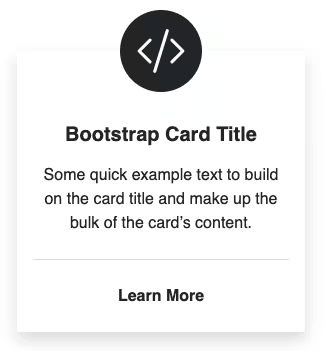
If you are starting fresh, you can use the official Bootstrap Horizontal card. It gives you a card with an image on the left side for larger screens. If you already have the basic card, you can get the image on left using some CSS. Follow these steps for a responsive Bootstrap 4 card with an image on the left.
Final output:

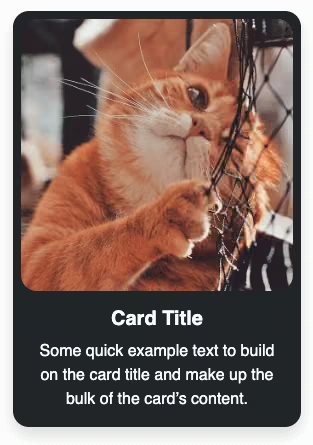
Card Title
Some quick example text to build on the card title and make up the bulk of the card’s content.
Go somewhereOn smaller screens:

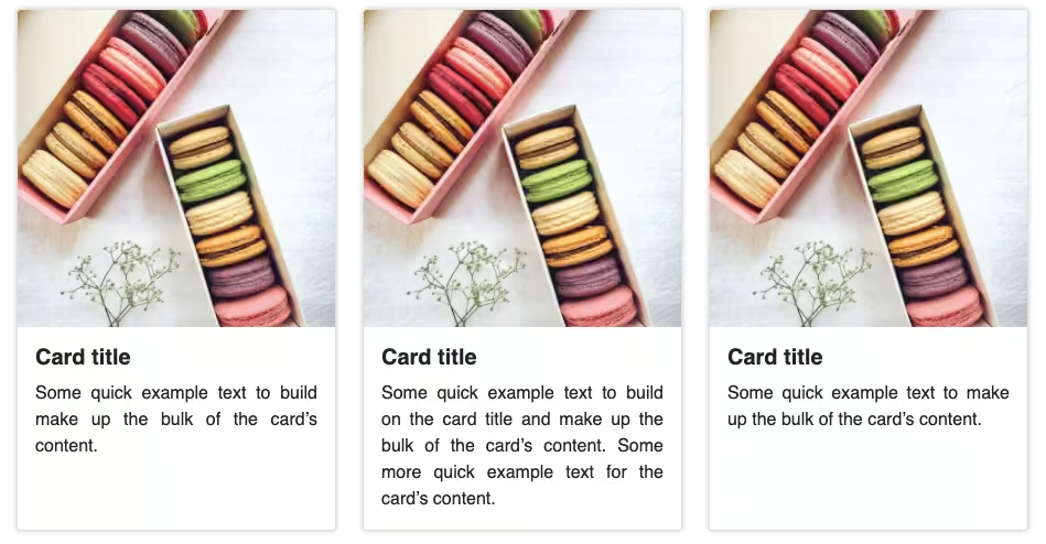
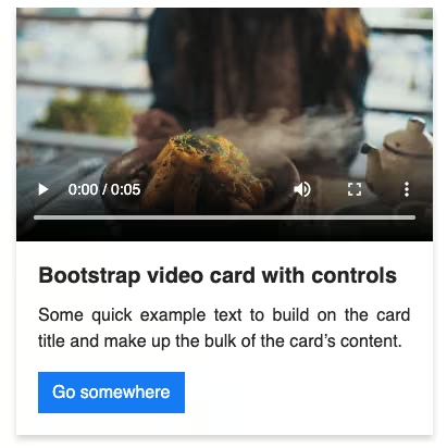
1. This is the basic Bootstrap card. (I added an image for the output)
<div class="card" style="width: 18rem;">
  <img src="..." class="card-img-top" alt="...">
  <div class="card-body">
    <h5 class="card-title">Card title</h5>
    <p class="card-text">Some quick example text to build on the card title and make up the bulk of the card's content.</p>
    <a href="#" class="btn btn-primary">Go somewhere</a>
  </div>
</div>
Output:
Card title
Some quick example text to build on the card title and make up the bulk of the card’s content.
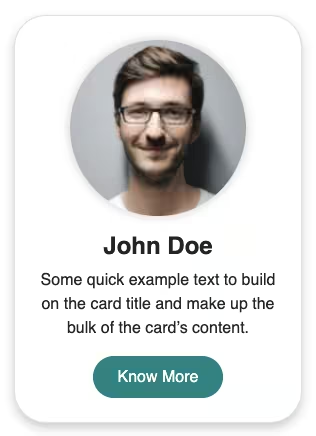
Go somewhere2. By default, the flex-direction of the card is set to column by Bootstrap. To get the image on the left of the card(horizontal card on the small screen as well), change the flex-direction to row. Also, remove the fixed width and set the width of the image as per the content size.
.card {
  flex-direction: row;
}
.card img {
  width: 30%;
}
Output:
Card title
Some quick example text to build on the card title and make up the bulk of the card’s content.
Go somewhereDifferent image sizes as per content:

3. Since the display type of the card component is flex, to get the content in the card center-aligned vertically, set align-items to center. The border-radius now has to be for the top-left and bottom-left corner.
.card {
  align-items: center;
}
.card-title {
  font-weight: bold;
}
.card img {
  border-top-right-radius: 0;
  border-bottom-left-radius: calc(0.25rem - 1px);
}
Output:
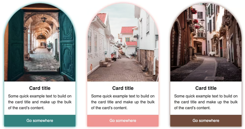
Card title
Some quick example text to build on the card title and make up the bulk of the card’s content.
Go somewhere4. As per your text content and image size, it might not look as good on smaller screens. For this example, I thought of dropping the button on smaller screens and adjust the padding and margin accordingly.(May vary for you). I have also adjusted the image sizes for better results on various screens.
@media only screen and (max-width: 768px) {
  a {
    display: none;
  }
  .card-body {
    padding: 0.5em 1.2em;
  }
  .card-body .card-text {
    margin: 0;
  }
  .card img {
    width: 50%;
  }
}
@media only screen and (max-width: 1200px) {
  .card img {
    width: 40%;
  }
}
Output:
Card title
Some quick example text to build on the card title and make up the bulk of the card’s content.
Go somewhereVideo tutorial for Responsive Bootstrap 5 card image left:
Final Output Code for Responsive Bootstrap 4 card image left:
HTML
<div class="card">
  <img src="https://codingyaar.com/wp-content/uploads/bootstrap-4-card-image-left-demo-image.jpg" class="card-img-top" />
  <div class="card-body">
    <h5 class="card-title">Card Title</h5>
    <p class="card-text">
      Some quick example text to build on the card title and make up the
      bulk of the card's content.
    </p>
    <a href="#" class="btn btn-primary">Go somewhere</a>
  </div>
</div>
CSS
.card {
  flex-direction: row;
  align-items: center;
}
.card-title {
  font-weight: bold;
}
.card img {
  width: 30%;
  border-top-right-radius: 0;
  border-bottom-left-radius: calc(0.25rem - 1px);
}
@media only screen and (max-width: 768px) {
  a {
    display: none;
  }
  .card-body {
    padding: 0.5em 1.2em;
  }
  .card-body .card-text {
    margin: 0;
  }
  .card img {
    width: 50%;
  }
}
@media only screen and (max-width: 1200px) {
  .card img {
    width: 40%;
  }
}
If you have any doubts or stuck somewhere, you can reach out through Coding Yaar's Discord server.