How to create a simple responsive one-page website or landing page template using HTML CSS and Bootstrap 5.
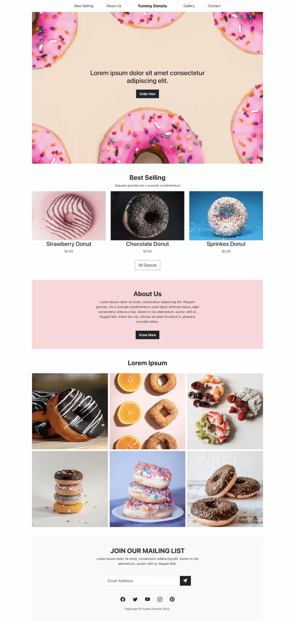
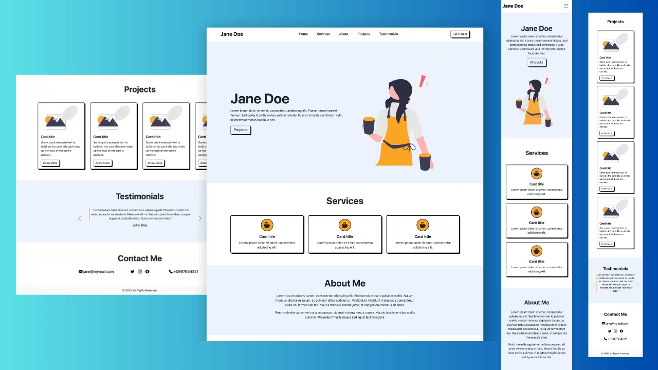
Final output:
Lorem ipsum dolor sit amet consectetur adipiscing elit
Why Us?
Lorem ipsum | consectetur adipiscing | dolor sit

Lorem

Ipsum

Consectetur
“Maecenas sit amet nisi vel lacus feugiat gravida at at augue.”
– Sed Vulputate
About Us?

Enim excepteur voluptate laboris magna et laborum dolore elit eiusmod incididunt. Nisi occaecat ipsum nostrud esse consectetur deserunt esse veniam veniam ex dolore irure minim ipsum.
Lorem ipsum dolor sit amet consectetur adipiscing elit
1. Create an HTML and a CSS page. Add Bootstrap’s CSS and JS to the HTML file. Also, add the Bootstrap icons link. Link your CSS file.
index.html
<!doctype html>
<html lang="en">
  <head>
    <meta charset="utf-8">
    <meta name="viewport" content="width=device-width, initial-scale=1">
    <title>Bootstrap demo</title>
    <link href="https://cdn.jsdelivr.net/npm/bootstrap@5.3.2/dist/css/bootstrap.min.css" rel="stylesheet" integrity="sha384-T3c6CoIi6uLrA9TneNEoa7RxnatzjcDSCmG1MXxSR1GAsXEV/Dwwykc2MPK8M2HN" crossorigin="anonymous">
    <link rel="stylesheet" href="index.css">
  </head>
  <body>
    <h1>Hello, world!</h1>
    <script src="https://cdn.jsdelivr.net/npm/bootstrap@5.3.2/dist/js/bootstrap.bundle.min.js" integrity="sha384-C6RzsynM9kWDrMNeT87bh95OGNyZPhcTNXj1NW7RuBCsyN/o0jlpcV8Qyq46cDfL" crossorigin="anonymous"></script>
  </body>
</html>
2. Let’s start with the navigation bar.
Add a Bootstrap navbar. I am using a dark background and placing the nav links in the center with the button on the right.
Here’s the detailed explanation for reference: Bootstrap Navbar With Button Right.
<nav class="navbar navbar-expand-lg fixed-top shadow" data-bs-theme="dark">
    <div class="container-fluid">
        <a class="navbar-brand fw-bold" href="#">Navbar</a>
        <button class="navbar-toggler" type="button" data-bs-toggle="collapse" data-bs-target="#navbarSupportedContent"
            aria-controls="navbarSupportedContent" aria-expanded="false" aria-label="Toggle navigation">
            <span class="navbar-toggler-icon"></span>
        </button>
        <div class="collapse navbar-collapse" id="navbarSupportedContent">
            <ul class="navbar-nav mx-auto mb-2 mb-lg-0">
                <li class="nav-item">
                    <a class="nav-link active" aria-current="page" href="#">Home</a>
                </li>
                <li class="nav-item">
                    <a class="nav-link" href="#">About</a>
                </li>
                <li class="nav-item dropdown">
                    <a class="nav-link dropdown-toggle" href="#" role="button" data-bs-toggle="dropdown"
                        aria-expanded="false">
                        Products
                    </a>
                    <ul class="dropdown-menu">
                        <li><a class="dropdown-item" href="#">Action</a></li>
                        <li><a class="dropdown-item" href="#">Another action</a></li>
                        <li>
                            <hr class="dropdown-divider">
                        </li>
                        <li><a class="dropdown-item" href="#">Something else here</a></li>
                    </ul>
                </li>
                <li class="nav-item">
                    <a class="nav-link">Blog</a>
                </li>
            </ul>
            <a href="#" class="btn">Contact Us</a>
        </div>
    </div>
</nav>
Set variables for the colors that will be used. Set the border radius to 0 for all elements.
Add some styling to the navbar.
:root {
  --primary-color: #2f4054;
  --accent-color: #ffd24c;
}
:root * {
  border-radius: 0;
}
h2 {
    color: var(--primary-color);
}
.navbar, .navbar .dropdown-menu {
  background-color: var(--primary-color);
}
.navbar-brand {
  color: #ffffff;
  font-size: 1.5rem;
}
.navbar .navbar-nav .nav-link {
  color: #ffffff;
}
@media screen and (min-width: 768px) {
  .navbar .navbar-nav .nav-link {
    font-size: 1.2rem;
    padding: 0.5rem 1.5rem;
  }
}
Output:
3. Next will be the hero section.
Add a div with class hero, and a div(hero-content) with a headline and the CTA button.
Style the heading by adding some padding and a background with opacity.
References:
–bs-bg-opacity: background with opacity
p-3: padding on all sides
pb-3: bottom padding
<div class="hero">
    <div class="hero-content">
        <h1 class="text-light bg-dark p-3 pb-4" style="--bs-bg-opacity: .5;">Lorem ipsum dolor sit amet
            consectetur
            adipiscing elit</h1>
        <a href="#" class="btn">View Products</a>
    </div>
</div>
Add a background image for the hero section. Set some height and style the button.
.hero {
  background: url("...") center no-repeat;
  background-size: cover;
  height: 50vh;
}
.hero .hero-content {
  width: 90%;
}
.btn:not(.btn-outline-light) {
  background-color: var(--accent-color);
  text-transform: uppercase;
  letter-spacing: 1px;
  font-weight: bold;
  padding: 0.7rem 1.2rem;
}

@media screen and (orientation: landscape) {
  .hero {
    height: 70vh;
  }
}
@media screen and (min-width: 768px) {
  .hero .hero-content {
    width: 50%;
  }
}
Output:
Lorem ipsum dolor sit amet consectetur adipiscing elit
View Products4. Let’s use Flexbox to align the content in the center vertically and horizontally.
<div class="hero d-flex align-items-center justify-content-center text-center">
    <div class="hero-content">
        ...
    </div>
</div>
We’ll use absolute positioning to place some part of the CTA button on the heading.
Set the parent(hero-content) position to relative. Use top-100 to place it right after the heading and start-50 to place it in the center horizontally. Translate it vertically to -50% to overlap it on the heading.
References:
flex classes: center align
Bootstrap position classes: Overlap the button on the heading
<div class="hero d-flex align-items-center justify-content-center text-center">
    <div class="hero-content position-relative">
        <h1 class="text-light bg-dark p-3 pb-4" style="--bs-bg-opacity: .5;">Lorem ipsum dolor sit amet
            consectetur
            adipiscing elit</h1>
        <button class="btn position-absolute top-100 start-50 translate-middle">View Products</button>
    </div>
</div>
Output:
Lorem ipsum dolor sit amet consectetur adipiscing elit
5. Now, the next section. Create a div with a container. Add title and subtitle.
<div class="why-us text-center pt-5">
    <div class="container">
        <h2 class="fw-bold">Why Us?</h2>
        <h5 class="text-uppercase text-secondary p-3">
            <span class="p-3">Lorem ipsum</span> |
            <span class="p-3">consectetur adipiscing</span> |
            <span class="p-3">dolor sit</span>
        </h5>
    </div>
</div>
Create a row with three columns inside the sub-section. Add product image, title, and a button to each column.
<div class="why-sub-section">
    <div class="row g-4">
        <div class="col-sm-4">
            <img src="..." class="img-fluid" alt="">
            <h5 class="p-2">Lorem</h5>
            <button class="btn">KNOW MORE</button>
        </div>
        <div class="col-sm-4">
            <img src="..." class="img-fluid" alt="">
            <h5 class="p-2">Ipsum</h5>
            <button class="btn">KNOW MORE</button>
        </div>
        <div class="col-sm-4">
            <img src="..." class="img-fluid" alt="">
            <h5 class="p-2">Consectetur</h5>
            <button class="btn">KNOW MORE</button>
        </div>
    </div>
</div>
Output:
Why Us?
Lorem ipsum | consectetur adipiscing | dolor sit
Lorem
Ipsum
Consectetur
6. Below the sub-section, add a testimonial div.
<div class="quote pt-3 text-center">
    <p class="fs-5">"Maecenas sit amet nisi vel lacus feugiat gravida at at augue."</p class="fs-5">
    <p class="text-uppercase">- Sed Vulputate</p>
</div>
For the dark background, we’ll create another div. To make the images overlap on the background midway, use position absolute. Set its z-index to -1(z-n1), to place it behind the content. Don’t forget to set the parent’s position to relative.
Also, display the background div only on larger screens(d-none d-lg-block).
<div class="why-us text-center position-relative pt-5">
    <div class="container">
        ...
        <div class="quote pt-3 text-center">
            ...
        </div>
        <div class="quote-bg py-5 position-absolute bottom-0 start-0 end-0 z-n1 d-none d-lg-block">
        </div>
    </div>
</div>
Add a background color to the div and set a height. Add some additional styling such as padding and font color.
.why-us .quote-bg {
  background-color: var(--primary-color);
  height: 30vw;
}
@media screen and (orientation: landscape) {
  .why-us .quote-bg {
    height: 35vh;
  }
}
@media screen and (min-width: 992px) {
  .container {
    padding: 2rem 5rem;
  }
}
.why-us {
  color: #ffffff;
}
@media screen and (max-width: 991px) {
  .why-us {
    padding: 2rem 1rem 0;
    color: #000000;
  }
}
Place a thick white border around the images.
.why-sub-section .img-fluid {
  border: 0.5rem solid #ffffff;
}
Output:
Why Us?
Lorem ipsum | consectetur adipiscing | dolor sit
Lorem
Ipsum
Consectetur
“Maecenas sit amet nisi vel lacus feugiat gravida at at augue.”
– Sed Vulputate
7. Next is the About section. Create a div with a container. Add your title.
<div class="about">
    <div class="container">
        <h2 class="fw-bold py-3 px-4">About Us?</h2>
    </div>
</div>
Create a row with two columns. Add your image in the first and description and button in the second column.
<div class="row">
    <div class="col-xl-6 col-lg-7">
        <img src="..." class="img-fluid" alt="">
    </div>
    <div class="col-xl-6 col-lg-5">
        <p class="py-2">Enim excepteur voluptate laboris magna et laborum dolore elit eiusmod
            incididunt. Excepteur cupidatat qui veniam ut anim consequat in
            officia et. Nisi occaecat ipsum nostrud esse consectetur deserunt esse veniam veniam ex dolore
            irure
            minim ipsum. </p>
        <button class="btn">LEARN MORE</button>
    </div>
</div>
Use class align-items-end to place content at the bottom of the row. To place half the title above the image, we’ll use position absolute. So set the position of the parent to relative.
<div class="about position-relative py-5">
    <div class="container">
        <h2 class="fw-bold py-3 px-4">About Us?</h2>
        <div class="row align-items-end">
           ...
        </div>
    </div>
</div>
Position the title to overlap with the image by setting the left value to 50% and translating it back. Use a media query so this does not affect the smaller screens. Add additional styles.
@media screen and (min-width: 992px) {
  .about h2 {
    position: absolute;
    left: 50%;
    transform: translateX(-40%);
    background-color: rgba(0, 0, 0, 0.4);
    color: #ffffff;
  }
}
@media screen and (max-width: 991px) {
  .about {
    text-align: center;
    padding: 0 1.5rem;
  }
}
Output:
About Us?
Enim excepteur voluptate laboris magna et laborum dolore elit eiusmod incididunt. Nisi occaecat ipsum nostrud esse consectetur deserunt esse veniam veniam ex dolore irure minim ipsum.
8. Moving on to the section. This is the same as the hero section. Change the background image and text.
<div class="contact hero d-flex align-items-center justify-content-center text-center">
    <div class="hero-content position-relative">
        <h2 class="text-light bg-dark p-3 pb-4" style="--bs-bg-opacity: .5;">Lorem ipsum dolor sit amet
            consectetur
            adipiscing elit</h2>
        <button class="btn position-absolute top-100 start-50 translate-middle">View Products</button>
    </div>
</div>
.contact {
background: url("...") center no-repeat;
}Output:
Lorem ipsum dolor sit amet consectetur adipiscing elit
9. Lastly, add a footer to our landing page. I’m using the footer created in a previous post: Bootstrap Footer template.
<footer class="bg-dark text-light pt-5">
<div class="container px-5">
<div class="row">
<div class="col-6 col-lg-4">
<h3 class="fw-bold">Coding Yaar</h3>
<p class="pt-2">321, Lorem ipsum dolor sit amet, consectetur adipiscing elit.</p>
<p class="mb-2">0987654321</p>
<p>1234567890</p>
</div>
<div class="col">
<h4>Menu</h4>
<ul class="list-unstyled pt-2">
<li class="py-1">Home</li>
<li class="py-1">Shorts</li>
<li class="py-1">About</li>
<li class="py-1">Contact</li>
</ul>
</div>
<div class="col">
<h4>More</h4>
<ul class="list-unstyled pt-2">
<li class="py-1">Landing Pages</li>
<li class="py-1">FAQs</li>
</ul>
</div>
<div class="col">
<h4>Categories</h4>
<ul class="list-unstyled pt-2">
<li class="py-1">Navbars</li>
<li class="py-1">Cards</li>
<li class="py-1">Buttons</li>
<li class="py-1">Carousels</li>
</ul>
</div>
<div class="col-6 col-lg-3 text-lg-end">
<h4>Social Media Links</h4>
<div class="social-media pt-2">
<a href="#" class="text-light fs-2 me-3"><i class="bi bi-facebook"></i></a>
<a href="#" class="text-light fs-2 me-3"><i class="bi bi-pinterest"></i></a>
<a href="#" class="text-light fs-2 me-3"><i class="bi bi-instagram"></i></a>
<a href="#" class="text-light fs-2"><i class="bi bi-linkedin"></i></a>
</div>
</div>
</div>
<hr>
<div class="d-sm-flex justify-content-between py-1">
<p>2023 © Coding Yaar. All Rights Reserved. </p>
<p>
<a href="#" class="text-light text-decoration-none pe-4">Terms of use</a>
<a href="#" class="text-light text-decoration-none"> Privacy policy</a>
</p>
</div>
</div>
</footer>Since I have less space to work with here, I am replacing the container with container-lg and removing the padding. Remove the background too.
<footer class="text-light pt-5">
<div class="container-lg">
...
</div>
</footer>Keep the theme color consistent.
footer {
background-color: var(--primary-color);
}Output:
Final Output Code for Responsive Website Landing Page Template using HTML CSS Bootstrap 5:
HTML
<nav class="navbar navbar-expand-lg fixed-top shadow" data-bs-theme="dark">
<div class="container-lg">
<a class="navbar-brand fw-bold" href="#">Coding Yaar</a>
<button class="navbar-toggler" type="button" data-bs-toggle="collapse"
data-bs-target="#navbarSupportedContent" aria-controls="navbarSupportedContent" aria-expanded="false"
aria-label="Toggle navigation">
<span class="navbar-toggler-icon"></span>
</button>
<div class="collapse navbar-collapse" id="navbarSupportedContent">
<ul class="navbar-nav mx-auto mb-2 mb-lg-0">
<li class="nav-item">
<a class="nav-link active" aria-current="page" href="#">Home</a>
</li>
<li class="nav-item">
<a class="nav-link" href="#">About</a>
</li>
<li class="nav-item dropdown">
<a class="nav-link dropdown-toggle" href="#" role="button" data-bs-toggle="dropdown"
aria-expanded="false">
Products
</a>
<ul class="dropdown-menu">
<li><a class="dropdown-item" href="#">Action</a></li>
<li><a class="dropdown-item" href="#">Another action</a></li>
<li>
<hr class="dropdown-divider">
</li>
<li><a class="dropdown-item" href="#">Something else here</a></li>
</ul>
</li>
<li class="nav-item">
<a class="nav-link">Blog</a>
</li>
</ul>
<a class="btn btn-outline-light" href="#">Contact Us</a>
</div>
</div>
</nav>
<div class="hero d-flex align-items-center justify-content-center text-center">
<div class="hero-content position-relative">
<h1 class="text-light bg-dark p-3 pb-4" style="--bs-bg-opacity: .5;">Lorem ipsum dolor sit amet
consectetur
adipiscing elit</h1>
<button class="btn position-absolute top-100 start-50 translate-middle">View Products</button>
</div>
</div>
<div class="why-us text-center position-relative pt-5">
<div class="container">
<h2 class="fw-bold">Why Us?</h2>
<h5 class="text-uppercase text-secondary p-3"><span class="p-3">Lorem ipsum</span> | <span
class="p-3">consectetur adipiscing
| <span class="p-3">dolor
sit</span> </span>
</h5>
<div class="why-sub-section">
<div class="row g-4">
<div class="col-sm-4">
<img src="..." class="img-fluid" alt="">
<h5 class="p-2">Lorem</h5>
<button class="btn">KNOW MORE</button>
</div>
<div class="col-sm-4">
<img src="..." class="img-fluid" alt="">
<h5 class="p-2">Ipsum</h5>
<button class="btn">KNOW MORE</button>
</div>
<div class="col-sm-4">
<img src="..." class="img-fluid" alt="">
<h5 class="p-2">Consectetur</h5>
<button class="btn">KNOW MORE</button>
</div>
</div>
</div>
<div class="quote pt-3 text-center">
<p class="fs-5">"Maecenas sit amet nisi vel lacus feugiat gravida at at augue."</p class="fs-5">
<p class="text-uppercase">- Sed Vulputate</p>
</div>
<div class="quote-bg py-5 position-absolute bottom-0 start-0 end-0 z-n1 d-none d-lg-block">
</div>
</div>
</div>
<div class="about position-relative py-5">
<div class="container">
<h2 class="fw-bold py-3 px-4">About
Us?</h2>
<div class="row align-items-end">
<div class="col-xl-6 col-lg-7">
<img src="..." class="img-fluid" alt="">
</div>
<div class="col-xl-6 col-lg-5">
<p class="py-2">Enim excepteur voluptate laboris magna et laborum dolore elit eiusmod
incididunt. Excepteur cupidatat qui veniam ut anim consequat in
officia et. Nisi occaecat ipsum nostrud esse consectetur deserunt esse veniam veniam ex dolore
irure
minim ipsum. </p>
<button class="btn">LEARN MORE</button>
</div>
</div>
</div>
</div>
<div class="contact hero d-flex align-items-center justify-content-center text-center">
<div class="hero-content position-relative">
<h1 class="text-light bg-dark p-3 pb-4" style="--bs-bg-opacity: .5;">Lorem ipsum dolor sit amet
consectetur
adipiscing elit</h1>
<button class="btn position-absolute top-100 start-50 translate-middle">View Products</button>
</div>
</div>
<footer class="text-light pt-5">
<div class="container-lg">
<div class="row">
<div class="col-6 col-lg-4">
<h3 class="fw-bold">Coding Yaar</h3>
<p class="pt-2">321, Lorem ipsum dolor sit amet, consectetur adipiscing elit.</p>
<p class="mb-2">0987654321</p>
<p>1234567890</p>
</div>
<div class="col">
<h4>Menu</h4>
<ul class="list-unstyled pt-2">
<li class="py-1">Home</li>
<li class="py-1">Shorts</li>
<li class="py-1">About</li>
<li class="py-1">Contact</li>
</ul>
</div>
<div class="col">
<h4>More</h4>
<ul class="list-unstyled pt-2">
<li class="py-1">Landing Pages</li>
<li class="py-1">FAQs</li>
</ul>
</div>
<div class="col">
<h4>Categories</h4>
<ul class="list-unstyled pt-2">
<li class="py-1">Navbars</li>
<li class="py-1">Cards</li>
<li class="py-1">Buttons</li>
<li class="py-1">Carousels</li>
</ul>
</div>
<div class="col-6 col-lg-3 text-lg-end">
<h4>Social Media Links</h4>
<div class="social-media pt-2">
<a href="#" class="text-light fs-2 me-3"><i class="bi bi-facebook"></i></a>
<a href="#" class="text-light fs-2 me-3"><i class="bi bi-pinterest"></i></a>
<a href="#" class="text-light fs-2 me-3"><i class="bi bi-instagram"></i></a>
<a href="#" class="text-light fs-2"><i class="bi bi-linkedin"></i></a>
</div>
</div>
</div>
<hr>
<div class="d-sm-flex justify-content-between py-1">
<p>2023 © Coding Yaar. All Rights Reserved. </p>
<p>
<a href="#" class="text-light text-decoration-none pe-4">Terms of use</a>
<a href="#" class="text-light text-decoration-none"> Privacy policy</a>
</p>
</div>
</div>
</footer>CSS
:root {
--primary-color: #2f4054;
--accent-color: #ffd24c;
}
:root * {
border-radius: 0;
}
h2 {
color: var(--primary-color);
}
.navbar,
.navbar .dropdown-menu,
.why-us .quote-bg,
footer {
background-color: var(--primary-color);
}
.navbar-brand {
color: #ffffff;
font-size: 1.5rem;
}
.navbar .navbar-nav .nav-link {
color: #ffffff;
}
.hero {
background: url("...") center no-repeat;
background-size: cover;
height: 50vh;
}
.hero .hero-content {
width: 90%;
}
.why-us .quote-bg {
height: 30vw;
}
@media screen and (orientation: landscape) {
.hero {
height: 100vh;
}
.why-us .quote-bg {
height: 40vh;
}
}
@media screen and (min-width: 768px) {
.hero .hero-content {
width: 50%;
}
.navbar .navbar-nav .nav-link {
font-size: 1.2rem;
padding: 0.5rem 1.5rem;
}
}
.btn:not(.btn-outline-light) {
background-color: var(--accent-color);
text-transform: uppercase;
letter-spacing: 1px;
font-weight: bold;
padding: 0.7rem 1.2rem;
}
.why-us {
color: #ffffff;
}
.why-sub-section .img-fluid {
border: 0.5rem solid #ffffff;
}
@media screen and (min-width: 768px) {
.contact {
height: 70vh;
}
}
@media screen and (min-width: 992px) {
.container {
padding: 2rem 5rem;
}
.about h2 {
position: absolute;
left: 50%;
transform: translateX(-40%);
background-color: rgba(0, 0, 0, 0.4);
color: #ffffff;
}
}
@media screen and (max-width: 991px) {
.about {
text-align: center;
}
.about {
padding: 0 1.5rem;
}
.why-us {
padding: 2rem 1rem 0;
color: #000000;
}
}
.contact {
  background: url("...") center no-repeat;
}If you have any doubts or stuck somewhere, you can reach out through Coding Yaar's Discord server.