How to create a simple responsive portfolio website using HTML CSS and Bootstrap.
Final output:
Jane Doe
Lorem ipsum dolor sit amet, consectetur adipiscing elit. Fusce rutrum laoreet finibus. Sed porta lobortis metus sed commodo.
Services
Card title
Some quick example text to build on the card title and make up the bulk of the card’s content.
Card title
Some quick example text to build on the card title and make up the bulk of the card’s content.
Card title
Some quick example text to build on the card title and make up the bulk of the card’s content.
About Me
Lorem ipsum dolor sit amet, consectetur adipiscing elit. Sed interdum est id pulvinar mollis. Nullam rhoncus dignissim ipsum, ac pulvinar tellus sodales ut. Vestibulum tincidunt malesuada consectetur. Nulla vel fermentum leo. Mauris rhoncus blandit justo, at congue dui rhoncus sit amet.
Proin molestie sapien vel nulla accumsan, sit amet viverra metus ornare. Mauris iaculis ex vitae mollis pulvinar. Phasellus fringilla neque sed ligula lacinia iaculis.
Portfolio

Card title
Some quick example text to build on the card title and make up the bulk of the card’s content.
Go somewhereCard title
Some quick example text to build on the card title and make up the bulk of the card’s content.
Go somewhereCard title
Some quick example text to build on the card title and make up the bulk of the card’s content.
Go somewhereCard title
Some quick example text to build on the card title and make up the bulk of the card’s content.
Go somewhereCard title
Some quick example text to build on the card title and make up the bulk of the card’s content.
Go somewhereCard title
Some quick example text to build on the card title and make up the bulk of the card’s content.
Go somewhereTestimonials
Contact Me
1. Let’s start with this navbar from the official Bootstrap Navbar page.
<nav class="navbar navbar-expand-lg bg-body-tertiary">
  <div class="container-fluid">
    <a class="navbar-brand" href="#">Navbar</a>
    <button class="navbar-toggler" type="button" data-bs-toggle="collapse" data-bs-target="#navbarNav" aria-controls="navbarNav" aria-expanded="false" aria-label="Toggle navigation">
      <span class="navbar-toggler-icon"></span>
    </button>
    <div class="collapse navbar-collapse" id="navbarNav">
      <ul class="navbar-nav">
        <li class="nav-item">
          <a class="nav-link active" aria-current="page" href="#">Home</a>
        </li>
        <li class="nav-item">
          <a class="nav-link" href="#">Features</a>
        </li>
        <li class="nav-item">
          <a class="nav-link" href="#">Pricing</a>
        </li>
        <li class="nav-item">
          <a class="nav-link disabled">Disabled</a>
        </li>
      </ul>
    </div>
  </div>
</nav>
Output:
2. Remove the background color and the disabled link. Add more nav links.
Use this anchor tag to create a button that links to the contact section and use Bootstrap’s button classes to style it.
<nav class="navbar navbar-expand-lg">
    <div class="container-fluid">
      <a class="navbar-brand" href="#">Navbar</a>
      <button class="navbar-toggler" type="button" data-bs-toggle="collapse" data-bs-target="#navbarNav" aria-controls="navbarNav" aria-expanded="false" aria-label="Toggle navigation">
        <span class="navbar-toggler-icon"></span>
      </button>
      <div class="collapse navbar-collapse" id="navbarNav">
        <ul class="navbar-nav">
          <li class="nav-item">
            <a class="nav-link active" aria-current="page" href="#">Home</a>
          </li>
          <li class="nav-item">
            <a class="nav-link" href="#">Services</a>
          </li>
          <li class="nav-item">
            <a class="nav-link" href="#">About</a>
          </li>
          <li class="nav-item">
              <a class="nav-link" href="#">Projects</a>
            </li>
            <li class="nav-item">
              <a class="nav-link" href="#">Testimonials</a>
            </li>
        </ul>
        <a class="btn btn-outline-dark" href="#">Let's Talk</a>
      </div>
    </div>
  </nav>
Use class mx-auto to place the nav links in the center.
<ul class="navbar-nav mx-auto">Output:
3. Replace the container-fluid class with container-lg.
Reference: Responsive containers
<nav class="navbar navbar-expand-lg">
    <div class="container-fluid">
        ...
    </div>
</nav>
Change the nav links color to black and increase the font size.
Add some padding to its parent element nav-item.
.navbar {
  background-color: #ffffff;
}
.navbar-nav .nav-link {
  color: #000000;
  font-size: 1.1rem;
}
.navbar-nav .nav-item {
  padding: 0 .5rem;
}
Output:
4. This is how it looks on the mobile screen.

Let’s change the button to a nav-link like the others on the small screen. So add another nav link for Contact.
Add class d-lg-none to hide this link on large screens. Add classes d-none d-lg-block to the button to hide it on small screens.
Reference: Hiding elements
    <li class="nav-item">
        <a class="nav-link d-lg-none" href="#">Contact</a>
    </li>
</ul>
<a class="btn btn-outline-dark d-none d-lg-block" href="#">Let's Talk</a>
Let’s fix the navbar-brand and nav links alignment. Add a media query to check if it’s a large screen and add the nav-item padding inside it.
@media screen and (min-width: 1024px) {
  .navbar-nav .nav-item {
    padding: 0 0.5rem;
  }
}
Output:

5. Let’s move on to the hero section of the website.
Create a section with class and id hero.
<section class="hero" id="hero">

</section>
Use this id in the navbar.
<li class="nav-item">
    <a class="nav-link active" aria-current="page" href="#hero">Home</a>
</li>
Add a container and a row with two columns.
<div class="container">
    <div class="row">
        <div class="col-sm-6">
        </div>
        <div class="col-sm-6">
        </div>
    </div>
</div>
Add a title, description, and button. Use Bootstrap button classes to style the button.
Add your hero image in the second column.
<div class="container">
    <div class="row">
        <div class="col-sm-6">
            <h1 class="display-4 fw-bold">Jane Doe</h1>
            <p>Lorem ipsum dolor sit amet, consectetur adipiscing elit. Fusce rutrum laoreet finibus. Sed porta
                lobortis metus sed commodo.
            </p>
            <button class="btn btn-outline-dark btn-lg">Projects</button>
        </div>
        <div class="col-sm-6">
            <img src="..." alt="">
        </div>
    </div>
</div>
Output:
Jane Doe
Lorem ipsum dolor sit amet, consectetur adipiscing elit. Fusce rutrum laoreet finibus. Sed porta lobortis metus sed commodo.
6. Since the row is a flexbox we can use align-items-center.
Align the image to the center.
<div class="row align-items-center">
    <div class="col-sm-6">
        <h1 class="display-4 fw-bold">Jane Doe</h1>
        <p>Lorem ipsum dolor sit amet, consectetur adipiscing elit. Fusce rutrum laoreet finibus. Sed porta
            lobortis metus sed commodo.
        </p>
        <button class="btn btn-outline-dark btn-lg">Projects</button>
    </div>
    <div class="col-sm-6 text-center">
        <img src="..." class="img-fluid" alt="">
    </div>
</div>
Add a background color for the hero section.
section.hero {
  background-color: #ecf2ff;
}
Add some padding for the containers.
[class^=”container”] will select all elements that begin with the class container(container, container-lg, container-fluid)
section [class^="container"] {
  padding: 4rem 2rem;
}
@media screen and (min-width: 1024px) {
  section [class^="container"] {
    padding: 4rem;
  }
  nav [class^="container"] {
    padding: 0 4rem;
  }
}
Set the navbar fixed at the top and add a box shadow. Use container only for large screens(container-lg).
<nav class="navbar navbar-expand-lg fixed-top shadow-sm">
    <div class="container-lg">
        <a class="navbar-brand fw-bold" href="#">Jane Doe</a>
        ...
    </div>
</nav>
Increase font-weight (fw-bold) and font size for the navbar brand on large screens.
@media screen and (min-width: 1024px) {
  .navbar-brand {
    font-size: 1.5rem;
  }
}
Add some padding to the hero section to avoid the navbar overlapping over the website content.
Only for the small screens, align text to the center and reduce image size(depending on your image size).
section.hero {
  padding-top: 72px;
}
@media screen and (max-width: 576px) {
  section.hero {
    text-align: center;
  }
  section.hero .img-fluid {
    width: 80%;
  }
}
Output:
Jane Doe
Lorem ipsum dolor sit amet, consectetur adipiscing elit. Fusce rutrum laoreet finibus. Sed porta lobortis metus sed commodo.
7. Okay, so the next section of our website is services. Add a section with class services and an id.
Add a container with a heading. Increase its font size(display-5) and weight.
<section class="services" id="services">
    <div class="container">
        <h2 class="display-5 fw-bold mb-4">Services</h2>
    </div>
</section>
Add a row with three columns.
<div class="row">
    <div class="col-sm-4"></div>
    <div class="col-sm-4"></div>
    <div class="col-sm-4"></div>
</div>
Let’s add a Bootstrap card. Remove the button. I’ll be using Bootstrap icons instead of an image. Let’s install it.
Pick an icon and replace the image with it. Remove the fixed card width and make the title bold.
<div class="col-sm-4">
    <div class="card">
        <i class="bi bi-cup-hot-fill"></i>
        <div class="card-body">
            <h5 class="card-title fw-bold">Card title</h5>
            <p class="card-text">Some quick example text to build on the card title and make up the bulk
                of the card's content.</p>
        </div>
    </div>
</div>
Except for the first section, set the text-align to center.
section:not(:first-of-type) {
  text-align: center;
}
Add some more styles for the card icon.
section.services i {
  font-size: 2rem;
  margin: 1rem auto 0;
  border: 2px solid #000000;
  width: 4rem;
  height: 4rem;
  border-radius: 50%;
  display: flex;
  align-items: center;
  justify-content: center;
  background-color: #f5a841;
}
Output:
Services
Card title
Some quick example text to build on the card title and make up the bulk of the card’s content.
Card title
Some quick example text to build on the card title and make up the bulk of the card’s content.
Card title
Some quick example text to build on the card title and make up the bulk of the card’s content.
8. Add a border and box shadow to the card.
section .card {
  border: 2px solid #000000;
  box-shadow: 4px 4px #000000;
  transition: all 0.4s;
}
Add margin-top using mt-4. Let’s have equal-width columns on the large screen and two each on smaller than that.
<div class="row">
    <div class="col-lg col-sm-6 mt-4">
        ...
    </div>
    <div class="col-lg col-sm-6 mt-4">
        ...
    </div>
    <div class="col-lg col-sm-6 mt-4">
        ...
    </div>
</div>
Set a max width for the cards and align them to the center.
section .card {
  max-width: 22rem;
  margin-inline: auto;
}
Output:
Services
Card title
Some quick example text to build on the card title and make up the bulk of the card’s content.
Card title
Some quick example text to build on the card title and make up the bulk of the card’s content.
Card title
Some quick example text to build on the card title and make up the bulk of the card’s content.
9. Add an About section with a container and the heading.
<section class="about" id="about">
    <div class="container">
        <h2 class="display-5 fw-bold mb-4">About Me</h2>
    </div>
</section>
The About section will have just two paragraph texts.
<section class="about" id="about">
    <div class="container">
        <h2 class="display-5 fw-bold mb-4">About Me</h2>
        <p>Lorem ipsum dolor sit amet, consectetur adipiscing elit. Sed interdum est id pulvinar mollis. Nullam
            rhoncus dignissim ipsum, ac pulvinar tellus sodales ut. Vestibulum tincidunt malesuada consectetur.
            Nulla vel fermentum leo. Mauris rhoncus blandit justo, at congue dui rhoncus sit amet.</p>
        <p>Proin molestie
            sapien vel nulla accumsan, sit amet viverra metus ornare. Mauris iaculis ex vitae mollis pulvinar.
            Phasellus fringilla neque sed ligula lacinia iaculis.</p>
    </div>
</section>
Make it easier to read by reducing the width for large screens.
@media screen and (min-width: 1024px) {
  section.about .container {
    width: 75%;
  }
}
Add the background color for alternate sections.
section:nth-child(2n) {
  background-color: #ecf2ff;
}
Output:
About Me
Lorem ipsum dolor sit amet, consectetur adipiscing elit. Sed interdum est id pulvinar mollis. Nullam rhoncus dignissim ipsum, ac pulvinar tellus sodales ut. Vestibulum tincidunt malesuada consectetur. Nulla vel fermentum leo. Mauris rhoncus blandit justo, at congue dui rhoncus sit amet.
Proin molestie sapien vel nulla accumsan, sit amet viverra metus ornare. Mauris iaculis ex vitae mollis pulvinar. Phasellus fringilla neque sed ligula lacinia iaculis.
10. Now to the portfolio or the projects section. Similar to the services section, add a row with any number of columns.
<section class="projects" id="projects">
    <div class="container">
        <h2 class="display-5 fw-bold mb-4">Portfolio</h2>
        <div class="row">
            <div class="col-lg-4 col-sm-6 mt-4"></div>
            <div class="col-lg-4 col-sm-6 mt-4"></div>
            <div class="col-lg-4 col-sm-6 mt-4"></div>
            <div class="col-lg-4 col-sm-6 mt-4"></div>
            <div class="col-lg-4 col-sm-6 mt-4"></div>
            <div class="col-lg-4 col-sm-6 mt-4"></div>
        </div>
    </div>
</section>
Add Bootstrap cards.
<div class="col-lg-4 col-sm-6 mt-4">
    <div class="card">
        <img src="..." class="card-img-top" alt="...">
        <div class="card-body">
            <h5 class="card-title fw-bold">Card title</h5>
            <p class="card-text">Some quick example text to build on the card title and make up the bulk
                of the card's content.</p>
            <a href="#" class="btn btn-outline-dark">Go somewhere</a>
        </div>
    </div>
</div>
For the projects section cards, set the max width to 17rem and align the text to the left.
section.projects .card {
  max-width: 17rem;
  text-align: left;
}
Let’s add the border and box shadow to the button as well.
.btn-outline-dark {
  border: 2px solid #000000;
  box-shadow: 4px 4px #000000;
  transition: all 0.4s;
}
For the buttons, let’s change the shadow color on hover.
.btn-outline-dark:hover {
  box-shadow: 4px 4px #f5a841;
}
Output:
Portfolio
Card title
Some quick example text to build on the card title and make up the bulk of the card’s content.
Go somewhereCard title
Some quick example text to build on the card title and make up the bulk of the card’s content.
Go somewhereCard title
Some quick example text to build on the card title and make up the bulk of the card’s content.
Go somewhereCard title
Some quick example text to build on the card title and make up the bulk of the card’s content.
Go somewhereCard title
Some quick example text to build on the card title and make up the bulk of the card’s content.
Go somewhereCard title
Some quick example text to build on the card title and make up the bulk of the card’s content.
Go somewhere11. Moving on to the testimonials section of the website. Here we’ll use the Bootstrap carousel.
<section class="testimonials" id="testimonials">
    <div class="container">
        <h2 class="display-5 fw-bold mb-4">Testimonials</h2>
        <div id="carouselExample" class="carousel slide">
            <div class="carousel-inner">
                <div class="carousel-item active">
                    <img src="..." class="d-block w-100" alt="...">
                </div>
                <div class="carousel-item">
                    <img src="..." class="d-block w-100" alt="...">
                </div>
                <div class="carousel-item">
                    <img src="..." class="d-block w-100" alt="...">
                </div>
            </div>
            <button class="carousel-control-prev" type="button" data-bs-target="#carouselExample" data-bs-slide="prev">
                <span class="carousel-control-prev-icon" aria-hidden="true"></span>
                <span class="visually-hidden">Previous</span>
            </button>
            <button class="carousel-control-next" type="button" data-bs-target="#carouselExample" data-bs-slide="next">
                <span class="carousel-control-next-icon" aria-hidden="true"></span>
                <span class="visually-hidden">Next</span>
            </button>
        </div>
    </div>
</section>
Replace the image with the testimonials texts.
<div class="carousel-item active">
    <p>"Lorem ipsum dolor sit amet, consectetur adipiscing elit. Phasellus mattis orci enim, ac
        auctor ex iaculis ut. Mauris ut elit mi. Sed nec quam bibendum, congue augue ut, molestie
        tellus. Fusce vel semper dolor." </p>
    <h5>John Doe</h5>
</div>
Reduce width like about section.
section.testimonials .container {
  width: 75%;
}
Use carousel-dark class since we have a lighter background.
<div id="carouselExample" class="carousel slide carousel-dark">Output:
Testimonials
12. Get the controls away from the text. Reduce the width of the controls.
Reduce the text width too.
section.testimonials .carousel-control-prev,
section.testimonials .carousel-control-next {
  width: 5%;
}
section.testimonials .carousel-item p {
  max-width: 80%;
}
We need to center align it, but before that let’s add the carousel-fade class.
<div id="carouselExample" class="carousel slide carousel-dark carousel-fade">It doesn’t work because Bootstrap supports the prefers-reduced-motion media feature. You can override that, by adding the transition Bootstrap uses.
section.testimonials .carousel.carousel-fade .carousel-item {
  transition: opacity 0.5s;
}
Center align the text using flexbox properties.
section.testimonials .carousel-item {
  display: flex;
  flex-direction: column;
  align-items: center;
  justify-content: center;
}
Output:
Testimonials
13. Alright now the contact section. Add a row with three columns.
<section class="contact" id="contact">
    <div class="container">
        <h2 class="display-5 fw-bold mb-4">Contact Me</h2>
        <div class="row">
            <div class="col-sm-4 mt-4"></div>
            <div class="col-sm-4 mt-4"></div>
            <div class="col-sm-4 mt-4"></div>
        </div>
    </div>
</section>
Add an anchor tag in the first and last columns with email and phone respectively.
Add social media links in the second column. I’ll be using Bootstrap icons.
<section class="contact" id="contact">
    <div class="container">
        <h2 class="display-5 fw-bold mb-4">Contact Me</h2>
        <div class="row">
            <div class="col-sm-4 mt-4">
                <a href="#">jane@mymail.com</a>
            </div>
            <div class="col-sm-4 mt-4">
                <div class="social-media">
                    <a href="#"><i class="bi bi-twitter"></i></a>
                    <a href="#"><i class="bi bi-instagram"></i></a>
                    <a href="#"><i class="bi bi-facebook"></i></a>
                </div>
            </div>
            <div class="col-sm-4 mt-4">
                <a href="#">+1234567890</a>
            </div>
        </div>
    </div>
</section>
Add icons to the email and phone too.
<a href="#"><i class="bi bi-envelope-fill"></i> jane@mymail.com</a>

<a href="#"><i class="bi bi-telephone-fill"></i> +1234567890</a>
Let’s style the anchor tags.
section.contact .social-media a {
  padding: 0 0.5rem;
  font-size: 1.3rem;
}
a {
  color: #000000;
  text-decoration: none;
  transition: all .3s;
}
a:not(.btn):hover {
  color: #f5a841;
}
Add a hover effect for nav links too.
.navbar-nav .nav-link {
  transition: all 0.5s;
}
.navbar-nav .nav-link:hover {
  color: #f5a841;
}
Output:
Contact Me
14. Lastly, let’s add a small footer at the end of the website. Use Bootstrap classes to style it.
<footer class="text-center p-3 bg-body-tertiary">
    <div>© 2023. All Rights Reserved.</div>
</footer>
Output:
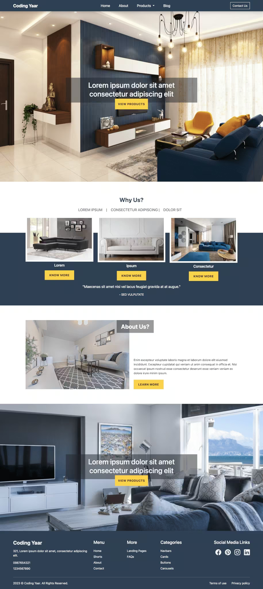
Final Output Code for Responsive Portfolio Website using HTML CSS Bootstrap:
HTML
<nav class="navbar navbar-expand-lg sticky-top shadow-sm">
    <div class="container-lg">
        <a class="navbar-brand fw-bold" href="#">Jane Doe</a>
        <button class="navbar-toggler" type="button" data-bs-toggle="collapse" data-bs-target="#navbarNav"
            aria-controls="navbarNav" aria-expanded="false" aria-label="Toggle navigation">
            <span class="navbar-toggler-icon"></span>
        </button>
        <div class="collapse navbar-collapse" id="navbarNav">
            <ul class="navbar-nav mx-auto">
                <li class="nav-item">
                    <a class="nav-link active" aria-current="page" href="#hero">Home</a>
                </li>
                <li class="nav-item">
                    <a class="nav-link" href="#services">Services</a>
                </li>
                <li class="nav-item">
                    <a class="nav-link" href="#about">About</a>
                </li>
                <li class="nav-item">
                    <a class="nav-link" href="#projects">Projects</a>
                </li>
                <li class="nav-item">
                    <a class="nav-link" href="#testimonials">Testimonials</a>
                </li>
                <li class="nav-item">
                    <a class="nav-link d-lg-none" href="#contact">Contact</a>
                </li>
            </ul>
            <a class="btn btn-outline-dark d-none d-lg-block" href="#contact">Let's Talk</a>
        </div>
    </div>
</nav>

<section class="hero" id="hero">
    <div class="container-lg">
        <div class="row align-items-center">
            <div class="col-sm-6">
                <h1 class="display-4 fw-bold">Jane Doe</h1>
                <p>Lorem ipsum dolor sit amet, consectetur adipiscing elit. Fusce rutrum laoreet finibus. Sed porta
                    lobortis metus sed commodo.
                </p>
                <button class="btn btn-outline-dark btn-lg">Projects</button>
            </div>
            <div class="col-sm-6 text-center">
                <img src="..." class="img-fluid" alt="">
            </div>
        </div>
    </div>
</section>

<section class="services" id="services">
    <div class="container">
        <h2 class="display-5 fw-bold mb-4">Services</h2>
        <div class="row">
            <div class="col-lg col-sm-6 mt-4">
                <div class="card">
                    <i class="bi bi-cup-hot-fill"></i>
                    <div class="card-body">
                        <h5 class="card-title fw-bold">Card title</h5>
                        <p class="card-text">Some quick example text to build on the card title and make up the bulk
                            of the card's content.</p>
                    </div>
                </div>
            </div>
        </div>
    </div>
</section>

<section class="about" id="about">
    <div class="container">
        <h2 class="display-5 fw-bold mb-4">About Me</h2>
        <p>Lorem ipsum dolor sit amet, consectetur adipiscing elit. Sed interdum est id pulvinar mollis. Nullam
            rhoncus dignissim ipsum, ac pulvinar tellus sodales ut. Vestibulum tincidunt malesuada consectetur.
            Nulla vel fermentum leo. Mauris rhoncus blandit justo, at congue dui rhoncus sit amet.</p>
        <p>Proin molestie
            sapien vel nulla accumsan, sit amet viverra metus ornare. Mauris iaculis ex vitae mollis pulvinar.
            Phasellus fringilla neque sed ligula lacinia iaculis.</p>
    </div>
</section>

<section class="projects" id="projects">
    <div class="container">
        <h2 class="display-5 fw-bold mb-4">Portfolio</h2>
        <div class="row">
            <div class="col-lg-4 col-sm-6 mt-4">
                <div class="card">
                    <img src="..." class="card-img-top" alt="...">
                    <div class="card-body">
                        <h5 class="card-title fw-bold">Card title</h5>
                        <p class="card-text">Some quick example text to build on the card title and make up the bulk
                            of the card's content.</p>
                        <a href="#" class="btn btn-outline-dark">Go somewhere</a>
                    </div>
                </div>
            </div>
        </div>
    </div>
</section>

<section class="testimonials" id="testimonials">
    <div class="container">
        <h2 class="display-5 fw-bold mb-4">Testimonials</h2>
        <div id="carouselExample" class="carousel slide carousel-dark carousel-fade">
            <div class="carousel-inner">
                <div class="carousel-item active">
                    <p>"Lorem ipsum dolor sit amet, consectetur adipiscing elit. Phasellus mattis orci enim, ac
                        auctor ex iaculis ut. Mauris ut elit mi. Sed nec quam bibendum, congue augue ut, molestie
                        tellus. Fusce vel semper dolor." </p>
                    <h5>John Doe</h5>
                </div>
                <div class="carousel-item">
                    <p>"Lorem ipsum dolor sit amet, consectetur adipiscing elit. Nunc at tortor a massa facilisis
                        venenatis sit amet non libero. Etiam vel sem venenatis tellus laoreet feugiat eu in mi."
                    </p>
                    <h5>June Doe</h5>
                </div>
                <div class="carousel-item">
                    <p>"Lorem ipsum dolor sit amet, consectetur adipiscing elit. Ut non metus eu sem ultrices
                        tincidunt sit amet ac nisi. In hac habitasse platea dictumst. Aliquam pellentesque diam non
                        eros feugiat maximus." </p>
                    <h5>Johnny Doe</h5>
                </div>
            </div>
            <button class="carousel-control-prev" type="button" data-bs-target="#carouselExample" data-bs-slide="prev">
                <span class="carousel-control-prev-icon" aria-hidden="true"></span>
                <span class="visually-hidden">Previous</span>
            </button>
            <button class="carousel-control-next" type="button" data-bs-target="#carouselExample" data-bs-slide="next">
                <span class="carousel-control-next-icon" aria-hidden="true"></span>
                <span class="visually-hidden">Next</span>
            </button>
        </div>
    </div>
</section>

<section class="contact" id="contact">
    <div class="container">
        <h2 class="display-5 fw-bold mb-4">Contact Me</h2>
        <div class="row">
            <div class="col-sm-4 mt-4">
                <a href="#">jane@mymail.com</a>
            </div>
            <div class="col-sm-4 mt-4">
                <div class="social-media">
                    <a href="#"><i class="bi bi-twitter"></i></a>
                    <a href="#"><i class="bi bi-instagram"></i></a>
                    <a href="#"><i class="bi bi-facebook"></i></a>
                </div>
            </div>
            <div class="col-sm-4 mt-4">
                <a href="#">+1234567890</a>
            </div>
        </div>
    </div>
</section>

<footer class="text-center p-3 bg-body-tertiary">
    <div>© 2023. All Rights Reserved.</div>
</footer>
CSS
section [class^="container"] {
  padding: 4rem 2rem;
}
@media screen and (min-width: 1024px) {
  section [class^="container"] {
    padding: 4rem;
  }
  nav [class^="container"] {
    padding: 0 4rem;
  }
}

section:not(:first-of-type) {
  text-align: center;
}

section:nth-child(2n) {
  background-color: #ecf2ff;
}

a {
  color: #000000;
  text-decoration: none;
  transition: all 0.3s;
}
a:not(.btn):hover {
  color: #f5a841;
}

section .card,
.btn-outline-dark {
  border: 2px solid #000000;
  box-shadow: 4px 4px #000000;
  transition: all 0.4s;
}
.btn-outline-dark:hover {
  box-shadow: 4px 4px #f5a841;
}
section .card {
  max-width: 22rem;
  margin-inline: auto;
}

/* NAVBAR */

.navbar {
  background-color: #ffffff;
}

.navbar-nav .nav-link {
  color: #000000;
  font-size: 1.1rem;
  transition: all 0.5s;
}
.navbar-nav .nav-link:hover {
  color: #f5a841;
}
@media screen and (min-width: 1024px) {
  .navbar-nav .nav-item {
    padding: 0 1rem;
  }
  .navbar-brand {
    font-size: 1.5rem;
  }
}

/* HERO */

section.hero {
  padding-top: 72px;
}
@media screen and (max-width: 576px) {
  section.hero {
    text-align: center;
  }
  section.hero .img-fluid {
    width: 70%;
  }
}

/* SERVICES */

section.services i {
  font-size: 2rem;
  margin: 1rem auto 0;
  border: 2px solid #000000;
  width: 4rem;
  height: 4rem;
  border-radius: 50%;
  display: flex;
  align-items: center;
  justify-content: center;
  background-color: #f5a841;
}

/* ABOUT */

@media screen and (min-width: 1024px) {
  section.about .container,
  section.testimonials .container {
    width: 75%;
  }
}

/* PROJECTS */

section.projects .card {
  max-width: 17rem;
  text-align: left;
}
section.projects .card img {
  max-width: 70%;
  margin: 0 auto;
}

/* TESTIMONIALS */

section.testimonials .carousel-control-prev,
section.testimonials .carousel-control-next {
  width: 5%;
}

section.testimonials .carousel-item p {
  max-width: 80%;
  border-left: 5px solid #f5a841;
  padding-left: 1rem;
}
section.testimonials .carousel-item {
  display: flex;
  flex-direction: column;
  align-items: center;
  justify-content: center;
}
section.testimonials .carousel.carousel-fade .carousel-item {
  transition: opacity 0.5s;
}

/* CONTACT */

section.contact .social-media a {
  padding: 0 0.5rem;
  font-size: 1.3rem;
}
Video tutorial for Portfolio Website using HTML CSS Bootstrap 5:
If you have any doubts or stuck somewhere, you can reach out through Coding Yaar's Discord server.