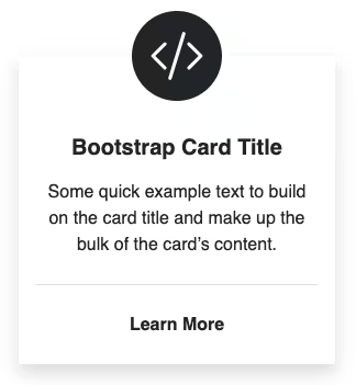
Convert the basic Bootstrap card into a Bootstrap card with rounded corners using the following steps.
Final output:

John Doe
Some quick example text to build on the card title and make up the bulk of the card’s content.
Know More1. Let’s start with the basic Bootstrap card. (I have changed some text and added an image for the output card)
<div class="card" style="width: 18rem;">
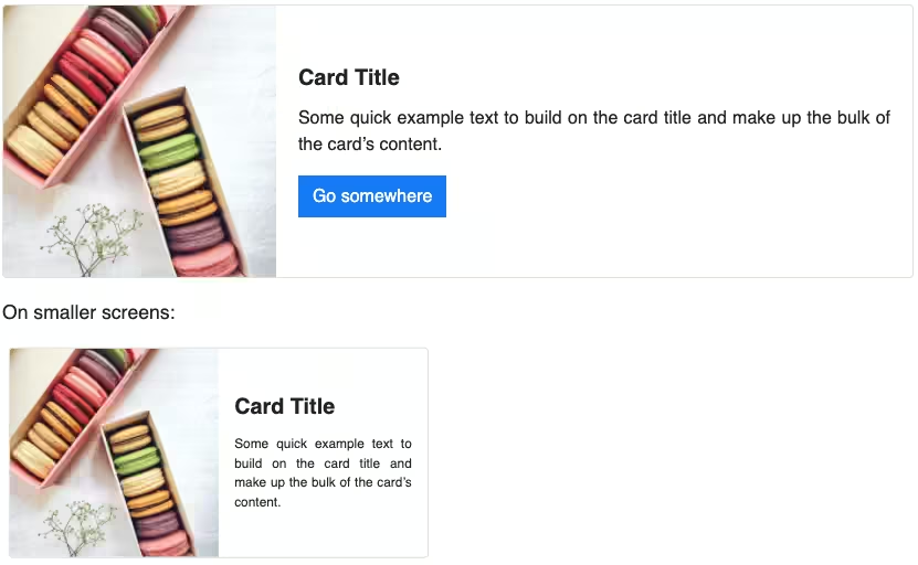
<img src="..." class="card-img-top" alt="...">
<div class="card-body">
<h5 class="card-title">Card title</h5>
<p class="card-text">Some quick example text to build on the card title and make up the bulk of the card's content.</p>
<a href="#" class="btn btn-primary">Go somewhere</a>
</div>
</div>Output:
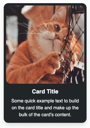
John Doe
Some quick example text to build on the card title and make up the bulk of the card’s content.
Know More2. To style the image, make it circular using border-radius and also add a box-shadow.
img{
    width: 65%;
    border-radius: 50%;
    margin: 0 auto;
    box-shadow: 0 0 10px rgba(0,0,0,.2);
}
Output:
John Doe
Some quick example text to build on the card title and make up the bulk of the card’s content.
Know More3. Next, style the card similarly using border-radius and box-shadow. Add some padding and bring everything to the center.
FYI: border-radius when in percentage, depends on the width of the element to create an ellipse or a circle(like we did for the image in step 2). But for the card, I am using em as we don’t want the entire card to be elliptical but have rounded corners.
.card{
    padding: 1.5em .5em .5em;
    border-radius: 2em;
    text-align: center;
    box-shadow: 0 5px 10px rgba(0,0,0,.2);
}
Output:
John Doe
Some quick example text to build on the card title and make up the bulk of the card’s content.
Know More4. Let’s make the card title look like a title by adding some weight to it.
.card-title{
    font-weight: 700;
    font-size: 1.5em;
}
Output:
John Doe
Some quick example text to build on the card title and make up the bulk of the card’s content.
Know More5. Modify the button to match the card UI. Also, add a little hover effect on the card button and remove the btn-primary class.
.btn{
    border-radius:2em;
    background-color: teal;
    color: #ffffff;
    padding: .5em 1.5em;
}
.btn:hover {
  background-color: rgba(0, 128, 128, 0.7);
  color: #ffffff;
  box-shadow: 0 0 10px rgba(0, 0, 0, 0.2);
}
Output:
John Doe
Some quick example text to build on the card title and make up the bulk of the card’s content.
Know MoreVideo tutorial for Bootstrap Profile Card #1(rounded corners):
Final Output Code for Bootstrap Card Example(rounded corners):
HTML
<div class="card" style="width: 18rem;">
  <img src="..." class="card-img-top" alt="">
  <div class="card-body">
    <h5 class="card-title">John Doe</h5>
    <p class="card-text">Some quick example text to build on the card title and make up the bulk of the card's content.</p>
    <a href="#" class="btn">Know More</a>
  </div>
</div>
CSS
.card {
  margin-top: 2em;
  padding: 1.5em 0.5em 0.5em;
  border-radius: 2em;
  text-align: center;
  box-shadow: 0 5px 10px rgba(0, 0, 0, 0.2);
}
.card img {
  width: 65%;
  border-radius: 50%;
  margin: 0 auto;
  box-shadow: 0 0 10px rgba(0, 0, 0, 0.2);
}
.card .card-title {
  font-weight: 700;
  font-size: 1.5em;
}
.card .btn {
  border-radius: 2em;
  background-color: teal;
  color: #ffffff;
  padding: 0.5em 1.5em;
}
.card .btn:hover {
  background-color: rgba(0, 128, 128, 0.7);
  color: #ffffff;
  box-shadow: 0 0 10px rgba(0, 0, 0, 0.2);
}
If you have any doubts or stuck somewhere, you can reach out through Coding Yaar's Discord server.