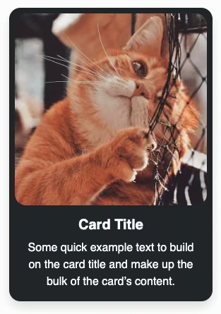
How to create a simple responsive Bootstrap 5 card design with an icon using the basic Bootstrap 5 card.
Final output:
Bootstrap Card Title
Some quick example text to build on the card title and make up the bulk of the card’s content.
1. Let’s start with the first card from the official Bootstrap Card page. Replace the image with an icon.
I am using this Bootstrap SVG icon. Change the width and height attributes.
<svg xmlns="http://www.w3.org/2000/svg" width="50" height="50" fill="currentColor" class="bi bi-code-slash"
    viewBox="0 0 16 16">
    <path
        d="M10.478 1.647a.5.5 0 1 0-.956-.294l-4 13a.5.5 0 0 0 .956.294l4-13zM4.854 4.146a.5.5 0 0 1 0 .708L1.707 8l3.147 3.146a.5.5 0 0 1-.708.708l-3.5-3.5a.5.5 0 0 1 0-.708l3.5-3.5a.5.5 0 0 1 .708 0zm6.292 0a.5.5 0 0 0 0 .708L14.293 8l-3.147 3.146a.5.5 0 0 0 .708.708l3.5-3.5a.5.5 0 0 0 0-.708l-3.5-3.5a.5.5 0 0 0-.708 0z" />
</svg>
<div class="card" style="width: 18rem;">
<svg xmlns="http://www.w3.org/2000/svg" width="50" height="50" fill="currentColor" class="bi bi-code-slash"
viewBox="0 0 16 16">
<path
d="M10.478 1.647a.5.5 0 1 0-.956-.294l-4 13a.5.5 0 0 0 .956.294l4-13zM4.854 4.146a.5.5 0 0 1 0 .708L1.707 8l3.147 3.146a.5.5 0 0 1-.708.708l-3.5-3.5a.5.5 0 0 1 0-.708l3.5-3.5a.5.5 0 0 1 .708 0zm6.292 0a.5.5 0 0 0 0 .708L14.293 8l-3.147 3.146a.5.5 0 0 0 .708.708l3.5-3.5a.5.5 0 0 0 0-.708l-3.5-3.5a.5.5 0 0 0-.708 0z" />
</svg>
<div class="card-body">
<h5 class="card-title">Card title</h5>
<p class="card-text">Some quick example text to build on the card title and make up the bulk of the card's
content.</p>
<a href="#" class="btn btn-primary">Go somewhere</a>
</div>
</div>Output:
Card title
Some quick example text to build on the card title and make up the bulk of the card’s content.
Go somewhere2. Wrap the icon in a div. Use Bootstrap’s position utility to place the icon overlapping over the card at the top.
Change the border radius(rounded-circle) and add some padding(p-3).
Change the icon’s font(text-light) and background color(bg-dark).
<div class="position-absolute start-50 translate-middle rounded-circle p-3 text-light bg-dark">
    <svg>
        ...
    </svg>
</div>
Output:
Card title
Some quick example text to build on the card title and make up the bulk of the card’s content.
Go somewhere3. Align elements in the card to the center using text-center. Set the border and the border radius of the card to zero. Add a box shadow.
Add a top margin to avoid the card overlapping over any other elements on the webpage.
<div class="card text-center border-0 rounded-0 shadow mt-5" style="width: 18rem;">
    ...
</div>
Output:
Card title
Some quick example text to build on the card title and make up the bulk of the card’s content.
Go somewhere4. Convert the button into a link.
<a href="#" class="text-dark text-decoration-none fw-bold d-block py-2">Learn More</a>Add a horizontal rule before the link. Change its color.
<div class="text-secondary">
    <hr>
</div>
Adjust the padding for the card title and card text. Increase font-weight(fw-bold) for card title.
<div class="card-body mt-5">
    <h5 class="card-title pt-2 fw-bold">Bootstrap Card Title</h5>
    <p class="card-text py-2">Some quick example text to build on the card title and make up the bulk of
        the
        card's
        content.</p>
    <div class="text-secondary">
        <hr>
    </div>
    <a href="#" class="text-dark text-decoration-none fw-bold d-block py-2">Learn More</a>
</div>
Output:
Bootstrap Card Title
Some quick example text to build on the card title and make up the bulk of the card’s content.
Video tutorial for Bootstrap 5 card with icon:
Final Output Code for Responsive Bootstrap 5 card with icon:
HTML
<div class="card text-center border-0 rounded-0 shadow mt-5" style="width: 18rem;">
    <div class="card-icon position-absolute start-50 translate-middle text-light rounded-circle p-3 bg-dark">
        <svg xmlns="http://www.w3.org/2000/svg" width="50" height="50" fill="currentColor" class="bi bi-code-slash"
            viewBox="0 0 16 16">
            <path
                d="M10.478 1.647a.5.5 0 1 0-.956-.294l-4 13a.5.5 0 0 0 .956.294l4-13zM4.854 4.146a.5.5 0 0 1 0 .708L1.707 8l3.147 3.146a.5.5 0 0 1-.708.708l-3.5-3.5a.5.5 0 0 1 0-.708l3.5-3.5a.5.5 0 0 1 .708 0zm6.292 0a.5.5 0 0 0 0 .708L14.293 8l-3.147 3.146a.5.5 0 0 0 .708.708l3.5-3.5a.5.5 0 0 0 0-.708l-3.5-3.5a.5.5 0 0 0-.708 0z" />
        </svg>
    </div>
    <div class="card-body mt-5">
        <h5 class="card-title pt-2 fw-bold">Bootstrap Card Title</h5>
        <p class="card-text  py-2">Some quick example text to build on the card title and make up the bulk of
            the
            card's
            content.</p>
        <div class="text-secondary">
            <hr>
        </div>
        <a href="#" class="text-dark text-decoration-none fw-bold d-block py-2">Learn More</a>
    </div>
</div>
If you have any doubts or stuck somewhere, you can reach out through Coding Yaar's Discord server.