This one is already in the Bootstrap documentation. But I think it takes a while to find out where. Here’s a detailed explanation of how you can create a row of Bootstrap 5 cards side by side with the same height.
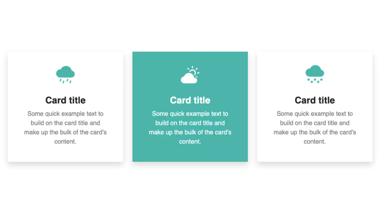
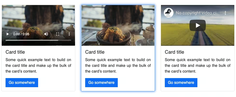
Final output:
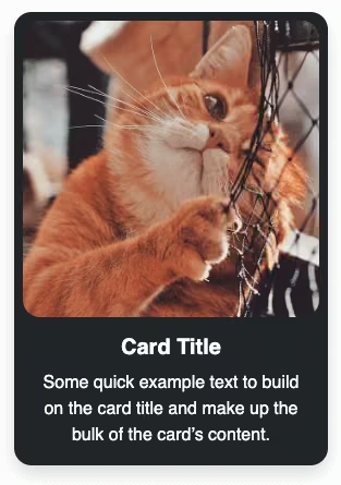
Card title
Some quick example text to build make up the bulk of the card’s content.
Card title
Some quick example text to build on the card title and make up the bulk of the card’s content. Some more quick example text for the card’s content.
Card title
Some quick example text to make up the bulk of the card’s content.
1. Let’s start with the basic Bootstrap grid structure which will give you equal-width columns. You can add or remove columns as per your requirements. I’m going with a set of 3.
<div class="container">
    <div class="row">
        <div class="col">
            Column
        </div>
        <div class="col">
            Column
        </div>
        <div class="col">
            Column
        </div>
    </div>
</div>
Output:
2. Add your cards to the columns.
<div class="container">
    <div class="row">
        <div class="col">
            <div class="card">
                <img src="..." class="card-img-top" alt="...">
                <div class="card-body">
                  <h5 class="card-title">Card title</h5>
                  <p class="card-text">Some quick example text to build on the card title and make up the bulk of the card's content.</p>
                </div>
              </div>
        </div>
        <div class="col">
            <div class="card">
                <img src="..." class="card-img-top" alt="...">
                <div class="card-body">
                  <h5 class="card-title">Card title</h5>
                  <p class="card-text">Some quick example text to build on the card title and make up the bulk of the card's content. Some more quick example text for the card's content.</p>
                </div>
              </div>
        </div>
        <div class="col">
            <div class="card">
                <img src="..." class="card-img-top" alt="...">
                <div class="card-body">
                  <h5 class="card-title">Card title</h5>
                  <p class="card-text">Some quick example text to make up the bulk of the card's content.</p>
                </div>
              </div>
        </div>
    </div>
</div>
Output:
Card title
Some quick example text to build on the card title and make up the bulk of the card’s content.
Card title
Some quick example text to build on the card title and make up the bulk of the card’s content. Some more quick example text for the card’s content.
Card title
Some quick example text to make up the bulk of the card’s content.
3. To get it to the same height, add Bootstrap class h-100 to all the cards or use CSS height.
<div class="container">
    <div class="row">
        <div class="col">
            <div class="card h-100">
                <img src="..." class="card-img-top" alt="...">
                <div class="card-body">
                  <h5 class="card-title">Card title</h5>
                  <p class="card-text">Some quick example text to build on the card title and make up the bulk of the card's content.</p>
                </div>
              </div>
        </div>
        <div class="col">
            <div class="card h-100">
                <img src="..." class="card-img-top" alt="...">
                <div class="card-body">
                  <h5 class="card-title">Card title</h5>
                  <p class="card-text">Some quick example text to build on the card title and make up the bulk of the card's content. Some more quick example text for the card's content.</p>
                </div>
              </div>
        </div>
        <div class="col">
            <div class="card h-100">
                <img src="..." class="card-img-top" alt="...">
                <div class="card-body">
                  <h5 class="card-title">Card title</h5>
                  <p class="card-text">Some quick example text to make up the bulk of the card's content.</p>
                </div>
              </div>
        </div>
    </div>
</div>
OR
.card{
  height: 100%;
}
Output:
Card title
Some quick example text to build on the card title and make up the bulk of the card’s content.
Card title
Some quick example text to build on the card title and make up the bulk of the card’s content. Some more quick example text for the card’s content.
Card title
Some quick example text to make up the bulk of the card’s content.
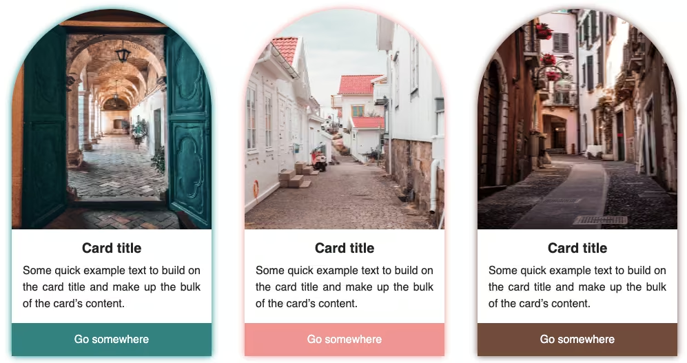
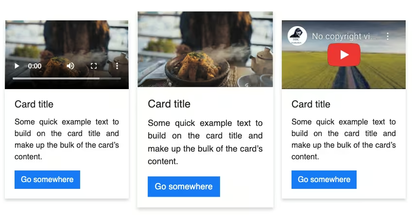
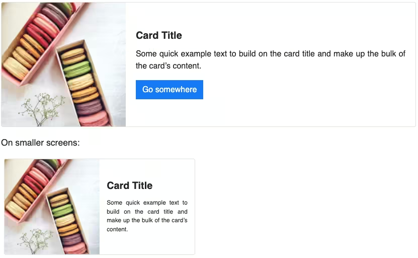
4. Using the Bootstrap class col, the columns will be adjusted as per screen size. But it might not look good on smaller screen devices. Like the image below or 2 cards in a row and 1 below.

To avoid this, replace Bootstrap class col with col-sm to add a breakpoint so that on smaller screens the cards are stacked vertically.
Also, to add some space between cards, add the class gy-3 to the row which is used to add a vertical gutter.
<div class="container">
    <div class="row gy-3">
        <div class="col-sm">
            <div class="card h-100">
                <img src="..." class="card-img-top" alt="...">
                <div class="card-body">
                  <h5 class="card-title">Card title</h5>
                  <p class="card-text">Some quick example text to build on the card title and make up the bulk of the card's content.</p>
                </div>
              </div>
        </div>
        <div class="col-sm">
            <div class="card h-100">
                <img src="..." class="card-img-top" alt="...">
                <div class="card-body">
                  <h5 class="card-title">Card title</h5>
                  <p class="card-text">Some quick example text to build on the card title and make up the bulk of the card's content. Some more quick example text for the card's content.</p>
                </div>
              </div>
        </div>
        <div class="col-sm">
            <div class="card h-100">
                <img src="..." class="card-img-top" alt="...">
                <div class="card-body">
                  <h5 class="card-title">Card title</h5>
                  <p class="card-text">Some quick example text to make up the bulk of the card's content.</p>
                </div>
              </div>
        </div>
    </div>
</div>
If you are using Bootstrap 4, you would have to use CSS instead, as it does not support the gutter classes introduced in Bootstrap 5.
.col-sm{
    margin-bottom: 1em;
}
Output:
Card title
Some quick example text to build make up the bulk of the card’s content.
Card title
Some quick example text to build on the card title and make up the bulk of the card’s content. Some more quick example text for the card’s content.
Card title
Some quick example text to make up the bulk of the card’s content.
Video tutorial for Bootstrap 5 Cards Same Height:
Final Output Code for Bootstrap 5 Cards Same Height:
HTML
<div class="container">
    <div class="row gy-4">
        <div class="col-sm">
            <div class="card h-100">
                <img src="..." class="card-img-top" alt="...">
                <div class="card-body">
                    <h5 class="card-title fw-bold">Card title</h5>
                    <p class="card-text">Some quick example text to build make up the bulk of the card's content.
                    </p>
                </div>
            </div>
        </div>
        <div class="col-sm">
            <div class="card h-100">
                <img src="..." class="card-img-top" alt="...">
                <div class="card-body">
                    <h5 class="card-title fw-bold">Card title</h5>
                    <p class="card-text">Some quick example text to build on the card title and make up the bulk of the card's content. Some more quick example text for the card's content.</p>
                </div>
            </div>
        </div>
        <div class="col-sm">
            <div class="card h-100">
                <img src="..." class="card-img-top" alt="...">
                <div class="card-body">
                    <h5 class="card-title fw-bold">Card title</h5>
                    <p class="card-text">Some quick example text to make up the bulk of the card's content.</p>
                </div>
            </div>
        </div>
    </div>
</div>
CSS
.card{
    box-shadow: 0 0 5px 0 rgba(22, 22, 26, .25);
}
If you have any doubts or stuck somewhere, you can reach out through Coding Yaar's Discord server.