How to create a Bootstrap 5 product card using the basic Bootstrap 5 card.
Final output:
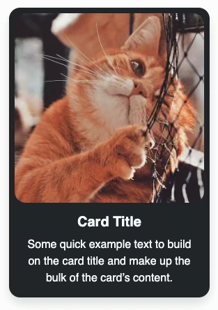
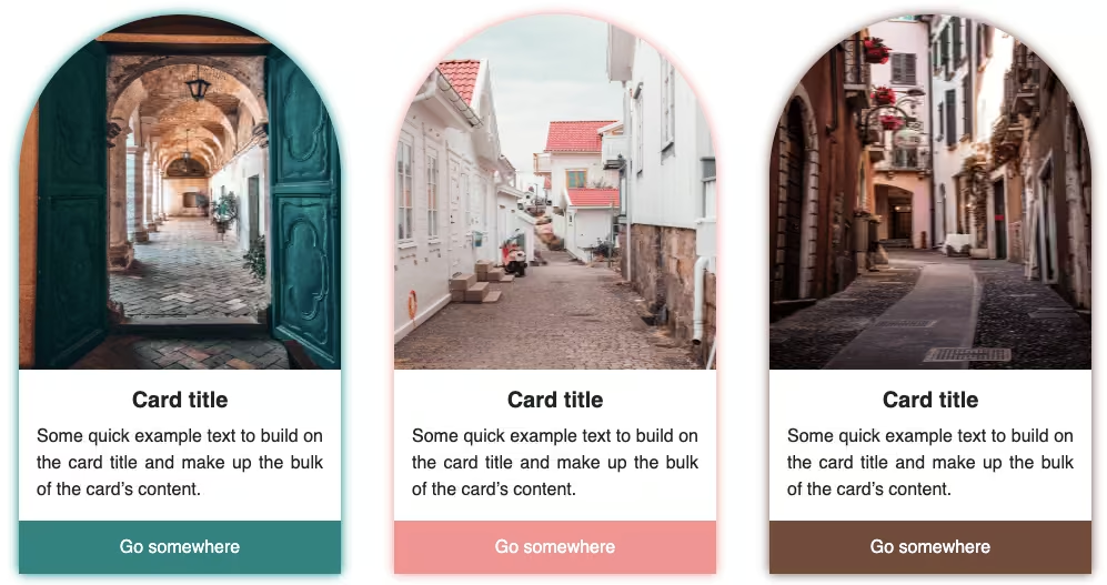
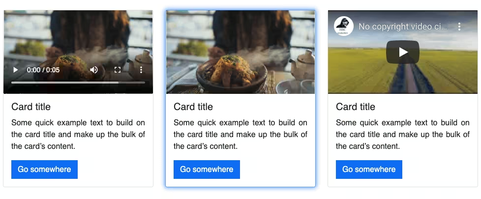
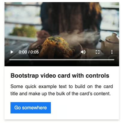
1. Let’s start with the first card from the official Bootstrap Card page.
<div class="card" style="width: 18rem;">
  <img src="..." class="card-img-top" alt="...">
  <div class="card-body">
    <h5 class="card-title">Card title</h5>
    <p class="card-text">Some quick example text to build on the card title and make up the bulk of the card's content.</p>
    <a href="#" class="btn btn-primary">Go somewhere</a>
  </div>
</div>
Output:

Card title
Some quick example text to build on the card title and make up the bulk of the card’s content.
Go somewhere2. Create a row with two columns inside the card-body.
<div class="row">
    <div class="col-10"></div>
    <div class="col-2"></div>
</div>
Place the product title and the card-text in the first column.
Replace h5 with h4 to increase the product title’s size.
Install Bootstrap icons.
And replace the card text with star icons for product ratings. Use class text-warning for yellow color.
In the second column, add a Bookmark or wishlist icon and increase the font size(fs-2).
<div class="row">
    <div class="col-10">
        <h4 class="card-title">Product title</h4>
        <p class="card-text">
            <i class="bi bi-star-fill text-warning"></i>
            <i class="bi bi-star-fill text-warning"></i>
            <i class="bi bi-star-fill text-warning"></i>
            <i class="bi bi-star-fill text-warning"></i>
            (123)
        </p>
    </div>
    <div class="col-2">
        <i class="bi bi-bookmark-plus fs-2"></i>
    </div>
</div>
Output:
Product title
(123)
3. Add another row with two columns outside card-body. Add the product price in the first column and the button in the other. Change the button class to btn-dark.
<div class="row">
    <div class="col-4">
        <h5>$129</h5>
    </div>
    <div class="col-8">
        <a href="#" class="btn btn-dark">ADD TO CART</a>
    </div>
</div>
Style the button further.
<a href="#" class="btn btn-dark w-100 p-3 rounded-0 text-warning">ADD TO CART</a>Output:
4. Align the product price to the center using flex classes. Set the gutter to zero(g-0).
<div class="row align-items-center text-center g-0">
    <div class="col-4">
        ...
    </div>
    <div class="col-8">
        ...
    </div>
</div>
Add some top and bottom margins for the card-body.
<div class="card-body mt-3 mb-3">
    ...
</div>
Output:
5. Set the border and border radius for the card to zero. And add a shadow.
Remove the border radius for the image as well.
<div class="card border-0 rounded-0 shadow" style="width: 18rem;">
    <img src="..." class="card-img-top rounded-0" alt="...">
    ...
</div>
Output:
Final Output Code for Responsive Bootstrap 5 Product Card:
HTML
<div class="card border-0 rounded-0 shadow" style="width: 18rem;">
    <img src="..." class="card-img-top rounded-0" alt="...">
    <div class="card-body mt-3 mb-3">
        <div class="row">
            <div class="col-10">
                <h4 class="card-title">Product title</h4>
                <p class="card-text">
                    <i class="bi bi-star-fill text-warning"></i>
                    <i class="bi bi-star-fill text-warning"></i>
                    <i class="bi bi-star-fill text-warning"></i>
                    <i class="bi bi-star-fill text-warning"></i>
                    (123)
                </p>
            </div>
            <div class="col-2">
                <i class="bi bi-bookmark-plus fs-2"></i>
            </div>
        </div>
    </div>
    <div class="row align-items-center text-center g-0">
        <div class="col-4">
            <h5>$129</h5>
        </div>
        <div class="col-8">
            <a href="#" class="btn btn-dark w-100 p-3 rounded-0 text-warning">ADD TO CART</a>
        </div>
    </div>
</div>
Video tutorial for Responsive Bootstrap 5 Product Card:
If you have any doubts or stuck somewhere, you can reach out through Coding Yaar's Discord server.