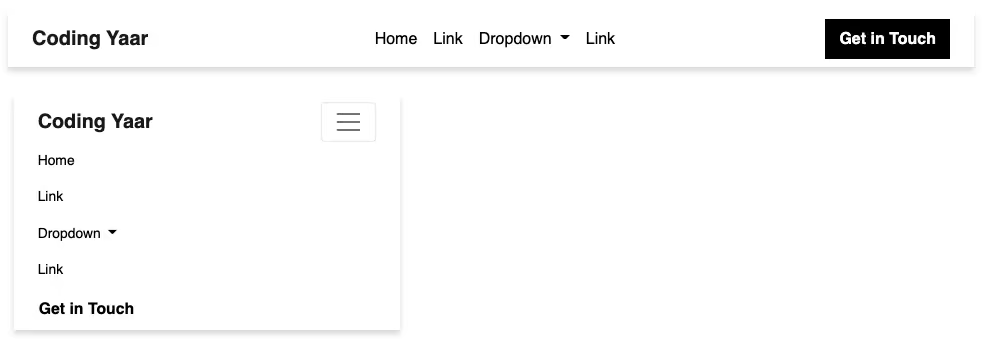
Follow these steps to create a responsive Bootstrap 5 E-commerce Multi-line Navbar using the Bootstrap navbar with a dropdown.
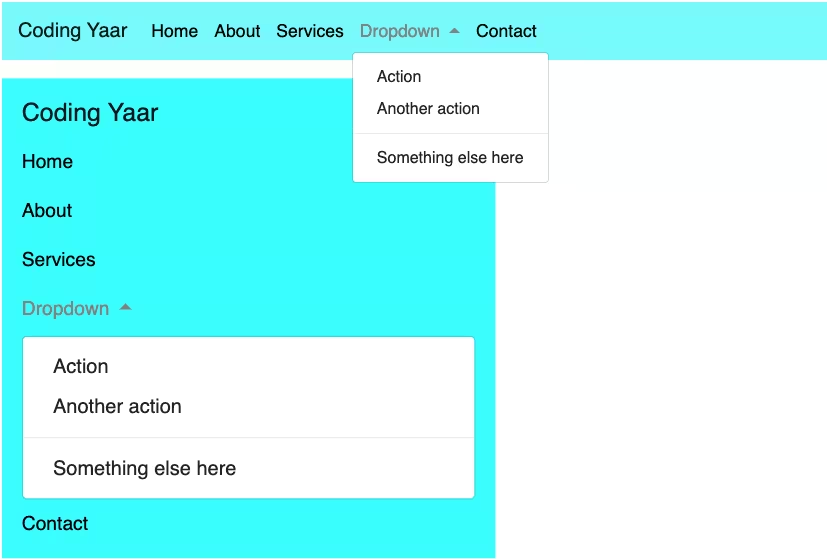
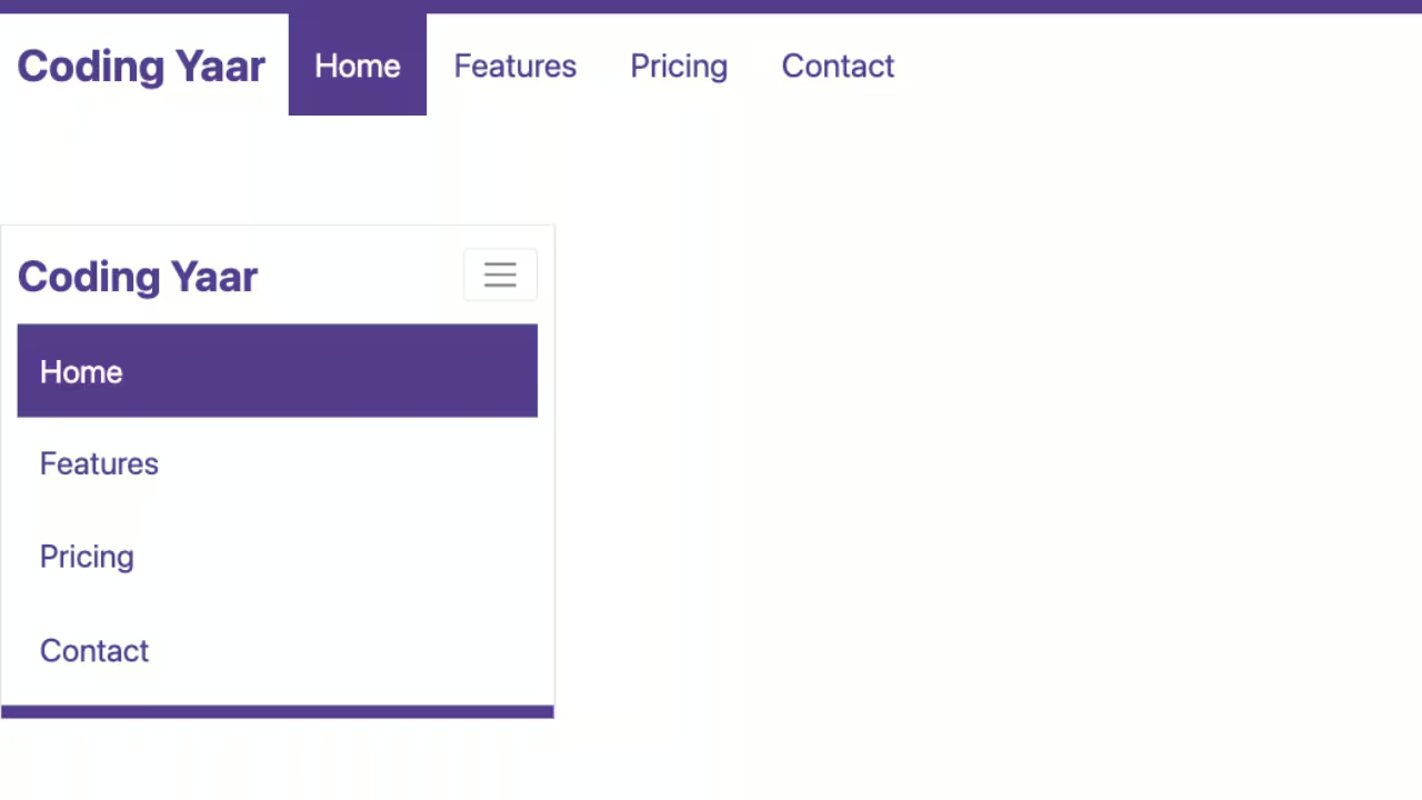
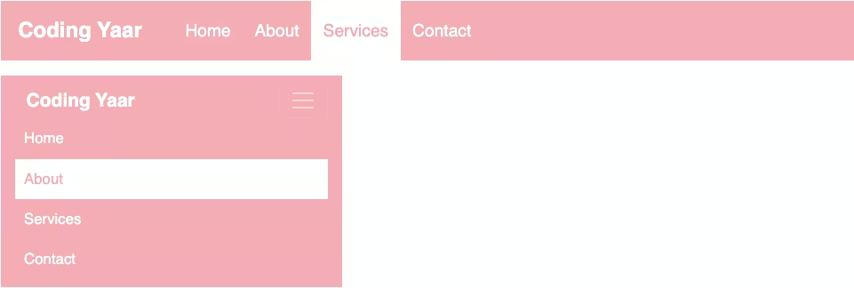
Final output:
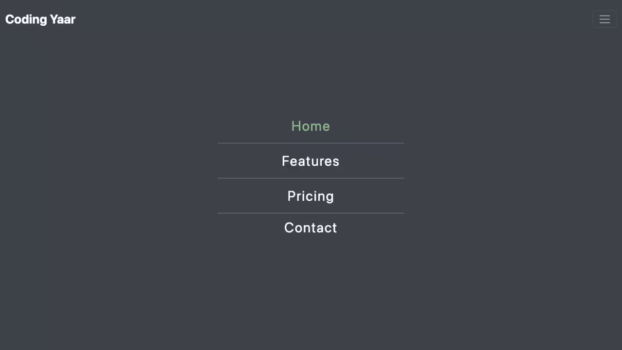
On smaller screens:

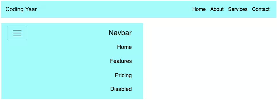
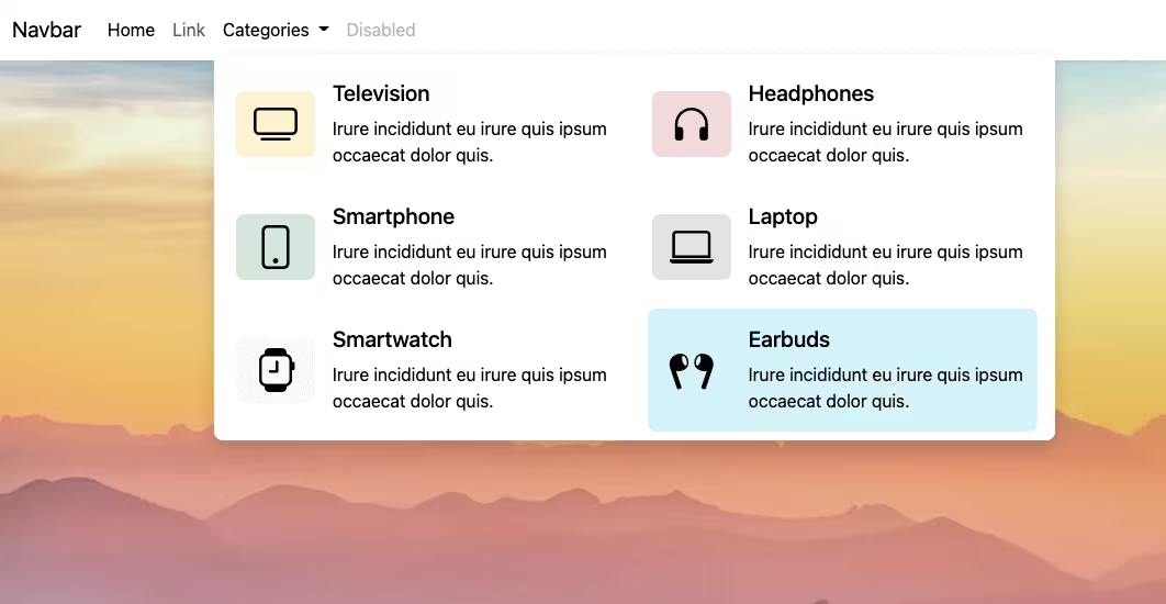
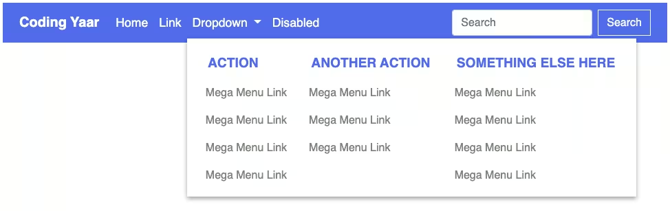
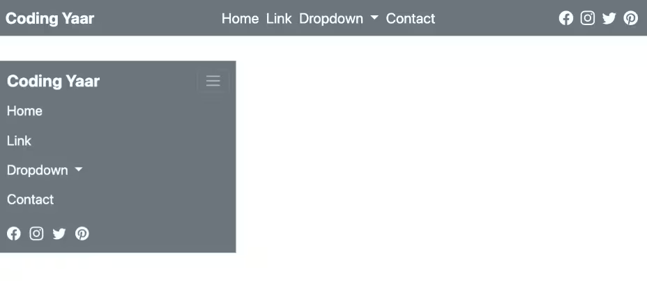
1. Let’s start with the first navbar from the official Bootstrap Navbar page.
<nav class="navbar navbar-expand-lg bg-light">
  <div class="container-fluid">
    <a class="navbar-brand" href="#">Navbar</a>
    <button class="navbar-toggler" type="button" data-bs-toggle="collapse" data-bs-target="#navbarSupportedContent" aria-controls="navbarSupportedContent" aria-expanded="false" aria-label="Toggle navigation">
      <span class="navbar-toggler-icon"></span>
    </button>
    <div class="collapse navbar-collapse" id="navbarSupportedContent">
      <ul class="navbar-nav me-auto mb-2 mb-lg-0">
        <li class="nav-item">
          <a class="nav-link active" aria-current="page" href="#">Home</a>
        </li>
        <li class="nav-item">
          <a class="nav-link" href="#">Link</a>
        </li>
        <li class="nav-item dropdown">
          <a class="nav-link dropdown-toggle" href="#" role="button" data-bs-toggle="dropdown" aria-expanded="false">
            Dropdown
          </a>
          <ul class="dropdown-menu">
            <li><a class="dropdown-item" href="#">Action</a></li>
            <li><a class="dropdown-item" href="#">Another action</a></li>
            <li><hr class="dropdown-divider"></li>
            <li><a class="dropdown-item" href="#">Something else here</a></li>
          </ul>
        </li>
        <li class="nav-item">
          <a class="nav-link disabled">Disabled</a>
        </li>
      </ul>
      <form class="d-flex" role="search">
        <input class="form-control me-2" type="search" placeholder="Search" aria-label="Search">
        <button class="btn btn-outline-success" type="submit">Search</button>
      </form>
    </div>
  </div>
</nav>
Output:
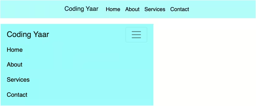
2. Place your logo image inside the navbar-brand.
<a class="navbar-brand" href="#">
    <img src="..." alt="">
</a>
Replace navbar-expand-lg with navbar-expand-md so that the navbar collapses only for small screens.
<nav class="navbar navbar-expand-md bg-light">Reduce the logo size.
Now, let’s split the nav links and the search form into two lines for large-screen devices.
We’ll use the CSS flexbox for this. Place it in a media query so it doesn’t affect the small screens.
Increase the logo size a bit for large screens.
.navbar .navbar-brand img {
  max-width: 100px;
}
@media screen and (min-width: 768px) {
  .navbar-collapse {
    display: flex;
    flex-direction: column-reverse;
    align-items: flex-end;
  }
  .navbar .navbar-brand img {
    max-width: 6em;
  }
}
Replace me-auto with ms-auto to align the nav links to the right.
<ul class="navbar-nav ms-auto mb-2 mb-lg-0">Output:
3. Add more nav links and a dropdown.
<li class="nav-item dropdown">
    <a class="nav-link dropdown-toggle" href="#" role="button" data-bs-toggle="dropdown"
        aria-expanded="false">
        Dropdown
    </a>
    <ul class="dropdown-menu">
        <li><a class="dropdown-item" href="#">Action</a></li>
        <li><a class="dropdown-item" href="#">Another action</a></li>
        <li>
            <hr class="dropdown-divider">
        </li>
        <li><a class="dropdown-item" href="#">Something else here</a></li>
    </ul>
</li>
<li class="nav-item">
    <a class="nav-link">Another Link</a>
</li>
<li class="nav-item">
    <a class="nav-link">Another Link</a>
</li>
For the icons, I’m using Bootstrap icons. Wrap the form and the icons in a div. Add class d-flex to the icons div and Bootstrap margin classes as well.
<div class="search-and-icons">
    <form class="d-flex mb-2 me-4" role="search">
        <input class="form-control me-2" type="search" placeholder="Search" aria-label="Search">
        <button class="btn btn-outline-success" type="submit">Search</button>
    </form>
    <div class="user-icons d-flex mb-2">
        <div class="account"><i class="bi bi-person"></i></div>
        <div class="wishlist"><i class="bi bi-heart"></i></div>
        <div class="cart"><i class="bi bi-cart3"></i></div>
    </div>
</div>
Style them to appear inline.
@media screen and (min-width: 768px) {
  .search-and-icons {
    display: flex;
    flex-direction: row;
    align-items: center;
    justify-content: flex-end;
  }
}
.user-icons div {
  padding-right: 1em;
  font-size: 1.2em;
}
Output:
4. Add some contact information to be displayed at the top.
<div class="contact-info">
    <p>+9876543210 | +1234567890</p>
    <p><a href="mailto:">contact@domainname.com</a></p>
</div>
Contact information styling:
@media screen and (min-width: 768px) {
  .contact-info {
    display: flex;
    flex-direction: row;
    align-items: center;
    justify-content: flex-end;
  }
}
.contact-info p {
  font-size: 0.8em;
  padding-right: 1em;
  color: #000;
}
.contact-info a {
  color: #000;
}
Output:
5. Let’s remove the search button and use an icon instead. I’m removing the placeholder as well.
<form class="d-flex mb-2 me-4" role="search">
    <input class="form-control me-2" type="search" aria-label="Search">
</form>
Set the border radius to 0. Reduce the height to 2em. I’m using the Bootstrap search icon. Encode the SVG to use it as a background image for the search input field.
Add a background color along with it. Set the background repeat to no-repeat, the background-position to 95% to align it to the right, and change the fill color to grey.
.navbar form input[type="search"] {
  border-radius: 0;
  height: 2em;
  background: #fff
    url("data:image/svg+xml,%3Csvg xmlns='http://www.w3.org/2000/svg' width='16' height='16' fill='currentColor' class='bi bi-search' viewBox='0 0 16 16'%3E%3Cpath d='M11.742 10.344a6.5 6.5 0 1 0-1.397 1.398h-.001c.03.04.062.078.098.115l3.85 3.85a1 1 0 0 0 1.415-1.414l-3.85-3.85a1.007 1.007 0 0 0-.115-.1zM12 6.5a5.5 5.5 0 1 1-11 0 5.5 5.5 0 0 1 11 0z'/%3E%3C/svg%3E")
    no-repeat 95%;
}
On focus, you can remove the search icon by removing the icon and keeping only the background color.
Set box-shadow to none to remove the thick blue border on focus.
.navbar form input[type="search"]:focus {
  background: #fff;
  box-shadow: none;
}
Output:
6. Add a box shadow for the navbar and set the font color of the nav links and user icons to black.
.navbar {
  box-shadow: 0 5px 5px rgba(0, 0, 0, 0.18);
}
.navbar-collapse .navbar-nav .nav-link {
  color: #000;
}
.user-icons div {
  color: #000;
}
For the larger screens, increase the letter spacing, add some padding to the nav links, and increase the logo size.
@media screen and (min-width: 1200px) {
  .navbar {
    letter-spacing: 0.05em;
  }
  .navbar-collapse .navbar-nav .nav-link {
    padding: 0.2em 1em;
  }
  .navbar .navbar-brand img {
    max-width: 7em;
  }
}
Output:
7. Increase the search box size by setting flex 1 for the form. Reduce the width of the wrapper as you wish.
.search-and-icons {
  width: 60%;
}
.navbar form {
  flex: 1;
}
Output:
Final Output Code for Responsive Bootstrap 5 E-Commerce Multi-Line Navbar:
HTML
<nav class="navbar navbar-expand-md bg-light">
    <div class="container-fluid">
        <a class="navbar-brand" href="#">
            <img src="..." alt="">
        </a>
        <button class="navbar-toggler" type="button" data-bs-toggle="collapse" data-bs-target="#navbarSupportedContent" aria-controls="navbarSupportedContent" aria-expanded="false" aria-label="Toggle navigation">
            <span class="navbar-toggler-icon"></span>
        </button>
        <div class="collapse navbar-collapse" id="navbarSupportedContent">
            <ul class="navbar-nav ms-auto mb-2 mb-lg-0">
                <li class="nav-item">
                    <a class="nav-link active" aria-current="page" href="#">Home</a>
                </li>
                <li class="nav-item">
                    <a class="nav-link" href="#">Link</a>
                </li>
                <li class="nav-item dropdown">
                    <a class="nav-link dropdown-toggle" href="#" role="button" data-bs-toggle="dropdown" aria-expanded="false">
                        Dropdown
                    </a>
                    <ul class="dropdown-menu">
                        <li><a class="dropdown-item" href="#">Action</a></li>
                        <li><a class="dropdown-item" href="#">Another action</a></li>
                        <li>
                            <hr class="dropdown-divider">
                        </li>
                        <li><a class="dropdown-item" href="#">Something else here</a></li>
                    </ul>
                </li>
                <li class="nav-item">
                    <a class="nav-link">Another Link</a>
                </li>
                <li class="nav-item">
                    <a class="nav-link">Another Link</a>
                </li>
            </ul>
            <div class="search-and-icons">
                <form class="d-flex mb-2 me-4" role="search">
                    <input class="form-control me-2" type="search" aria-label="Search">
                </form>
                <div class="user-icons d-flex mb-2">
                    <div class="account"><i class="bi bi-person"></i></div>
                    <div class="wishlist"><i class="bi bi-heart"></i></div>
                    <div class="cart"><i class="bi bi-cart3"></i></div>
                  </div>
            </div>
            <div class="contact-info">
                <p>+9876543210 | +1234567890</p>
                <p><a href="mailto:">contact@domainname.com</a></p>
            </div>
        </div>
    </div>
</nav>
CSS
.navbar {
  box-shadow: 0 5px 5px rgba(0, 0, 0, 0.18);
}
.navbar .navbar-brand img {
  max-width: 100px;
}
@media screen and (min-width: 1200px) {
  .navbar {
    letter-spacing: 0.05em;
  }
  .navbar-collapse .navbar-nav .nav-link {
    padding: 0.2em 1em;
  }
  .navbar .navbar-brand img {
    max-width: 7em;
  }
}
@media screen and (min-width: 768px) {
  .navbar .navbar-brand img {
    max-width: 6em;
  }
  .navbar-collapse {
    display: flex;
    flex-direction: column-reverse;
    align-items: flex-end;
  }
  .search-and-icons,
  .contact-info {
    display: flex;
    flex-direction: row;
    align-items: center;
    justify-content: flex-end;
  }
  .search-and-icons {
    width: 70%;
  }
  .navbar form {
    flex: 1;
  }
}
.navbar-collapse .navbar-nav .nav-link {
  color: #000;
}
.contact-info p {
  justify-content: center;
  font-size: 0.8em;
  padding-right: 1em;
  color: #000;
}
.contact-info a {
  color: #000;
  text-decoration: underline;
}
.user-icons div {
  padding-right: 1em;
  font-size: 1.2em;
  color: #000;
}
.navbar form input {
  border-radius: 0;
}
.navbar form input[type="search"] {
  height: 2em;
  background: #fff
    url("data:image/svg+xml,%3Csvg xmlns='http://www.w3.org/2000/svg' width='16' height='16' fill='grey' class='bi bi-search' viewBox='0 0 16 16'%3E%3Cpath d='M11.742 10.344a6.5 6.5 0 1 0-1.397 1.398h-.001c.03.04.062.078.098.115l3.85 3.85a1 1 0 0 0 1.415-1.414l-3.85-3.85a1.007 1.007 0 0 0-.115-.1zM12 6.5a5.5 5.5 0 1 1-11 0 5.5 5.5 0 0 1 11 0z'%3E%3C/path%3E%3C/svg%3E")
    no-repeat 95%;
}
.navbar form input[type="search"]:focus {
  background: #fff;
  box-shadow: none;
}
Video tutorial for Responsive Bootstrap 5 E-Commerce Multi-Line Navbar:
If you have any doubts or stuck somewhere, you can reach out through Coding Yaar's Discord server.


