A good Bootstrap card can save you hours when you are building a layout. In this post, I am sharing 14 Bootstrap card examples from my own collection, and every one comes with a live demo. Whether you need a product card, a profile card, or a hover effect, you can pick one and make it yours.
Each card below has a short note and a link to its full tutorial. Then, you can follow along step by step and copy the code. Let’s start with the simplest one.
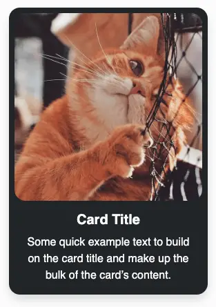
1. Simple Bootstrap Card with a Dark Background

Card Title
Some quick example text to build on the card title and make up the bulk of the card’s content.
This simple Bootstrap card uses a dark background with small padding, so it stays compact and easy to read. Therefore, it is a great starting point if you are new to cards.
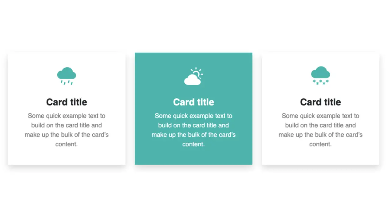
2. Bootstrap Card Hover Effect for Services
Card title
Some quick example text to build on the card title and make up the bulk of the card’s content.
This services card reacts when you hover over it, which makes it feel interactive. As a result, it works well for feature and service sections.
3. Bootstrap Card with an Icon
Bootstrap Card Title
Some quick example text to build on the card title and make up the bulk of the card’s content.
This services card puts an icon at the top, so each service is easy to spot at a glance. Also, it fits nicely in a row of three.
4. Oval Pill-Shaped Bootstrap Product Card

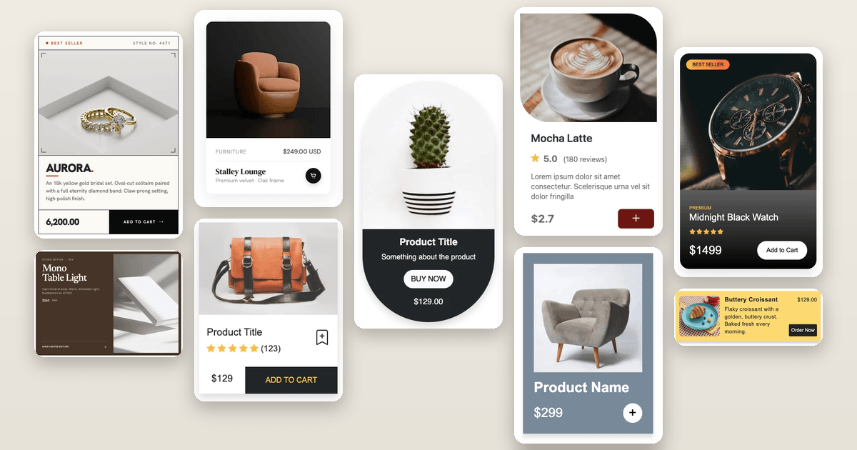
This product card uses an oval design for a softer, more playful look. Because of that, it stands out from the usual rectangular shop cards.
5. Basic Bootstrap Product Card
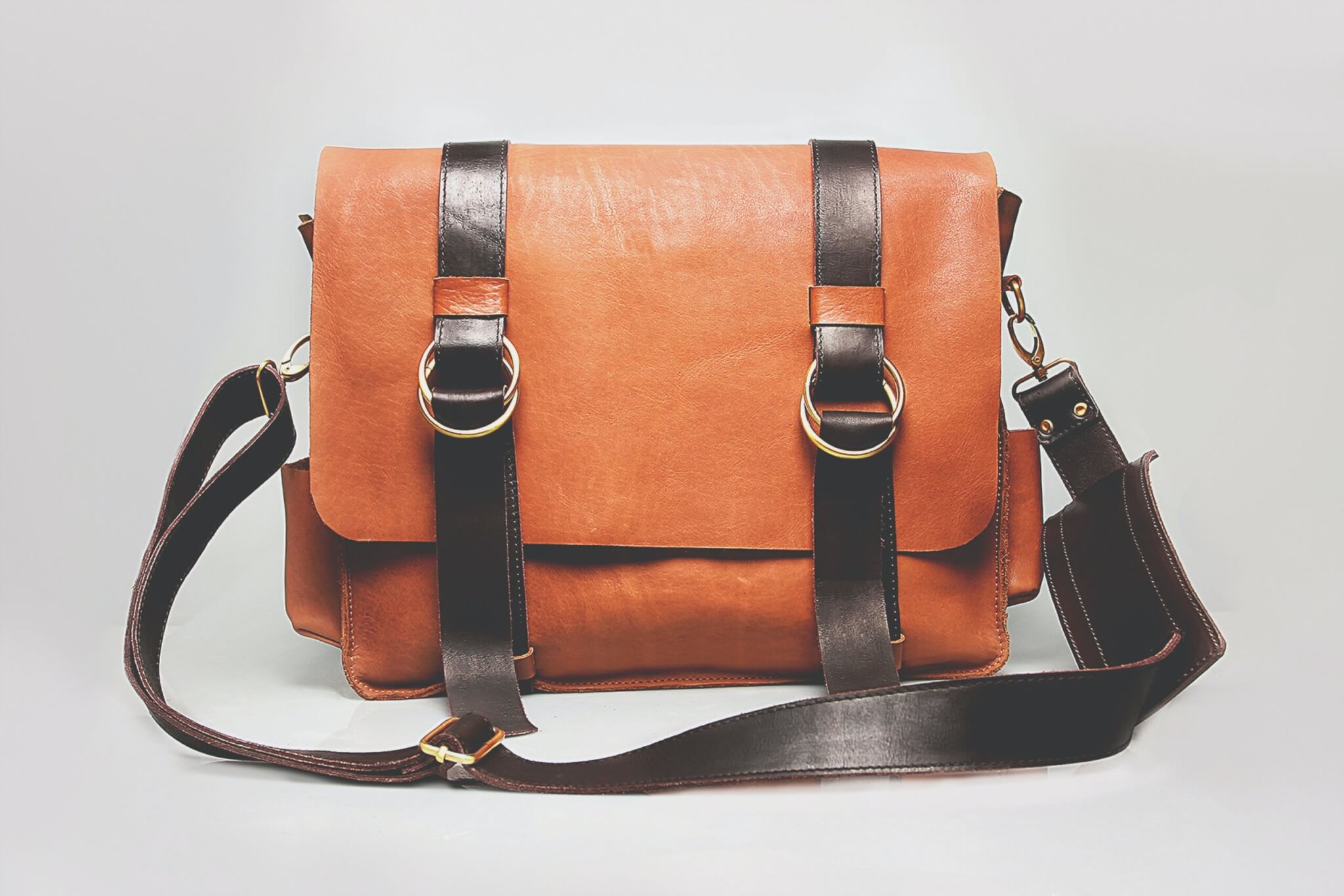
This is a clean product card that you can drop into any shop page. Then, you can swap in your own image, title, and price.
6. Horizontal Bootstrap Product Card

Card title
Some quick example text to build on the card’s content.
This horizontal product card places the image beside the details, which saves vertical space. Consequently, it suits product lists and search results.
7. Bootstrap Card with an Arched Image
Card title
Some quick example text to build on the card title and make up the bulk of the card’s content.
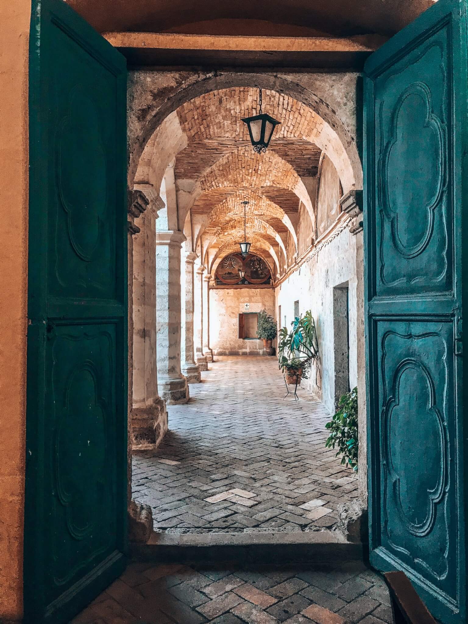
This card gives the image an arched shape, which adds a unique touch to an otherwise standard layout.
8. Bootstrap Card Hover Effect with a Color Change
Circle Card
Some quick example text to build on the card title and make up the bulk of the card’s content.
Learn MoreOn hover, the background color of this card changes smoothly. Because the change is subtle, it gives feedback without distracting from the content.
9. Bootstrap Profile Card with Rounded Corners

John Doe
Some quick example text to build on the card title and make up the bulk of the card’s content.
Know MoreThis profile card has rounded corners and a friendly look. As a result, it works well for team pages and author boxes.
10. Bootstrap Card Glow Hover Effect
Bootstrap video card
Some quick example text to build on the card title and make up the bulk of the card’s content.
Go somewhereThis card gets a soft glow when you hover over it, so it feels modern and eye-catching.
11. Bootstrap Card Zoom Hover Effect
Card title
Some quick example text to build on the card title and make up the bulk of the card’s content.
Go somewhereThis card zooms in slightly on hover. Therefore, it draws attention to the item your visitor is about to click.
12. Bootstrap Video Cards
Bootstrap video card with controls
Some quick example text to build on the card title and make up the bulk of the card’s content.
Go somewhereBootstrap video card autoplay loop
Some quick example text to build on the card title and make up the bulk of the card’s content.
Go somewhereBootstrap card with youtube video
Some quick example text to build on the card title and make up the bulk of the card’s content.
Go somewhereThese video cards show how to place a video inside a Bootstrap card. Consequently, you can build tutorial and course sections with ease.
13. Bootstrap Horizontal Card with the Image on the Left

Card Title
Some quick example text to build on the card title and make up the bulk of the card’s content.
Go somewhereThis horizontal card puts the image on the left and the text on the right, and it stays responsive on smaller screens.
14. Bootstrap Card with Text Overlapping the Image

Card title
Some quick example text to build on the card title and make up the bulk of the card’s content.
This Bootstrap card lets the text panel overlap the bottom of the photo, which gives it a layered look. Also, the hot pink panel with white text makes it pop.
15. Bootstrap Card with a Background Image
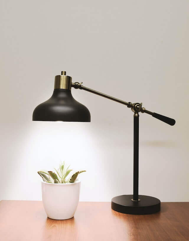
This category card uses a full photo as the background, with a bold heading and a Shop Now button centered on top. As a result, it works well for category and promo sections.
If you have any doubts or stuck somewhere, you can reach out through Coding Yaar's Discord server.