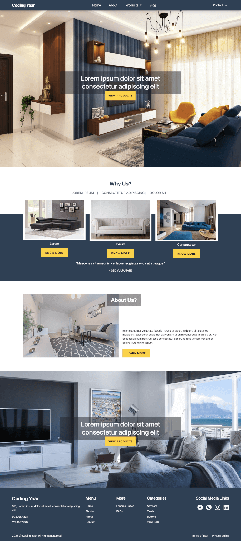
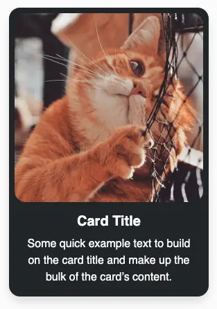
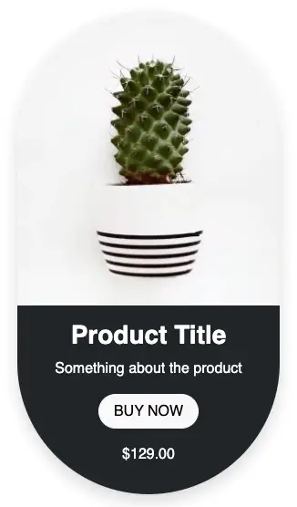
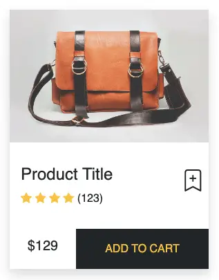
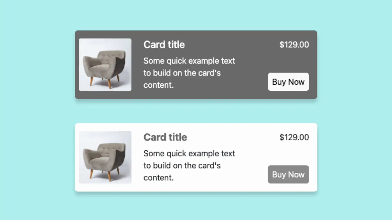
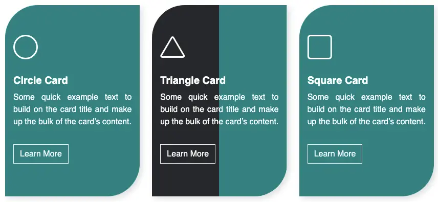
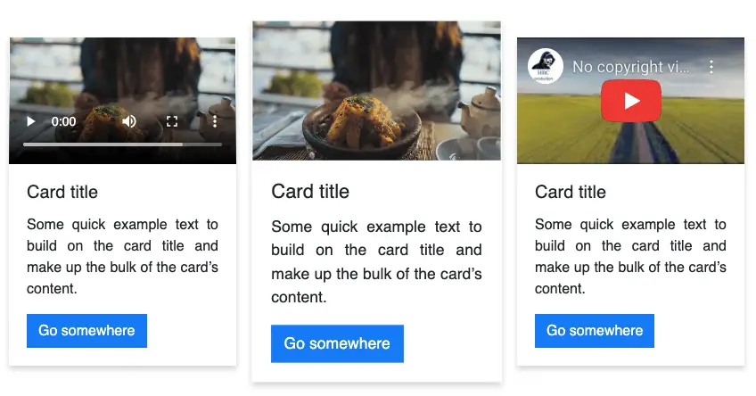
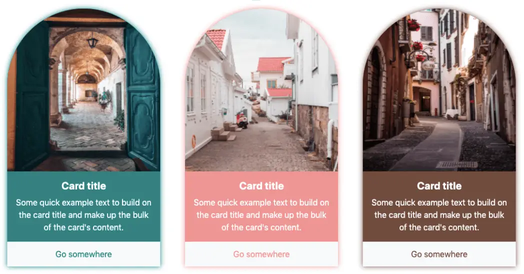
This is a Bootstrap card example with rounded corners on top making it look dome-shaped.
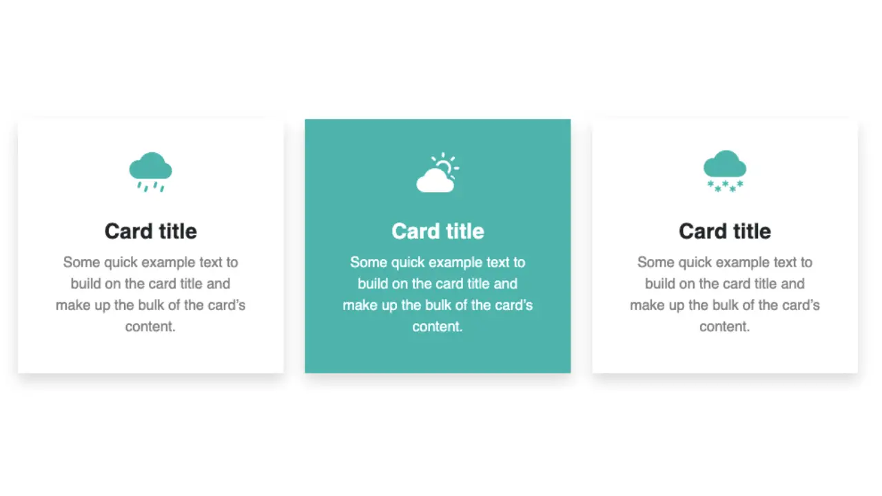
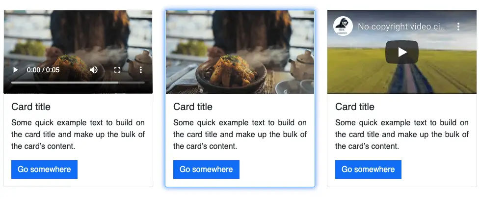
Final output:
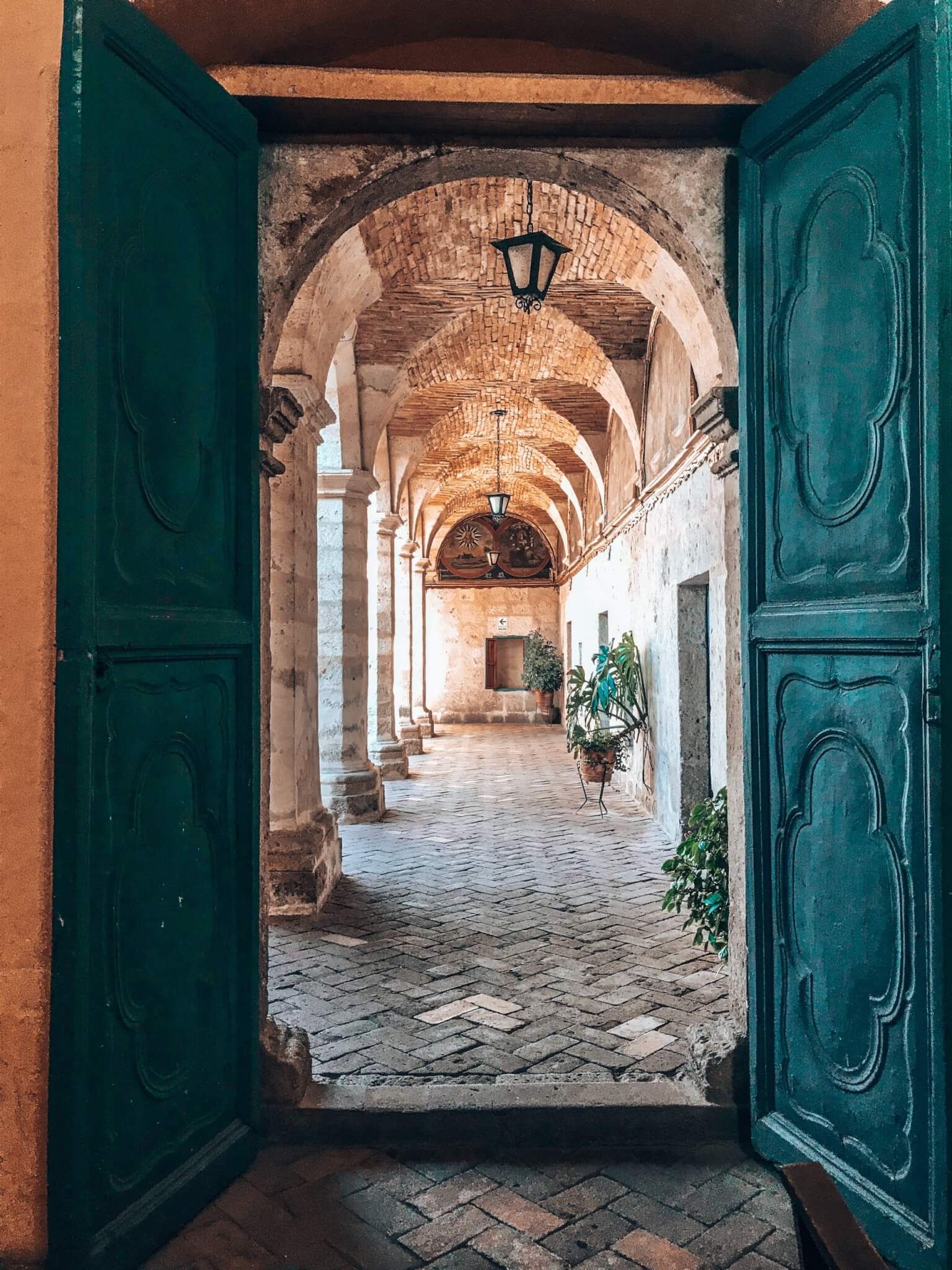
Card title
Some quick example text to build on the card title and make up the bulk of the card’s content.
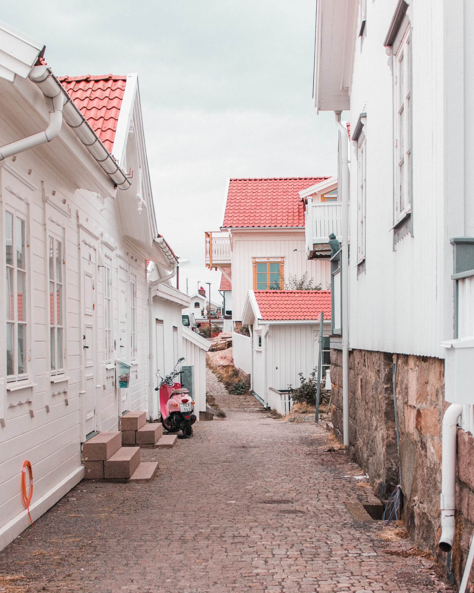
Card title
Some quick example text to build on the card title and make up the bulk of the card’s content.
Card title
Some quick example text to build on the card title and make up the bulk of the card’s content.
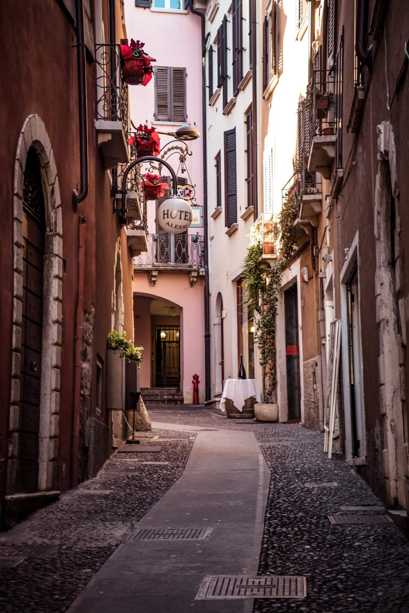
1. Let’s start with the basic Bootstrap card example. (I have added an image for the output card)
<div class="card" style="width: 18rem;">
  <img src="..." class="card-img-top" alt="...">
  <div class="card-body">
    <h5 class="card-title">Card title</h5>
    <p class="card-text">Some quick example text to build on the card title and make up the bulk of the card's content.</p>
    <a href="#" class="btn btn-primary">Go somewhere</a>
  </div>
</div>
Output:

Card title
Some quick example text to build on the card title and make up the bulk of the card’s content.
Go somewhere2. To make it dome-shaped, use the border-radius. And align all the content to the center.
.card {
  text-align: center;
  border-top-left-radius: 10em;
  border-top-right-radius: 10em;
}
.card img {
  border-top-left-radius: 10em;
  border-top-right-radius: 10em;
}
Output:

Card title
Some quick example text to build on the card title and make up the bulk of the card’s content.
Go somewhere3. Style the button to make it full width and match the image somehow.
.btn {
  width: 100%;
  padding: 0.75em 0.5em;
  border-radius: 0;
  background-color: teal;
  border-color: teal;
}
Output:

Card title
Some quick example text to build on the card title and make up the bulk of the card’s content.
Go somewhere4. The button is taking all the width but the card-body has some padding. So, let’s take the button out of the card-body div.
<div class="card" style="width: 18rem;">
  <img src="..." class="card-img-top" alt="...">
  <div class="card-body">
    <h5 class="card-title">Card title</h5>
    <p class="card-text">Some quick example text to build on the card title and make up the bulk of the card's content.</p>
  </div>
  <a href="#" class="btn btn-primary">Go somewhere</a>
</div>
Output:

Card title
Some quick example text to build on the card title and make up the bulk of the card’s content.
5. Lastly, remove the border and add a box shadow with the color teal.
.card {
  border:none;
  box-shadow: 0px 0px 10px teal;
}
Also, made the title bold by using Bootstrap class fw-bold.
<h5 class="card-title fw-bold">Card title</h5>Output:

Card title
Some quick example text to build on the card title and make up the bulk of the card’s content.
Final Output Code for Bootstrap card example(dome-shaped image):
HTML
<div class="card" style="width: 18rem;">
  <img src="..." class="card-img-top" alt="...">
  <div class="card-body">
    <h5 class="card-title fw-bold">Card title</h5>
    <p class="card-text">Some quick example text to build on the card title and make up the bulk of the card's content.</p>
  </div>
  <a href="#" class="btn btn-primary">Go somewhere</a>
</div>
CSS
.card {
  border:none;
  text-align: center;
  border-top-left-radius: 10em;
  border-top-right-radius: 10em;
  box-shadow: 0px 0px 10px teal;
}
.card img {
  border-top-left-radius: 10em;
  border-top-right-radius: 10em;
}
.btn {
  width: 100%;
  padding: 0.75em 0.5em;
  border-radius: 0;
  background-color: teal;
  border-color: teal;
}
Alternate ending:
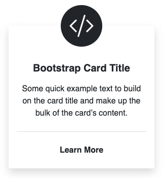
You could also switch the background and font color of the card body with the button to make it look like this.
If you have any doubts or stuck somewhere, you can reach out through Coding Yaar's Discord server.
