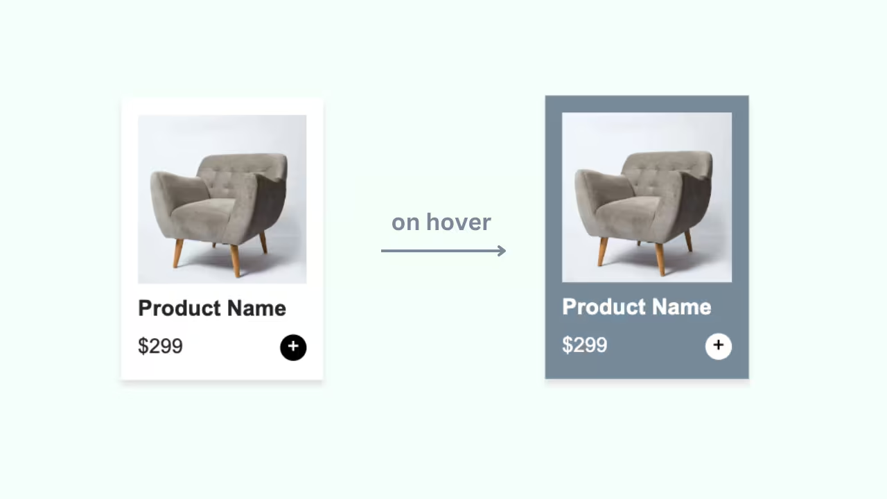
Responsive product card built with HTML and CSS, featuring an image, title, rating, description, and price with a clear add-to-cart button. Designed with a clean layout and balanced spacing for easy readability and smooth user interaction across all devices.
Final output:

Mocha Latte

Rich espresso blended with steamed milk and a hint of chocolate. Perfect for a cozy morning pick-me-up.
1. Let’s start by adding a div with a classname product-card. Add the product image and a .card-body div.
<div class="product-card">
    <img class="product-img" src="mocha.png" alt="">
    <div class="card-body">
    </div>
</div>
Inside .card-body, add the product name, rating, description, and a footer with price and button.
<div class="card-body">
    <h2>Mocha Latte</h2>
    <div class="rating-container">
        <img src="star.svg" alt="">
        <span>5.0</span>
        <span class="reviews">(180 reviews)</span>
    </div>
    <p class="description">Rich espresso blended with steamed milk and a hint of chocolate. Perfect for a cozy morning pick-me-up.</p>
    <div class="card-footer">
        <span class="price">$2.7</span>
        <button><img src="plus.svg" alt=""></button>
    </div>
</div>
Output:
Mocha Latte
Rich espresso blended with steamed milk and a hint of chocolate. Perfect for a cozy morning pick-me-up.
2. Reset margins and set the font family on the body.
* {
    margin: 0;
}
body {
    font-family: system-ui, -apple-system, BlinkMacSystemFont, 'Segoe UI', Roboto, Oxygen, Ubuntu, Cantarell, 'Open Sans', 'Helvetica Neue', sans-serif;
}
Set a max-width on .product-card and add the diagonal rounded corners. border-bottom-left-radius and border-top-right-radius give it that distinctive shape. Apply the same border-radius to the image so it matches the card, and set width: 100% so the image fills the card width.
.product-card {
    max-width: 20rem;
    color: #282A3A;
    border-bottom-left-radius: 4rem;
    border-top-right-radius: 4rem;
}
.product-card .product-img {
    border-bottom-left-radius: 4rem;
    border-top-right-radius: 4rem;
    width: 100%;
}
Output:
Mocha Latte
Rich espresso blended with steamed milk and a hint of chocolate. Perfect for a cozy morning pick-me-up.
3. Let’s style the .card-body. Use flex-direction: column with a gap to evenly space out the name, rating, description, and footer.
.product-card .card-body {
    padding: 1rem 1.5rem;
    display: flex;
    flex-direction: column;
    gap: 1rem;
}
For the product name, set the font size to 1.5rem and the line-height to 1.4. Set the font weight to 600.
.product-card .card-body h2 {
    font-size: 1.5rem;
    line-height: 1.4;
    font-weight: 600;
}
Output:
Mocha Latte
Rich espresso blended with steamed milk and a hint of chocolate. Perfect for a cozy morning pick-me-up.
4. Style the .rating-container. Use opacity on the rating number and reviews text to make them look muted without changing the color.
.product-card .rating-container{
    display: flex;
    align-items: center;
    line-height: 1.2;
}
.product-card .rating-container img {
    margin-right: 4px;
    width: 1.25rem;
}
.product-card .rating-container span:first-of-type {
    font-size: 1.25rem;
    font-weight: 700;
    letter-spacing: 0.4px;
    opacity: 0.7;
}
.product-card .rating-container .reviews {
    margin-left: .5rem;
    font-size: 1rem;
    opacity: 0.72;
}
Apply the same opacity trick to the description.
.product-card .description {
    font-size: 1rem;
    line-height: 1.4;
    opacity: 0.72;
}
Output:
Mocha Latte
Rich espresso blended with steamed milk and a hint of chocolate. Perfect for a cozy morning pick-me-up.
5. For .card-footer, use flexbox to push the price and button to opposite ends. Style the button with a dark red background and some padding.
.product-card .card-footer {
    display: flex;
    justify-content: space-between;
    align-items: center;
}
.product-card .card-footer .price {
    font-size: 1.5rem;
    font-weight: 700;
    line-height: 1.2;
    opacity: 0.7;
    letter-spacing: 0.4px;
}
.product-card .card-footer button {
    background-color: #6D1600;
    padding: 0.75rem 2rem;
    border-radius: 0.5rem;
    border: none;
}
.product-card .card-footer button img {
    width: 1rem;
    height: 1rem;
}
Output:
Mocha Latte
Rich espresso blended with steamed milk and a hint of chocolate. Perfect for a cozy morning pick-me-up.
Final Output Code for Responsive HTML CSS Product Card #2:
HTML
<div class="product-card">
    <img class="product-img" src="mocha.png" alt="">
    <div class="card-body">
        <h2>Mocha Latte</h2>
        <div class="rating-container">
            <img src="star.svg" alt="">
            <span>5.0</span>
            <span class="reviews">(180 reviews)</span>
        </div>
        <p class="description">Rich espresso blended with steamed milk and a hint of chocolate. Perfect for a cozy
            morning pick-me-up.</p>
        <div class="card-footer">
            <span class="price">$2.7</span>
            <button><img src="plus.svg" alt=""></button>
        </div>
    </div>
</div>
CSS
* {
    margin: 0;
}

body {
    font-family: system-ui, -apple-system, BlinkMacSystemFont, 'Segoe UI', Roboto, Oxygen, Ubuntu, Cantarell, 'Open Sans', 'Helvetica Neue', sans-serif;
}

.product-card {
    max-width: 20rem;
    color: #282A3A;
    border-bottom-left-radius: 4rem;
    border-top-right-radius: 4rem;

    .product-img {
        border-bottom-left-radius: 4rem;
        border-top-right-radius: 4rem;
        width: 100%;
    }

    .card-body {
        padding: 1rem 1.5rem;
        display: flex;
        flex-direction: column;
        gap: 1rem;

        h2 {
            font-size: 1.5rem;
            line-height: 1.4;
            font-weight: 600;
        }

        .rating-container {
            display: flex;
            align-items: center;
            line-height: 1.2;

            img {
                margin-right: 4px;
            }

            span:first-of-type {
                font-size: 1.25rem;
                font-weight: 700;
                letter-spacing: 0.4px;
                opacity: 0.7;
            }

            .reviews {
                margin-left: .5rem;
                font-size: 1rem;
                opacity: 0.72;
            }
        }

        .description {
            font-size: 1rem;
            line-height: 1.4;
            opacity: 0.72;

        }

        .card-footer {
            display: flex;
            justify-content: space-between;
            align-items: center;

            .price {
                font-size: 1.5rem;
                font-weight: 700;
                line-height: 1.2;
                opacity: 0.7;
                letter-spacing: 0.4px;
            }

            button {
                background-color: #6D1600;
                padding: 0.75rem 2rem;
                border-radius: 0.5rem;
                border: none;

                img {
                    width: 1rem;
                    height: 1rem;
                }
            }
        }
    }
}
Video tutorial for Responsive HTML CSS Product Card #2:
If you have any doubts or stuck somewhere, you can reach out through Coding Yaar's Discord server.


