This product card HTML CSS tutorial shows you how to build a warm dark-toned product card with a two-column grid layout. The left side has a serif product title, a studio edition label, a sale price with a crossed-out original price, and a link pinned to the bottom using margin-top: auto. The right side has a product image with a subtle inset padding so it looks framed inside the card. On mobile, the grid collapses to a single column with the image stacking below.
Final output:
Studio edition · 004
Mono
Table Light
Cast mineral body. Warm, dimmable light. Numbered run of 200.
$240 $320
Shop limited edition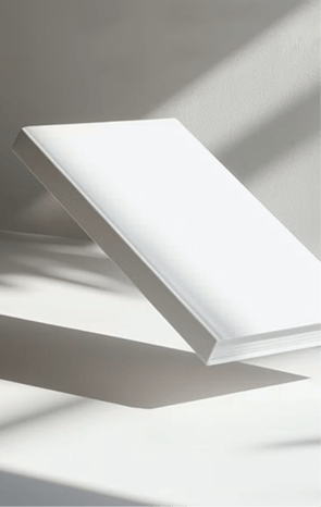
Steps for Horizontal Product Card HTML CSS #9:
1. First, link the Manrope and Newsreader fonts from Google Fonts in the head.
<link rel="preconnect" href="https://fonts.googleapis.com">
<link rel="preconnect" href="https://fonts.gstatic.com" crossorigin>
<link href="https://fonts.googleapis.com/css2?family=Manrope:wght@200..800&family=Newsreader:ital,opsz,wght@0,6..72,200..800;1,6..72,200..800&display=swap" rel="stylesheet">
Let’s start with a .product-card div. Inside it, add a .product-card-body div and a product image.
<div class="product-card">
    <div class="product-card-body"></div>
    <img class="product-image" src="table-light.png" alt="">
</div>
Then reset margins, set Manrope as the font family, and style the card with a warm dark brown background and a cream text color. Use a two-column grid so the card body takes up slightly more space than the image. On mobile, collapse to a single column.
* {
    margin: 0;
    box-sizing: border-box;
}
body {
    font-family: "Manrope", sans-serif;
}
.product-card {
    background-color: hsl(23, 27%, 22%);
    color: hsl(42, 39%, 94%);
    display: grid;
    grid-template-columns: 1.15fr 1fr;
    max-width: 42rem;
}
@media screen and (max-width: 500px) {
    .product-card {
        grid-template-columns: 1fr;
    }
}
Output:
2. Fill in .product-card-body with the product label, title, description, price, and a link.
<div class="product-card-body">
    <p class="product-label">Studio edition   ·   004</p>
    <h3 class="product-title">Mono <br> Table Light</h3>
    <p class="product-description">Cast mineral body. Warm, dimmable light. Numbered run of 200.</p>
    <p class="product-price">
        <span>$240</span>
        <span>$320</span>
    </p>
    <a href="#">Shop limited edition
        <svg width="18" height="18" viewBox="0 0 18 18" fill="none" xmlns="http://www.w3.org/2000/svg">
            <path d="M3.75 9H14.25M10.5 12.75L14.25 9L10.5 5.25" stroke="#F5F1E8" stroke-width="1.125" stroke-linecap="round" stroke-linejoin="round" />
        </svg>
    </a>
</div>
Set the display property to flex with the flex direction property set to column on .product-card-body so the link can be pushed to the bottom using margin-top: auto later. Add some padding.
.product-card .product-card-body {
    padding: 1.875rem;
    display: flex;
    flex-direction: column;
}
Output:
Studio edition · 004
Mono
Table Light
Cast mineral body. Warm, dimmable light. Numbered run of 200.
$240 $320
Shop limited edition
3. Style the label with a small uppercase font in a muted warm tone. Style the title with the Newsreader serif font at a large size and a tight line height. Add some top and bottom margin using the margin block property to space it away from the label above and description below. Style the description with a small font and a muted color, and cap the width so it doesn’t stretch too wide.
.product-card .product-label {
    font-weight: 500;
    font-size: 0.625rem;
    line-height: 1.5;
    letter-spacing: 1.5px;
    text-transform: uppercase;
    color: hsl(29, 20%, 73%);
}
.product-card .product-title {
    margin-block: .875rem 1.125rem;
    font-family: "Newsreader", serif;
    font-weight: 500;
    font-size: 2.75rem;
    line-height: 1;
    letter-spacing: -1.25px;
}
.product-card .product-description {
    font-size: .75rem;
    line-height: 1.5;
    letter-spacing: 1.05px;
    color: hsl(29, 20%, 73%);
    margin-bottom: .875rem;
    max-width: 20rem;
}
Style the .product-price. Use flexbox with the align items property set to center to keep both price spans on the same line. The first span is the sale price in a normal font weight. The second span is the original price with a line-through text decoration and a more muted color so it reads clearly as the crossed-out value.
.product-card .product-price {
    display: flex;
    align-items: center;
    gap: .75rem;
    margin-bottom: 2rem;
}
.product-card .product-price span:first-child {
    font-weight: 500;
    font-size: .875rem;
    line-height: 1.5;
}
.product-card .product-price span:last-child {
    font-weight: 500;
    font-size: .625rem;
    line-height: 1.5;
    text-decoration: line-through;
    color: hsl(27, 14%, 63%);
}
Output:
Studio edition · 004
Mono
Table Light
Cast mineral body. Warm, dimmable light. Numbered run of 200.
$240 $320
Shop limited edition
4. Style the link. Set the margin top property to auto so it always sticks to the bottom of the card body, regardless of how much content is above it. And add a top border to visually separate it from the price above. Use flexbox with the justify content property set to space-between so the text and arrow SVG sit at opposite ends.
.product-card .product-card-body a {
    margin-top: auto;
    border-top: 1px solid hsl(24, 14%, 42%);
    display: flex;
    justify-content: space-between;
    font-weight: 600;
    font-size: .625rem;
    line-height: 1.5;
    letter-spacing: 0.7px;
    text-transform: uppercase;
    color: inherit;
    text-decoration: none;
    padding-top: .875rem;
}
Lastly, let’s style the product image. Add some padding so it sits inset from the card edges, giving it a framed look. Also, set the object fit property to cover so it fills the image column without stretching. On mobile, remove the padding and cap the height slightly shorter since the image stacks below the card body.
.product-card .product-image {
    padding: .75rem .75rem .75rem 0;
    width: 100%;
    max-height: 30rem;
    object-fit: cover;
}
@media screen and (max-width: 500px) {
    .product-card .product-image {
        max-height: 25rem;
        padding: 0;
    }
}
Output:
Studio edition · 004
Mono
Table Light
Cast mineral body. Warm, dimmable light. Numbered run of 200.
$240 $320
Shop limited edition
Final Output Code for HTML CSS Product Card Horizontal #9:
HTML
<div class="product-card">
    <div class="product-card-body">
        <p class="product-label">Studio edition   ·   004</p>
        <h3 class="product-title">Mono <br>
            Table Light</h3>
        <p class="product-description">Cast mineral body. Warm, dimmable light. Numbered
            run of 200.</p>
        <p class="product-price"><span>$240</span> <span>$320</span></p>
        <a href="#">Shop limited edition <svg width="18" height="18" viewBox="0 0 18 18" fill="none"
                xmlns="http://www.w3.org/2000/svg">
                <path d="M3.75 9H14.25M10.5 12.75L14.25 9L10.5 5.25" stroke="#F5F1E8" stroke-width="1.125"
                    stroke-linecap="round" stroke-linejoin="round" />
            </svg>
        </a>
    </div>
    <img class="product-image" src="table-light.png" alt="">
</div>
CSS
* {
    margin: 0;
    box-sizing: border-box;
}
body {
    font-family: "Manrope", sans-serif;
}
.product-card {
    background-color: hsl(23, 27%, 22%);
    color: hsl(42, 39%, 94%);
    display: grid;
    grid-template-columns: 1.15fr 1fr;
    max-width: 42rem;
}
@media screen and (max-width: 500px) {
    .product-card {
        grid-template-columns: 1fr;
    }
}
.product-card .product-card-body {
    padding: 1.875rem;
    display: flex;
    flex-direction: column;
}
.product-card .product-label {
    font-weight: 500;
    font-size: 0.625rem;
    line-height: 1.5;
    letter-spacing: 1.5px;
    text-transform: uppercase;
    color: hsl(29, 20%, 73%);
}
.product-card .product-title {
    margin-block: .875rem 1.125rem;
    font-family: "Newsreader", serif;
    font-weight: 500;
    font-size: 2.75rem;
    line-height: 1;
    letter-spacing: -1.25px;
}
.product-card .product-description {
    font-size: .75rem;
    line-height: 1.5;
    letter-spacing: 1.05px;
    color: hsl(29, 20%, 73%);
    margin-bottom: .875rem;
    max-width: 20rem;
}
.product-card .product-price {
    display: flex;
    align-items: center;
    gap: .75rem;
    margin-bottom: 2rem;
}
.product-card .product-price span:first-child {
    font-weight: 500;
    font-size: .875rem;
    line-height: 1.5;
}
.product-card .product-price span:last-child {
    font-weight: 500;
    font-size: .625rem;
    line-height: 1.5;
    text-decoration: line-through;
    color: hsl(27, 14%, 63%);
}
.product-card .product-card-body a {
    margin-top: auto;
    border-top: 1px solid hsl(24, 14%, 42%);
    display: flex;
    justify-content: space-between;
    font-weight: 600;
    font-size: .625rem;
    line-height: 1.5;
    letter-spacing: 0.7px;
    text-transform: uppercase;
    color: inherit;
    text-decoration: none;
    padding-top: .875rem;
}
.product-card .product-image {
    padding: .75rem .75rem .75rem 0;
    width: 100%;
    max-height: 30rem;
    object-fit: cover;
}
@media screen and (max-width: 500px) {
    .product-card .product-image {
        max-height: 25rem;
        padding: 0;
    }
}
If you have any doubts or stuck somewhere, you can reach out through Coding Yaar's Discord server.