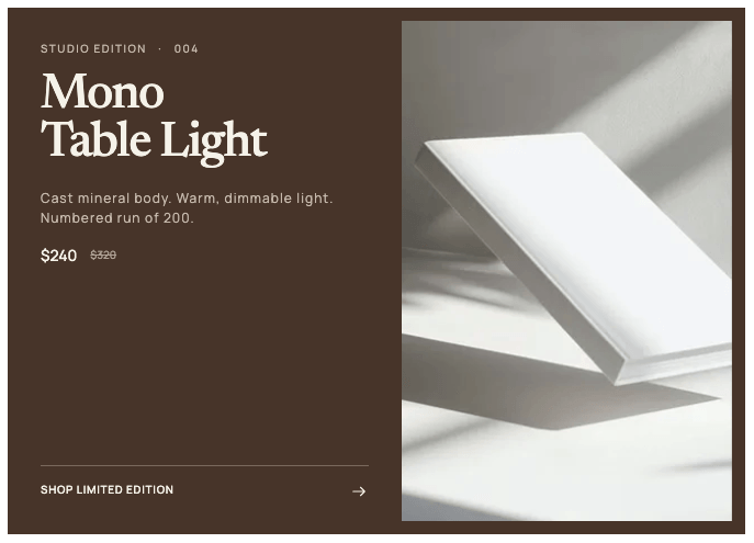
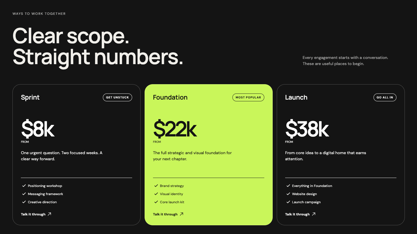
Simple responsive horizontal product card built with HTML and CSS. Uses a two-column grid to place the image and card body side by side, with the title, description, price, and order button neatly laid out inside. Collapses to a single column on mobile.
Final output:
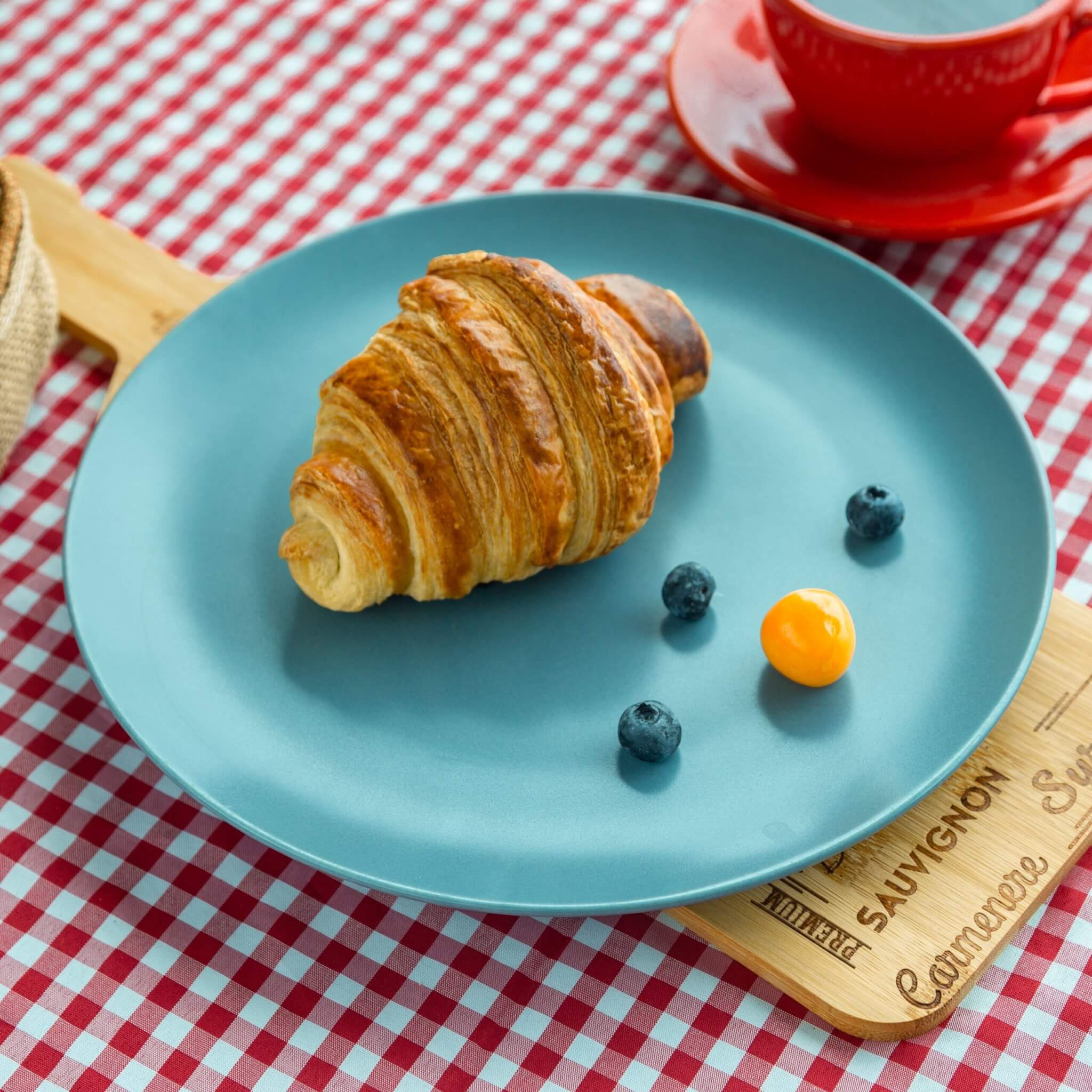
Buttery Croissant
Flaky croissant with a golden, buttery crust. Baked fresh every morning.
1. Let’s start by adding a .product-card div. Inside it, add the product image and a .card-body div.
<div class="product-card">
    <img src="product-image.jpg" alt="">
    <div class="card-body">
    </div>
</div>
Reset margins, set the font family, and style your card. Use a two-column grid with grid-template-columns: 1.75fr 4fr to give the image less space than the card body.
Add a yellow background, some padding, and a box-shadow. On mobile, collapse to a single column so the image and body stack vertically.
* {
    margin: 0;
    box-sizing: border-box;
}
body {
    font-family: Arial, Helvetica, sans-serif;
}
.product-card {
    display: grid;
    grid-template-columns: 1.75fr 4fr;
    gap: 1rem;
    max-width: 30em;
    border-radius: .375rem;
    background-color: #fbd871;
    padding: 1rem .75rem;
    box-shadow: 0 7px 7px rgba(0, 0, 0, .18);
}
@media screen and (max-width: 576px) {
    .product-card {
        grid-template-columns: 1fr;
    }
}
Style the image with width: 100% and object-fit: cover so it fills its column without stretching. Add a border-radius to give it rounded corners.
.product-card img {
    width: 100%;
    max-height: 12rem;
    object-fit: cover;
    border-radius: .7em;
}
Output:
2. Add your product details in your .card-body with a .text-section and a .cta-section.
<div class="card-body">
    <div class="text-section">
        <h5 class="card-title">Buttery Croissant</h5>
        <p class="card-text">Flaky croissant with a golden, buttery crust. Baked fresh every morning.</p>
    </div>
    <div class="cta-section">
        <span class="price">$129.00</span>
        <a href="#" class="order-button">Order Now</a>
    </div>
</div>
Use a two-column grid on .card-body to place the text and CTA side by side, giving the text section more space with 3fr 1.5fr.
.product-card .card-body {
    display: grid;
    grid-template-columns: 3fr 1.5fr;
    gap: .5rem;
}
Output:
Buttery Croissant
Flaky croissant with a golden, buttery crust. Baked fresh every morning.
3. Style your card title and description with font sizes, letter-spacing, and a bottom margin to space them out.
.product-card .card-title {
    font-size: 1.25rem;
    font-weight: 600;
    margin-bottom: .75rem;
    letter-spacing: .5px;
}
.product-card .card-text {
    letter-spacing: .5px;
    font-size: 1.1rem;
    line-height: 1.4;
}
Output:
Buttery Croissant
Flaky croissant with a golden, buttery crust. Baked fresh every morning.
4. Style your .cta-section. Use flex-direction: column with justify-content: space-between to push the price to the top and the button to the bottom. Also, set align-items: flex-end to right-align both.
.product-card .cta-section {
    display: flex;
    flex-direction: column;
    gap: 1rem;
    align-items: flex-end;
    justify-content: space-between;
}
.product-card .price {
    font-size: 1.125rem;
}
.product-card .order-button {
    border-radius: .2rem;
    padding: .5rem;
    font-size: 1rem;
    text-decoration: none;
    color: #f1f1f1;
    background-color: #242124;
}
Output:
Buttery Croissant
Flaky croissant with a golden, buttery crust. Baked fresh every morning.
Final Output Code for Responsive HTML CSS Product Card #4:
HTML
<div class="product-card">
    <img src="product-image.jpg" alt="">
    <div class="card-body">
        <div class="text-section">
            <h5 class="card-title">Buttery Croissant</h5>
            <p class="card-text">Flaky croissant with a golden, buttery crust. Baked fresh every morning.</p>
        </div>
        <div class="cta-section">
            <span class="price">$129.00</span>
            <a href="#" class="order-button">Order Now</a>
        </div>
    </div>
</div>
CSS
* {
    margin: 0;
    box-sizing: border-box;
}
body {
    font-family: Arial, Helvetica, sans-serif;
}
.product-card {
    display: grid;
    grid-template-columns: 1.75fr 4fr;
    gap: 1rem;
    max-width: 30em;
    border-radius: .375rem;
    background-color: #fbd871;
    padding: 1rem .75rem;
    box-shadow: 0 7px 7px rgba(0, 0, 0, .18);
}
@media screen and (max-width: 576px) {
    .product-card {
        grid-template-columns: 1fr;
    }
}
.product-card img {
    width: 100%;
    max-height: 20rem;
    object-fit: cover;
    border-radius: .7em;
}
.product-card .card-body {
    display: grid;
    grid-template-columns: 3fr 1.5fr;
    gap: .5rem;
}
.product-card .card-title {
    font-size: 1.25rem;
    font-weight: 600;
    margin-bottom: .75rem;
    letter-spacing: .5px;
}
.product-card .card-text {
    letter-spacing: .5px;
    font-size: 1.1rem;
    line-height: 1.4;
}
.product-card .cta-section {
    display: flex;
    flex-direction: column;
    gap: 1rem;
    align-items: flex-end;
    justify-content: space-between;
}
.product-card .price {
    font-size: 1.125rem;
}
.product-card .order-button {
    border-radius: .2rem;
    padding: .5rem;
    font-size: 1rem;
    text-decoration: none;
    color: #f1f1f1;
    background-color: #242124;
}
If you have any doubts or stuck somewhere, you can reach out through Coding Yaar's Discord server.