This about section design tutorial shows you how to build a clean two-column layout with a large heading, a short description, and an image on the right. A details block with hours, address, and services sits at the bottom of the left column using margin-top: auto, so it lines up with the bottom of the image. The grid collapses to a single column on tablet and below, so it stays readable on any screen.
Final output:
About
A little more green.
Fern & Folk is an independent plant shop bringing greenery into everyday spaces. From easy-care houseplants to statement foliage, we help people find the right plants for their homes and make caring for them a little easier.
Hours
Monday-Saturday, 10-7
Address
26 Garden Lane
Services
Plants, pots & repotting
Steps for About Section Design HTML CSS:
1. Start with the About section structure
Link the Inter font from Google Fonts in the head.
<link rel="preconnect" href="https://fonts.googleapis.com">
<link rel="preconnect" href="https://fonts.gstatic.com" crossorigin>
<link href="https://fonts.googleapis.com/css2?family=Inter:ital,opsz,wght@0,14..32,100..900;1,14..32,100..900&display=swap" rel="stylesheet">
Let’s start with a section element with the class about-section. Inside it, I am adding a .section-container div with an .about-grid, and inside that, an .about-left and an .about-right div.
<section class="about-section">
    <div class="section-container">
        <div class="about-grid">
            <div class="about-left"></div>
            <div class="about-right"></div>
        </div>
    </div>
</section>
Then reset the margins and set Inter as the font family. Give the section a warm off-white background with a near-black text color. Finally, center the container with the margin inline property set to auto and a max width.
* {
    margin: 0;
    box-sizing: border-box;
}
body {
    font-family: "Inter", sans-serif;
}
.about-section {
    padding: 7rem 5%;
    background-color: hsla(60, 16%, 96%, 1);
    color: hsla(0, 0%, 9%, 1);
}
.about-section .section-container {
    max-width: 76rem;
    margin-inline: auto;
}
2. Add an image in the grid
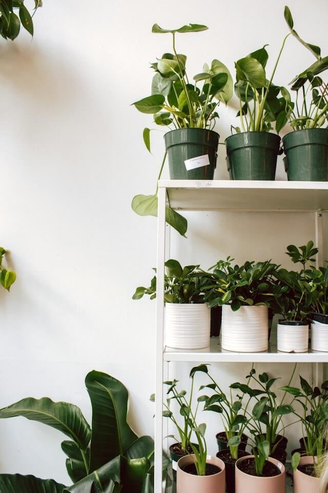
Let’s put the image in .about-right.
<div class="about-right">
    <img src="plant-store.jpg" alt="">
</div>
Use a two-column grid on .about-grid so the text takes up more space than the image. On tablet and below, collapse to a single column so the image stacks under the text. Then set the width property on the image to 100% and the object fit property to cover, with a max height so it never gets too tall.
.about-section .about-grid {
    display: grid;
    grid-template-columns: 1.4fr 1fr;
    gap: 5rem 6rem;
}
@media screen and (max-width: 992px) {
    .about-section .about-grid {
        grid-template-columns: 1fr;
    }
}
.about-section .about-right img {
    width: 100%;
    max-height: 38rem;
    object-fit: cover;
}
Output:
3. Add content to the left column
Now fill in .about-left with the label, heading, and description.
<div class="about-left">
    <p class="section-label">About</p>
    <h2 class="about-title">A little more green.</h2>
    <p class="about-description">Fern & Folk is an independent plant shop bringing greenery into everyday spaces. From easy-care houseplants to statement foliage, we help people find the right plants for their homes and make caring for them a little easier.</p>
</div>
Use flexbox with the flex direction property set to column on .about-left. This matters because we will push the details block to the bottom in a later step. For the heading, I am using clamp() on the font size so it scales smoothly, plus a very tight line height and a negative letter spacing.
.about-section .about-left {
    display: flex;
    flex-direction: column;
}
.about-section .section-label {
    font-size: .75rem;
    line-height: 1.5;
    color: hsla(0, 0%, 40%, 1);
}
.about-section .about-title {
    margin-block: 1.5rem 2.5rem;
    font-weight: 500;
    font-size: clamp(3.75rem, calc(1rem + 5.83vw), 6.25rem);
    line-height: .8;
    letter-spacing: -0.0402em;
}
Style the description with a larger font size and a generous line height so it reads comfortably. On small screens, lower the font size slightly.
.about-section .about-description {
    font-size: 1.125rem;
    line-height: 1.8;
    margin-bottom: 3.5rem;
}
@media screen and (max-width: 576px) {
    .about-section .about-description {
        font-size: 1rem;
    }
}
Output:
About
A little more green.
Fern & Folk is an independent plant shop bringing greenery into everyday spaces. From easy-care houseplants to statement foliage, we help people find the right plants for their homes and make caring for them a little easier.
4. Add store details
Finally, add the .details-wrapper after the description. Each .details-row has a label on the left and a value on the right.
<div class="details-wrapper">
    <div class="details-row">
        <p>Hours</p>
        <p>Monday-Saturday, 10-7</p>
    </div>
    <div class="details-row">
        <p>Address</p>
        <p>26 Garden Lane</p>
    </div>
    <div class="details-row">
        <p>Services</p>
        <p>Plants, pots & repotting</p>
    </div>
</div>
Set the margin top property to auto on the wrapper so it always sits at the bottom of the left column, which lines it up with the bottom of the image. Add a dark top border, then use a faint bottom border on each row to create clean dividers. Use a two-column grid on each row, with the label column narrower than the value column. As a result, all the values line up neatly.
.about-section .details-wrapper {
    margin-top: auto;
    border-top: 1px solid hsla(0, 0%, 9%, 1);
}
.about-section .details-row {
    padding-block: 1rem;
    display: grid;
    grid-template-columns: 1fr 4fr;
    align-items: center;
    border-bottom: 1px solid hsla(0, 0%, 73%, 1);
}
.about-section .details-row p:first-child {
    font-size: .875rem;
    line-height: 1.5;
    color: hsla(0, 0%, 40%, 1);
}
.about-section .details-row p:last-child {
    font-size: 0.813rem;
    line-height: 1.5;
}
Output:
About
A little more green.
Fern & Folk is an independent plant shop bringing greenery into everyday spaces. From easy-care houseplants to statement foliage, we help people find the right plants for their homes and make caring for them a little easier.
Final Output Code for About Us Section Design HTML CSS:
HTML
<section class="about-section">
    <div class="section-container">
        <div class="about-grid">
            <div class="about-left">
                <p class="section-label">About</p>
                <h2 class="about-title">A little more green.</h2>
                <p class="about-description">Fern & Folk is an independent plant shop bringing greenery into
                    everyday spaces. From easy-care houseplants to statement foliage, we help people find the right
                    plants for their homes and make caring for them a little easier.</p>
                <div class="details-wrapper">
                    <div class="details-row">
                        <p>Hours</p>
                        <p>Monday-Saturday, 10-7</p>
                    </div>
                    <div class="details-row">
                        <p>Address</p>
                        <p>26 Garden Lane</p>
                    </div>
                    <div class="details-row">
                        <p>Services</p>
                        <p>Plants, pots & repotting</p>
                    </div>
                </div>
            </div>
            <div class="about-right">
                <img src="https://codingyaar.com/wp-content/uploads/plant-store.jpg" alt="">
            </div>
        </div>
    </div>
</section>
CSS
* {
    margin: 0;
    box-sizing: border-box;
}
body {
    font-family: "Inter", sans-serif;
}
.about-section {
    padding: 7rem 5%;
    background-color: hsla(60, 16%, 96%, 1);
    color: hsla(0, 0%, 9%, 1);
}
.about-section .section-container {
    max-width: 76rem;
    margin-inline: auto;
}
.about-section .about-grid {
    display: grid;
    grid-template-columns: 1.4fr 1fr;
    gap: 5rem 6rem;
}
@media screen and (max-width: 992px) {
    .about-section .about-grid {
        grid-template-columns: 1fr;
    }
}
.about-section .about-right img {
    width: 100%;
    max-height: 38rem;
    object-fit: cover;
}
.about-section .about-left {
    display: flex;
    flex-direction: column;
}
.about-section .section-label {
    font-size: .75rem;
    line-height: 1.5;
    color: hsla(0, 0%, 40%, 1);
}
.about-section .about-title {
    margin-block: 1.5rem 2.5rem;
    font-weight: 500;
    font-size: clamp(3.75rem, calc(1rem + 5.83vw), 6.25rem);
    line-height: .8;
    letter-spacing: -0.0402em;
}
.about-section .about-description {
    font-size: 1.125rem;
    line-height: 1.8;
    margin-bottom: 3.5rem;
}
@media screen and (max-width: 576px) {
    .about-section .about-description {
        font-size: 1rem;
    }
}
.about-section .details-wrapper {
    margin-top: auto;
    border-top: 1px solid hsla(0, 0%, 9%, 1);
}
.about-section .details-row {
    padding-block: 1rem;
    display: grid;
    grid-template-columns: 1fr 4fr;
    align-items: center;
    border-bottom: 1px solid hsla(0, 0%, 73%, 1);
}
.about-section .details-row p:first-child {
    font-size: .875rem;
    line-height: 1.5;
    color: hsla(0, 0%, 40%, 1);
}
.about-section .details-row p:last-child {
    font-size: 0.813rem;
    line-height: 1.5;
}
If you have any doubts or stuck somewhere, you can reach out through Coding Yaar's Discord server.