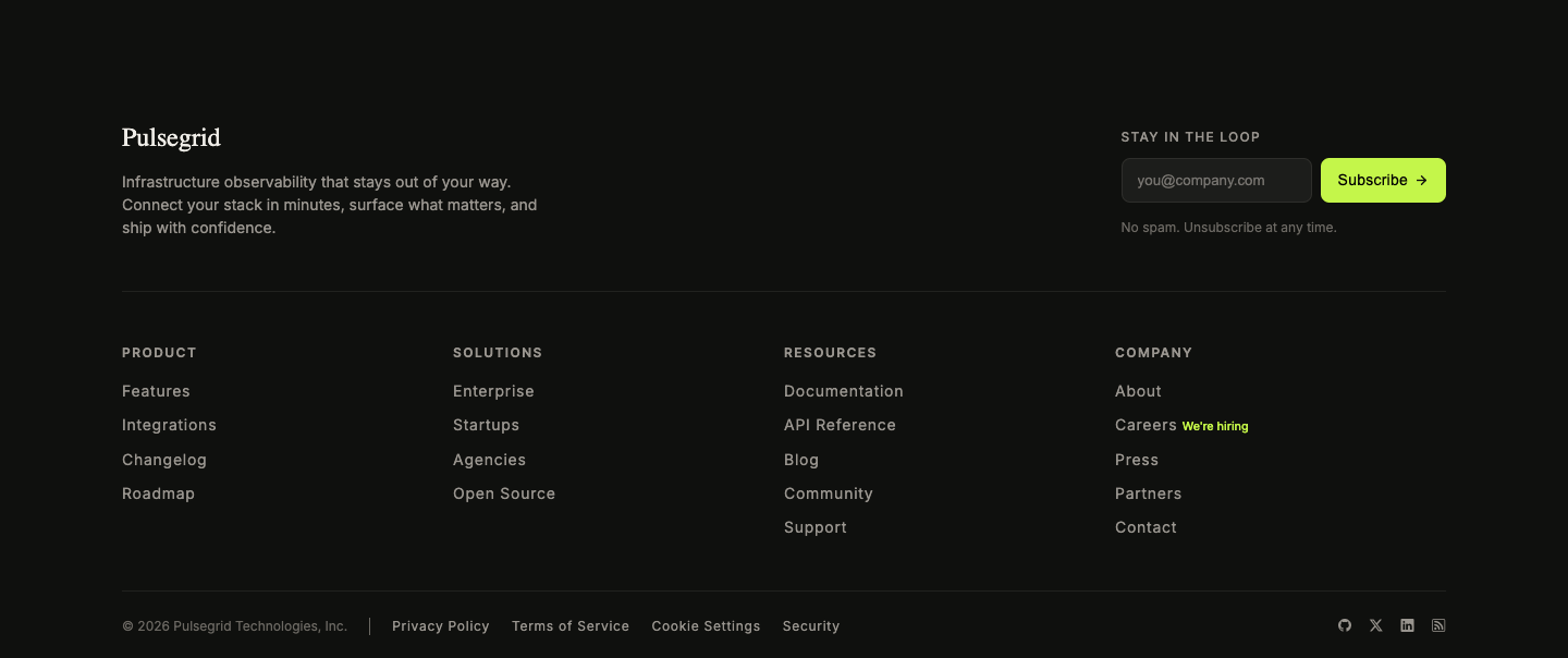
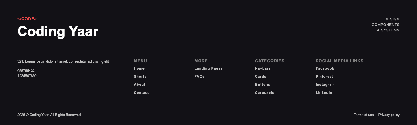
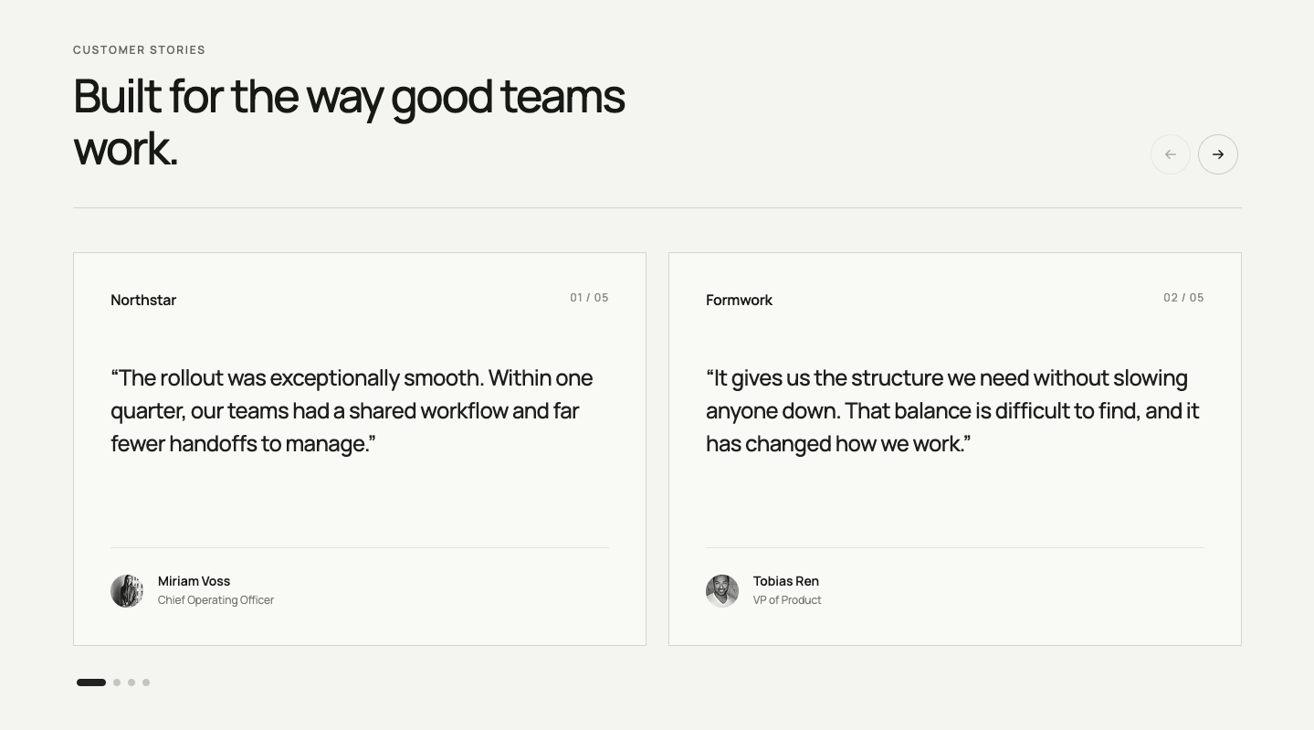
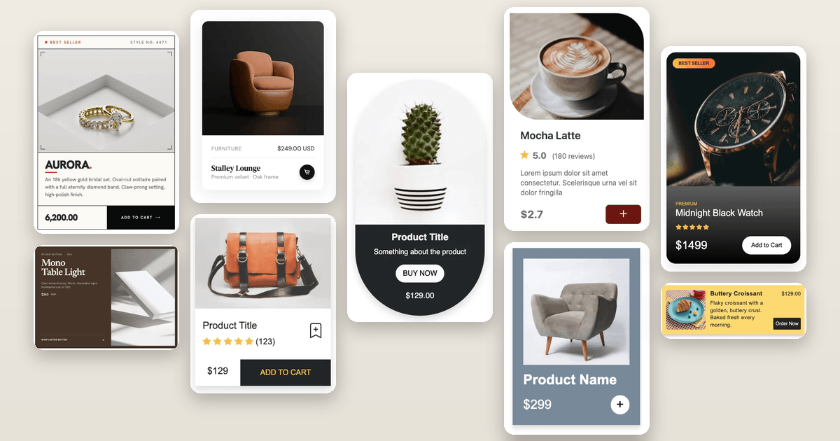
This responsive website footer design HTML CSS tutorial shows you how to build a two-tone footer with a dark left panel and a light right panel. The left side has a large heading with an italic lime accent word and an email link. The right side has two link columns, a newsletter form with a single shared underline, and a copyright row. Links slide slightly on hover, and the grid collapses to a single column on mobile.
Final output:
Steps for Website Footer Design HTML CSS:
1. Start with the Footer section structure
Link the Inter font from Google Fonts in the head.
<link rel="preconnect" href="https://fonts.googleapis.com">
<link rel="preconnect" href="https://fonts.gstatic.com" crossorigin>
<link href="https://fonts.googleapis.com/css2?family=Inter:ital,opsz,wght@0,14..32,100..900;1,14..32,100..900&display=swap" rel="stylesheet">
Let’s start with a footer element. Inside it, I am adding a .footer-grid div with a .footer-left and a .footer-right div.
<footer>
    <div class="footer-grid">
        <div class="footer-left"></div>
        <div class="footer-right"></div>
    </div>
</footer>
Then reset the margins, set Inter as the font family, and define the lime color as a CSS variable on :root. Give the footer a dark background, center it with the margin inline property set to auto, and add a max width. Next, use a two-column grid on .footer-grid so the left side takes up more space. On mobile, collapse to a single column.
* {
    margin: 0;
    box-sizing: border-box;
}
body {
    font-family: "Inter", sans-serif;
}
:root {
    --lime: hsla(73, 63%, 57%, 1);
}
footer {
    max-width: 92.5rem;
    margin-inline: auto;
    background-color: hsla(120, 4%, 10%, 1);
    color: hsla(44, 33%, 94%, 1);
}
footer .footer-grid {
    display: grid;
    grid-template-columns: 2fr 1fr;
}
@media screen and (max-width: 768px) {
    footer .footer-grid {
        grid-template-columns: 1fr;
    }
}
2. Add footer brand
Now fill in .footer-left with a .footer-brand-wrapper div containing the brand name and the year.
<div class="footer-left">
    <div class="footer-brand-wrapper">
        <p>Company</p>
        <p>Est. 2024</p>
    </div>
</div>
Add padding to .footer-left and use clamp() on the inline padding so it scales with the screen. Then set the justify content property to space-between on the brand wrapper so the name and year sit at opposite ends. Style the name with a small bold uppercase font, and the year with a lime italic font. Since the content below needs room, use clamp() on the bottom margin as well.
footer .footer-left {
    padding: 3.5rem clamp(1.75rem, calc(1rem + 2.78vw), 3.5rem);
}
footer .footer-brand-wrapper {
    display: flex;
    justify-content: space-between;
    gap: 1rem;
    margin-bottom: clamp(4rem, calc(1rem + 5.97vw), 6.375rem);
}
footer .footer-brand-wrapper p:first-child {
    font-weight: 700;
    font-size: .875rem;
    line-height: 1.4;
    letter-spacing: 2.8px;
    text-transform: uppercase;
}
footer .footer-brand-wrapper p:last-child {
    font-size: 1.25rem;
    line-height: 1.4;
    color: var(--lime);
    font-style: italic;
}
Output:
3. Add content to the left column
Next, add the .footer-left-content-wrapper div after the brand wrapper. Inside it, add a small label, the heading with a span, and an email link with an arrow SVG.
<div class="footer-left-content-wrapper">
    <p>Ready when you are</p>
    <h2>Let's build something <span>better.</span></h2>
    <a href="#">
        hello@company.com
        <svg width="16" height="16" viewBox="0 0 16 16" fill="none" xmlns="http://www.w3.org/2000/svg">
            <path d="M4 12L12 4M12 11V4H5" stroke-width="1.5" stroke="currentColor" />
        </svg>
    </a>
</div>
Style the label with a small uppercase font and a semi-transparent color. For the heading, I am using clamp() on the font size, plus a tight line height and a large negative letter spacing. The span gets the lime color and an italic style, so the last word stands out. Then style the link with a bottom border, and set the vertical align property to middle on the SVG so the arrow lines up with the text.
footer .footer-left-content-wrapper p {
    font-weight: 600;
    font-size: .75rem;
    line-height: 1.3;
    letter-spacing: 2.16px;
    text-transform: uppercase;
    color: hsla(15, 100%, 100%, 0.5);
}
footer .footer-left-content-wrapper h2 {
    margin-block: 1.125rem 2.25rem;
    font-size: clamp(3.75rem, calc(1rem + 6.39vw), 6.75rem);
    line-height: .9;
    letter-spacing: -0.06em;
}
footer .footer-left-content-wrapper h2 span {
    font-weight: 400;
    font-style: italic;
    color: var(--lime);
}
footer .footer-left-content-wrapper a {
    font-weight: 600;
    font-size: .875rem;
    line-height: 1.4;
    color: hsla(44, 33%, 94%, 1);
    text-decoration: none;
    padding-bottom: .5rem;
    border-bottom: 1px solid hsla(15, 100%, 100%, 0.4);
}
footer .footer-left-content-wrapper a svg {
    margin-left: .75rem;
    vertical-align: middle;
}
Output:
4. Add Footer Links
Now let’s build the right side. Add a .footer-links-grid div inside .footer-right with two .footer-links-wrapper divs. Each one has a heading and a nav with a list of links.
<div class="footer-right">
    <div class="footer-links-grid">
        <div class="footer-links-wrapper">
            <h3>Explore</h3>
            <nav>
                <ul>
                    <li><a href="#">About</a></li>
                    <li><a href="#">Services</a></li>
                    <li><a href="#">Projects</a></li>
                </ul>
            </nav>
        </div>
        <div class="footer-links-wrapper">
            <h3>Company</h3>
            <nav>
                <ul>
                    <li><a href="#">News</a></li>
                    <li><a href="#">Careers</a></li>
                    <li><a href="#">Contact</a></li>
                </ul>
            </nav>
        </div>
    </div>
</div>
Give .footer-right a light background and dark text, so it contrasts with the dark left side. Then use a two-column grid on .footer-links-grid so the two link groups sit side by side. Style the headings with a small uppercase font and a faded color. After that, remove the default list styles and add a top margin to every list item except the first. I explained a similar link column layout in my Responsive Footer HTML CSS #3 post, so check that one out if you want more detail.
footer .footer-right {
    padding: 3rem clamp(1.5rem, calc(1rem + 2.22vw), 3rem);
    background-color: hsla(42, 21%, 88%, 1);
    color: hsla(120, 4%, 9%, 1);
}
footer .footer-links-grid {
    display: grid;
    grid-template-columns: 1fr 1fr;
    gap: 2rem;
    margin-bottom: clamp(3rem, calc(1rem + 4.44vw), 5rem);
}
footer .footer-links-wrapper h3 {
    font-weight: 600;
    font-size: .75rem;
    line-height: 1.4;
    letter-spacing: 1.98px;
    text-transform: uppercase;
    color: hsla(0, 0%, 0%, 0.45);
    margin-bottom: 1.25rem;
}
footer .footer-links-wrapper nav ul {
    padding: 0;
    list-style: none;
}
footer .footer-links-wrapper nav ul li:not(:first-child) {
    margin-top: .875rem;
}
footer .footer-links-wrapper nav ul li a {
    font-size: .875rem;
    line-height: 1.4;
    text-decoration: none;
    color: hsla(120, 4%, 9%, 1);
}
Output:
5. Add Email Form
Add the .email-form-wrapper div below the links grid. Inside it, add a heading, a short description, and a form with a .form-row containing an email input and a submit button.
<div class="email-form-wrapper">
    <h3>Stay in the loop.</h3>
    <p>News, ideas, and updates delivered occasionally.</p>
    <form action="">
        <div class="form-row">
            <input type="email" name="email" id="email" placeholder="Email address">
            <button type="submit">
                <span>Join</span>
                <svg width="16" height="16" viewBox="0 0 16 16" fill="none" xmlns="http://www.w3.org/2000/svg">
                    <path d="M4 12L12 4M12 11V4H5" stroke-width="1.5" stroke="#171917" />
                </svg>
            </button>
        </div>
    </form>
</div>
Add a top border and some top padding to separate the form from the links above. Style the heading and description so the heading reads first. Then use flexbox on .form-row with the justify content property set to space-between, and add a single bottom border. Since the border is on the row, the input and button share one underline. For that reason, remove the border, background, and outline from both the input and the button. Finally, set the flex property to 1 on the input so it fills the remaining space.
footer .email-form-wrapper {
    padding-top: 1.75rem;
    border-top: 1px solid hsla(0, 0%, 0%, 0.15);
}
footer .email-form-wrapper h3 {
    font-weight: 500;
    font-size: 1.125rem;
    line-height: 1.5;
    letter-spacing: -0.36px;
    margin-bottom: .25rem;
}
footer .email-form-wrapper p {
    font-size: .875rem;
    line-height: 1.4;
    color: hsla(0, 0%, 0%, 0.55);
    margin-bottom: 1.25rem;
}
footer .form-row {
    display: flex;
    justify-content: space-between;
    align-items: center;
    gap: .5rem;
    border-bottom: 1px solid hsla(0, 0%, 0%, 0.35);
}
footer .form-row input,
footer .form-row button {
    background-color: transparent;
    border: none;
    outline: none;
}
footer .form-row input {
    flex: 1;
    padding-block: .875rem;
}
footer .form-row input::placeholder {
    font-size: .875rem;
    line-height: 1;
    color: hsla(0, 0%, 0%, 0.4);
}
footer .form-row button {
    display: flex;
    font-weight: 700;
    font-size: .75rem;
    line-height: 1.3;
    letter-spacing: 1.44px;
    text-transform: uppercase;
    padding-block: .875rem;
    cursor: pointer;
}
footer .form-row button svg {
    vertical-align: middle;
}
Output:
6. Add copyright and legal links
Add the .copyright-wrapper div at the bottom of .footer-right. Inside it, add the copyright text and a div with the privacy and terms links.
<div class="copyright-wrapper">
    <p>© 2026 Company, Inc.</p>
    <div>
        <a href="#">Privacy</a>
        <a href="#">Terms</a>
    </div>
</div>
Use flexbox with the justify content property set to space-between to push the copyright and links to opposite ends. Style everything with a small, faded font so the row reads as a quiet footnote. Then add a left margin to each link to space them out.
footer .copyright-wrapper {
    margin-top: 3.5rem;
    display: flex;
    justify-content: space-between;
    align-items: center;
    gap: .5rem;
    color: hsla(0, 0%, 0%, 0.5);
    font-size: .75rem;
    line-height: 1.5;
}
footer .copyright-wrapper a {
    text-decoration: none;
    color: inherit;
    margin-left: 1rem;
}
Output:
7. Add hover effects
Finally, let’s add the hover effects, since the layout is done. On the email link, add a transition on the color and border color properties. Then, on hover, change both to lime. Next, add a transition on the transform property of each footer link item, and on hover, set the transform property to translateX(.25rem) so the link slides slightly to the right.
footer .footer-left-content-wrapper a {
    transition: .2s color, .2s border-color;
}
footer .footer-left-content-wrapper a:hover {
    color: var(--lime);
    border-color: var(--lime);
}
footer .footer-links-wrapper nav ul li {
    transition: .2s transform;
}
footer .footer-links-wrapper nav ul li:hover {
    transform: translateX(.25rem);
}
Output:
Final Output Code for Website Footer Design HTML CSS:
HTML
<footer>
    <div class="footer-grid">
        <div class="footer-left">
            <div class="footer-brand-wrapper">
                <p>Company</p>
                <p>Est. 2024</p>
            </div>
            <div class="footer-left-content-wrapper">
                <p>Ready when you are</p>
                <h2>Let's build
                    something <span>better.</span></h2>
                <a href="#">
                    hello@company.com
                    <svg width="16" height="16" viewBox="0 0 16 16" fill="none" xmlns="http://www.w3.org/2000/svg">
                        <path d="M4 12L12 4M12 11V4H5" stroke-width="1.5" stroke="currentColor" />
                    </svg>
                </a>
            </div>
        </div>
        <div class="footer-right">
            <div class="footer-links-grid">
                <div class="footer-links-wrapper">
                    <h3>Explore</h3>
                    <nav>
                        <ul>
                            <li><a href="#">About</a></li>
                            <li><a href="#">Services</a></li>
                            <li><a href="#">Projects</a></li>
                        </ul>
                    </nav>
                </div>
                <div class="footer-links-wrapper">
                    <h3>Company</h3>
                    <nav>
                        <ul>
                            <li><a href="#">News</a></li>
                            <li><a href="#">Careers</a></li>
                            <li><a href="#">Contact</a></li>
                        </ul>
                    </nav>
                </div>
            </div>
            <div class="email-form-wrapper">
                <h3>Stay in the loop.</h3>
                <p>News, ideas, and updates delivered occasionally.</p>
                <form action="">
                    <div class="form-row">
                        <input type="email" name="email" id="email" placeholder="Email address">
                        <button type="submit">
                            <span>Join</span>
                            <svg width="16" height="16" viewBox="0 0 16 16" fill="none"
                                xmlns="http://www.w3.org/2000/svg">
                                <path d="M4 12L12 4M12 11V4H5" stroke-width="1.5" stroke="#171917" />
                            </svg>
                        </button>
                    </div>
                </form>
            </div>
            <div class="copyright-wrapper">
                <p>© 2026 Company, Inc.</p>
                <div>
                    <a href="#">Privacy</a>
                    <a href="#">Terms</a>
                </div>
            </div>
        </div>
    </div>
</footer>
CSS
* {
    margin: 0;
    box-sizing: border-box;
}
body {
    font-family: "Inter", sans-serif;
}
:root {
    --lime: hsla(73, 63%, 57%, 1);
}
footer {
    max-width: 92.5rem;
    margin-inline: auto;
    background-color: hsla(120, 4%, 10%, 1);
    color: hsla(44, 33%, 94%, 1);
}
footer .footer-grid {
    display: grid;
    grid-template-columns: 2fr 1fr;
}
@media screen and (max-width: 768px) {
    footer .footer-grid {
        grid-template-columns: 1fr;
    }
}
footer .footer-left {
    padding: 3.5rem clamp(1.75rem, calc(1rem + 2.78vw), 3.5rem);
}
footer .footer-brand-wrapper {
    display: flex;
    justify-content: space-between;
    gap: 1rem;
    margin-bottom: clamp(4rem, calc(1rem + 5.97vw), 6.375rem);
}
footer .footer-brand-wrapper p:first-child {
    font-weight: 700;
    font-size: .875rem;
    line-height: 1.4;
    letter-spacing: 2.8px;
    text-transform: uppercase;
}
footer .footer-brand-wrapper p:last-child {
    font-size: 1.25rem;
    line-height: 1.4;
    color: var(--lime);
    font-style: italic;
}
footer .footer-left-content-wrapper p {
    font-weight: 600;
    font-size: .75rem;
    line-height: 1.3;
    letter-spacing: 2.16px;
    text-transform: uppercase;
    color: hsla(15, 100%, 100%, 0.5);
}
footer .footer-left-content-wrapper h2 {
    margin-block: 1.125rem 2.25rem;
    font-size: clamp(3.75rem, calc(1rem + 6.39vw), 6.75rem);
    line-height: .9;
    letter-spacing: -0.06em;
}
footer .footer-left-content-wrapper h2 span {
    font-weight: 400;
    font-style: italic;
    color: var(--lime);
}
footer .footer-left-content-wrapper a {
    font-weight: 600;
    font-size: .875rem;
    line-height: 1.4;
    color: hsla(44, 33%, 94%, 1);
    text-decoration: none;
    padding-bottom: .5rem;
    border-bottom: 1px solid hsla(15, 100%, 100%, 0.4);
    transition: .2s color, .2s border-color;
}
footer .footer-left-content-wrapper a svg {
    margin-left: .75rem;
    vertical-align: middle;
}
footer .footer-left-content-wrapper a:hover {
    color: var(--lime);
    border-color: var(--lime);
}
footer .footer-right {
    padding: 3rem clamp(1.5rem, calc(1rem + 2.22vw), 3rem);
    background-color: hsla(42, 21%, 88%, 1);
    color: hsla(120, 4%, 9%, 1);
}
footer .footer-links-grid {
    display: grid;
    grid-template-columns: 1fr 1fr;
    gap: 2rem;
    margin-bottom: clamp(3rem, calc(1rem + 4.44vw), 5rem);
}
footer .footer-links-wrapper h3 {
    font-weight: 600;
    font-size: .75rem;
    line-height: 1.4;
    letter-spacing: 1.98px;
    text-transform: uppercase;
    color: hsla(0, 0%, 0%, 0.45);
    margin-bottom: 1.25rem;
}
footer .footer-links-wrapper nav ul {
    padding: 0;
    list-style: none;
}
footer .footer-links-wrapper nav ul li {
    transition: .2s transform;
}
footer .footer-links-wrapper nav ul li:hover {
    transform: translateX(.25rem);
}
footer .footer-links-wrapper nav ul li:not(:first-child) {
    margin-top: .875rem;
}
footer .footer-links-wrapper nav ul li a {
    font-size: .875rem;
    line-height: 1.4;
    text-decoration: none;
    color: hsla(120, 4%, 9%, 1);
}
footer .email-form-wrapper {
    padding-top: 1.75rem;
    border-top: 1px solid hsla(0, 0%, 0%, 0.15);
}
footer .email-form-wrapper h3 {
    font-weight: 500;
    font-size: 1.125rem;
    line-height: 1.5;
    letter-spacing: -0.36px;
    margin-bottom: .25rem;
}
footer .email-form-wrapper p {
    font-size: .875rem;
    line-height: 1.4;
    color: hsla(0, 0%, 0%, 0.55);
    margin-bottom: 1.25rem;
}
footer .form-row {
    display: flex;
    justify-content: space-between;
    align-items: center;
    gap: .5rem;
    border-bottom: 1px solid hsla(0, 0%, 0%, 0.35);
}
footer .form-row input,
footer .form-row button {
    background-color: transparent;
    border: none;
    outline: none;
}
footer .form-row input {
    flex: 1;
    padding-block: .875rem;
}
footer .form-row input::placeholder {
    font-size: .875rem;
    line-height: 1;
    color: hsla(0, 0%, 0%, 0.4);
}
footer .form-row button {
    display: flex;
    font-weight: 700;
    font-size: .75rem;
    line-height: 1.3;
    letter-spacing: 1.44px;
    text-transform: uppercase;
    padding-block: .875rem;
    cursor: pointer;
}
footer .form-row button svg {
    vertical-align: middle;
}
footer .copyright-wrapper {
    margin-top: 3.5rem;
    display: flex;
    justify-content: space-between;
    align-items: center;
    gap: .5rem;
    color: hsla(0, 0%, 0%, 0.5);
    font-size: .75rem;
    line-height: 1.5;
}
footer .copyright-wrapper a {
    text-decoration: none;
    color: inherit;
    margin-left: 1rem;
}
If you have any doubts or stuck somewhere, you can reach out through Coding Yaar's Discord server.