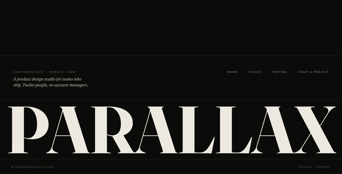
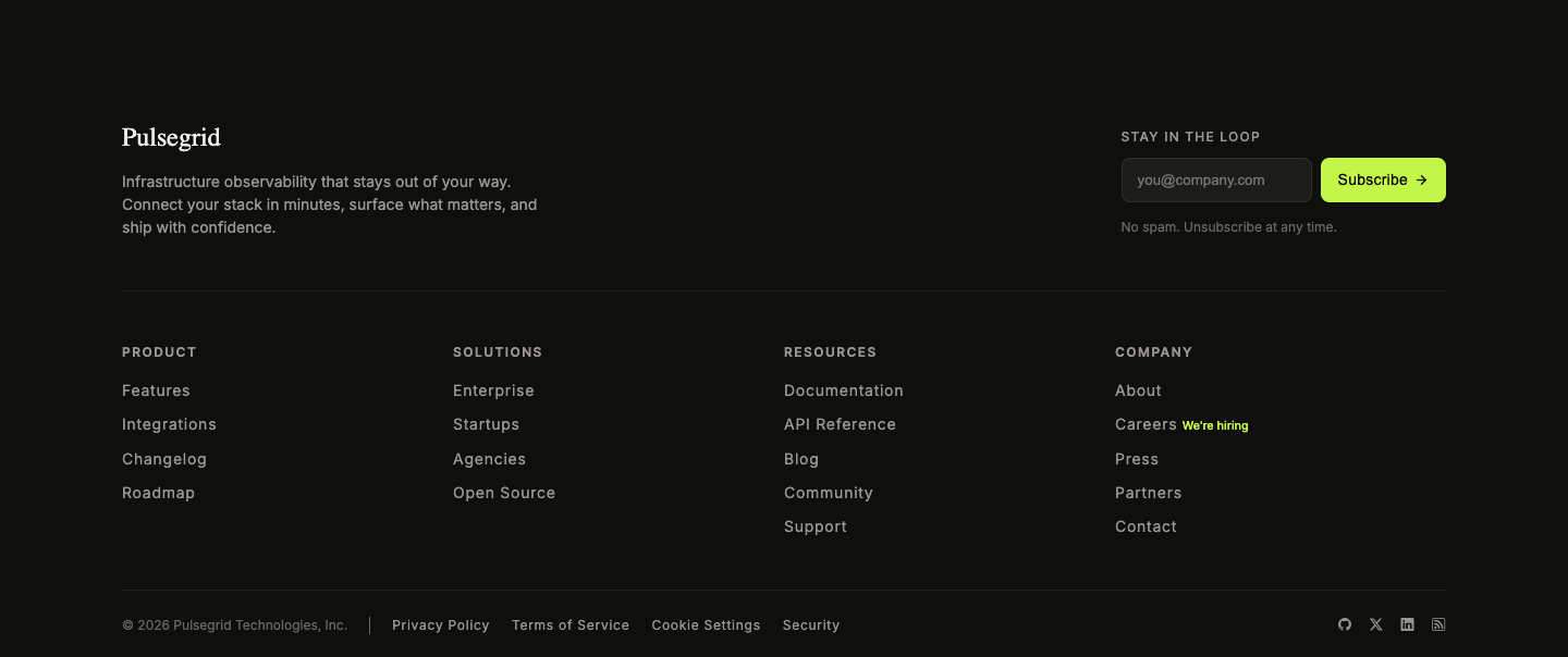
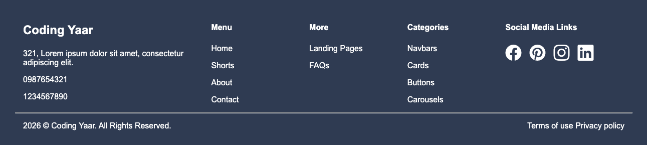
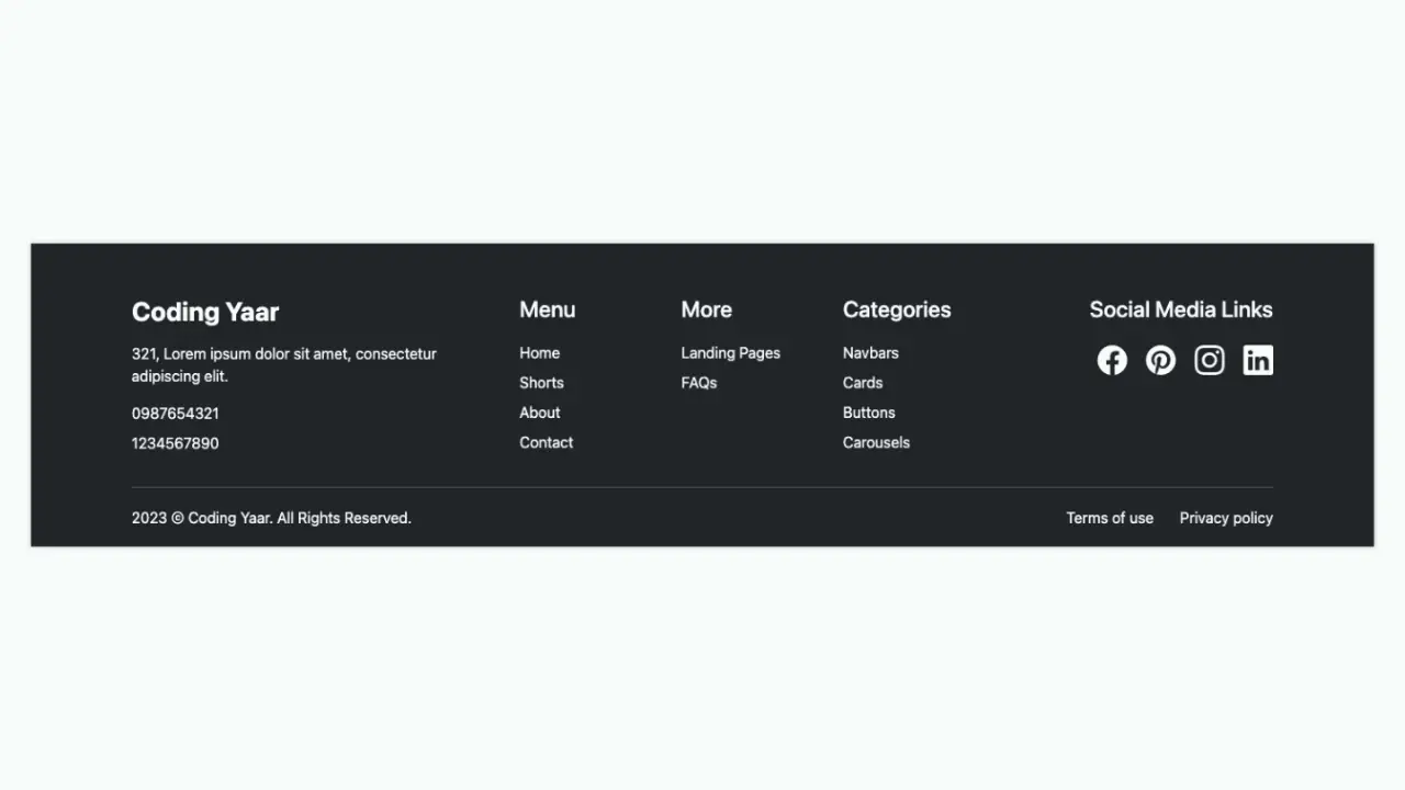
Responsive footer built with HTML and CSS. Features a brand section, a multi-column link grid, and a bottom copyright row. The grid collapses from five columns down to two as the screen gets smaller, so it looks clean on all screen sizes.
Final output:
1. Let’s start with a footer element. Inside it, add three divs: .top-row, .footer-columns, and .bottom-row.
<footer>
    <div class="top-row"></div>
    <div class="footer-columns"></div>
    <div class="bottom-row"></div>
</footer>
Then reset margins and style the footer with a dark background, white text, and some padding. Use display: flex with flex-direction: column and a gap for evenly spaced rows. On mobile, reduce the padding so it doesn’t feel too tight.
* {
    margin: 0;
    box-sizing: border-box;
}
footer {
    font-family: Arial, Helvetica, sans-serif;
    background-color: #121216;
    color: #ffffff;
    padding: 3.75rem 3.75rem 1.875rem;
    display: flex;
    flex-direction: column;
    gap: 2.5rem;
    font-size: .75rem;
}
@media screen and (max-width: 576px) {
    footer {
        padding: 2rem 2rem 1rem;
    }
}
Also set the link color and hover state so it applies across the whole footer.
footer a {
    color: #c0c0c0;
    text-decoration: none;
}
footer a:hover {
    color: #f1f1f1;
}
Output:
2. Add your brand name and tagline to the .top-row div. The brand has a red span above the h2, and the tagline sits on the right side.
<div class="top-row">
    <div>
        <span></code></span>
        <h2>Coding Yaar</h2>
    </div>
    <div class="tagline">DESIGN<br>COMPONENTS<br>& SYSTEMS</div>
</div>
Then use flexbox with justify-content: space-between to push the brand and tagline to opposite ends. Use clamp() on the heading so it scales smoothly between screen sizes. On mobile, stack them vertically and left-align the tagline.
footer .top-row {
    display: flex;
    justify-content: space-between;
    gap: 1rem;
}
footer .top-row h2 {
    font-size: clamp(2rem, calc(4vw + 1rem), 3rem);
    line-height: 1;
    margin-top: .75rem;
}
footer .top-row span {
    color: #FF4D4D;
    text-transform: uppercase;
    font-weight: 700;
    font-size: 0.875rem;
    line-height: 1;
    letter-spacing: 1px;
}
footer .top-row .tagline {
    line-height: 1.6;
    letter-spacing: 1px;
    text-align: right;
    color: #c0c0c0;
}
@media screen and (max-width: 576px) {
    footer .top-row {
        flex-direction: column;
    }
    footer .top-row .tagline {
        text-align: left;
    }
}
Output:
3. Add your footer columns to the .footer-columns div. Each .col has a heading and a list of links, except the first one, which has the address and contact numbers.
<div class="footer-columns">
    <div class="col">
        <p>321, Lorem ipsum dolor sit amet, consectetur adipiscing elit.</p>
        <span>0987654321 <br> 1234567890</span>
    </div>
    <div class="col">
        <h3>Menu</h3>
        <ul>
            <li><a>Home</a></li>
            <li><a>Shorts</a></li>
            <li><a>About</a></li>
            <li><a>Contact</a></li>
        </ul>
    </div>
    <div class="col">
        <h3>More</h3>
        <ul>
            <li><a>Landing Pages</a></li>
            <li><a>FAQs</a></li>
        </ul>
    </div>
    <div class="col">
        <h3>Categories</h3>
        <ul>
            <li><a>Navbars</a></li>
            <li><a>Cards</a></li>
            <li><a>Buttons</a></li>
            <li><a>Carousels</a></li>
        </ul>
    </div>
    <div class="col">
        <h3>Social Media Links</h3>
        <div class="social-media">
            <ul>
                <li><a href="#">Facebook</a></li>
                <li><a href="#">Pinterest</a></li>
                <li><a href="#">Instagram</a></li>
                <li><a href="#">LinkedIn</a></li>
            </ul>
        </div>
    </div>
</div>
Output:
4. Now style your .footer-columns with a five-column grid. Give the first column 4fr so the address section has more room, while the link columns share the remaining space. Add a top border and some padding-top to visually separate it from the top row.
As the screen gets smaller, collapse to three columns, then two, so your responsive footer HTML CSS layout adapts cleanly across all screen sizes.
footer .footer-columns {
    display: grid;
    grid-template-columns: 4fr 2fr 2fr 2fr 3fr;
    gap: 2rem 1rem;
    border-top: 1px solid #696969;
    padding-top: 1.875rem;
    line-height: 1.5;
    color: #c0c0c0;
}
footer .footer-columns p {
    max-width: 20rem;
    margin-bottom: .875rem;
}
@media (max-width: 768px) {
    footer .footer-columns {
        grid-template-columns: 4fr 2fr 2fr;
    }
    footer .footer-columns p {
        max-width: 10rem;
    }
}
@media (max-width: 576px) {
    footer .footer-columns {
        grid-template-columns: 2fr 1fr;
    }
}
Output:
5. Style your .col headings with uppercase text in a muted gray color. Then remove the default list styles and add some spacing between each list item.
footer .col h3 {
    font-weight: 600;
    line-height: 1;
    letter-spacing: 1px;
    text-transform: uppercase;
    color: #808080;
}
@media (max-width: 576px) {
    footer .col h3 {
        line-height: 1.2;
    }
}
footer .col ul {
    list-style: none;
    padding-left: 0;
}
footer .col li {
    margin-top: 0.625rem;
    font-weight: 600;
    line-height: 1.5;
    letter-spacing: 1px;
}
Output:
6. Add your copyright text and policy links to the .bottom-row div. Then use flexbox with justify-content: space-between to push them to opposite ends. Add flex-wrap: wrap and a gap so they stack cleanly on smaller screens.
<div class="bottom-row">
    <p>2026 © Coding Yaar. All Rights Reserved.</p>
    <div>
        <a href="#">Terms of use</a>
        <a href="#"> Privacy policy</a>
    </div>
</div>
footer .bottom-row {
padding-top: 1.25rem;
display: flex;
justify-content: space-between;
flex-wrap: wrap;
gap: 1rem;
color: #c0c0c0;
border-top: 1px solid #696969;
}
footer .bottom-row div {
display: flex;
gap: 1rem;
}Output:
Final Output Code for Responsive Footer HTML CSS #2:
HTML
<footer>
<div class="top-row">
<div>
<span></code></span>
<h2>Coding Yaar</h2>
</div>
<div class="tagline">DESIGN<br>COMPONENTS<br>& SYSTEMS</div>
</div>
<div class="footer-columns">
<div class="col">
<p>321, Lorem ipsum dolor sit amet, consectetur adipiscing elit.</p>
<span>0987654321 <br> 1234567890</span>
</div>
<div class="col">
<h3>Menu</h3>
<ul>
<li><a>Home</a></li>
<li><a>Shorts</a></li>
<li><a>About</a></li>
<li><a>Contact</a></li>
</ul>
</div>
<div class="col">
<h3>More</h3>
<ul>
<li><a>Landing Pages</a></li>
<li><a>FAQs</a></li>
</ul>
</div>
<div class="col">
<h3>Categories</h3>
<ul>
<li><a>Navbars</a></li>
<li><a>Cards</a></li>
<li><a>Buttons</a></li>
<li><a>Carousels</a></li>
</ul>
</div>
<div class="col">
<h3>Social Media Links</h3>
<div class="social-media">
<ul>
<li><a href="#">Facebook</a></li>
<li><a href="#">Pinterest</a></li>
<li><a href="#">Instagram</a></li>
<li><a href="#">LinkedIn</a></li>
</ul>
</div>
</div>
</div>
<div class="bottom-row">
<p>2026 © Coding Yaar. All Rights Reserved.</p>
<div>
<a href="#">Terms of use</a>
<a href="#"> Privacy policy</a>
</div>
</div>
</footer>CSS:
* {
margin: 0;
box-sizing: border-box;
}
footer {
font-family: Arial, Helvetica, sans-serif;
background-color: #121216;
color: #ffffff;
padding: 3.75rem 3.75rem 1.875rem;
display: flex;
flex-direction: column;
gap: 2.5rem;
font-size: .75rem;
}
@media screen and (max-width: 576px) {
footer {
padding: 2rem 2rem 1rem;
}
}
footer a {
color: #c0c0c0;
text-decoration: none;
}
footer a:hover {
color: #f1f1f1;
}
footer .top-row {
display: flex;
justify-content: space-between;
gap: 1rem;
}
footer .top-row h2 {
font-size: clamp(2rem, calc(4vw + 1rem), 3rem);
line-height: 1;
margin-top: .75rem;
}
footer .top-row span {
color: #FF4D4D;
text-transform: uppercase;
font-weight: 700;
font-size: 0.875rem;
line-height: 1;
letter-spacing: 1px;
}
footer .top-row .tagline {
line-height: 1.6;
letter-spacing: 1px;
text-align: right;
color: #c0c0c0;
}
@media screen and (max-width: 576px) {
footer .top-row {
flex-direction: column;
}
footer .top-row .tagline {
text-align: left;
}
}
footer .footer-columns {
display: grid;
grid-template-columns: 4fr 2fr 2fr 2fr 3fr;
gap: 2rem 1rem;
border-top: 1px solid #696969;
padding-top: 1.875rem;
line-height: 1.5;
color: #c0c0c0;
}
footer .footer-columns p {
max-width: 20rem;
margin-bottom: .875rem;
}
@media (max-width: 768px) {
footer .footer-columns {
grid-template-columns: 4fr 2fr 2fr;
}
footer .footer-columns p {
max-width: 10rem;
}
}
@media (max-width: 576px) {
footer .footer-columns {
grid-template-columns: 2fr 1fr;
}
}
footer .col h3 {
font-weight: 600;
line-height: 1;
letter-spacing: 1px;
text-transform: uppercase;
color: #808080;
}
@media (max-width: 576px) {
footer .col h3 {
line-height: 1.2;
}
}
footer .col ul {
list-style: none;
padding-left: 0;
}
footer .col li {
margin-top: 0.625rem;
font-weight: 600;
line-height: 1.5;
letter-spacing: 1px;
}
footer .bottom-row {
    padding-top: 1.25rem;
    display: flex;
    justify-content: space-between;
    flex-wrap: wrap;
    gap: 1rem;
    color: #c0c0c0;
    border-top: 1px solid #696969;
}
footer .bottom-row div {
    display: flex;
    gap: 1rem;
}If you have any doubts or stuck somewhere, you can reach out through Coding Yaar's Discord server.