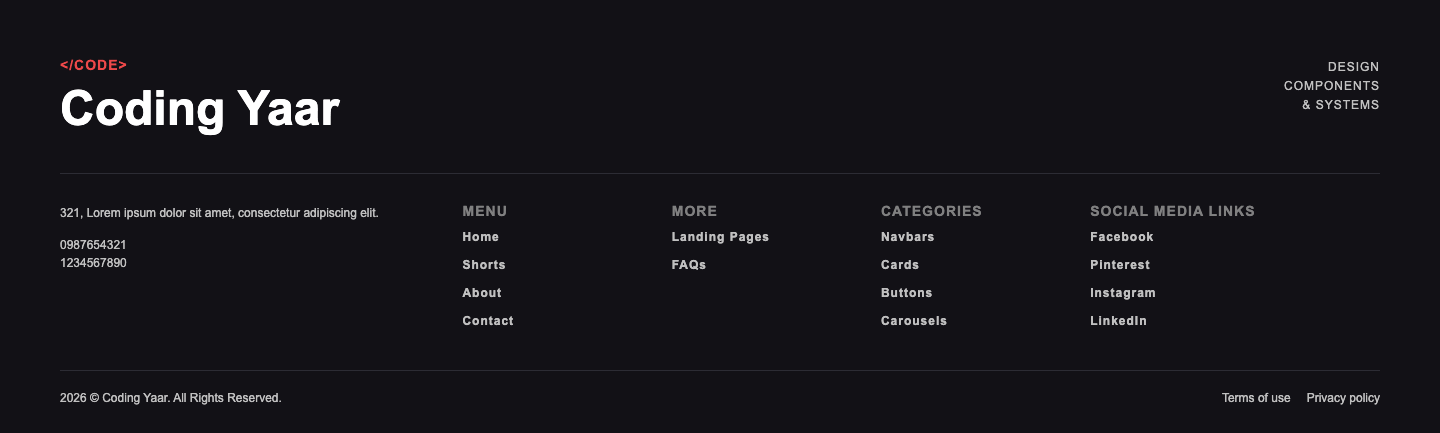
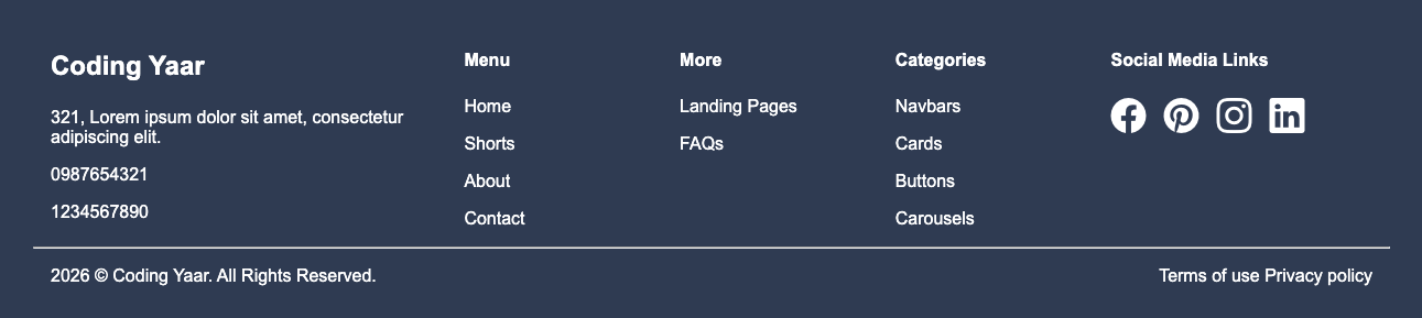
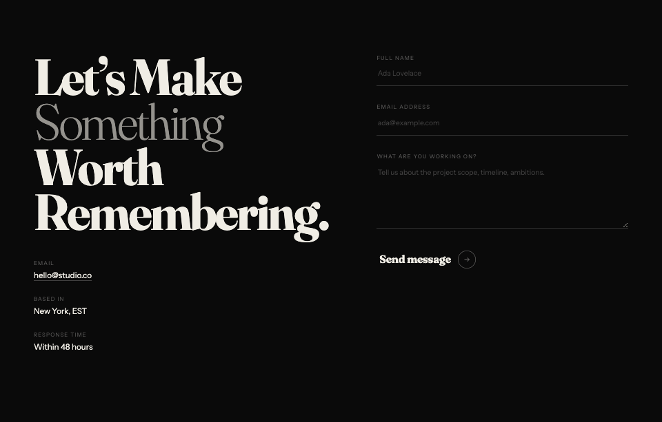
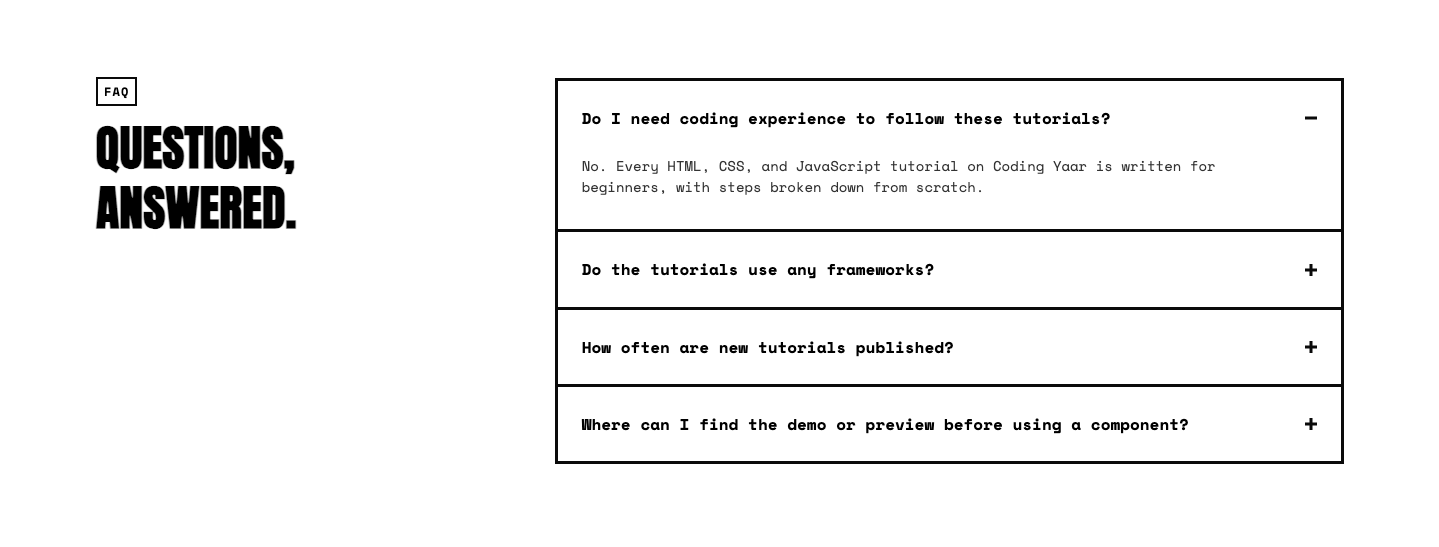
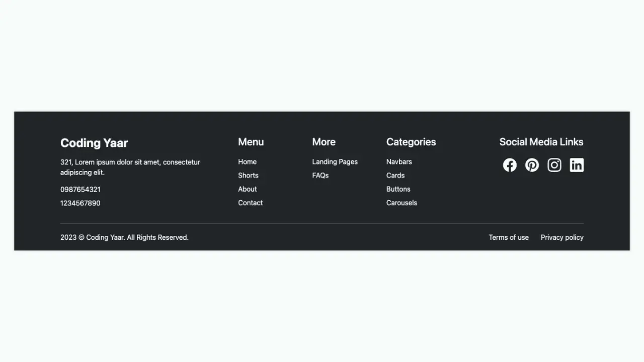
This responsive footer HTML CSS tutorial shows you how to build a dark-themed footer with a brand section, a newsletter signup form, a four-column link grid, and a bottom bar with legal links and social icons. The layout uses clamp() throughout so the spacing scales smoothly with the screen size, and the grid collapses to a flexible wrap layout on smaller screens.
Final output:
Steps for Responsive Footer HTML CSS #3:
1. First, link the Inter and Fraunces fonts and Bootstrap Icons in the head.
<link rel="preconnect" href="https://fonts.googleapis.com">
<link rel="preconnect" href="https://fonts.gstatic.com" crossorigin>
<link href="https://fonts.googleapis.com/css2?family=Fraunces:ital,opsz,wght@0,9..144,100..900;1,9..144,100..900&family=Inter:ital,opsz,wght@0,14..32,100..900;1,14..32,100..900&display=swap"
    rel="stylesheet">
<link rel="stylesheet" href="https://cdn.jsdelivr.net/npm/bootstrap-icons@1.13.1/font/bootstrap-icons.min.css">
Now let’s start with a footer element. Inside it, add a .footer-top div, a .footer-links-wrapper div, and a .footer-bottom div.
<footer>
    <div class="footer-top"></div>
    <div class="footer-links-wrapper"></div>
    <div class="footer-bottom"></div>
</footer>
Then reset margins, set Inter as the font family, and style the footer with a near-black background and a muted warm text color. Use clamp() on the padding so it scales naturally with the screen size rather than jumping between fixed breakpoints.
* {
    margin: 0;
    box-sizing: border-box;
}
body {
    font-family: "Inter", sans-serif;
}
footer {
    background-color: hsl(60, 3%, 6%);
    color: hsl(36, 5%, 58%);
    padding: clamp(2rem, 8vw, 8rem) clamp(1.5rem, 6vw, 5rem) 0;
}
Output:
2. Fill in .footer-top with a .footer-top-left div containing the brand name and description, and a .footer-top-right div containing the newsletter signup form.
<div class="footer-top">
    <div class="footer-top-left">
        <h2>Pulsegrid</h2>
        <p>Infrastructure observability that stays out of your way. Connect your stack in minutes, surface what matters, and ship with confidence.</p>
    </div>
    <div class="footer-top-right">
        <span>Stay in the loop</span>
        <form action="#">
            <input type="email" placeholder="you@company.com">
            <button type="submit">Subscribe
                <svg width="13" height="13" viewBox="0 0 13 13" fill="none" xmlns="http://www.w3.org/2000/svg">
                    <path d="M2.70898 6.5H10.2923" stroke="#111110" stroke-width="1.35417" stroke-linecap="round" stroke-linejoin="round" />
                    <path d="M6.5 2.70898L10.2917 6.50065L6.5 10.2923" stroke="#111110" stroke-width="1.35417" stroke-linecap="round" stroke-linejoin="round" />
                </svg>
            </button>
        </form>
        <span>No spam. Unsubscribe at any time.</span>
    </div>
</div>
Use flexbox with the justify content property set to space-between on .footer-top so the brand info and newsletter form sit at opposite ends. Add flex-wrap: wrap so they stack on smaller screens. Use clamp() on the margin so the spacing scales with the screen size.
footer .footer-top {
    margin: clamp(2rem, 5vw, 4rem) clamp(1rem, 3vw, 2rem) clamp(1.5rem, 4vw, 3rem);
    display: flex;
    flex-wrap: wrap;
    justify-content: space-between;
    gap: 2rem 1rem;
}
Style the brand name with the Fraunces font in a light weight and a warm cream color since it’s the most important element in the left column. Style the description with a smaller font size and a comfortable line height so it reads easily.
footer .footer-top-left {
    max-width: 24rem;
}
footer .footer-top-left h2 {
    margin-bottom: 1.125rem;
    font-family: "Fraunces", serif;
    font-weight: 300;
    font-size: 1.5rem;
    line-height: 1;
    letter-spacing: .24px;
    color: hsl(43, 18%, 92%);
}
footer .footer-top-left p {
    font-size: .875rem;
    line-height: 1.5;
}
Output:
3. Style the newsletter form area. Give the label a small uppercase font with a wide letter spacing. Style the input with a subtle transparent background and a faint border so it blends into the dark footer without disappearing.
Style the submit button with a bright green background so it stands out as the primary action, and add an opacity transition on hover for feedback.
footer .footer-top-right span:first-child {
    font-weight: 500;
    font-size: .75rem;
    line-height: 1.3;
    letter-spacing: 1.24px;
    text-transform: uppercase;
}
footer .footer-top-right form {
    margin-block: .675rem;
    display: flex;
    flex-wrap: wrap;
    gap: .5rem;
}
footer .footer-top-right input {
    padding: .75rem .875rem;
    border: 1px solid hsla(43, 18%, 92%, 0.08);
    border-radius: .5rem;
    background-color: hsla(43, 18%, 92%, 0.06);
    color: hsl(36, 5%, 58%);
}
footer .footer-top-right button {
    border-radius: .5rem;
    border: 0;
    padding: .75rem 1rem;
    background-color: hsla(79, 100%, 65%, 1);
    display: flex;
    align-items: center;
    gap: 0.375rem;
    font-weight: 500;
    font-size: .875rem;
    line-height: 1.2;
    letter-spacing: .24px;
    cursor: pointer;
    transition: opacity .3s;
}
footer .footer-top-right button:hover {
    opacity: .8;
}
footer .footer-top-right span:last-child {
    font-size: .75rem;
    line-height: 1.3;
    color: hsl(36, 6%, 40%);
}
Output:
4. Fill in .footer-links-wrapper with four column divs, each containing a heading and a list of links. Note the “We’re hiring” badge next to the Careers link since it uses a span element that needs its own style later.
<div class="footer-links-wrapper">
    <div>
        <h3>Product</h3>
        <ul>
            <li><a href="#">Features</a></li>
            <li><a href="#">Integrations</a></li>
            <li><a href="#">Changelog</a></li>
            <li><a href="#">Roadmap</a></li>
        </ul>
    </div>
    <div>
        <h3>Solutions</h3>
        <ul>
            <li><a href="#">Enterprise</a></li>
            <li><a href="#">Startups</a></li>
            <li><a href="#">Agencies</a></li>
            <li><a href="#">Open Source</a></li>
        </ul>
    </div>
    <div>
        <h3>Resources</h3>
        <ul>
            <li><a href="#">Documentation</a></li>
            <li><a href="#">API Reference</a></li>
            <li><a href="#">Blog</a></li>
            <li><a href="#">Community</a></li>
            <li><a href="#">Support</a></li>
        </ul>
    </div>
    <div>
        <h3>Company</h3>
        <ul>
            <li><a href="#">About</a></li>
            <li><a href="#">Careers</a> <span>We're hiring</span></li>
            <li><a href="#">Press</a></li>
            <li><a href="#">Partners</a></li>
            <li><a href="#">Contact</a></li>
        </ul>
    </div>
</div>
Add top and bottom borders on .footer-links-wrapper using the border block property to visually separate it from the top and bottom sections. Use a four-column grid on desktop. On smaller screens, switch to flexbox with flex-wrap: wrap so the columns reflow naturally without breaking the layout.
footer .footer-links-wrapper {
    border-block: 1px solid hsla(43, 18%, 92%, 0.08);
    margin-inline: clamp(1rem, 4vw, 2rem);
    padding-block: clamp(1.5rem, 5vw, 3rem);
    display: grid;
    grid-template-columns: repeat(4, 1fr);
}
@media screen and (max-width: 992px) {
    footer .footer-links-wrapper {
        display: flex;
        flex-wrap: wrap;
        gap: 2.5rem 4rem;
    }
}
footer .footer-links-wrapper > div {
    flex: 1;
}
Output:
5. Style the column headings with a small uppercase font and wide letter spacing so they feel like category labels rather than regular headings.
Remove the default list styles and add some top margin between each list item. Style the links with a subtle opacity transition on hover. Style the “We’re hiring” badge span with the bright green color so it draws the eye without being too loud.
footer .footer-links-wrapper h3 {
    font-weight: 600;
    font-size: .75rem;
    line-height: 1.3;
    letter-spacing: 1.44px;
    text-transform: uppercase;
    margin-bottom: 1rem;
}
footer .footer-links-wrapper ul {
    list-style: none;
    padding: 0;
}
footer .footer-links-wrapper ul li:not(:first-child) {
    margin-top: .675rem;
}
footer .footer-links-wrapper ul a {
    font-size: .875rem;
    line-height: 1.4;
    letter-spacing: .74px;
    text-decoration: none;
    color: hsl(36, 5%, 58%);
    transition: opacity .3s;
}
footer .footer-links-wrapper ul a:hover {
    opacity: .7;
}
footer .footer-links-wrapper ul span {
    color: hsl(79, 100%, 65%);
    font-weight: 500;
    font-size: .675rem;
    line-height: 1;
    text-wrap: nowrap;
}
Output:
6. Fill in .footer-bottom with a .footer-bottom-left div containing the copyright and legal links, and a .footer-bottom-right div with the social icon links.
<div class="footer-bottom">
    <div class="footer-bottom-left">
        <span>© 2026 Pulsegrid Technologies, Inc.</span>
        <a href="#">Privacy Policy</a>
        <a href="#">Terms of Service</a>
        <a href="#">Cookie Settings</a>
        <a href="#">Security</a>
    </div>
    <div class="footer-bottom-right">
        <a href="#"><i class="bi bi-github"></i></a>
        <a href="#"><i class="bi bi-twitter-x"></i></a>
        <a href="#"><i class="bi bi-linkedin"></i></a>
        <a href="#"><i class="bi bi-rss"></i></a>
    </div>
</div>
Use flexbox with the justify-content property set to space-between on .footer-bottom to push the copyright and social links to opposite ends.
Style the copyright span with a right border and some right padding to separate it from the legal links next to it. Use flexbox on both the left and right divs to lay their items in a row with a gap between them.
footer .footer-bottom {
    padding: 1.5rem 2rem;
    display: flex;
    flex-wrap: wrap;
    justify-content: space-between;
    gap: 2rem 1rem;
    font-size: .75rem;
    line-height: 1.3;
}
footer .footer-bottom a {
    text-decoration: none;
    color: hsl(36, 5%, 58%);
    transition: opacity .3s;
    letter-spacing: .74px;
}
footer .footer-bottom a:hover {
    opacity: .7;
}
footer .footer-bottom-left {
    display: flex;
    flex-wrap: wrap;
    gap: 1.25rem;
}
footer .footer-bottom-left span {
    color: hsl(36, 6%, 40%);
    border-right: 1px solid hsla(43, 18%, 92%, 0.4);
    padding-right: 1.25rem;
}
footer .footer-bottom-right {
    display: flex;
    flex-wrap: wrap;
    gap: 1rem;
}
Output:
Final Output Code for Responsive Footer HTML CSS #3:
HTML
<footer>
    <div class="footer-top">
        <div class="footer-top-left">
            <h2>Pulsegrid</h2>
            <p>Infrastructure observability that stays out of your way.
                Connect your stack in minutes, surface what matters, and
                ship with confidence.</p>
        </div>
        <div class="footer-top-right">
            <span>Stay in the loop</span>
            <form action="#">
                <input type="email" placeholder="you@company.com">
                <button type="submit">Subscribe
                    <svg width="13" height="13" viewBox="0 0 13 13" fill="none" xmlns="http://www.w3.org/2000/svg">
                        <path d="M2.70898 6.5H10.2923" stroke="#111110" stroke-width="1.35417" stroke-linecap="round"
                            stroke-linejoin="round" />
                        <path d="M6.5 2.70898L10.2917 6.50065L6.5 10.2923" stroke="#111110" stroke-width="1.35417"
                            stroke-linecap="round" stroke-linejoin="round" />
                    </svg>
                </button>
            </form>
            <span>No spam. Unsubscribe at any time.</span>
        </div>
    </div>
    <div class="footer-links-wrapper">
        <div>
            <h3>Product</h3>
            <ul>
                <li><a href="#">Features</a></li>
                <li><a href="#">Integrations</a></li>
                <li><a href="#">Changelog</a></li>
                <li><a href="#">Roadmap</a></li>
            </ul>
        </div>
        <div>
            <h3>Solutions</h3>
            <ul>
                <li><a href="#">Enterprise</a></li>
                <li><a href="#">Startups</a></li>
                <li><a href="#">Agencies</a></li>
                <li><a href="#">Open Source</a></li>
            </ul>
        </div>
        <div>
            <h3>Resources</h3>
            <ul>
                <li><a href="#">Documentation</a></li>
                <li><a href="#">API Reference</a></li>
                <li><a href="#">Blog</a></li>
                <li><a href="#">Community</a></li>
                <li><a href="#">Support</a></li>
            </ul>
        </div>
        <div>
            <h3>Company</h3>
            <ul>
                <li><a href="#">About</a></li>
                <li><a href="#">Careers</a> <span>We're hiring</span></li>
                <li><a href="#">Press</a></li>
                <li><a href="#">Partners</a></li>
                <li><a href="#">Contact</a></li>
            </ul>
        </div>
    </div>
    <div class="footer-bottom">
        <div class="footer-bottom-left">
            <span>© 2026 Pulsegrid Technologies, Inc.</span>
            <a href="#">Privacy Policy</a>
            <a href="#">Terms of Service</a>
            <a href="#">Cookie Settings</a>
            <a href="#">Security</a>
        </div>
        <div class="footer-bottom-right">
            <a href="#"><i class="bi bi-github"></i></a>
            <a href="#"><i class="bi bi-twitter-x"></i></a>
            <a href="#"><i class="bi bi-linkedin"></i></a>
            <a href="#"><i class="bi bi-rss"></i></a>
        </div>
    </div>
</footer>
CSS:
* {
    margin: 0;
    box-sizing: border-box;
}
body {
    font-family: "Inter", sans-serif;
}
footer {
    background-color: hsl(60, 3%, 6%);
    color: hsl(36, 5%, 58%);
    padding: clamp(2rem, 8vw, 8rem) clamp(1.5rem, 6vw, 5rem) 0;
}
footer .footer-top {
    margin: clamp(2rem, 5vw, 4rem) clamp(1rem, 3vw, 2rem) clamp(1.5rem, 4vw, 3rem);
    display: flex;
    flex-wrap: wrap;
    justify-content: space-between;
    gap: 2rem 1rem;
}
footer .footer-top-left {
    max-width: 24rem;
}
footer .footer-top-left h2 {
    margin-bottom: 1.125rem;
    font-family: "Fraunces", serif;
    font-weight: 300;
    font-size: 1.5rem;
    line-height: 1;
    color: hsl(43, 18%, 92%);
    letter-spacing: .24px;
}
footer .footer-top-left p {
    font-size: .875rem;
    line-height: 1.5;
}
footer .footer-top-right span:first-child {
    font-weight: 500;
    font-size: .75rem;
    line-height: 1.3;
    letter-spacing: 1.24px;
    text-transform: uppercase;
}
footer .footer-top-right form {
    margin-block: .675rem;
    display: flex;
    flex-wrap: wrap;
    gap: .5rem;
}
footer .footer-top-right input {
    padding: .75rem .875rem;
    border: 1px solid hsla(43, 18%, 92%, 0.08);
    border-radius: .5rem;
    background-color: hsla(43, 18%, 92%, 0.06);
    color: hsl(36, 5%, 58%);
}
footer .footer-top-right button {
    border-radius: .5rem;
    border: 0;
    padding: .75rem 1rem;
    background-color: hsla(79, 100%, 65%, 1);
    display: flex;
    align-items: center;
    gap: 0.375rem;
    font-weight: 500;
    font-size: .875rem;
    line-height: 1.2;
    letter-spacing: .24px;
    cursor: pointer;
    transition: opacity .3s;
}
footer .footer-top-right button:hover {
    opacity: .8;
}
footer .footer-top-right span:last-child {
    font-size: .75rem;
    line-height: 1.3;
    color: hsl(36, 6%, 40%);
}
footer .footer-links-wrapper {
    border-block: 1px solid hsla(43, 18%, 92%, 0.08);
    margin-inline: clamp(1rem, 4vw, 2rem);
    padding-block: clamp(1.5rem, 5vw, 3rem);
    display: grid;
    grid-template-columns: repeat(4, 1fr);
}
@media screen and (max-width: 992px) {
    footer .footer-links-wrapper {
        display: flex;
        flex-wrap: wrap;
        gap: 2.5rem 4rem;
    }
}
footer .footer-links-wrapper > div {
    flex: 1;
}
footer .footer-links-wrapper h3 {
    font-weight: 600;
    font-size: .75rem;
    line-height: 1.3;
    letter-spacing: 1.44px;
    text-transform: uppercase;
    margin-bottom: 1rem;
}
footer .footer-links-wrapper ul {
    list-style: none;
    padding: 0;
}
footer .footer-links-wrapper ul li:not(:first-child) {
    margin-top: .675rem;
}
footer .footer-links-wrapper ul a {
    font-size: .875rem;
    line-height: 1.4;
    letter-spacing: .74px;
    text-decoration: none;
    color: hsl(36, 5%, 58%);
    transition: opacity .3s;
}
footer .footer-links-wrapper ul a:hover {
    opacity: .7;
}
footer .footer-links-wrapper ul span {
    color: hsl(79, 100%, 65%);
    font-weight: 500;
    font-size: .675rem;
    line-height: 1;
    text-wrap: nowrap;
}
footer .footer-bottom {
    padding: 1.5rem 2rem;
    display: flex;
    flex-wrap: wrap;
    justify-content: space-between;
    gap: 2rem 1rem;
    font-size: .75rem;
    line-height: 1.3;
}
footer .footer-bottom a {
    text-decoration: none;
    color: hsl(36, 5%, 58%);
    transition: opacity .3s;
    letter-spacing: .74px;
}
footer .footer-bottom a:hover {
    opacity: .7;
}
footer .footer-bottom-left {
    display: flex;
    flex-wrap: wrap;
    gap: 1.25rem;
}
footer .footer-bottom-left span {
    color: hsl(36, 6%, 40%);
    border-right: 1px solid hsla(43, 18%, 92%, 0.4);
    padding-right: 1.25rem;
}
footer .footer-bottom-right {
    display: flex;
    flex-wrap: wrap;
    gap: 1rem;
}
If you have any doubts or stuck somewhere, you can reach out through Coding Yaar's Discord server.