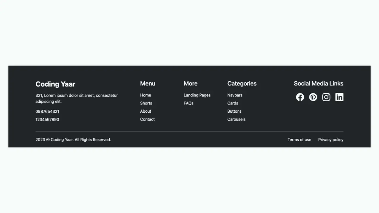
This responsive minimal footer HTML CSS tutorial shows you how to build a dark-themed footer with a location label, an italic tagline, navigation links, and a large SVG text logo that stretches edge to edge at any screen size. The SVG text approach is what makes the full-width logo possible, since it scales perfectly without wrapping or overflowing. The bottom row has copyright text and policy links, all styled with a very faint opacity so they sit quietly below the oversized logo.
Final output:
Steps for Minimal Footer HTML CSS:
1. First, link the DM Sans and Fraunces fonts in the head.
<link rel="preconnect" href="https://fonts.googleapis.com">
<link rel="preconnect" href="https://fonts.gstatic.com" crossorigin>
<link href="https://fonts.googleapis.com/css2?family=DM+Sans:ital,opsz,wght@0,9..40,100..1000;1,9..40,100..1000&family=Fraunces:ital,opsz,wght@0,9..144,100..900;1,9..144,100..900&display=swap"
        rel="stylesheet">
Then reset margins, define the Fraunces font as a CSS variable on :root, and set DM Sans as the font family. Give the footer a near-black background and white text. Use clamp() on the top padding so it scales generously with the screen size, since the large logo at the bottom needs room to breathe.
* {
    margin: 0;
    box-sizing: border-box;
}
:root {
    --heading-font: "Fraunces", serif;
}
body {
    font-family: "DM Sans", sans-serif;
}
footer {
    background-color: hsl(40, 14%, 4%);
    color: hsl(0, 0%, 100%);
    padding-top: clamp(6rem, calc(1rem + 15.56vw), 15rem);
}
2. Fill in .footer-top with a .footer-top-left div containing the location label and tagline, and a .footer-top-right div containing the navigation links.
<div class="footer-top">
    <div class="footer-top-left">
        <span>SAN FRANCISCO — REMOTE TEAM</span>
        <p>A product design studio for teams who ship. Twelve people, no account managers.</p>
    </div>
    <div class="footer-top-right">
        <ul>
            <li><a href="#">Work</a></li>
            <li><a href="#">Studio</a></li>
            <li><a href="#">Writing</a></li>
            <li><a href="#">Start a project</a></li>
        </ul>
    </div>
</div>
Add a top border on .footer-top to separate it from the content above. Use flexbox with the justify content property set to space-between so the left and right sides sit at opposite ends. On mobile, reduce the padding so it doesn’t feel too tight.
footer .footer-top {
    padding: 3.5rem 3.5rem 3rem;
    border-top: 1px solid hsla(37, 27%, 90%, 0.15);
    display: flex;
    justify-content: space-between;
    flex-wrap: wrap;
    gap: 2rem;
}
@media screen and (max-width: 576px) {
    footer .footer-top {
        padding: 2rem;
    }
}
Output:
3. Style the left side. Give the location label a very faint opacity and wide letter spacing so it reads as subtle metadata. Style the tagline with the Fraunces font in italic and a light weight, since it’s meant to feel like a quiet statement rather than a headline.
footer .footer-top-left span {
    font-weight: 300;
    font-size: .75rem;
    line-height: 1.5;
    letter-spacing: 2.75px;
    text-transform: uppercase;
    color: hsla(37, 27%, 90%, 0.38);
}
footer .footer-top-left p {
    font-family: var(--heading-font);
    font-weight: 300;
    font-style: italic;
    font-size: 1.125rem;
    line-height: 1.4;
    color: hsla(37, 27%, 90%, 0.7);
    max-width: 20rem;
    margin-top: .5rem;
}
Style the navigation links with a small uppercase font and a faint opacity. Remove the default list styles and use flexbox with flex-wrap: wrap so the links reflow on smaller screens.
footer .footer-top-right ul {
    list-style: none;
    display: flex;
    flex-wrap: wrap;
    gap: 1rem 3rem;
    padding: 0;
}
footer .footer-top-right ul li a {
    text-decoration: none;
    color: hsla(37, 27%, 90%, 0.5);
    font-weight: 300;
    font-size: .75rem;
    line-height: 1.2;
    letter-spacing: 1.84px;
    text-transform: uppercase;
}
Output:
4. Fill in .logo-huge-wrapper with an SVG element. Inside the SVG, use a text element to render the studio name at a very large size. Using an SVG text element instead of a regular HTML heading is what allows the text to scale perfectly to the full width of the footer without wrapping or overflowing. The preserveAspectRatio=”none” attribute on the SVG and width: 100% on the wrapper ensure the text always stretches edge to edge regardless of screen size.
<div class="logo-huge-wrapper">
    <svg viewBox="0 0 1382 202" preserveAspectRatio="none">
        <text x="0" y="202" fill="#EDE8E0">PARALLAX</text>
    </svg>
</div>
Add top and bottom borders on .logo-huge-wrapper using the border block property to frame the large logo. Set the display property to block and the width property to 100% on the SVG so it fills the wrapper, and set the height property to auto so it scales proportionally.
footer .logo-huge-wrapper {
    padding: 1.5rem;
    border-block: 1px solid hsla(37, 27%, 90%, 0.15);
}
footer .logo-huge-wrapper svg {
    display: block;
    width: 100%;
    height: auto;
}
footer .logo-huge-wrapper text {
    font-family: var(--heading-font);
    font-weight: 700;
    font-size: 17.5rem;
    line-height: .9;
    letter-spacing: -.02em;
}
Output:
5. Fill in .footer-bottom with the copyright text and a div containing the privacy and careers links.
<div class="footer-bottom">
    <span>© 2026 Parallax Studio</span>
    <div>
        <a href="#">Privacy</a>
        <a href="#">Careers</a>
    </div>
</div>
Use flexbox with the justify content property set to space-between to push the copyright and links to opposite ends. Style everything with a very faint opacity so the bottom row reads as a quiet footnote rather than competing with the large logo above it. On mobile, reduce the padding so it matches the tighter spacing of the top row.
footer .footer-bottom {
    padding: 1.5rem 3rem;
    font-weight: 300;
    font-size: .75rem;
    line-height: 1.4;
    letter-spacing: 1.61px;
    text-transform: uppercase;
    color: hsla(37, 27%, 90%, 0.28);
    display: flex;
    justify-content: space-between;
    flex-wrap: wrap;
    gap: 1rem 3rem;
}
@media screen and (max-width: 576px) {
    footer .footer-bottom {
        padding: 1.5rem 2rem;
    }
}
footer .footer-bottom div {
    display: flex;
    gap: 1rem;
}
footer .footer-bottom div a {
    text-decoration: none;
    color: hsla(37, 27%, 90%, 0.28);
}
Output:
Final Output Code for Responsive Footer HTML CSS #4:
HTML
<footer>
    <div class="footer-top">
        <div class="footer-top-left">
            <span>SAN FRANCISCO — REMOTE TEAM</span>
            <p>A product design studio for teams who ship. Twelve people, no account managers.</p>
        </div>
        <div class="footer-top-right">
            <ul>
                <li><a href="#">Work</a></li>
                <li><a href="#">Studio</a></li>
                <li><a href="#">Writing</a></li>
                <li><a href="#">Start a project</a></li>
            </ul>
        </div>
    </div>
    <div class="logo-huge-wrapper">
        <svg viewBox="0 0 1382 202" preserveAspectRatio="none">
            <text x="0" y="202" fill="#EDE8E0">PARALLAX</text>
        </svg>
    </div>
    <div class="footer-bottom">
        <span>© 2026 Parallax Studio</span>
        <div>
            <a href="#">Privacy</a>
            <a href="#">Careers</a>
        </div>
    </div>
</footer>
CSS:
* {
    margin: 0;
    box-sizing: border-box;
}
:root {
    --heading-font: "Fraunces", serif;
}
body {
    font-family: "DM Sans", sans-serif;
}
footer {
    background-color: hsl(40, 14%, 4%);
    color: hsl(0, 0%, 100%);
    padding-top: clamp(6rem, calc(1rem + 15.56vw), 15rem);
}
footer .footer-top {
    padding: 3.5rem 3.5rem 3rem;
    border-top: 1px solid hsla(37, 27%, 90%, 0.15);
    display: flex;
    justify-content: space-between;
    flex-wrap: wrap;
    gap: 2rem;
}
@media screen and (max-width: 576px) {
    footer .footer-top {
        padding: 2rem;
    }
}
footer .footer-top-left span {
    font-weight: 300;
    font-size: .75rem;
    line-height: 1.5;
    letter-spacing: 2.75px;
    text-transform: uppercase;
    color: hsla(37, 27%, 90%, 0.38);
}
footer .footer-top-left p {
    font-family: var(--heading-font);
    font-weight: 300;
    font-style: italic;
    font-size: 1.125rem;
    line-height: 1.4;
    color: hsla(37, 27%, 90%, 0.7);
    max-width: 20rem;
    margin-top: .5rem;
}
footer .footer-top-right ul {
    list-style: none;
    display: flex;
    flex-wrap: wrap;
    gap: 1rem 3rem;
    padding: 0;
}
footer .footer-top-right ul li a {
    text-decoration: none;
    color: hsla(37, 27%, 90%, 0.5);
    font-weight: 300;
    font-size: .75rem;
    line-height: 1.2;
    letter-spacing: 1.84px;
    text-transform: uppercase;
}
footer .logo-huge-wrapper {
    padding: 1.5rem;
    border-block: 1px solid hsla(37, 27%, 90%, 0.15);
}
footer .logo-huge-wrapper svg {
    display: block;
    width: 100%;
    height: auto;
}
footer .logo-huge-wrapper text {
    font-family: var(--heading-font);
    font-weight: 700;
    font-size: 17.5rem;
    line-height: .9;
    letter-spacing: -.02em;
}
footer .footer-bottom {
    padding: 1.5rem 3rem;
    font-weight: 300;
    font-size: .75rem;
    line-height: 1.4;
    letter-spacing: 1.61px;
    text-transform: uppercase;
    color: hsla(37, 27%, 90%, 0.28);
    display: flex;
    justify-content: space-between;
    flex-wrap: wrap;
    gap: 1rem 3rem;
}
@media screen and (max-width: 576px) {
    footer .footer-bottom {
        padding: 1.5rem 2rem;
    }
}
footer .footer-bottom div {
    display: flex;
    gap: 1rem;
}
footer .footer-bottom div a {
    text-decoration: none;
    color: hsla(37, 27%, 90%, 0.28);
}
If you have any doubts or stuck somewhere, you can reach out through Coding Yaar's Discord server.