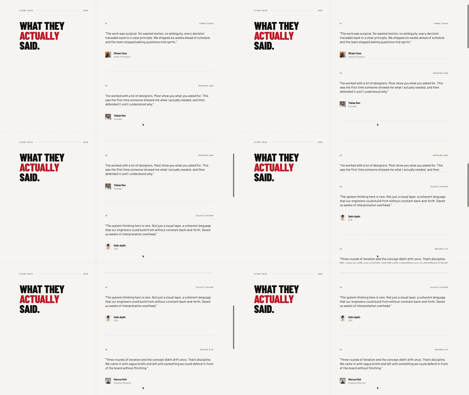
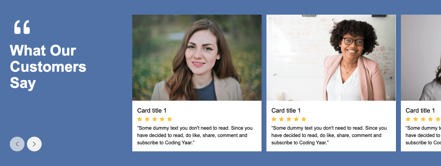
This testimonial section HTML CSS sticky scroll tutorial shows you how to build a two-column layout where the left panel stays fixed while the testimonial blocks on the right stack on top of each other as you scroll. Each block covers the previous one, creating a clean stacking scroll effect. The layout collapses to a single column on mobile.
Final output:
04 FIELD NOTES
HEARD
IN THE WILD.
MONO disappears into the room visually, then completely takes it over sonically. The spatial imaging is almost architectural.
Mara Holt
Sound & Vision
A rare object where industrial restraint and serious acoustic engineering genuinely reinforce one another.
Jon Bell
Form Journal
It handles quiet music with the same confidence as a packed- room session. Precise, physical, and never clinical.
Elias Kim
Producer / Berlin
Steps for Testimonial Section HTML CSS:
1. First, link the Outfit and Unbounded fonts from Google Fonts in the head.
<link rel="preconnect" href="https://fonts.googleapis.com">
<link rel="preconnect" href="https://fonts.gstatic.com" crossorigin>
<link href="https://fonts.googleapis.com/css2?family=Outfit:wght@100..900&family=Unbounded:wght@200..900&display=swap"
    rel="stylesheet">
Let’s start with a section element with the class testimonial-section. Inside it, add a .section-label paragraph, a .section-title heading, and a .testimonial-blocks-wrapper div.
<section class="testimonial-section">
    <p class="section-label"><span>04</span> FIELD NOTES <span class="rule"></span></p>
    <h2 class="section-title">HEARD <br> IN THE WILD.</h2>
    <div class="testimonial-blocks-wrapper"></div>
</section>
Then reset margins, set Outfit as the font family, and define the Unbounded font and lime green color as CSS variables on the body. Give the section a near-black background with a warm cream text color and some padding.
* {
    margin: 0;
    box-sizing: border-box;
}
body {
    font-family: "Outfit", sans-serif;
    --heading-font: "Unbounded", sans-serif;
    --lime: hsla(71, 100%, 47%, 1);
}
.testimonial-section {
    padding: 3.75rem 5% 9.5rem;
    background-color: hsla(0, 0%, 3%, 1);
    color: hsla(37, 39%, 94%, 1);
}
2. Style the .section-label. Use flexbox with the align items property set to center so the number, text, and rule all sit on the same line. The .rule span stretches to fill all remaining space using the flex property set to 1, creating a horizontal line that runs from the label to the right edge of the section.
.testimonial-section .section-label {
    font-size: 0.625rem;
    line-height: 1;
    letter-spacing: 1.6px;
    color: var(--lime);
    display: flex;
    align-items: center;
    gap: 1.125rem;
}
.testimonial-section .rule {
    flex: 1;
    height: 1px;
    background-color: hsla(0, 0%, 100%, 0.15);
}
Style the heading with the Unbounded font at a very large size using clamp() so it scales smoothly. Set the line height property to 0.9 and a large negative letter spacing to make the heavy uppercase text feel tight and impactful.
.testimonial-section .section-title {
    margin-top: 3.25rem;
    font-family: var(--heading-font);
    font-weight: 900;
    font-size: clamp(3rem, calc(1rem + 6.89vw), 7.2rem);
    line-height: .9;
    letter-spacing: -0.075em;
}
Output:
04 FIELD NOTES
HEARD
IN THE WILD.
3. Fill in .testimonial-blocks-wrapper with three .testimonial-block divs. Each block has a .quotes span, a .testimonial-text paragraph, and a .testimonial-block-bottom div with the reviewer name and publication.
<div class="testimonial-blocks-wrapper">
    <div class="testimonial-block">
        <span class="quotes">"</span>
        <p class="testimonial-text">MONO disappears into the room visually, then completely takes it over sonically. The spatial imaging is almost architectural.</p>
        <div class="testimonial-block-bottom">
            <p>Mara Holt</p>
            <p>Sound & Vision</p>
        </div>
    </div>
    <!-- add more blocks -->
</div>
Add a border around .testimonial-blocks-wrapper and use a three-column grid so the blocks sit side by side. On tablet and below, collapse to a single column. Add a right border on each block except the last using :not(:last-child), and switch to a bottom border on mobile instead.
.testimonial-section .testimonial-blocks-wrapper {
    margin-top: 5.625rem;
    border: 1px solid hsla(0, 0%, 100%, 0.15);
    display: grid;
    grid-template-columns: repeat(3, 1fr);
}
@media screen and (max-width: 992px) {
    .testimonial-section .testimonial-blocks-wrapper {
        grid-template-columns: 1fr;
    }
}
.testimonial-section .testimonial-block {
    padding: 2rem;
    display: flex;
    flex-direction: column;
}
.testimonial-section .testimonial-block:not(:last-child) {
    border-right: 1px solid hsla(0, 0%, 100%, 0.15);
}
@media screen and (max-width: 992px) {
    .testimonial-section .testimonial-block:not(:last-child) {
        border-right: none;
        border-bottom: 1px solid hsla(0, 0%, 100%, 0.15);
    }
}
Output:
04 FIELD NOTES
HEARD
IN THE WILD.
MONO disappears into the room visually, then completely takes it over sonically. The spatial imaging is almost architectural.
Mara Holt
Sound & Vision
A rare object where industrial restraint and serious acoustic engineering genuinely reinforce one another.
Jon Bell
Form Journal
It handles quiet music with the same confidence as a packed- room session. Precise, physical, and never clinical.
Elias Kim
Producer / Berlin
4. Style the .quotes span with the Unbounded font at a large size in the lime green color so it acts as a strong visual accent above the quote text. Style the .testimonial-text with a light font weight and a generous font size so it reads as the focal point of each block.
Add top and bottom margin using the margin block property to space it away from the quote icon above and the author details below. Set the margin top property to auto on .testimonial-block-bottom so it always sticks to the bottom of each block regardless of how long the quote is.
.testimonial-section .quotes {
    font-family: var(--heading-font);
    font-weight: 900;
    font-size: 3.25rem;
    line-height: .8;
    color: var(--lime);
}
.testimonial-section .testimonial-text {
    margin-block: 2.625rem 5.125rem;
    font-weight: 300;
    font-size: 1.5rem;
    line-height: 1.375;
}
.testimonial-section .testimonial-block-bottom {
    margin-top: auto;
}
.testimonial-section .testimonial-block-bottom p {
    font-size: 0.75rem;
    line-height: 1.1;
    letter-spacing: 0.9px;
    text-transform: uppercase;
}
.testimonial-section .testimonial-block-bottom p:last-child {
    margin-top: .375rem;
    color: hsla(37, 39%, 94%, 0.28);
}
Output:
04 FIELD NOTES
HEARD
IN THE WILD.
MONO disappears into the room visually, then completely takes it over sonically. The spatial imaging is almost architectural.
Mara Holt
Sound & Vision
A rare object where industrial restraint and serious acoustic engineering genuinely reinforce one another.
Jon Bell
Form Journal
It handles quiet music with the same confidence as a packed- room session. Precise, physical, and never clinical.
Elias Kim
Producer / Berlin
Final Output Code for Testimonial Section HTML CSS:
HTML
<section class="testimonial-section">
    <p class="section-label"><span>04</span> FIELD NOTES <span class="rule"></span></p>
    <h2 class="section-title">HEARD <br>
        IN THE WILD.</h2>
    <div class="testimonial-blocks-wrapper">
        <div class="testimonial-block">
            <span class="quotes">“</span>
            <p class="testimonial-text">MONO disappears into the room
                visually, then completely takes it
                over sonically. The spatial imaging
                is almost architectural.</p>
            <div class="testimonial-block-bottom">
                <p>Mara Holt</p>
                <p>Sound & Vision</p>
            </div>
        </div>
        <div class="testimonial-block">
            <span class="quotes">“</span>
            <p class="testimonial-text">A rare object where industrial
                restraint and serious acoustic
                engineering genuinely reinforce
                one another.</p>
            <div class="testimonial-block-bottom">
                <p>Jon Bell</p>
                <p>Form Journal</p>
            </div>
        </div>
        <div class="testimonial-block">
            <span class="quotes">“</span>
            <p class="testimonial-text">It handles quiet music with the
                same confidence as a packed-
                room session. Precise, physical,
                and never clinical.</p>
            <div class="testimonial-block-bottom">
                <p>Elias Kim</p>
                <p>Producer / Berlin</p>
            </div>
        </div>
    </div>
</section>
CSS
* {
    margin: 0;
    box-sizing: border-box;
}
body {
    font-family: "Outfit", sans-serif;
    --heading-font: "Unbounded", sans-serif;
    --lime: hsla(71, 100%, 47%, 1);
}
.testimonial-section {
    padding: 3.75rem 5% 9.5rem;
    background-color: hsla(0, 0%, 3%, 1);
    color: hsla(37, 39%, 94%, 1);
}
.testimonial-section .section-label {
    font-size: 0.625rem;
    line-height: 1;
    letter-spacing: 1.6px;
    color: var(--lime);
    display: flex;
    align-items: center;
    gap: 1.125rem;
}
.testimonial-section .rule {
    flex: 1;
    height: 1px;
    background-color: hsla(0, 0%, 100%, 0.15);
}
.testimonial-section .section-title {
    margin-top: 3.25rem;
    font-family: var(--heading-font);
    font-weight: 900;
    font-size: clamp(3rem, calc(1rem + 6.89vw), 7.2rem);
    line-height: .9;
    letter-spacing: -0.075em;
}
.testimonial-section .testimonial-blocks-wrapper {
    margin-top: 5.625rem;
    border: 1px solid hsla(0, 0%, 100%, 0.15);
    display: grid;
    grid-template-columns: repeat(3, 1fr);
}
@media screen and (max-width: 992px) {
    .testimonial-section .testimonial-blocks-wrapper {
        grid-template-columns: 1fr;
    }
}
.testimonial-section .testimonial-block {
    padding: 2rem;
    display: flex;
    flex-direction: column;
}
.testimonial-section .testimonial-block:not(:last-child) {
    border-right: 1px solid hsla(0, 0%, 100%, 0.15);
}
@media screen and (max-width: 992px) {
    .testimonial-section .testimonial-block:not(:last-child) {
        border-right: none;
        border-bottom: 1px solid hsla(0, 0%, 100%, 0.15);
    }
}
.testimonial-section .quotes {
    font-family: var(--heading-font);
    font-weight: 900;
    font-size: 3.25rem;
    line-height: .8;
    color: var(--lime);
}
.testimonial-section .testimonial-text {
    margin-block: 2.625rem 5.125rem;
    font-weight: 300;
    font-size: 1.5rem;
    line-height: 1.375;
}
.testimonial-section .testimonial-block-bottom {
    margin-top: auto;
}
.testimonial-section .testimonial-block-bottom p {
    font-size: 0.75rem;
    line-height: 1.1;
    letter-spacing: 0.9px;
    text-transform: uppercase;
}
.testimonial-section .testimonial-block-bottom p:last-child {
    margin-top: .375rem;
    color: hsla(37, 39%, 94%, 0.28);
}
If you have any doubts or stuck somewhere, you can reach out through Coding Yaar's Discord server.