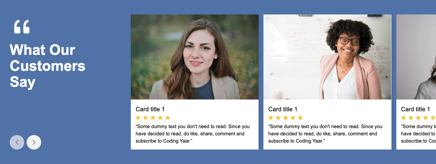
This testimonial section HTML CSS sticky scroll tutorial shows you how to build a two-column layout where the left panel stays fixed while the testimonial blocks on the right stack on top of each other as you scroll. Each block covers the previous one, creating a clean stacking scroll effect. The layout collapses to a single column on mobile.
Final output:
What they actually
said.
“The work was surgical. No wasted motion, no ambiguity, every decision traceable back to a clear principle. We shipped six weeks ahead of schedule and the team stopped asking questions mid-sprint.”

Miriam Voss
Head of Product“I’ve worked with a lot of designers. Most show you what you asked for. This was the first time someone showed me what I actually needed, and then defended it until I understood why.”

Tobias Ren
Founder“The system thinking here is rare. Not just a visual layer, a coherent language that our engineers could build from without constant back-and-forth. Saved us weeks of interpretation overhead.”

Selin Aydin
CTO“Three rounds of iteration and the concept didn’t drift once. That’s discipline. We came in with vague briefs and left with something we could defend in front of the board without flinching.”

Marcus Holt
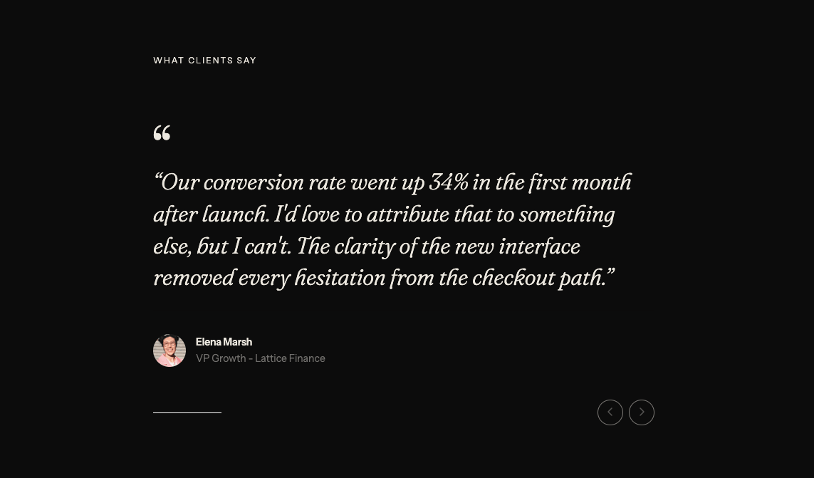
Creative Director“Our conversion rate went up 34% in the first month after launch. I’d love to attribute that to something else, but I can’t. The clarity of the new interface removed every hesitation from the checkout path.”

Elena Marsh
VP Growth“We asked for a homepage refresh. We got a complete rethinking of how we communicate our value. Uncomfortable at first. Correct in the end. Our bounce rate dropped by half in three weeks.”

Florian Kaas
CEOSteps for Testimonial Section HTML CSS Sticky Scroll:
1. First, link your fonts(I am using the Barlow and Barlow Condensed fonts from Google Fonts) in the head if needed.
<link rel="preconnect" href="https://fonts.googleapis.com">
<link rel="preconnect" href="https://fonts.gstatic.com" crossorigin>
<link
    href="https://fonts.googleapis.com/css2?family=Barlow+Condensed:wght@400;600;800&family=Barlow:wght@300;400;600&display=swap"
    rel="stylesheet">
Start with a section element with the class section-testimonials. Inside it, add a .testimonials-wrapper div with a .testimonials-left and a .testimonials-right div.
<section class="section-testimonials">
    <div class="testimonials-wrapper">
        <div class="testimonials-left"></div>
        <div class="testimonials-right"></div>
    </div>
</section>
Reset margins, set Barlow as the font family, and define two CSS variables on the :root for the font color and border color so you can reuse them throughout. Give the section a warm off-white background and some horizontal padding.
* {
    margin: 0;
    box-sizing: border-box;
}
body {
    font-family: "Barlow", sans-serif;
}
:root {
    --font-grey: hsla(60, 8%, 5%, 1);
    --border-grey: hsla(60, 8%, 5%, 0.12);
}
.section-testimonials {
    background-color: #F7F6F2;
    color: var(--font-grey);
    padding: 0 5%;
}
Style .testimonials-wrapper with a two-column grid so the left panel takes up less space than the right. Center it with the margin inline property set to auto and a max-width. On mobile, collapse to a single column so both sides stack vertically.
.section-testimonials .testimonials-wrapper {
    display: grid;
    grid-template-columns: 1fr 1.5fr;
    max-width: 90rem;
    margin: 0 auto;
}
@media screen and (max-width: 992px) {
    .section-testimonials .testimonials-wrapper {
        grid-template-columns: 1fr;
    }
}
2. Fill in .testimonials-left with a top row div containing the label, a rule, and the year. Then add the heading with a highlighted span and a horizontal rule below it.
<div class="testimonials-left">
    <div>
        <span class="section-label">Client Voice</span>
        <span class="rule"></span>
        <span>2026</span>
    </div>
    <h2>What they <span>actually</span><br> said.</h2>
    <span class="rule"></span>
</div>
Add some padding to the left panel and a right border to visually separate it from the right column.
.section-testimonials .testimonials-left {
    padding: 2.5rem 1rem;
}
@media screen and (min-width: 769px) {
    .section-testimonials .testimonials-left {
        padding: 3.5rem 3rem;
        border-right: 1px solid var(--border-grey);
    }
}
Output:
What they actually
said.
3. Style the top row div inside .testimonials-left. Use flexbox with the justify-content property set to space-between to push the label and year to opposite ends. The .rule span acts as a horizontal line, so set the flex property to 1 on it so it stretches to fill all the remaining space between the label and year.
.section-testimonials .testimonials-left > div {
    color: #7A7870;
    display: flex;
    gap: 1rem;
    align-items: center;
    justify-content: space-between;
    font-family: "Barlow Condensed", sans-serif;
    font-size: .75rem;
    line-height: 1.3;
    font-weight: 600;
    letter-spacing: 2.2px;
    text-transform: uppercase;
}
.section-testimonials .rule {
    flex: 1;
    height: 1px;
    background-color: var(--border-grey);
}
Style the heading with the Barlow Condensed font in a heavy weight. Use clamp() on the font size so it scales smoothly between screen sizes. Set the line height property to 0.9 and use a negative letter spacing to make the large uppercase text feel compact and impactful. The span inside gets a red color to highlight the word “actually” and create contrast with the rest of the heading.
.section-testimonials .testimonials-left h2 {
    margin-top: 3.375rem;
    font-family: "Barlow Condensed", sans-serif;
    font-weight: 800;
    font-size: clamp(2rem, calc(8vw + 1rem), 4.25rem);
    line-height: .9;
    letter-spacing: -1.34px;
    text-transform: uppercase;
    color: hsl(60, 8%, 5%);
}
.section-testimonials .testimonials-left h2 span {
    color: hsl(2, 75%, 47%);
}
Output:
What they actually
said.
4. Fill in .testimonials-right with the testimonial blocks. Each .testimonial-block has a header div with the number and company name, a quote paragraph, and a footer div with the client image and their details.
<div class="testimonials-right">
    <div class="testimonial-block">
        <div>
            <span>01</span>
            <span class="section-label">FORMA STUDIO</span>
        </div>
        <p class="testimonial-text">"The work was surgical..."</p>
        <div class="testimonial-block-footer">
            <img src="Miriam Voss.png" alt="">
            <div>
                <h3>Miriam Voss</h3>
                <span>Head of Product</span>
            </div>
        </div>
    </div>
    <!-- add more blocks -->
</div>
Add padding to the right panel. On desktop, increase the padding so the blocks feel more spacious.
.section-testimonials .testimonials-right {
    padding: 2.5rem 1rem;
}
@media screen and (min-width: 769px) {
    .section-testimonials .testimonials-right {
        padding: 3.5rem;
    }
}
Output:
What they actually
said.
“The work was surgical. No wasted motion, no ambiguity, every decision traceable back to a clear principle. We shipped six weeks ahead of schedule and the team stopped asking questions mid-sprint.”
Miriam Voss
Head of Product“I’ve worked with a lot of designers. Most show you what you asked for. This was the first time someone showed me what I actually needed, and then defended it until I understood why.”
Tobias Ren
Founder“The system thinking here is rare. Not just a visual layer, a coherent language that our engineers could build from without constant back-and-forth. Saved us weeks of interpretation overhead.”
Selin Aydin
CTO“Three rounds of iteration and the concept didn’t drift once. That’s discipline. We came in with vague briefs and left with something we could defend in front of the board without flinching.”
Marcus Holt
Creative Director“Our conversion rate went up 34% in the first month after launch. I’d love to attribute that to something else, but I can’t. The clarity of the new interface removed every hesitation from the checkout path.”
Elena Marsh
VP Growth“We asked for a homepage refresh. We got a complete rethinking of how we communicate our value. Uncomfortable at first. Correct in the end. Our bounce rate dropped by half in three weeks.”
Florian Kaas
CEO5. Style each .testimonial-block. Add some padding above and below each block using the padding block property. Add a top border on all blocks except the first using :not(:first-child), and a bottom border on the last one, so the blocks feel like a stacked list with clean dividers between them.
.section-testimonials .testimonial-block {
    padding-block: 5rem;
    background-color: #F7F6F2;
}
.section-testimonials .testimonial-block:not(:first-child) {
    border-top: 1px solid var(--border-grey);
}
.section-testimonials .testimonial-block:last-child {
    border-bottom: 1px solid var(--border-grey);
}
Now style the header row inside each block. Set the justify-content property to space-between so the number and company name sit at opposite ends of the row. Also set the margin-bottom property to 2.5rem to space it away from the quote below it.
.section-testimonials .testimonial-block > :first-child {
    color: #7A7870;
    display: flex;
    gap: 1rem;
    align-items: center;
    justify-content: space-between;
    font-family: "Barlow Condensed", sans-serif;
    font-size: .75rem;
    line-height: 1.3;
    font-weight: 600;
    letter-spacing: 2.2px;
    text-transform: uppercase;
    margin-bottom: 2.5rem;
}
Output:
What they actually
said.
“The work was surgical. No wasted motion, no ambiguity, every decision traceable back to a clear principle. We shipped six weeks ahead of schedule and the team stopped asking questions mid-sprint.”
Miriam Voss
Head of Product“I’ve worked with a lot of designers. Most show you what you asked for. This was the first time someone showed me what I actually needed, and then defended it until I understood why.”
Tobias Ren
Founder“The system thinking here is rare. Not just a visual layer, a coherent language that our engineers could build from without constant back-and-forth. Saved us weeks of interpretation overhead.”
Selin Aydin
CTO“Three rounds of iteration and the concept didn’t drift once. That’s discipline. We came in with vague briefs and left with something we could defend in front of the board without flinching.”
Marcus Holt
Creative Director“Our conversion rate went up 34% in the first month after launch. I’d love to attribute that to something else, but I can’t. The clarity of the new interface removed every hesitation from the checkout path.”
Elena Marsh
VP Growth“We asked for a homepage refresh. We got a complete rethinking of how we communicate our value. Uncomfortable at first. Correct in the end. Our bounce rate dropped by half in three weeks.”
Florian Kaas
CEO6. Style the testimonial quote with a light font weight and a generous font size so it reads as the focal point of each block. Then style the footer with flexbox to lay the image and client details side by side. Fix the image size so it stays consistent across all blocks.
.section-testimonials .testimonial-text {
    font-weight: 300;
    font-size: 1.25rem;
    line-height: 1.3;
    margin-bottom: 3rem;
}
.section-testimonials .testimonial-block-footer {
    display: flex;
    gap: 1rem;
}
.section-testimonials .testimonial-block-footer img {
    width: 2.25rem;
    height: 2.25rem;
}
.section-testimonials .testimonial-block-footer h3 {
    font-weight: 600;
    font-size: 1rem;
    line-height: 1.3;
    letter-spacing: -0.32px;
}
.section-testimonials .testimonial-block-footer span {
    font-size: .875rem;
    line-height: 1.3;
    letter-spacing: 0.3px;
    color: hsl(48, 4%, 46%);
}
Output:
What they actually
said.
“The work was surgical. No wasted motion, no ambiguity, every decision traceable back to a clear principle. We shipped six weeks ahead of schedule and the team stopped asking questions mid-sprint.”
Miriam Voss
Head of Product“I’ve worked with a lot of designers. Most show you what you asked for. This was the first time someone showed me what I actually needed, and then defended it until I understood why.”
Tobias Ren
Founder“The system thinking here is rare. Not just a visual layer, a coherent language that our engineers could build from without constant back-and-forth. Saved us weeks of interpretation overhead.”
Selin Aydin
CTO“Three rounds of iteration and the concept didn’t drift once. That’s discipline. We came in with vague briefs and left with something we could defend in front of the board without flinching.”
Marcus Holt
Creative Director“Our conversion rate went up 34% in the first month after launch. I’d love to attribute that to something else, but I can’t. The clarity of the new interface removed every hesitation from the checkout path.”
Elena Marsh
VP Growth“We asked for a homepage refresh. We got a complete rethinking of how we communicate our value. Uncomfortable at first. Correct in the end. Our bounce rate dropped by half in three weeks.”
Florian Kaas
CEO7. Now let’s add the sticky scroll effect. On desktop, set the position property to sticky and the top property to 0 on .testimonials-left, and set the height property to 100vh. This keeps the left panel fixed in view as the user scrolls through all the testimonials on the right side.
Then set the position property to sticky and the top property to 3.5rem on each .testimonial-block so each block stacks on top of the previous one as you scroll down.
Since the background color of each block matches the section, each new block cleanly covers the one before it, creating that satisfying stacking scroll effect.
@media screen and (min-width: 769px) {
    .section-testimonials .testimonials-left {
        position: sticky;
        top: 0;
        height: 100vh;
    }
}
.section-testimonials .testimonial-block {
    position: sticky;
    top: 3.5rem;
}
Output:
What they actually
said.
“The work was surgical. No wasted motion, no ambiguity, every decision traceable back to a clear principle. We shipped six weeks ahead of schedule and the team stopped asking questions mid-sprint.”
Miriam Voss
Head of Product“I’ve worked with a lot of designers. Most show you what you asked for. This was the first time someone showed me what I actually needed, and then defended it until I understood why.”
Tobias Ren
Founder“The system thinking here is rare. Not just a visual layer, a coherent language that our engineers could build from without constant back-and-forth. Saved us weeks of interpretation overhead.”
Selin Aydin
CTO“Three rounds of iteration and the concept didn’t drift once. That’s discipline. We came in with vague briefs and left with something we could defend in front of the board without flinching.”
Marcus Holt
Creative Director“Our conversion rate went up 34% in the first month after launch. I’d love to attribute that to something else, but I can’t. The clarity of the new interface removed every hesitation from the checkout path.”
Elena Marsh
VP Growth“We asked for a homepage refresh. We got a complete rethinking of how we communicate our value. Uncomfortable at first. Correct in the end. Our bounce rate dropped by half in three weeks.”
Florian Kaas
CEOFinal Output Code for Testimonial Section HTML CSS Sticky Scroll:
HTML
<section class="section-testimonials">
    <div class="testimonials-wrapper">
        <div class="testimonials-left">
            <div>
                <span class="section-label">Client Voice</span>
                <span class="rule"></span>
                <span>2026</span>
            </div>
            <h2>What they <span> actually</span><br> said.</h2>
            <span class="rule"></span>
        </div>
        <div class="testimonials-right">
            <div class="testimonial-block">
                <div>
                    <span>01</span>
                    <span class="section-label">FORMA STUDIO</span>
                </div>
                <p class="testimonial-text">
                    "The work was surgical. No wasted motion, no ambiguity, every decision traceable back to a clear
                    principle. We shipped six weeks ahead of schedule and the team stopped asking questions
                    mid-sprint."
                </p>
                <div class="testimonial-block-footer">
                    <img src="Miriam Voss.png" alt="">
                    <div>
                        <h3>Miriam Voss</h3>
                        <span>Head of Product</span>
                    </div>
                </div>
            </div>
            <div class="testimonial-block">
                <div>
                    <span>02</span>
                    <span class="section-label">MERIDIAN LABS</span>
                </div>
                <p class="testimonial-text">
                    "I've worked with a lot of designers. Most show you what you asked for. This was the first time
                    someone showed me what I actually needed, and then defended it until I understood why."
                </p>
                <div class="testimonial-block-footer">
                    <img src="Tobias Ren.png" alt="">
                    <div>
                        <h3>Tobias Ren</h3>
                        <span>Founder</span>
                    </div>
                </div>
            </div>
            <div class="testimonial-block">
                <div>
                    <span>03</span>
                    <span class="section-label">CELESTE SYSTEMS</span>
                </div>
                <p class="testimonial-text">
                    "The system thinking here is rare. Not just a visual layer, a coherent language that our
                    engineers could build from without constant back-and-forth. Saved us weeks of interpretation
                    overhead."
                </p>
                <div class="testimonial-block-footer">
                    <img src="Selin Aydin.png" alt="">
                    <div>
                        <h3>Selin Aydin</h3>
                        <span>CTO</span>
                    </div>
                </div>
            </div>
            <div class="testimonial-block">
                <div>
                    <span>04</span>
                    <span class="section-label">BEACON & CO</span>
                </div>
                <p class="testimonial-text">
                    "Three rounds of iteration and the concept didn't drift once. That's discipline. We came in with
                    vague briefs and left with something we could defend in front of the board without flinching."
                </p>
                <div class="testimonial-block-footer">
                    <img src="Marcus Holt.png" alt="">
                    <div>
                        <h3>Marcus Holt</h3>
                        <span>Creative Director</span>
                    </div>
                </div>
            </div>
            <div class="testimonial-block">
                <div>
                    <span>05</span>
                    <span class="section-label">LATTICE FINANCE</span>
                </div>
                <p class="testimonial-text">
                    "Our conversion rate went up 34% in the first month after launch. I'd love to attribute that to
                    something else, but I can't. The clarity of the new interface removed every hesitation from the
                    checkout path."
                </p>
                <div class="testimonial-block-footer">
                    <img src="Elena Marsh.png" alt="">
                    <div>
                        <h3>Elena Marsh</h3>
                        <span>VP Growth</span>
                    </div>
                </div>
            </div>
            <div class="testimonial-block">
                <div>
                    <span>06</span>
                    <span class="section-label">KINDRED HEALTH</span>
                </div>
                <p class="testimonial-text">
                    "We asked for a homepage refresh. We got a complete rethinking of how we communicate our value.
                    Uncomfortable at first. Correct in the end. Our bounce rate dropped by half in three weeks."
                </p>
                <div class="testimonial-block-footer">
                    <img src="Florian Kaas.png" alt="">
                    <div>
                        <h3>Florian Kaas</h3>
                        <span>CEO</span>
                    </div>
                </div>
            </div>
        </div>
    </div>
</section>
CSS
* {
    margin: 0;
    box-sizing: border-box;
}

:root {
    --font-grey: hsla(60, 8%, 5%, 1);
    --border-grey: hsla(60, 8%, 5%, 0.12);
}

body {
    font-family: "Barlow", sans-serif;
}

.section-testimonials {
    background-color: #F7F6F2;
    color: var(--font-grey);
    padding: 0 5%;
}

.section-testimonials .testimonials-wrapper {
    display: grid;
    grid-template-columns: 1fr 1.5fr;
    max-width: 90rem;
    margin: 0 auto;
}

@media screen and (max-width: 768px) {
    .section-testimonials .testimonials-wrapper {
        grid-template-columns: 1fr;
    }
}

.section-testimonials .testimonials-left {
    padding: 2.5rem 1rem;
}

@media screen and (min-width: 992px) {
    .section-testimonials .testimonials-left {
        position: sticky;
        top: 0;
        height: 100vh;
        padding: 3.5rem 3rem;
        border-right: 1px solid var(--border-grey);
    }
}

.section-testimonials .testimonials-left > div {
    color: #7A7870;
    display: flex;
    gap: 1rem;
    align-items: center;
    justify-content: space-between;
    font-family: "Barlow Condensed", sans-serif;
    font-size: 0.75rem;
    line-height: 1.3;
    font-weight: 600;
    letter-spacing: 2.2px;
    text-transform: uppercase;
}

.section-testimonials .testimonials-left > div .rule {
    flex: 1;
    height: 1px;
    background-color: var(--border-grey);
}

.section-testimonials .testimonials-left h2 {
    margin-top: 3.375rem;
    font-family: "Barlow Condensed", sans-serif;
    font-weight: 800;
    font-size: clamp(2rem, calc(8vw + 1rem), 4.25rem);
    line-height: 0.9;
    letter-spacing: -1.34px;
    text-transform: uppercase;
    color: hsl(60, 8%, 5%);
}

.section-testimonials .testimonials-left h2 span {
    color: hsl(2, 75%, 47%);
}

.section-testimonials .testimonials-right {
    padding: 2.5rem 1rem;
}

@media screen and (min-width: 769px) {
    .section-testimonials .testimonials-right {
        padding: 3.5rem;
    }
}

.section-testimonials .testimonial-block {
    padding-block: 5rem;
    position: sticky;
    top: 3.5rem;
    background-color: #F7F6F2;
}

.section-testimonials .testimonial-block:not(:first-child) {
    border-top: 1px solid var(--border-grey);
}

.section-testimonials .testimonial-block:last-child {
    border-bottom: 1px solid var(--border-grey);
}

.section-testimonials .testimonial-block > :first-child {
    color: #7A7870;
    display: flex;
    gap: 1rem;
    align-items: center;
    justify-content: space-between;
    font-family: "Barlow Condensed", sans-serif;
    font-size: 0.75rem;
    line-height: 1.3;
    font-weight: 600;
    letter-spacing: 2.2px;
    text-transform: uppercase;
    margin-bottom: 2.5rem;
}

.section-testimonials .testimonial-text {
    font-weight: 300;
    font-size: 1.25rem;
    line-height: 1.3;
    margin-bottom: 3rem;
}

.section-testimonials .testimonial-block-footer {
    display: flex;
    gap: 1rem;
}

.section-testimonials .testimonial-block-footer img {
    width: 2.25rem;
    height: 2.25rem;
}

.section-testimonials .testimonial-block-footer h3 {
    font-weight: 600;
    font-size: 1rem;
    line-height: 1.3;
    letter-spacing: -0.32px;
}

.section-testimonials .testimonial-block-footer span {
    font-size: 0.875rem;
    line-height: 1.3;
    letter-spacing: 0.3px;
    color: hsl(48, 4%, 46%);
}
If you have any doubts or stuck somewhere, you can reach out through Coding Yaar's Discord server.