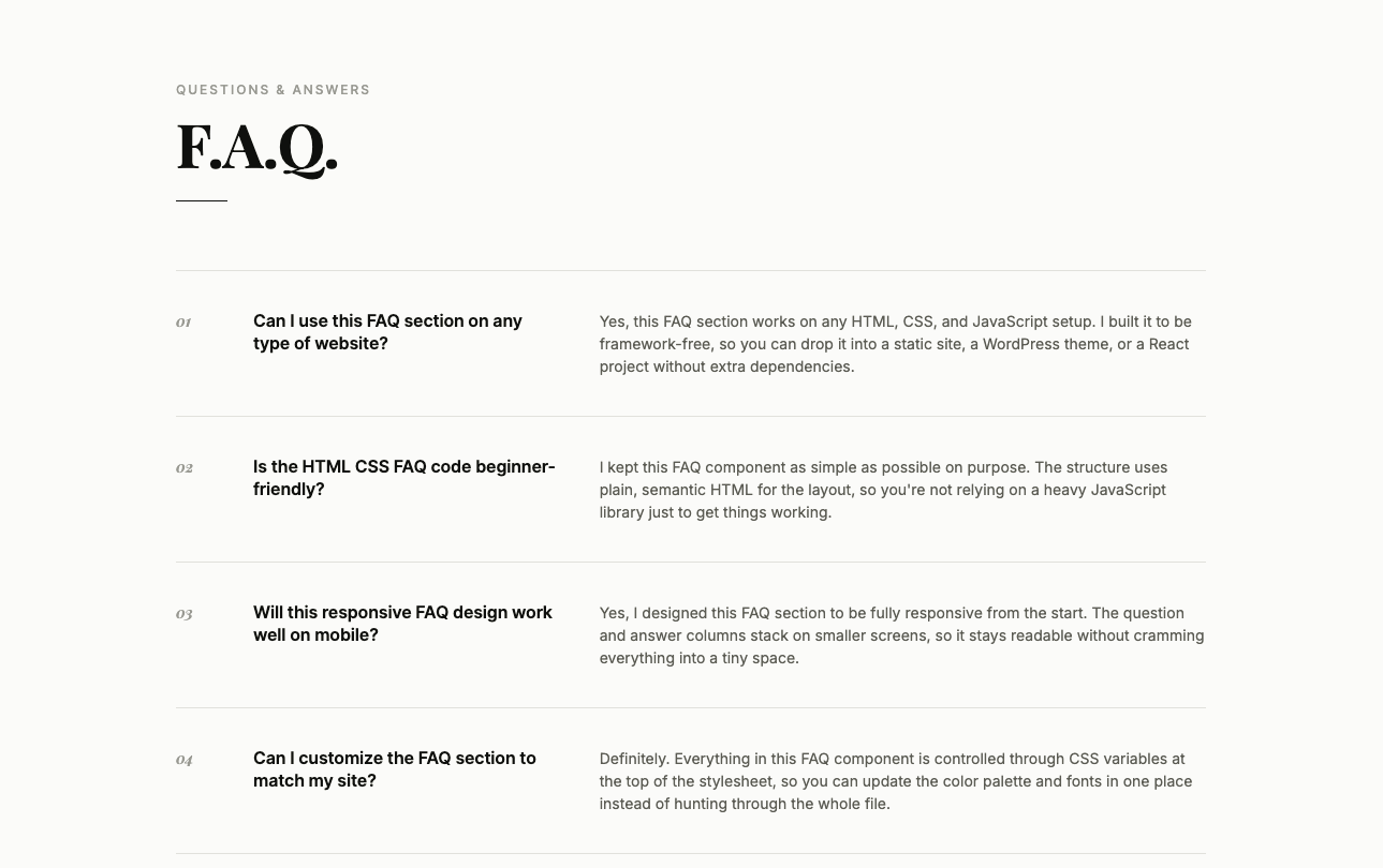
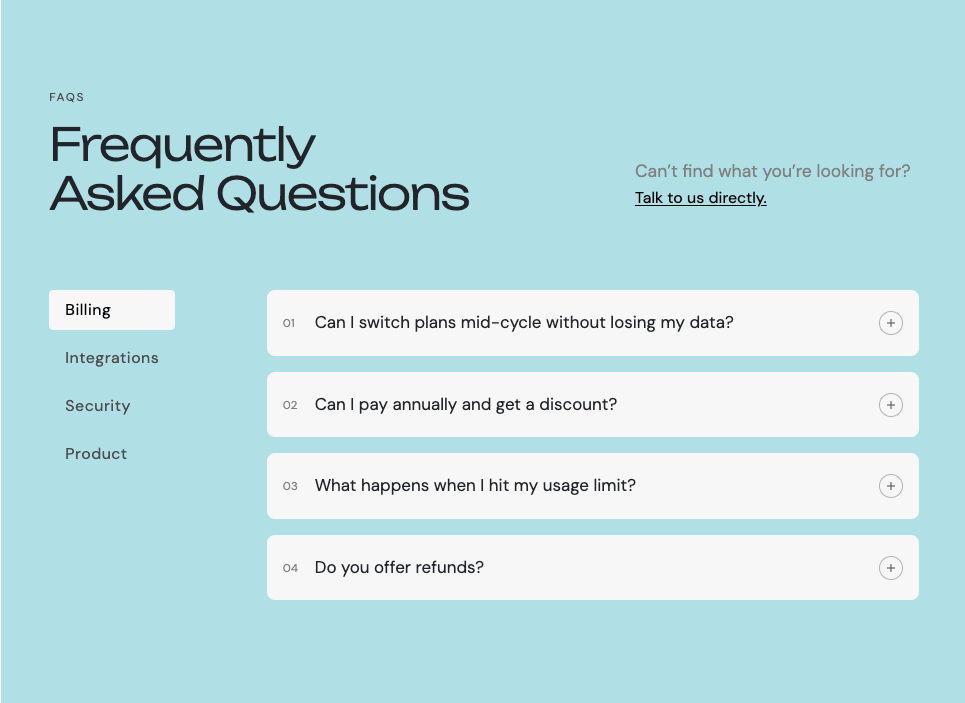
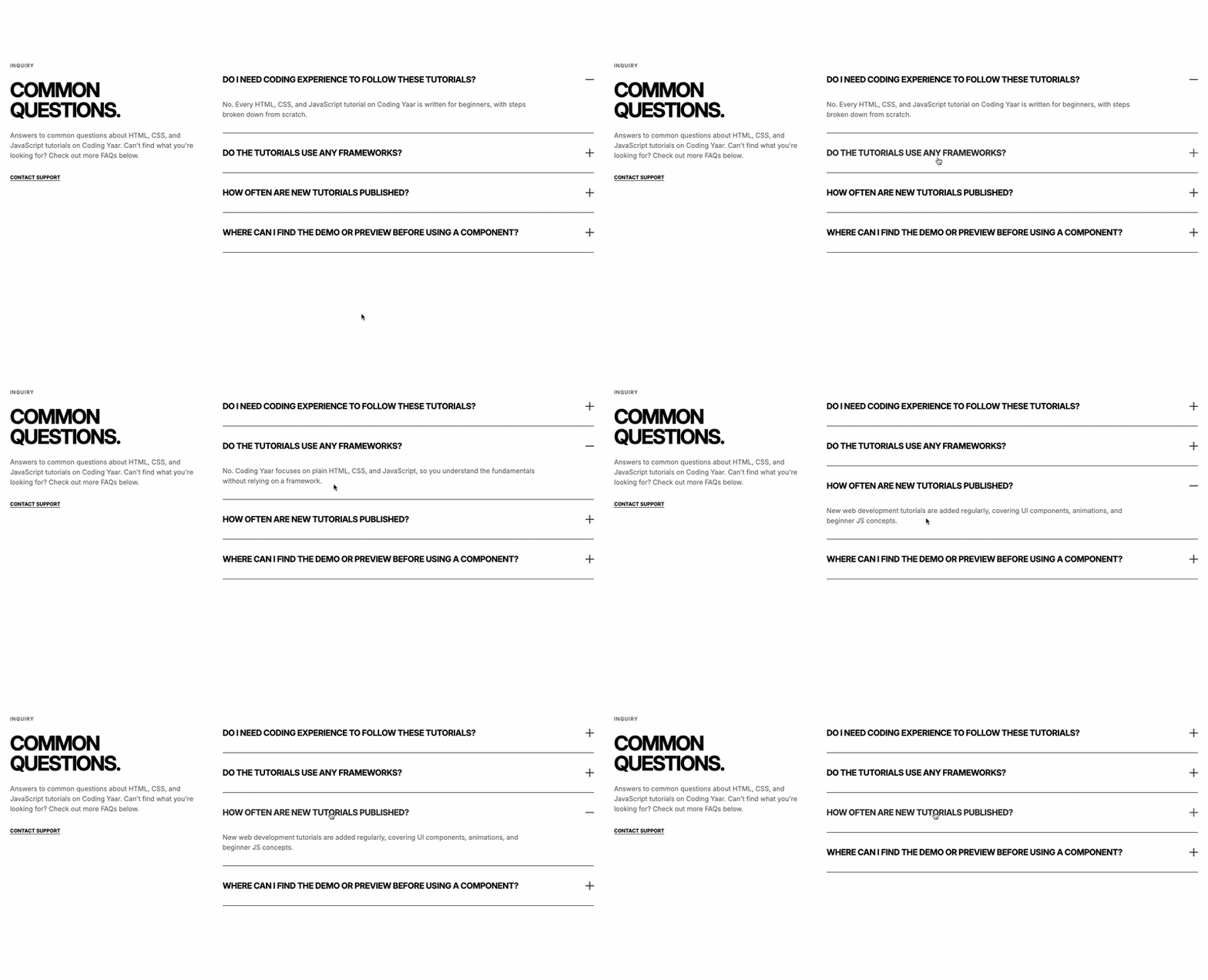
This FAQ section design HTML CSS tutorial shows you how to build a clean two-column FAQ layout with a large heading, a bordered header, and numbered question blocks. Each block uses flexbox to place the number beside the question and answer, and a faint bottom border separates every item. There is no JavaScript involved, and the grid collapses to a single column on mobile so everything stays readable.
Final output:
FAQ
Good to know.
Can I use this FAQ section on any type of website?
Yes, this FAQ section works on any HTML, CSS, and JavaScript setup. I built it to be framework-free, so you can drop it into a static site, a WordPress theme, or a React project without extra dependencies.
Is the HTML CSS FAQ code beginner-friendly?
I kept this FAQ component as simple as possible on purpose. The structure uses plain, semantic HTML for the layout, so you’re not relying on a heavy JavaScript library just to get things working.
Will this responsive FAQ design work well on mobile?
Yes, I designed this FAQ section to be fully responsive from the start. The faq columns stack on smaller screens, so it stays readable without cramming everything into a tiny space.
Can I customize the FAQ section to match my site?
Definitely. Everything in this FAQ component is controlled through CSS so you can update the color palette and font.
Can I add more questions to this FAQ section?
Yes, just copy one of the existing items and update the number, question, and answer. This FAQ component’s layout adjusts automatically, so you don’t need to touch the surrounding CSS.
Do I need JavaScript for this FAQ section?
No, this FAQ component is pure HTML and CSS. There’s no JavaScript involved at all, so you can copy this static FAQ section straight into any project without worrying about extra scripts or dependencies.
Steps for FAQ Section Design HTML CSS:
1. Start with the FAQ section structure
Link the Manrope font from Google Fonts in the head.
<link rel="preconnect" href="https://fonts.googleapis.com">
<link rel="preconnect" href="https://fonts.gstatic.com" crossorigin>
<link href="https://fonts.googleapis.com/css2?family=Manrope:wght@200..800&display=swap" rel="stylesheet">
Let’s start with a section element with the class faq-section. Inside it, I am adding a .section-container div with a .faq-header and a .faq-blocks-wrapper.
<section class="faq-section">
    <div class="section-container">
        <div class="faq-header"></div>
        <div class="faq-blocks-wrapper"></div>
    </div>
</section>
Then reset the margins and set Manrope as the font family. Give the section a warm off-white background with a deep green text color. Finally, center the container with the margin inline property set to auto and a max width.
* {
    margin: 0;
    box-sizing: border-box;
}
body {
    font-family: "Manrope", sans-serif;
}
.faq-section {
    padding: 6rem 5%;
    background-color: hsla(49, 31%, 93%, 1);
    color: hsla(140, 21%, 11%, 1);
}
.faq-section .section-container {
    max-width: 64rem;
    margin-inline: auto;
}
2. FAQ header
Next, fill in .faq-header with a label and a heading.
<div class="faq-header">
    <p class="section-label">FAQ</p>
    <h2>Good to know.</h2>
</div>
Add a bottom border and some bottom padding so the header is clearly separated from the questions below. Style the label with a small bold uppercase font and a wide letter spacing. For the heading, I am using clamp() on the font size so it scales smoothly, plus a tight line height and a negative letter spacing.
.faq-section .faq-header {
    padding-bottom: 3rem;
    border-bottom: 1px solid hsla(140, 21%, 11%, 1);
}
.faq-section .section-label {
    font-weight: 700;
    font-size: .75rem;
    line-height: 1.5;
    letter-spacing: 2.16px;
    text-transform: uppercase;
    color: hsla(141, 12%, 37%, 1);
}
.faq-section .faq-header h2 {
    margin-top: 1.25rem;
    font-weight: 500;
    font-size: clamp(3rem, calc(1rem + 3.89vw), 4.5rem);
    line-height: 1;
    letter-spacing: -0.06em;
}
Output:
FAQ
Good to know.
3. Add FAQ blocks
Now fill in .faq-blocks-wrapper with six .faq-block divs. Each block has a number span, and a div with the question and the answer.
<div class="faq-blocks-wrapper">
    <div class="faq-block">
        <span>01</span>
        <div>
            <h3>Can I use this FAQ section on any type of website?</h3>
            <p>Yes, this FAQ section works on any HTML, CSS, and JavaScript setup. I built it to be framework-free, so you can drop it into a static site, a WordPress theme, or a React project without extra dependencies.</p>
        </div>
    </div>
    <!-- add more blocks -->
</div>
Use a two-column grid on .faq-blocks-wrapper so the questions sit side by side. Add a top margin to space it away from the header. On mobile, collapse to a single column so each block gets the full width.
.faq-section .faq-blocks-wrapper {
    margin-top: 4rem;
    display: grid;
    grid-template-columns: 1fr 1fr;
    gap: 2rem 4rem;
}
@media screen and (max-width: 768px) {
    .faq-section .faq-blocks-wrapper {
        grid-template-columns: 1fr;
    }
}
Output:
FAQ
Good to know.
Can I use this FAQ section on any type of website?
Yes, this FAQ section works on any HTML, CSS, and JavaScript setup. I built it to be framework-free, so you can drop it into a static site, a WordPress theme, or a React project without extra dependencies.
Is the HTML CSS FAQ code beginner-friendly?
I kept this FAQ component as simple as possible on purpose. The structure uses plain, semantic HTML for the layout, so you’re not relying on a heavy JavaScript library just to get things working.
Will this responsive FAQ design work well on mobile?
Yes, I designed this FAQ section to be fully responsive from the start. The faq columns stack on smaller screens, so it stays readable without cramming everything into a tiny space.
Can I customize the FAQ section to match my site?
Definitely. Everything in this FAQ component is controlled through CSS so you can update the color palette and font.
Can I add more questions to this FAQ section?
Yes, just copy one of the existing items and update the number, question, and answer. This FAQ component’s layout adjusts automatically, so you don’t need to touch the surrounding CSS.
Do I need JavaScript for this FAQ section?
No, this FAQ component is pure HTML and CSS. There’s no JavaScript involved at all, so you can copy this static FAQ section straight into any project without worrying about extra scripts or dependencies.
4. Style the FAQ blocks
Style each .faq-block. Use flexbox with a gap so the number and the text sit side by side. Then add a faint bottom border and some bottom padding to create a clean divider under every question. I used the same number, question, and answer idea in my FAQ Section HTML CSS #3 post, so check that one out if you want a different layout for the same content.
.faq-section .faq-block {
    display: flex;
    gap: 1.25rem;
    padding-bottom: 2rem;
    border-bottom: 1px solid hsla(140, 21%, 11%, 0.2);
}
.faq-section .faq-block span {
    margin-top: .375rem;
    font-size: .625rem;
    line-height: 1.5;
    color: hsla(144, 6%, 47%, 1);
}
Output:
FAQ
Good to know.
Can I use this FAQ section on any type of website?
Yes, this FAQ section works on any HTML, CSS, and JavaScript setup. I built it to be framework-free, so you can drop it into a static site, a WordPress theme, or a React project without extra dependencies.
Is the HTML CSS FAQ code beginner-friendly?
I kept this FAQ component as simple as possible on purpose. The structure uses plain, semantic HTML for the layout, so you’re not relying on a heavy JavaScript library just to get things working.
Will this responsive FAQ design work well on mobile?
Yes, I designed this FAQ section to be fully responsive from the start. The faq columns stack on smaller screens, so it stays readable without cramming everything into a tiny space.
Can I customize the FAQ section to match my site?
Definitely. Everything in this FAQ component is controlled through CSS so you can update the color palette and font.
Can I add more questions to this FAQ section?
Yes, just copy one of the existing items and update the number, question, and answer. This FAQ component’s layout adjusts automatically, so you don’t need to touch the surrounding CSS.
Do I need JavaScript for this FAQ section?
No, this FAQ component is pure HTML and CSS. There’s no JavaScript involved at all, so you can copy this static FAQ section straight into any project without worrying about extra scripts or dependencies.
5. Style the question and the answer
Give the question a larger font size and a slight negative letter spacing so it stands out. Then use a smaller font size and a muted greenish gray color on the answer, since it is supporting content. As a result, the eye reads the question first and the answer second.
.faq-section .faq-block h3 {
    font-size: 1.125rem;
    line-height: 1.5;
    letter-spacing: -0.45px;
    margin-bottom: .75rem;
}
.faq-section .faq-block p {
    font-size: .875rem;
    line-height: 1.5;
    color: hsla(138, 7%, 35%, 1);
}
Output:
FAQ
Good to know.
Can I use this FAQ section on any type of website?
Yes, this FAQ section works on any HTML, CSS, and JavaScript setup. I built it to be framework-free, so you can drop it into a static site, a WordPress theme, or a React project without extra dependencies.
Is the HTML CSS FAQ code beginner-friendly?
I kept this FAQ component as simple as possible on purpose. The structure uses plain, semantic HTML for the layout, so you’re not relying on a heavy JavaScript library just to get things working.
Will this responsive FAQ design work well on mobile?
Yes, I designed this FAQ section to be fully responsive from the start. The faq columns stack on smaller screens, so it stays readable without cramming everything into a tiny space.
Can I customize the FAQ section to match my site?
Definitely. Everything in this FAQ component is controlled through CSS so you can update the color palette and font.
Can I add more questions to this FAQ section?
Yes, just copy one of the existing items and update the number, question, and answer. This FAQ component’s layout adjusts automatically, so you don’t need to touch the surrounding CSS.
Do I need JavaScript for this FAQ section?
No, this FAQ component is pure HTML and CSS. There’s no JavaScript involved at all, so you can copy this static FAQ section straight into any project without worrying about extra scripts or dependencies.
Final Output Code for FAQ Section Design HTML CSS:
HTML
<section class="faq-section">
    <div class="section-container">
        <div class="faq-header">
            <p class="section-label">FAQ</p>
            <h2>Good to know.</h2>
        </div>
        <div class="faq-blocks-wrapper">
            <div class="faq-block">
                <span>01</span>
                <div>
                    <h3>Can I use this FAQ section on any type of website?</h3>
                    <p>Yes, this FAQ section works on any HTML, CSS, and JavaScript setup. I built it to be
                        framework-free, so you can drop it into a static site, a WordPress theme, or a React project
                        without extra dependencies.</p>
                </div>
            </div>
            <div class="faq-block">
                <span>02</span>
                <div>
                    <h3>Is the HTML CSS FAQ code beginner-friendly?</h3>
                    <p>I kept this FAQ component as simple as possible on purpose. The structure uses plain,
                        semantic HTML for the layout, so you're not relying on a heavy JavaScript library just to
                        get things working.</p>
                </div>
            </div>
            <div class="faq-block">
                <span>03</span>
                <div>
                    <h3>Will this responsive FAQ design work well on mobile?</h3>
                    <p>Yes, I designed this FAQ section to be fully responsive from the start. The faq columns stack
                        on smaller screens, so it stays readable without cramming everything
                        into a tiny space.</p>
                </div>
            </div>
            <div class="faq-block">
                <span>04</span>
                <div>
                    <h3>Can I customize the FAQ section to match my site?</h3>
                    <p>Definitely. Everything in this FAQ component is controlled through CSS so you can update the
                        color palette and font.</p>
                </div>
            </div>
            <div class="faq-block">
                <span>05</span>
                <div>
                    <h3>Can I add more questions to this FAQ section?</h3>
                    <p>Yes, just copy one of the existing items and update the number, question, and answer. This
                        FAQ component's layout adjusts automatically, so you don't need to touch the surrounding
                        CSS.</p>
                </div>
            </div>
            <div class="faq-block">
                <span>06</span>
                <div>
                    <h3>Do I need JavaScript for this FAQ section?</h3>
                    <p>No, this FAQ component is pure HTML and CSS. There's no JavaScript involved at all, so you
                        can copy this static FAQ section straight into any project without worrying about extra
                        scripts or dependencies.</p>
                </div>
            </div>
        </div>
    </div>
</section>
CSS
* {
    margin: 0;
    box-sizing: border-box;
}
body {
    font-family: "Manrope", sans-serif;
}
.faq-section {
    padding: 6rem 5%;
    background-color: hsla(49, 31%, 93%, 1);
    color: hsla(140, 21%, 11%, 1);
}
.faq-section .section-container {
    max-width: 64rem;
    margin-inline: auto;
}
.faq-section .faq-header {
    padding-bottom: 3rem;
    border-bottom: 1px solid hsla(140, 21%, 11%, 1);
}
.faq-section .section-label {
    font-weight: 700;
    font-size: .75rem;
    line-height: 1.5;
    letter-spacing: 2.16px;
    text-transform: uppercase;
    color: hsla(141, 12%, 37%, 1);
}
.faq-section .faq-header h2 {
    margin-top: 1.25rem;
    font-weight: 500;
    font-size: clamp(3rem, calc(1rem + 3.89vw), 4.5rem);
    line-height: 1;
    letter-spacing: -0.06em;
}
.faq-section .faq-blocks-wrapper {
    margin-top: 4rem;
    display: grid;
    grid-template-columns: 1fr 1fr;
    gap: 2rem 4rem;
}
@media screen and (max-width: 768px) {
    .faq-section .faq-blocks-wrapper {
        grid-template-columns: 1fr;
    }
}
.faq-section .faq-block {
    display: flex;
    gap: 1.25rem;
    padding-bottom: 2rem;
    border-bottom: 1px solid hsla(140, 21%, 11%, 0.2);
}
.faq-section .faq-block span {
    margin-top: .375rem;
    font-size: .625rem;
    line-height: 1.5;
    color: hsla(144, 6%, 47%, 1);
}
.faq-section .faq-block h3 {
    font-size: 1.125rem;
    line-height: 1.5;
    letter-spacing: -0.45px;
    margin-bottom: .75rem;
}
.faq-section .faq-block p {
    font-size: .875rem;
    line-height: 1.5;
    color: hsla(138, 7%, 35%, 1);
}
If you have any doubts or stuck somewhere, you can reach out through Coding Yaar's Discord server.