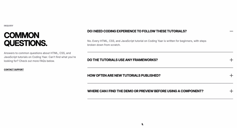
How to change Bootstrap accordion color using Bootstrap’s CSS variables. Here are two accordion examples or templates.
Final output:
.accordion-body, though the transition does limit overflow.
.accordion-body, though the transition does limit
overflow.
.accordion-body, though the transition does limit
overflow.
.accordion-body, though the transition does limit overflow.
.accordion-body, though the transition does limit
overflow.
.accordion-body, though the transition does limit
overflow.
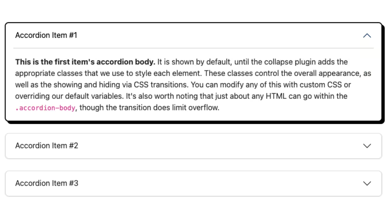
1. Start by adding the Bootstrap accordion.
<div class="accordion" id="accordionExample">
<div class="accordion-item">
<h2 class="accordion-header">
<button class="accordion-button" type="button" data-bs-toggle="collapse" data-bs-target="#collapseOne"
aria-expanded="true" aria-controls="collapseOne">
Accordion Item #1
</button>
</h2>
<div id="collapseOne" class="accordion-collapse collapse show" data-bs-parent="#accordionExample">
<div class="accordion-body">
<strong>This is the first item's accordion body.</strong> It is shown by default, until the collapse
plugin adds the appropriate classes that we use to style each element. These classes control the
overall appearance, as well as the showing and hiding via CSS transitions. You can modify any of
this with custom CSS or overriding our default variables. It's also worth noting that just about any
HTML can go within the <code>.accordion-body</code>, though the transition does limit overflow.
</div>
</div>
</div>
<div class="accordion-item">
<h2 class="accordion-header">
<button class="accordion-button collapsed" type="button" data-bs-toggle="collapse"
data-bs-target="#collapseTwo" aria-expanded="false" aria-controls="collapseTwo">
Accordion Item #2
</button>
</h2>
<div id="collapseTwo" class="accordion-collapse collapse" data-bs-parent="#accordionExample">
<div class="accordion-body">
<strong>This is the second item's accordion body.</strong> It is hidden by default, until the
collapse plugin adds the appropriate classes that we use to style each element. These classes
control the overall appearance, as well as the showing and hiding via CSS transitions. You can
modify any of this with custom CSS or overriding our default variables. It's also worth noting that
just about any HTML can go within the <code>.accordion-body</code>, though the transition does limit
overflow.
</div>
</div>
</div>
<div class="accordion-item">
<h2 class="accordion-header">
<button class="accordion-button collapsed" type="button" data-bs-toggle="collapse"
data-bs-target="#collapseThree" aria-expanded="false" aria-controls="collapseThree">
Accordion Item #3
</button>
</h2>
<div id="collapseThree" class="accordion-collapse collapse" data-bs-parent="#accordionExample">
<div class="accordion-body">
<strong>This is the third item's accordion body.</strong> It is hidden by default, until the
collapse plugin adds the appropriate classes that we use to style each element. These classes
control the overall appearance, as well as the showing and hiding via CSS transitions. You can
modify any of this with custom CSS or overriding our default variables. It's also worth noting that
just about any HTML can go within the <code>.accordion-body</code>, though the transition does limit
overflow.
</div>
</div>
</div>
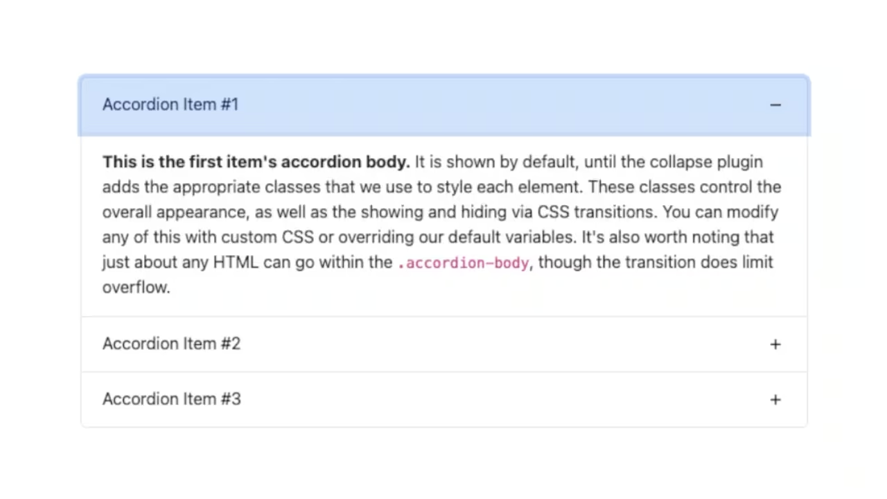
</div>2. We can use the CSS variables provided by Bootstrap to change the accordion color.
To change the button background color, we have to change the variable –#{$prefix}accordion-btn-bg. The prefix by default is bs unless you have changed it.
.accordion {
  --bs-accordion-btn-bg: #ffc0d3;
}
Also, change the active button background color and active font color.
.accordion {
  --bs-accordion-active-bg: #ff5c8d;
  --bs-accordion-active-color: white;
}
Remove the blue border that shows up on the active button by setting the box shadow to none.
.accordion {
  --bs-accordion-btn-focus-box-shadow: none;
}
Output:
.accordion-body, though the transition does limit overflow.
.accordion-body, though the transition does limit
overflow.
.accordion-body, though the transition does limit
overflow.
3. You can also change the accordion body color.
.accordion {
  --bs-accordion-bg: #524a4e;
  --bs-accordion-color: white;
}
Output:
.accordion-body, though the transition does limit overflow.
.accordion-body, though the transition does limit
overflow.
.accordion-body, though the transition does limit
overflow.
4. There’s this border top on the accordion body when you click outside the accordion. Let’s remove that.
.accordion-button:not(.collapsed) {
  box-shadow: none;
}
As shown in the Bootstrap accordion change icon post, you can also change the arrow icons to plus and minus.
.accordion-button::after {
  background-image: url("data:image/svg+xml,%3Csvg xmlns='http://www.w3.org/2000/svg' width='16' height='16' fill='currentColor' class='bi bi-plus' viewBox='0 0 16 16'%3E%3Cpath d='M8 4a.5.5 0 0 1 .5.5v3h3a.5.5 0 0 1 0 1h-3v3a.5.5 0 0 1-1 0v-3h-3a.5.5 0 0 1 0-1h3v-3A.5.5 0 0 1 8 4z'/%3E%3C/svg%3E");
  transition: all 0.5s;
}
.accordion-button:not(.collapsed)::after {
  background-image: url("data:image/svg+xml,%3Csvg xmlns='http://www.w3.org/2000/svg' width='16' height='16' fill='currentColor' class='bi bi-dash' viewBox='0 0 16 16'%3E%3Cpath d='M4 8a.5.5 0 0 1 .5-.5h7a.5.5 0 0 1 0 1h-7A.5.5 0 0 1 4 8z'/%3E%3C/svg%3E");
}
Output:
.accordion-body, though the transition does limit overflow.
.accordion-body, though the transition does limit
overflow.
.accordion-body, though the transition does limit
overflow.
The second Bootstrap accordion example:
5. We’ll use the same variables as in the first example. Change the active background color to mintcream and the font color to black.
.accordion {
  --bs-accordion-btn-bg: #ffffff;
  --bs-accordion-active-bg: mintcream;
  --bs-accordion-active-color: #000000;
  --bs-accordion-bg: mintcream;
  --bs-accordion-color: #000000;
  --bs-accordion-btn-focus-box-shadow: none;
}
Output:
.accordion-body, though the transition does limit overflow.
.accordion-body, though the transition does limit
overflow.
.accordion-body, though the transition does limit
overflow.
6. Use class accordion-flush to remove external borders.
<div class="accordion accordion-flush" id="accordionExample">Let’s add a top border to the accordion buttons.
.accordion-flush .accordion-button {
  border-top: 1px solid #000000;
}
Add a bottom border for the last accordion button when it’s collapsed and for the accordion body.
.accordion-flush .accordion-item:last-child .accordion-button.collapsed,
.accordion-flush .accordion-item:last-child .accordion-body {
  border-bottom: 1px solid #000000;
}
Output:
.accordion-body, though the transition does limit overflow.
.accordion-body, though the transition does limit
overflow.
.accordion-body, though the transition does limit
overflow.
Final Output Code for How to Change Bootstrap Accordion Color:
HTML
<div class="accordion" id="accordionExample">
    <div class="accordion-item">
        <h2 class="accordion-header">
            <button class="accordion-button" type="button" data-bs-toggle="collapse" data-bs-target="#collapseOne"
                aria-expanded="true" aria-controls="collapseOne">
                Accordion Item #1
            </button>
        </h2>
        <div id="collapseOne" class="accordion-collapse collapse show" data-bs-parent="#accordionExample">
            <div class="accordion-body">
                <strong>This is the first item's accordion body.</strong> It is shown by default, until the collapse
                plugin adds the appropriate classes that we use to style each element. These classes control the
                overall appearance, as well as the showing and hiding via CSS transitions. You can modify any of
                this with custom CSS or overriding our default variables. It's also worth noting that just about any
                HTML can go within the <code>.accordion-body</code>, though the transition does limit overflow.
            </div>
        </div>
    </div>
    <div class="accordion-item">
        <h2 class="accordion-header">
            <button class="accordion-button collapsed" type="button" data-bs-toggle="collapse"
                data-bs-target="#collapseTwo" aria-expanded="false" aria-controls="collapseTwo">
                Accordion Item #2
            </button>
        </h2>
        <div id="collapseTwo" class="accordion-collapse collapse" data-bs-parent="#accordionExample">
            <div class="accordion-body">
                <strong>This is the second item's accordion body.</strong> It is hidden by default, until the
                collapse plugin adds the appropriate classes that we use to style each element. These classes
                control the overall appearance, as well as the showing and hiding via CSS transitions. You can
                modify any of this with custom CSS or overriding our default variables. It's also worth noting that
                just about any HTML can go within the <code>.accordion-body</code>, though the transition does limit
                overflow.
            </div>
        </div>
    </div>
    <div class="accordion-item">
        <h2 class="accordion-header">
            <button class="accordion-button collapsed" type="button" data-bs-toggle="collapse"
                data-bs-target="#collapseThree" aria-expanded="false" aria-controls="collapseThree">
                Accordion Item #3
            </button>
        </h2>
        <div id="collapseThree" class="accordion-collapse collapse" data-bs-parent="#accordionExample">
            <div class="accordion-body">
                <strong>This is the third item's accordion body.</strong> It is hidden by default, until the
                collapse plugin adds the appropriate classes that we use to style each element. These classes
                control the overall appearance, as well as the showing and hiding via CSS transitions. You can
                modify any of this with custom CSS or overriding our default variables. It's also worth noting that
                just about any HTML can go within the <code>.accordion-body</code>, though the transition does limit
                overflow.
            </div>
        </div>
    </div>
</div>
CSS
/* Example 1 */

.accordion {
  --bs-accordion-btn-bg: #ffc0d3;
  --bs-accordion-active-bg: #ff5c8d;
  --bs-accordion-active-color: white;
  --bs-accordion-bg: #524a4e;
  --bs-accordion-color: white;
  --bs-accordion-btn-focus-box-shadow: none;
}
.accordion-button:not(.collapsed) {
  box-shadow: none;
}

/* Example 2 */

.accordion-flush.accordion {
  --bs-accordion-btn-bg: #ffffff;
  --bs-accordion-active-bg: mintcream;
  --bs-accordion-active-color: #000000;
  --bs-accordion-bg: mintcream;
  --bs-accordion-color: #000000;
  --bs-accordion-btn-focus-box-shadow: none;
  --bs-accordion-btn-focus-border-color: unset;
}

.accordion-flush .accordion-button {
  border-top: 1px solid #000000;
}

.accordion-flush .accordion-item:last-child .accordion-button.collapsed,
.accordion-flush .accordion-item:last-child .accordion-body {
  border-bottom: 1px solid #000000;
}

.accordion-button::after {
  background-image: url("data:image/svg+xml,%3Csvg xmlns='http://www.w3.org/2000/svg' width='16' height='16' fill='currentColor' class='bi bi-plus' viewBox='0 0 16 16'%3E%3Cpath d='M8 4a.5.5 0 0 1 .5.5v3h3a.5.5 0 0 1 0 1h-3v3a.5.5 0 0 1-1 0v-3h-3a.5.5 0 0 1 0-1h3v-3A.5.5 0 0 1 8 4z'/%3E%3C/svg%3E");
  transition: all 0.5s;
}
.accordion-button:not(.collapsed)::after {
  background-image: url("data:image/svg+xml,%3Csvg xmlns='http://www.w3.org/2000/svg' width='16' height='16' fill='currentColor' class='bi bi-dash' viewBox='0 0 16 16'%3E%3Cpath d='M4 8a.5.5 0 0 1 .5-.5h7a.5.5 0 0 1 0 1h-7A.5.5 0 0 1 4 8z'/%3E%3C/svg%3E");
}
Video tutorial for How to change Bootstrap Accordion Color:
If you have any doubts or stuck somewhere, you can reach out through Coding Yaar's Discord server.


