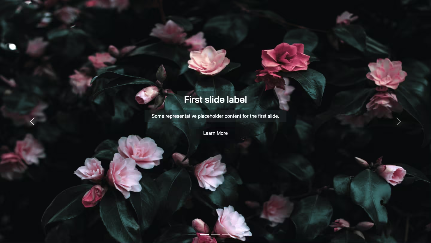
A simple responsive Bootstrap 5 carousel with vertical text thumbnails on the left using the Bootstrap carousel with indicators.
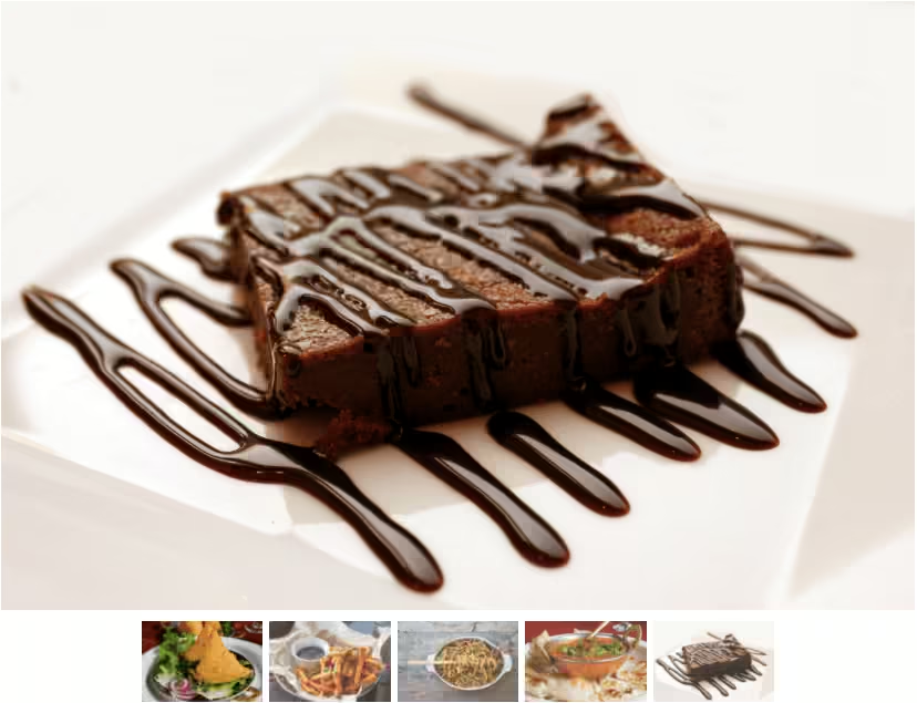
Final output:


1. Let’s start by adding the Bootstrap 5 carousel with indicators. Remove the controls.
<div id="carouselExampleIndicators" class="carousel slide">
  <div class="carousel-indicators">
    <button type="button" data-bs-target="#carouselExampleIndicators" data-bs-slide-to="0" class="active" aria-current="true" aria-label="Slide 1"></button>
    <button type="button" data-bs-target="#carouselExampleIndicators" data-bs-slide-to="1" aria-label="Slide 2"></button>
    <button type="button" data-bs-target="#carouselExampleIndicators" data-bs-slide-to="2" aria-label="Slide 3"></button>
  </div>
  <div class="carousel-inner">
    <div class="carousel-item active">
      <img src="..." class="d-block w-100" alt="...">
    </div>
    <div class="carousel-item">
      <img src="..." class="d-block w-100" alt="...">
    </div>
    <div class="carousel-item">
      <img src="..." class="d-block w-100" alt="...">
    </div>
  </div>
</div>
2. Add your images and add more indicators if necessary. Add your thumbnail texts inside the indicator buttons.
<div id="carouselExampleIndicators" class="carousel slide">
  <div class="carousel-indicators">
    <button type="button" data-bs-target="#carouselExampleIndicators" data-bs-slide-to="0" class="active" aria-current="true" aria-label="Slide 1">Donut</button>
    <button type="button" data-bs-target="#carouselExampleIndicators" data-bs-slide-to="1" aria-label="Slide 2">Cupcake</button>
    <button type="button" data-bs-target="#carouselExampleIndicators" data-bs-slide-to="2" aria-label="Slide 3">Crepe</button>
    <button type="button" data-bs-target="#carouselExampleIndicators" data-bs-slide-to="3" aria-label="Slide 3">Croissant</button>
    <button type="button" data-bs-target="#carouselExampleIndicators" data-bs-slide-to="4" aria-label="Slide 4">Pie</button>
  </div>
  <div class="carousel-inner">
    <div class="carousel-item active">
      <img src="..." class="d-block w-100" alt="...">
    </div>
    <div class="carousel-item">
      <img src="..." class="d-block w-100" alt="...">
    </div>
    <div class="carousel-item">
      <img src="..." class="d-block w-100" alt="...">
    </div>
    <div class="carousel-item">
        <img src="..." class="d-block w-100" alt="...">
      </div>
      <div class="carousel-item">
        <img src="..." class="d-block w-100" alt="...">
      </div>
  </div>
</div>
Unset the position for carousel-indicators div. For the buttons used as indicators, set text-indent to 0.
.carousel-indicators {
  position: unset;
}
.carousel-indicators [data-bs-target] {
  text-indent: 0;
}
Output:
3. To place the thumbnails on the left, set the display for carousel to flex by adding the Bootstrap class d-flex.
<div id="carouselExampleIndicators" class="carousel slide d-flex">Carousel-indicators div uses flex, so set its direction to column.
.carousel-indicators {
  flex-direction: column;
}
Output:
4. Set buttons height and width to 100% and opacity to 1.
.carousel-indicators [data-bs-target] {
  width: 100%;
  height: 100%;
  opacity: 1;
}
Add a background color for the carousel and set the button color to transparent.
.carousel {
  background-color: beige;
}
.carousel-indicators [data-bs-target] {
  background-color: transparent;
}
Output:
5. Add a bottom border for the carousel thumbnails(indicators).
.carousel-indicators [data-bs-target] {
  border-bottom: 1px solid #000;
}
For the carousel indicators, set the width to 100% and the margin to 0. Add some padding too.
.carousel-indicators {
  width: 100%;
  margin: 0;
  padding: 1em;
}
Output:
6. Set the font color of the active carousel thumbnail(indicator) to darkgoldenrod.
.carousel-indicators [data-bs-target].active {
  color: darkgoldenrod;
}
The doesn’t look vertically in the center. Remove the additional border-top.
.carousel-indicators [data-bs-target] {
  border-top: 0;
}
Output:
7. Let’s set some max-height for the image. To prevent it from stretching, set its max-width to 100%.
Add some padding and align it to the center.
.carousel-inner img {
  max-height: 400px;
  max-width: 100%;
  padding: 1em;
  margin-inline: auto;
}
Install Bootstrap icons and add the right arrow icon to the carousel indicators buttons.
<button type="button" data-bs-target="#carouselExampleIndicators" data-bs-slide-to="0" class="active"
    aria-current="true" aria-label="Slide 1">
    Donut <i class="bi bi-arrow-right"></i>
</button>
Align the text and the icon in the button using flex.
.carousel-indicators [data-bs-target] {
  display: flex;
  justify-content: space-between;
  align-items: center;
}
Let’s add some padding and increase the font size for the carousel on on larger screens.
@media screen and (min-width: 576px) {
  .carousel {
    padding: 2em;
    font-size: 1.3em;
  }
}
Output:
Video tutorial for Bootstrap Carousel With Vertical Text Thumbnails:
Final Output Code for Bootstrap Carousel With Vertical Text Thumbnails:
HTML
<div id="carouselExampleIndicators" class="carousel slide d-flex">
    <div class="carousel-indicators">
        <button type="button" data-bs-target="#carouselExampleIndicators" data-bs-slide-to="0" class="active"
            aria-current="true" aria-label="Slide 1">Donut <i class="bi bi-arrow-right"></i></button>
        <button type="button" data-bs-target="#carouselExampleIndicators" data-bs-slide-to="1"
            aria-label="Slide 2">Cupcake <i class="bi bi-arrow-right"></i></button>
        <button type="button" data-bs-target="#carouselExampleIndicators" data-bs-slide-to="2"
            aria-label="Slide 3">Crepe <i class="bi bi-arrow-right"></i></button>
        <button type="button" data-bs-target="#carouselExampleIndicators" data-bs-slide-to="3"
            aria-label="Slide 3">Croissant <i class="bi bi-arrow-right"></i></button>
        <button type="button" data-bs-target="#carouselExampleIndicators" data-bs-slide-to="4"
            aria-label="Slide 4">Pie <i class="bi bi-arrow-right"></i></button>
    </div>
    <div class="carousel-inner">
        <div class="carousel-item active">
            <img src="..." class="d-block" alt="...">
        </div>
        <div class="carousel-item">
            <img src="..." class="d-block" alt="...">
        </div>
        <div class="carousel-item">
            <img src="..." class="d-block" alt="...">
        </div>
        <div class="carousel-item">
            <img src="..." class="d-block" alt="...">
        </div>
        <div class="carousel-item">
            <img src="..." class="d-block" alt="...">
        </div>
    </div>
</div>
CSS
.carousel-indicators {
  position: unset;
  flex-direction: column;
  width: 100%;
  margin: 0;
  padding: 1em;
}
.carousel-indicators [data-bs-target] {
  text-indent: 0;
  width: 100%;
  height: 100%;
  opacity: 1;
  background-color: transparent;
  border-bottom: 1px solid #000;
  border-top: 0;
  display: flex;
  align-items: center;
  justify-content: space-between;
}
.carousel-indicators [data-bs-target].active {
  color: darkgoldenrod;
}
.carousel {
  background-color: beige;
}
.carousel-inner img {
  max-height: 400px;
  max-width: 100%;
  padding: 1em;
  margin-inline: auto;
}
@media screen and (min-width: 576px) {
  .carousel {
    padding: 2em;
    font-size: 1.3em;
  }
}
If you have any doubts or stuck somewhere, you can reach out through Coding Yaar's Discord server.