Here’s how to create a responsive Bootstrap 5 carousel multiple items and increment by 1 instead of 3. Bootstrap carousel with multiple cards was a bit similar to this.
Final output:

Card title 1
Some quick example text to build on the card title and make up the bulk of the card’s content.
Go somewhere
Card title 2
Some quick example text to build on the card title and make up the bulk of the card’s content.
Go somewhere
Card title 3
Some quick example text to build on the card title and make up the bulk of the card’s content.
Go somewhere
Card title 4
Some quick example text to build on the card title and make up the bulk of the card’s content.
Go somewhere
Card title 5
Some quick example text to build on the card title and make up the bulk of the card’s content.
Go somewhere
Card title 6
Some quick example text to build on the card title and make up the bulk of the card’s content.
Go somewhere
Card title 7
Some quick example text to build on the card title and make up the bulk of the card’s content.
Go somewhere
Card title 8
Some quick example text to build on the card title and make up the bulk of the card’s content.
Go somewhere
Card title 9
Some quick example text to build on the card title and make up the bulk of the card’s content.
Go somewhereOn smaller screens:
Just an image representation, minimize the window to check the working version

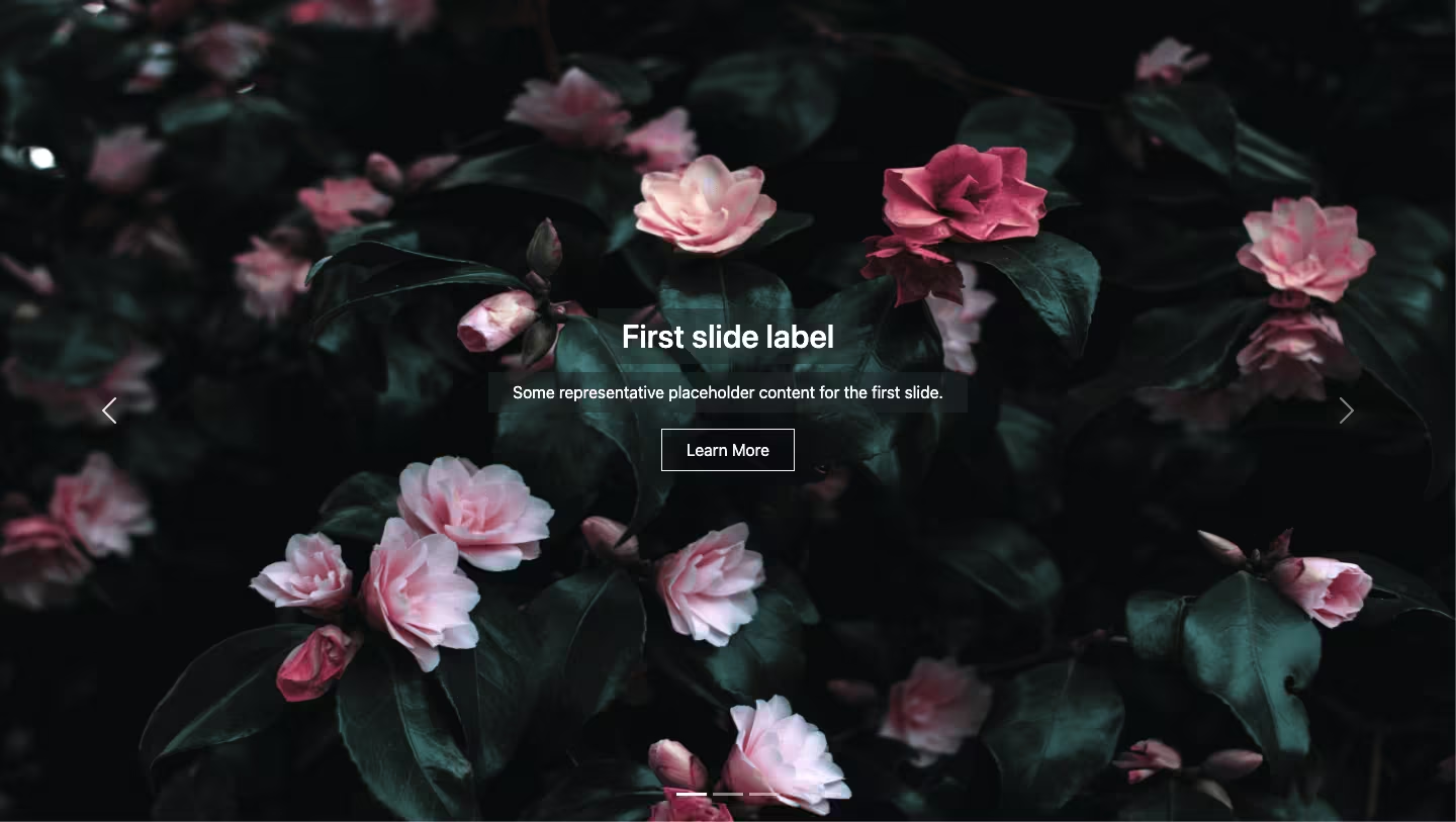
1. Let’s start with the basic Bootstrap 5 carousel with controls. (I’ve added some images for the demo in the output).
<div id="carouselExampleControls" class="carousel slide" data-bs-ride="carousel">
  <div class="carousel-inner">
    <div class="carousel-item active">
      <img src="..." class="d-block w-100" alt="...">
    </div>
    <div class="carousel-item">
      <img src="..." class="d-block w-100" alt="...">
    </div>
    <div class="carousel-item">
      <img src="..." class="d-block w-100" alt="...">
    </div>
  </div>
  <button class="carousel-control-prev" type="button" data-bs-target="#carouselExampleControls" data-bs-slide="prev">
    <span class="carousel-control-prev-icon" aria-hidden="true"></span>
    <span class="visually-hidden">Previous</span>
  </button>
  <button class="carousel-control-next" type="button" data-bs-target="#carouselExampleControls" data-bs-slide="next">
    <span class="carousel-control-next-icon" aria-hidden="true"></span>
    <span class="visually-hidden">Next</span>
  </button>
</div>
Output:
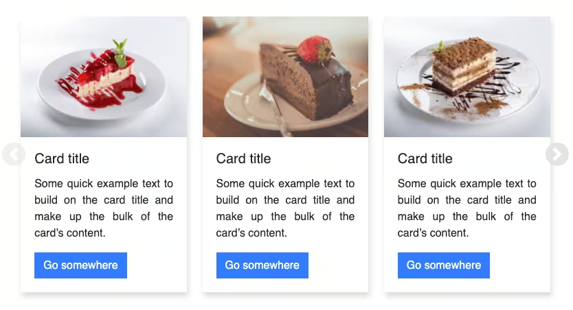
2. For a Bootstrap 5 carousel with multiple items, replace the images with cards. I have added 9 cards.
<div class="card">
    <img src="..." class="d-block w-100" alt="...">
    <div class="card-body">
        <h5 class="card-title">Card title 2</h5>
        <p class="card-text">Some quick example text to build on the card title and make up the bulk of the
            card's content.</p>
        <a href="#" class="btn btn-primary">Go somewhere</a>
    </div>
</div>
Output:
Card title 1
Some quick example text to build on the card title and make up the bulk of the card’s content.
Go somewhereCard title 2
Some quick example text to build on the card title and make up the bulk of the card’s content.
Go somewhereCard title 3
Some quick example text to build on the card title and make up the bulk of the card’s content.
Go somewhereCard title 4
Some quick example text to build on the card title and make up the bulk of the card’s content.
Go somewhereCard title 5
Some quick example text to build on the card title and make up the bulk of the card’s content.
Go somewhereCard title 6
Some quick example text to build on the card title and make up the bulk of the card’s content.
Go somewhereCard title 7
Some quick example text to build on the card title and make up the bulk of the card’s content.
Go somewhereCard title 8
Some quick example text to build on the card title and make up the bulk of the card’s content.
Go somewhereCard title 9
Some quick example text to build on the card title and make up the bulk of the card’s content.
Go somewhere3. To make it look like there are multiple items in one slide, you need to make some changes. To keep it responsive, apply the changes only to the screens with a width of more than 768px.
@media (min-width: 768px) {
  .carousel-inner {
    display: flex;
  }
  .carousel-item {
    margin-right: 0;
    flex: 0 0 33.333333%;
    display: block;
  }
}
Output:
Card title 1
Some quick example text to build on the card title and make up the bulk of the card’s content.
Go somewhereCard title 2
Some quick example text to build on the card title and make up the bulk of the card’s content.
Go somewhereCard title 3
Some quick example text to build on the card title and make up the bulk of the card’s content.
Go somewhereCard title 4
Some quick example text to build on the card title and make up the bulk of the card’s content.
Go somewhereCard title 5
Some quick example text to build on the card title and make up the bulk of the card’s content.
Go somewhereCard title 6
Some quick example text to build on the card title and make up the bulk of the card’s content.
Go somewhereCard title 7
Some quick example text to build on the card title and make up the bulk of the card’s content.
Go somewhereCard title 8
Some quick example text to build on the card title and make up the bulk of the card’s content.
Go somewhereCard title 9
Some quick example text to build on the card title and make up the bulk of the card’s content.
Go somewhere4. Let’s style the cards and controls.
.carousel-inner{
    padding: 1em;
}
.card{
    margin: 0 .5em;
    box-shadow: 2px 6px 8px 0 rgba(22, 22, 26, 0.18);
    border: none;
}
.carousel-control-prev, .carousel-control-next{
    background-color: #e1e1e1;
    width: 6vh;
    height: 6vh;
    border-radius: 50%;
    top: 50%;
    transform: translateY(-50%);
}
Output:
Card title 1
Some quick example text to build on the card title and make up the bulk of the card’s content.
Go somewhereCard title 2
Some quick example text to build on the card title and make up the bulk of the card’s content.
Go somewhereCard title 3
Some quick example text to build on the card title and make up the bulk of the card’s content.
Go somewhereCard title 4
Some quick example text to build on the card title and make up the bulk of the card’s content.
Go somewhereCard title 5
Some quick example text to build on the card title and make up the bulk of the card’s content.
Go somewhereCard title 6
Some quick example text to build on the card title and make up the bulk of the card’s content.
Go somewhereCard title 7
Some quick example text to build on the card title and make up the bulk of the card’s content.
Go somewhereCard title 8
Some quick example text to build on the card title and make up the bulk of the card’s content.
Go somewhereCard title 9
Some quick example text to build on the card title and make up the bulk of the card’s content.
Go somewhere5. Looks and works fine on smaller screens. Let’s make it work on larger screens as well. Time to use some jQuery. (Make sure you are using proper jQuery and not just a slim version of it.)
Okay, so the idea is,
- get the entire width of the carousel(from cards 1 to 9)
- get the width of a single card
- shift the scroll position to the width of a single card and keep incrementing or decrementing it accordingly
To get the entire width of the carousel, use scrollWidth.
var carouselWidth = $(".carousel-inner")[0].scrollWidth;To get the width of a single card in the carousel, use width().
var cardWidth = $(".carousel-item").width();Now, let’s use a variable to store the current scroll position which will initially be 0.
var scrollPosition = 0;When the next button is clicked, check if you’ve reached the 7th card, as you don’t want to scroll any further.
$(".carousel-control-next").on("click", function () {
  if (scrollPosition < (carouselWidth - cardWidth * 4)) { //check if you can go any further
    scrollPosition += cardWidth;  //update scroll position
    $(".carousel-inner").animate({ scrollLeft: scrollPosition },600); //scroll left
  }
});
Similarly, when the previous button is clicked, check if you are on the first card.
$(".carousel-control-prev").on("click", function () {
  if (scrollPosition > 0) {
    scrollPosition -= cardWidth;
    $(".carousel-inner").animate(
      { scrollLeft: scrollPosition },
      600
    );
  }
});
Output:
Card title 1
Some quick example text to build on the card title and make up the bulk of the card’s content.
Go somewhereCard title 2
Some quick example text to build on the card title and make up the bulk of the card’s content.
Go somewhereCard title 3
Some quick example text to build on the card title and make up the bulk of the card’s content.
Go somewhereCard title 4
Some quick example text to build on the card title and make up the bulk of the card’s content.
Go somewhereCard title 5
Some quick example text to build on the card title and make up the bulk of the card’s content.
Go somewhereCard title 6
Some quick example text to build on the card title and make up the bulk of the card’s content.
Go somewhereCard title 7
Some quick example text to build on the card title and make up the bulk of the card’s content.
Go somewhereCard title 8
Some quick example text to build on the card title and make up the bulk of the card’s content.
Go somewhereCard title 9
Some quick example text to build on the card title and make up the bulk of the card’s content.
Go somewhere6. To get rid of the unnecessary default slide effect, remove the slide class and add it through jquery only for smaller screens. Remove the data-bs-ride=”carousel” as well.
<div id="carouselExampleControls" class="carousel">To have the default Bootstrap carousel for smaller screens, check if the window size is at least 768px and execute the code. If not, add the slide class.
Also, stop the auto-cycling for larger screens by setting the interval to false.
var multipleCardCarousel = document.querySelector(
  "#carouselExampleControls"
);
if (window.matchMedia("(min-width: 768px)").matches) {
  //rest of the code
  var carousel = new bootstrap.Carousel(multipleCardCarousel, {
    interval: false
  });
} else {
  $(multipleCardCarousel).addClass("slide");
}
For Bootstrap 5.2+, add wrap: false to stop the continuous cycle.
var carousel = new bootstrap.Carousel(multipleCardCarousel, {
interval: false,
wrap: false,
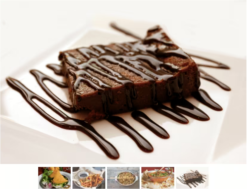
});Try using images of the same size. One of my images was smaller in height, which made the cards uneven in height, like this:

I wrapped the image in another div with a fixed height and adjusted the image to be in the center.
<div class="img-wrapper">
    <img src="..." class="d-block w-100" alt="...">
</div>
.card .img-wrapper {
max-width: 100%;
height: 13em;
display: flex;
justify-content: center;
align-items: center;
}
img{
max-height: 100%;
}Output:
Card title 1
Some quick example text to build on the card title and make up the bulk of the card’s content.
Go somewhereCard title 2
Some quick example text to build on the card title and make up the bulk of the card’s content.
Go somewhereCard title 3
Some quick example text to build on the card title and make up the bulk of the card’s content.
Go somewhereCard title 4
Some quick example text to build on the card title and make up the bulk of the card’s content.
Go somewhereCard title 5
Some quick example text to build on the card title and make up the bulk of the card’s content.
Go somewhereCard title 6
Some quick example text to build on the card title and make up the bulk of the card’s content.
Go somewhereCard title 7
Some quick example text to build on the card title and make up the bulk of the card’s content.
Go somewhereCard title 8
Some quick example text to build on the card title and make up the bulk of the card’s content.
Go somewhereCard title 9
Some quick example text to build on the card title and make up the bulk of the card’s content.
Go somewhereVideo Explanation for Bootstrap 5 Carousel Multiple Items Responsive:
Limitations:
Does not auto-slide.
Bonus Tip:
1. To increment as many cards as you want, you can multiply the cardWidth by the number of cards you want. For instance, for three cards at a time, multiply it by 3.
scrollPosition += cardWidth * 3;And similarly for the previous control:
scrollPosition -= cardWidth * 3;I would also suggest increasing the animation duration.
2. You can change the number of cards to be displayed in the carousel as shown below:
Hide control on the first and last card for Bootstrap Multiple Item Carousel:
Final Output Code for Bootstrap 5 Carousel Multiple Items:
HTML
<div id="carouselExampleControls" class="carousel">
    <div class="carousel-inner">
        <div class="carousel-item active">
            <div class="card">
                <div class="img-wrapper"><img src="..." class="d-block w-100" alt="..."> </div>
                <div class="card-body">
                    <h5 class="card-title">Card title 1</h5>
                    <p class="card-text">Some quick example text to build on the card title and make up the bulk of the
                        card's content.</p>
                    <a href="#" class="btn btn-primary">Go somewhere</a>
                </div>
            </div>
        </div>
        <div class="carousel-item">
            <div class="card">
                <div class="img-wrapper"><img src="..." class="d-block w-100" alt="..."> </div>
                <div class="card-body">
                    <h5 class="card-title">Card title 2</h5>
                    <p class="card-text">Some quick example text to build on the card title and make up the bulk of the
                        card's content.</p>
                    <a href="#" class="btn btn-primary">Go somewhere</a>
                </div>
            </div>
        </div>
        <div class="carousel-item">
            <div class="card">
                <div class="img-wrapper"><img src="..." class="d-block w-100" alt="..."> </div>
                <div class="card-body">
                    <h5 class="card-title">Card title 3</h5>
                    <p class="card-text">Some quick example text to build on the card title and make up the bulk of the
                        card's content.</p>
                    <a href="#" class="btn btn-primary">Go somewhere</a>
                </div>
            </div>
        </div>
        <div class="carousel-item">
            <div class="card">
                <div class="img-wrapper"><img src="..." class="d-block w-100" alt="..."> </div>
                <div class="card-body">
                    <h5 class="card-title">Card title 4</h5>
                    <p class="card-text">Some quick example text to build on the card title and make up the bulk of the
                        card's content.</p>
                    <a href="#" class="btn btn-primary">Go somewhere</a>
                </div>
            </div>
        </div>
        <div class="carousel-item">
            <div class="card">
                <div class="img-wrapper"><img src="..." class="d-block w-100" alt="..."> </div>
                <div class="card-body">
                    <h5 class="card-title">Card title 5</h5>
                    <p class="card-text">Some quick example text to build on the card title and make up the bulk of the
                        card's content.</p>
                    <a href="#" class="btn btn-primary">Go somewhere</a>
                </div>
            </div>
        </div>
        <div class="carousel-item">
            <div class="card">
                <div class="img-wrapper"><img src="..." class="d-block w-100" alt="..."> </div>
                <div class="card-body">
                    <h5 class="card-title">Card title 6</h5>
                    <p class="card-text">Some quick example text to build on the card title and make up the bulk of the
                        card's content.</p>
                    <a href="#" class="btn btn-primary">Go somewhere</a>
                </div>
            </div>
        </div>
        <div class="carousel-item">
            <div class="card">
                <div class="img-wrapper"><img src="..." class="d-block w-100" alt="..."> </div>
                <div class="card-body">
                    <h5 class="card-title">Card title 7</h5>
                    <p class="card-text">Some quick example text to build on the card title and make up the bulk of the
                        card's content.</p>
                    <a href="#" class="btn btn-primary">Go somewhere</a>
                </div>
            </div>
        </div>
        <div class="carousel-item">
            <div class="card">
                <div class="img-wrapper"><img src="..." class="d-block w-100" alt="..."> </div>
                <div class="card-body">
                    <h5 class="card-title">Card title 8</h5>
                    <p class="card-text">Some quick example text to build on the card title and make up the bulk of the
                        card's content.</p>
                    <a href="#" class="btn btn-primary">Go somewhere</a>
                </div>
            </div>
        </div>
        <div class="carousel-item">
            <div class="card">
                <div class="img-wrapper"><img src="..." class="d-block w-100" alt="..."> </div>
                <div class="card-body">
                    <h5 class="card-title">Card title 9</h5>
                    <p class="card-text">Some quick example text to build on the card title and make up the bulk of the
                        card's content.</p>
                    <a href="#" class="btn btn-primary">Go somewhere</a>
                </div>
            </div>
        </div>
    </div>
    <button class="carousel-control-prev" type="button" data-bs-target="#carouselExampleControls" data-bs-slide="prev">
        <span class="carousel-control-prev-icon" aria-hidden="true"></span>
        <span class="visually-hidden">Previous</span>
    </button>
    <button class="carousel-control-next" type="button" data-bs-target="#carouselExampleControls" data-bs-slide="next">
        <span class="carousel-control-next-icon" aria-hidden="true"></span>
        <span class="visually-hidden">Next</span>
    </button>
</div>
CSS
.carousel-inner {
  padding: 1em;
}
.card {
  margin: 0 0.5em;
  box-shadow: 2px 6px 8px 0 rgba(22, 22, 26, 0.18);
  border: none;
}
.carousel-control-prev,
.carousel-control-next {
  background-color: #e1e1e1;
  width: 6vh;
  height: 6vh;
  border-radius: 50%;
  top: 50%;
  transform: translateY(-50%);
}
@media (min-width: 768px) {
  .carousel-item {
    margin-right: 0;
    flex: 0 0 33.333333%;
    display: block;
  }
  .carousel-inner {
    display: flex;
  }
}
.card .img-wrapper {
    max-width: 100%;
    height: 13em;
    display: flex;
    justify-content: center;
    align-items: center;
}
.card img {
    max-height: 100%;
}
@media (max-width: 767px) {
  .card .img-wrapper {
    height: 17em;
  }
}
jQuery
var multipleCardCarousel = document.querySelector(
  "#carouselExampleControls"
);
if (window.matchMedia("(min-width: 768px)").matches) {
  var carousel = new bootstrap.Carousel(multipleCardCarousel, {
    interval: false,
  });
  var carouselWidth = $(".carousel-inner")[0].scrollWidth;
  var cardWidth = $(".carousel-item").width();
  var scrollPosition = 0;
  $("#carouselExampleControls .carousel-control-next").on("click", function () {
    if (scrollPosition < carouselWidth - cardWidth * 4) {
      scrollPosition += cardWidth;
      $("#carouselExampleControls .carousel-inner").animate(
        { scrollLeft: scrollPosition },
        600
      );
    }
  });
  $("#carouselExampleControls .carousel-control-prev").on("click", function () {
    if (scrollPosition > 0) {
      scrollPosition -= cardWidth;
      $("#carouselExampleControls .carousel-inner").animate(
        { scrollLeft: scrollPosition },
        600
      );
    }
  });
} else {
  $(multipleCardCarousel).addClass("slide");
}
If you have any doubts or stuck somewhere, you can reach out through Coding Yaar's Discord server.