Bootstrap provides a carousel component wherein you can replace the image with a text slide or any custom markup. Using the Bootstrap 4 image carousel, you can build a carousel with multiple items(bootstrap cards in this example). Follow the steps to learn how.
Final output:

Card title
Some quick example text to build on the card title and make up the bulk of the card’s content.
Go somewhere
Card title
Some quick example text to build on the card title and make up the bulk of the card’s content.
Go somewhere
Card title
Some quick example text to build on the card title and make up the bulk of the card’s content.
Go somewhere
Card title
Some quick example text to build on the card title and make up the bulk of the card’s content.
Go somewhere
Card title
Some quick example text to build on the card title and make up the bulk of the card’s content.
Go somewhere
Card title
Some quick example text to build on the card title and make up the bulk of the card’s content.
Go somewhere
Card title
Some quick example text to build on the card title and make up the bulk of the card’s content.
Go somewhere
Card title
Some quick example text to build on the card title and make up the bulk of the card’s content.
Go somewhere
Card title
Some quick example text to build on the card title and make up the bulk of the card’s content.
Go somewhereOn smaller screens:
Just an image representation, minimize the window to check the working version

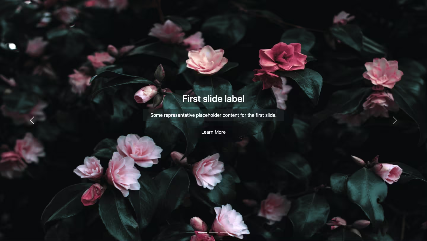
1. Let’s start with the basic Bootstrap carousel with controls. (I’ve added some images for demo in the output).
<div id="carouselExampleControls" class="carousel slide" data-ride="carousel">
  <div class="carousel-inner">
    <div class="carousel-item active">
      <img src="..." class="d-block w-100" alt="...">
    </div>
    <div class="carousel-item">
      <img src="..." class="d-block w-100" alt="...">
    </div>
    <div class="carousel-item">
      <img src="..." class="d-block w-100" alt="...">
    </div>
  </div>
  <a class="carousel-control-prev" href="#carouselExampleControls" role="button" data-slide="prev">
    <span class="carousel-control-prev-icon" aria-hidden="true"></span>
    <span class="sr-only">Previous</span>
  </a>
  <a class="carousel-control-next" href="#carouselExampleControls" role="button" data-slide="next">
    <span class="carousel-control-next-icon" aria-hidden="true"></span>
    <span class="sr-only">Next</span>
  </a>
</div>
Output:
2. For a Bootstrap carousel with multiple items, replace the images with the following code. I’ve created an outer div with the class name cards-wrapper and added 3 bootstrap cards.
<div class="cards-wrapper">
  <div class="card">
    <img src="..." class="card-img-top" alt="...">
    <div class="card-body">
      <h5 class="card-title">Card title</h5>
      <p class="card-text">Some quick example text to build on the card title and make up the bulk of the card's content.</p>
      <a href="#" class="btn btn-primary">Go somewhere</a>
    </div>
  </div>
</div>
The cards will be placed vertically by default. Let’s make it horizontal and adjust the image size.
.cards-wrapper {
  display: flex;
  justify-content: center;
}
.card img {
  max-width: 100%;
  max-height: 100%;
}
Output:
Card title
Some quick example text to build on the card title and make up the bulk of the card’s content.
Go somewhereCard title
Some quick example text to build on the card title and make up the bulk of the card’s content.
Go somewhereCard title
Some quick example text to build on the card title and make up the bulk of the card’s content.
Go somewhereCard title
Some quick example text to build on the card title and make up the bulk of the card’s content.
Go somewhereCard title
Some quick example text to build on the card title and make up the bulk of the card’s content.
Go somewhereCard title
Some quick example text to build on the card title and make up the bulk of the card’s content.
Go somewhereCard title
Some quick example text to build on the card title and make up the bulk of the card’s content.
Go somewhereCard title
Some quick example text to build on the card title and make up the bulk of the card’s content.
Go somewhereCard title
Some quick example text to build on the card title and make up the bulk of the card’s content.
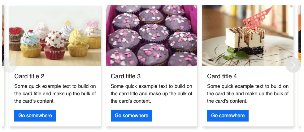
Go somewhere3. Let’s style the cards a bit. Adding a shadow creates a lot of difference.
.card {
  margin: 0 0.5em;
  box-shadow: 2px 6px 8px 0 rgba(22, 22, 26, 0.18);
  border: none;
  border-radius: 0;
}
.carousel-inner {
  padding: 1em;
}
Output:
Card title
Some quick example text to build on the card title and make up the bulk of the card’s content.
Go somewhereCard title
Some quick example text to build on the card title and make up the bulk of the card’s content.
Go somewhereCard title
Some quick example text to build on the card title and make up the bulk of the card’s content.
Go somewhereCard title
Some quick example text to build on the card title and make up the bulk of the card’s content.
Go somewhereCard title
Some quick example text to build on the card title and make up the bulk of the card’s content.
Go somewhereCard title
Some quick example text to build on the card title and make up the bulk of the card’s content.
Go somewhereCard title
Some quick example text to build on the card title and make up the bulk of the card’s content.
Go somewhereCard title
Some quick example text to build on the card title and make up the bulk of the card’s content.
Go somewhereCard title
Some quick example text to build on the card title and make up the bulk of the card’s content.
Go somewhere4. Since the previous and next controls are not clearly visible, I’ve modified them accordingly.
.carousel-control-prev,
.carousel-control-next {
  background-color: #e1e1e1;
  width: 5vh;
  height: 5vh;
  border-radius: 50%;
  top: 50%;
  transform: translateY(-50%);
}
Output:
Card title
Some quick example text to build on the card title and make up the bulk of the card’s content.
Go somewhereCard title
Some quick example text to build on the card title and make up the bulk of the card’s content.
Go somewhereCard title
Some quick example text to build on the card title and make up the bulk of the card’s content.
Go somewhereCard title
Some quick example text to build on the card title and make up the bulk of the card’s content.
Go somewhereCard title
Some quick example text to build on the card title and make up the bulk of the card’s content.
Go somewhereCard title
Some quick example text to build on the card title and make up the bulk of the card’s content.
Go somewhereCard title
Some quick example text to build on the card title and make up the bulk of the card’s content.
Go somewhereCard title
Some quick example text to build on the card title and make up the bulk of the card’s content.
Go somewhereCard title
Some quick example text to build on the card title and make up the bulk of the card’s content.
Go somewhere5. Looks fine now, but, only on larger screens. On smaller screens, it’s a mess. Let’s fix that.
It won’t make sense to show 3 tiny cards on smaller screens. Let’s hide 2 cards (only on smaller screens ) and make the one clearly readable.
Bootstrap provides classes to hide elements just like we want. Let’s use classes d-none d-md-block to hide cards on screens with a width of less than 768px.
<div class="card d-none d-md-block">I noticed that the content below the carousel moves up and down a bit when the controls are clicked. To fix that I’ve added a fixed height to the image. Use media query to keep the carousel responsive.
@media (min-width: 768px) {
    .card img {
      height: 11em;
    }
 }
Output:
Card title
Some quick example text to build on the card title and make up the bulk of the card’s content.
Go somewhereCard title
Some quick example text to build on the card title and make up the bulk of the card’s content.
Go somewhereCard title
Some quick example text to build on the card title and make up the bulk of the card’s content.
Go somewhereCard title
Some quick example text to build on the card title and make up the bulk of the card’s content.
Go somewhereCard title
Some quick example text to build on the card title and make up the bulk of the card’s content.
Go somewhereCard title
Some quick example text to build on the card title and make up the bulk of the card’s content.
Go somewhereCard title
Some quick example text to build on the card title and make up the bulk of the card’s content.
Go somewhereCard title
Some quick example text to build on the card title and make up the bulk of the card’s content.
Go somewhereCard title
Some quick example text to build on the card title and make up the bulk of the card’s content.
Go somewhereOutput on smaller screens:
Video Explanation for Bootstrap 5 Carousel Multiple Items Responsive:
Final Output Code for Bootstrap 4 Carousel Multiple Items Responsive:
HTML
<div id="carouselExampleControls" class="carousel slide" data-ride="carousel">
  <div class="carousel-inner">
    <div class="carousel-item active">
      <div class="cards-wrapper">
      <div class="card">
        <img src="..." class="card-img-top" alt="...">
        <div class="card-body">
          <h5 class="card-title">Card title</h5>
          <p class="card-text">Some quick example text to build on the card title and make up the bulk of the card's content.</p>
          <a href="#" class="btn btn-primary">Go somewhere</a>
        </div>
      </div>
      <div class="card d-none d-md-block">
        <img src="..." class="card-img-top" alt="...">
        <div class="card-body">
          <h5 class="card-title">Card title</h5>
          <p class="card-text">Some quick example text to build on the card title and make up the bulk of the card's content.</p>
          <a href="#" class="btn btn-primary">Go somewhere</a>
        </div>
      </div>
    </div>
    </div>
    <div class="carousel-item">
      <div class="cards-wrapper">
        <div class="card">
          <img src="..." class="card-img-top" alt="...">
          <div class="card-body">
            <h5 class="card-title">Card title</h5>
            <p class="card-text">Some quick example text to build on the card title and make up the bulk of the card's content.</p>
            <a href="#" class="btn btn-primary">Go somewhere</a>
          </div>
        </div>
        <div class="card d-none d-md-block">
          <img src="..." class="card-img-top" alt="...">
          <div class="card-body">
            <h5 class="card-title">Card title</h5>
            <p class="card-text">Some quick example text to build on the card title and make up the bulk of the card's content.</p>
            <a href="#" class="btn btn-primary">Go somewhere</a>
          </div>
        </div>
      </div>
    </div>
  </div>
  <a class="carousel-control-prev" href="#carouselExampleControls" role="button" data-slide="prev">
    <span class="carousel-control-prev-icon" aria-hidden="true"></span>
    <span class="sr-only">Previous</span>
  </a>
  <a class="carousel-control-next" href="#carouselExampleControls" role="button" data-slide="next">
    <span class="carousel-control-next-icon" aria-hidden="true"></span>
    <span class="sr-only">Next</span>
  </a>
</div>
CSS
.cards-wrapper {
  display: flex;
  justify-content: center;
}
.card img {
  max-width: 100%;
  max-height: 100%;
}
.card {
  margin: 0 0.5em;
  box-shadow: 2px 6px 8px 0 rgba(22, 22, 26, 0.18);
  border: none;
  border-radius: 0;
}
.carousel-inner {
  padding: 1em;
}
.carousel-control-prev,
.carousel-control-next {
  background-color: #e1e1e1;
  width: 5vh;
  height: 5vh;
  border-radius: 50%;
  top: 50%;
  transform: translateY(-50%);
}
@media (min-width: 768px) {
  .card img {
    height: 11em;
  }
}
Bonus Tip:
When you have multiple bootstrap carousels on the same page, make sure to keep the ids unique.
If you have any doubts or stuck somewhere, you can reach out through Coding Yaar's Discord server.