A simple responsive Bootstrap 5 testimonial slider using the Bootstrap carousel with multiple items.
Final output:
What our customers say

Card title 1
“Some dummy text you don’t need to read. Since you have decided to read, do like, share, comment and subscribe to Coding Yaar.”

Card title 2
“Some dummy text you don’t need to read. Since you have decided to read, do like, share, comment and subscribe to Coding Yaar.”

Card title 3
“Some dummy text you don’t need to read. Since you have decided to read, do like, share, comment and subscribe to Coding Yaar.”

Card title 4
“Some dummy text you don’t need to read. Since you have decided to read, do like, share, comment and subscribe to Coding Yaar.”

Card title 5
“Some dummy text you don’t need to read. Since you have decided to read, do like, share, comment and subscribe to Coding Yaar.”

Card title 6
“Some dummy text you don’t need to read. Since you have decided to read, do like, share, comment and subscribe to Coding Yaar.”
On smaller screens:

1. I’ll be using the Bootstrap 5 Carousel Multiple Items slider from a previous post for the Bootstrap testimonial slider.
(Rerun when changing sizes)
See the Pen Bootstrap carousel multiple items increment by 1 (jQuery) by Coding Yaar (@codingyaar) on CodePen.
For Bootstrap 5.2+, add wrap: false to stop the continuous cycle.
var carousel = new bootstrap.Carousel(multipleCardCarousel, {
  interval: false,
  wrap: false,
});
2. I have removed the buttons and replaced the images. Since the images are of the same size, I have removed the img-wrapper related CSS.
Output:
Card title 1
Some quick example text to build on the card title and make up the bulk of the card’s content.
Card title 2
Some quick example text to build on the card title and make up the bulk of the card’s content.
Card title 3
Some quick example text to build on the card title and make up the bulk of the card’s content.
Card title 4
Some quick example text to build on the card title and make up the bulk of the card’s content.
Card title 5
Some quick example text to build on the card title and make up the bulk of the card’s content.
Card title 6
Some quick example text to build on the card title and make up the bulk of the card’s content.
3. Add testimonial slider div and place the slider inside it.
Let’s add 2 columns inside the carousel. Add the title in the first column, with font-weight bold, and to increase the font size, I am using the display class.
Place the carousel-inner div in the second column.
<div class="testimonial-slider">
    <div id="carouselExampleControls" class="carousel" data-bs-ride="carousel">
        <div class="container-fluid">
            <div class="row">
                <div class="col-md-4">
                    <div class="testimonial-title">
                        <h2 class="fw-bold display-5">What our customers say</h2>
                    </div>
                </div>
                <div class="col-md-8">
                    <div class="carousel-inner">
                        ...
                    </div>
                </div>
            </div>
        </div>

        <button class="carousel-control-prev" type="button" data-bs-target="#carouselExampleControls" data-bs-slide="prev">
            <span class="carousel-control-prev-icon" aria-hidden="true"></span>
            <span class="visually-hidden">Previous</span>
        </button>
        <button class="carousel-control-next" type="button" data-bs-target="#carouselExampleControls" data-bs-slide="next">
            <span class="carousel-control-next-icon" aria-hidden="true"></span>
            <span class="visually-hidden">Next</span>
        </button>
    </div>
</div>
Output:
What our customers say
Card title 1
Some quick example text to build on the card title and make up the bulk of the card’s content.
Card title 2
Some quick example text to build on the card title and make up the bulk of the card’s content.
Card title 3
Some quick example text to build on the card title and make up the bulk of the card’s content.
Card title 4
Some quick example text to build on the card title and make up the bulk of the card’s content.
Card title 5
Some quick example text to build on the card title and make up the bulk of the card’s content.
Card title 6
Some quick example text to build on the card title and make up the bulk of the card’s content.
4. Instead of going to opposite ends each time on larger screens, let’s position the controls in the first column. So add the carousel controls to the first column.
<div class="testimonial-slider">
    <div id="carouselExampleControls" class="carousel" data-bs-ride="carousel">
        <div class="container-fluid">
            <div class="row">
                <div class="col-md-4">
                    <div class="testimonial-title">
                        <h2 class="fw-bold display-5">What our customers say</h2>
                    </div>
                    <button class="carousel-control-prev" type="button" data-bs-target="#carouselExampleControls" data-bs-slide="prev">
                        <span class="carousel-control-prev-icon" aria-hidden="true"></span>
                        <span class="visually-hidden">Previous</span>
                    </button>
                    <button class="carousel-control-next" type="button" data-bs-target="#carouselExampleControls" data-bs-slide="next">
                        <span class="carousel-control-next-icon" aria-hidden="true"></span>
                        <span class="visually-hidden">Next</span>
                    </button>
                </div>
                <div class="col-md-8">
                    <div class="carousel-inner">
                        ...
                    </div>
                </div>
            </div>
        </div>
    </div>
</div>
Set its height and width to 3em, and position to absolute. Adjust the left and top to place the controls at the bottom left.
@media screen and (min-width: 576px) {
  .carousel-control-prev,
  .carousel-control-next {
    width: 3em;
    height: 3em;
    position: absolute;
    left: 0;
    top: 90%;
  }
  .carousel-control-next {
    left: 6%;
  }
}
Output:
What our customers say
Card title 1
Some quick example text to build on the card title and make up the bulk of the card’s content.
Card title 2
Some quick example text to build on the card title and make up the bulk of the card’s content.
Card title 3
Some quick example text to build on the card title and make up the bulk of the card’s content.
Card title 4
Some quick example text to build on the card title and make up the bulk of the card’s content.
Card title 5
Some quick example text to build on the card title and make up the bulk of the card’s content.
Card title 6
Some quick example text to build on the card title and make up the bulk of the card’s content.
5. Let’s add a background color and some padding to the testimonial-slider div. Set the font color for the title to white.
.testimonial-slider {
  background-color: #5072a7;
  padding: 3em 2em;
}
.testimonial-title {
  color: #fff;
}
Add class carousel-dark to change the carousel controls icon color. Change its background color to white and set the opacity to 1 for larger screens.
<div id="carouselExampleControls" class="carousel carousel-dark" data-bs-ride="carousel">.carousel-control-prev, .carousel-control-next {
background-color: #fff;
opacity: 1;
}Output:
What our customers say
Card title 1
Some quick example text to build on the card title and make up the bulk of the card’s content.
Card title 2
Some quick example text to build on the card title and make up the bulk of the card’s content.
Card title 3
Some quick example text to build on the card title and make up the bulk of the card’s content.
Card title 4
Some quick example text to build on the card title and make up the bulk of the card’s content.
Card title 5
Some quick example text to build on the card title and make up the bulk of the card’s content.
Card title 6
Some quick example text to build on the card title and make up the bulk of the card’s content.
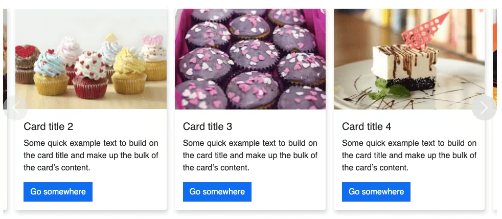
6. Let’s display only 2 cards at once instead of 3 for screens larger than 576px.
@media screen and (min-width: 576px) {
  .carousel-item {
    flex: 0 0 50%;
  }
}
But it won’t go until the last card. Since there are only 2 cards now, we need to update the JS as well.
if (scrollPosition < carouselWidth - cardWidth * 3) {Let’s change the position of the controls only for screens larger than 768px. Also, move the carousel inner padding to the same media query.
@media screen and (min-width: 768px) {
  .carousel-control-prev,
  .carousel-control-next {
    background-color: #fff;
    opacity: 1;
    width: 3em;
    height: 3em;
    position: absolute;
    left: 0;
    top: 90%;
  }
  .carousel-control-next {
    left: 6%;
  }
  .carousel-inner {
    padding: 1em;
  }
}
Output:
What our customers say
Card title 1
Some quick example text to build on the card title and make up the bulk of the card’s content.
Card title 2
Some quick example text to build on the card title and make up the bulk of the card’s content.
Card title 3
Some quick example text to build on the card title and make up the bulk of the card’s content.
Card title 4
Some quick example text to build on the card title and make up the bulk of the card’s content.
Card title 5
Some quick example text to build on the card title and make up the bulk of the card’s content.
Card title 6
Some quick example text to build on the card title and make up the bulk of the card’s content.
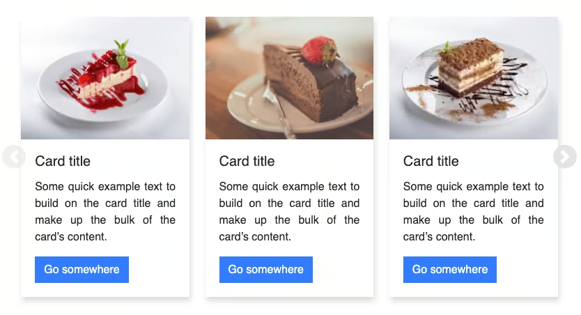
7. You can also add some icons to your Bootstrap testimonial slider. First, install Bootstrap icons(I am using the CDN link).
Add a quote icon above the title. I am using the display-2 class to increase the font size.
<div class="testimonial-title">
  <i class="bi bi-quote display-2"></i>
  <h2 class="fw-bold display-5">What our customers say</h2>
</div>
Similarly, you can also add stars for rating. Change the color with text-warning class and add some padding.
<div class="carousel-item active">
  <div class="card">
    <div class="img-wrapper"><img src="..." class="d-block w-100" alt="..."> </div>
    <div class="card-body">
      <h5 class="card-title">Card title 1</h5>
      <i class="bi bi-star-fill text-warning pe-1"></i>
      <i class="bi bi-star-fill text-warning pe-1"></i>
      <i class="bi bi-star-fill text-warning pe-1"></i>
      <i class="bi bi-star-fill text-warning pe-1"></i>
      <i class="bi bi-star-fill text-warning pe-1"></i>
      <p class="card-text">Some quick example text to build on the card title and make up the bulk of the
        card's content.</p>
    </div>
  </div>
</div>
For cards with equal height, set the height to 100% for the cards. Add some padding to the title, to align it with the quote icon and the card.
.card {
  height: 100%;
}
.testimonial-title h2 {
  padding-left: 0.2em;
}
Let’s place the controls a bit lower for smaller screens and add a box-shadow for the controls too.
.carousel-control-prev, .carousel-control-next {
  top: 60%;
  box-shadow: 2px 6px 8px 0 rgba(22, 22, 26, 0.18);
}
Output:
What our customers say
Card title 1
“Some dummy text you don’t need to read. Since you have decided to read, do like, share, comment and subscribe to Coding Yaar.”
Card title 2
“Some dummy text you don’t need to read. Since you have decided to read, do like, share, comment and subscribe to Coding Yaar.”
Card title 3
“Some dummy text you don’t need to read. Since you have decided to read, do like, share, comment and subscribe to Coding Yaar.”
Card title 4
“Some dummy text you don’t need to read. Since you have decided to read, do like, share, comment and subscribe to Coding Yaar.”
Card title 5
“Some dummy text you don’t need to read. Since you have decided to read, do like, share, comment and subscribe to Coding Yaar.”
Card title 6
“Some dummy text you don’t need to read. Since you have decided to read, do like, share, comment and subscribe to Coding Yaar.”
Video tutorial for Bootstrap 5 Testimonial Slider:
Final Output Code for Bootstrap 5 Testimonial Slider:
HTML
<div class="testimonial-slider">
    <div id="carouselExampleControls" class="carousel carousel-dark" data-bs-ride="carousel">
        <div class="container-fluid">
            <div class="row">
                <div class="col-md-4">
                    <div class="testimonial-title">
                        <i class="bi bi-quote display-2"></i>
                        <h2 class="fw-bold display-6">What our customers say</h2>
                    </div>
                    <button class="carousel-control-prev" type="button" data-bs-target="#carouselExampleControls" data-bs-slide="prev">
                        <span class="carousel-control-prev-icon" aria-hidden="true"></span>
                        <span class="visually-hidden">Previous</span>
                    </button>
                    <button class="carousel-control-next" type="button" data-bs-target="#carouselExampleControls" data-bs-slide="next">
                        <span class="carousel-control-next-icon" aria-hidden="true"></span>
                        <span class="visually-hidden">Next</span>
                    </button>
                </div>
                <div class="col-md-8">
                    <div class="carousel-inner">
                        <div class="carousel-item active">
                            <div class="card">
                                <div class="img-wrapper"><img src="..." class="d-block w-100" alt="..."> </div>
                                <div class="card-body">
                                    <h5 class="card-title">Card title 1</h5>
                                    <i class="bi bi-star-fill text-warning pe-1"></i>
                                    <i class="bi bi-star-fill text-warning pe-1"></i>
                                    <i class="bi bi-star-fill text-warning pe-1"></i>
                                    <i class="bi bi-star-fill text-warning pe-1"></i>
                                    <i class="bi bi-star-fill text-warning pe-1"></i>
                                    <p class="card-text">"Some dummy text you don't need to read. Since you have decided to read, do like, share, comment and subscribe to Coding Yaar."</p>
                                </div>
                            </div>
                        </div>
                        <div class="carousel-item">
                            <div class="card">
                                <div class="img-wrapper"><img src="..." class="d-block w-100" alt="..."> </div>
                                <div class="card-body">
                                    <h5 class="card-title">Card title 2</h5>
                                    <i class="bi bi-star-fill text-warning pe-1"></i>
                                    <i class="bi bi-star-fill text-warning pe-1"></i>
                                    <i class="bi bi-star-fill text-warning pe-1"></i>
                                    <i class="bi bi-star-fill text-warning pe-1"></i>
                                    <i class="bi bi-star-fill text-warning pe-1"></i>
                                    <p class="card-text">"Some dummy text you don't need to read. Since you have decided to read, do like, share, comment and subscribe to Coding Yaar."</p>
                                </div>
                            </div>
                        </div>
                        <div class="carousel-item">
                            <div class="card">
                                <div class="img-wrapper"><img src="..." class="d-block w-100" alt="..."> </div>
                                <div class="card-body">
                                    <h5 class="card-title">Card title 3</h5>
                                    <i class="bi bi-star-fill text-warning pe-1"></i>
                                    <i class="bi bi-star-fill text-warning pe-1"></i>
                                    <i class="bi bi-star-fill text-warning pe-1"></i>
                                    <i class="bi bi-star-fill text-warning pe-1"></i>
                                    <i class="bi bi-star-fill text-warning pe-1"></i>
                                    <p class="card-text">"Some dummy text you don't need to read. Since you have decided to read, do like, share, comment and subscribe to Coding Yaar."</p>
                                </div>
                            </div>
                        </div>
                        <div class="carousel-item">
                            <div class="card">
                                <div class="img-wrapper"><img src="..." class="d-block w-100" alt="..."> </div>
                                <div class="card-body">
                                    <h5 class="card-title">Card title 4</h5>
                                    <i class="bi bi-star-fill text-warning pe-1"></i>
                                    <i class="bi bi-star-fill text-warning pe-1"></i>
                                    <i class="bi bi-star-fill text-warning pe-1"></i>
                                    <i class="bi bi-star-fill text-warning pe-1"></i>
                                    <i class="bi bi-star-fill text-warning pe-1"></i>
                                    <p class="card-text">"Some dummy text you don't need to read. Since you have decided to read, do like, share, comment and subscribe to Coding Yaar."</p>
                                </div>
                            </div>
                        </div>
                        <div class="carousel-item">
                            <div class="card">
                                <div class="img-wrapper"><img src="..." class="d-block w-100" alt="..."> </div>
                                <div class="card-body">
                                    <h5 class="card-title">Card title 5</h5>
                                    <i class="bi bi-star-fill text-warning pe-1"></i>
                                    <i class="bi bi-star-fill text-warning pe-1"></i>
                                    <i class="bi bi-star-fill text-warning pe-1"></i>
                                    <i class="bi bi-star-fill text-warning pe-1"></i>
                                    <i class="bi bi-star-fill text-warning pe-1"></i>
                                    <p class="card-text">"Some dummy text you don't need to read. Since you have decided to read, do like, share, comment and subscribe to Coding Yaar."</p>
                                </div>
                            </div>
                        </div>
                        <div class="carousel-item">
                            <div class="card">
                                <div class="img-wrapper"><img src="..." class="d-block w-100" alt="..."> </div>
                                <div class="card-body">
                                    <h5 class="card-title">Card title 6</h5>
                                    <i class="bi bi-star-fill text-warning pe-1"></i>
                                    <i class="bi bi-star-fill text-warning pe-1"></i>
                                    <i class="bi bi-star-fill text-warning pe-1"></i>
                                    <i class="bi bi-star-fill text-warning pe-1"></i>
                                    <i class="bi bi-star-fill text-warning pe-1"></i>
                                    <p class="card-text">"Some dummy text you don't need to read. Since you have decided to read, do like, share, comment and subscribe to Coding Yaar."</p>
                                </div>
                            </div>
                        </div>
                    </div>
                </div>
            </div>
        </div>
    </div>
</div>
CSS
.testimonial-slider {
  background-color: #5072a7;
  padding: 3em 2em;
}
.testimonial-title {
  color: #fff;
}
.testimonial-title h2 {
  padding-left: 0.2em;
}
.card {
  margin: 0 0.5em;
  box-shadow: 2px 6px 8px 0 rgba(22, 22, 26, 0.18);
  border: none;
  height: 100%;
}
.carousel-control-prev,
.carousel-control-next {
  background-color: #fff;
  width: 3em;
  height: 3em;
  border-radius: 50%;
  top: 60%;
  transform: translateY(-50%);
  box-shadow: 2px 6px 8px 0 rgba(22, 22, 26, 0.18);
}
@media (min-width: 576px) {
  .carousel-item {
    margin-right: 0;
    flex: 0 0 50%;
    display: block;
  }
  .carousel-inner {
    display: flex;
  }
}
@media (min-width: 768px) {
  .carousel-inner {
    padding: 1em;
  }
  .carousel-control-prev,
  .carousel-control-next {
    width: 3em;
    height: 3em;
    position: absolute;
    left: 1em;
    top: 90%;
    opacity: 1;
  }
  .carousel-control-next {
    left: 4.5em;
  }
}
jQuery
$(document).ready(function () {
    var multipleCardCarousel = document.querySelector(
    "#carouselExampleControls"
  );
  if (window.matchMedia("(min-width: 576px)").matches) {
    var carousel = new bootstrap.Carousel(multipleCardCarousel, {
      interval: false,
      wrap: false
    });
    var carouselWidth = $(".carousel-inner")[0].scrollWidth;
    var cardWidth = $(".carousel-item").width();
    var scrollPosition = 0;
    $("#carouselExampleControls .carousel-control-next").on("click", function () {
      if (scrollPosition < carouselWidth - cardWidth * 3) {
        scrollPosition += cardWidth;
        $("#carouselExampleControls .carousel-inner").animate(
          { scrollLeft: scrollPosition },
          600
        );
      }
    });
    $("#carouselExampleControls .carousel-control-prev").on("click", function () {
      if (scrollPosition > 1) {
        scrollPosition -= cardWidth;
        $("#carouselExampleControls .carousel-inner").animate(
          { scrollLeft: scrollPosition },
          600
        );
      }
    });
  } else {
    $(multipleCardCarousel).addClass("slide");
  }
});
If you have any doubts or stuck somewhere, you can reach out through Coding Yaar's Discord server.