A simple responsive Bootstrap 5 carousel full width with captions horizontally and vertically positioned in the center.
Final output:

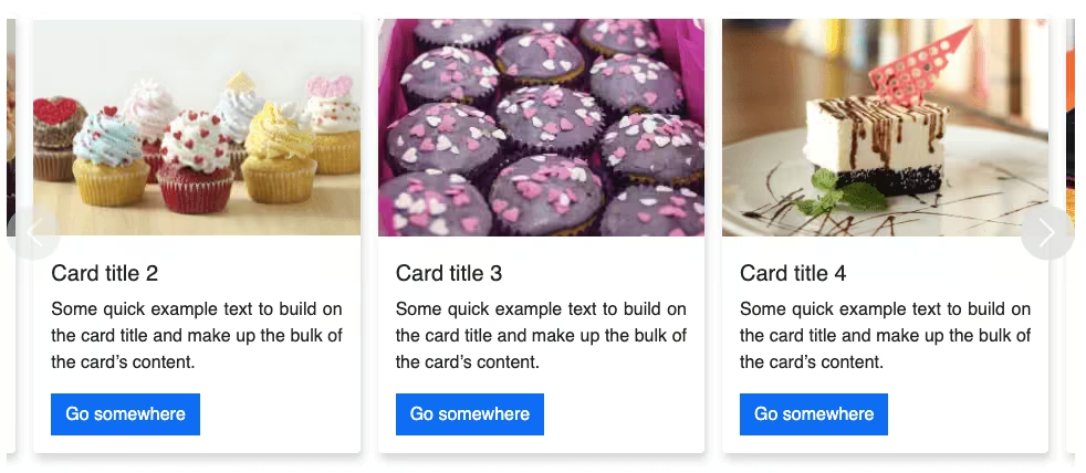
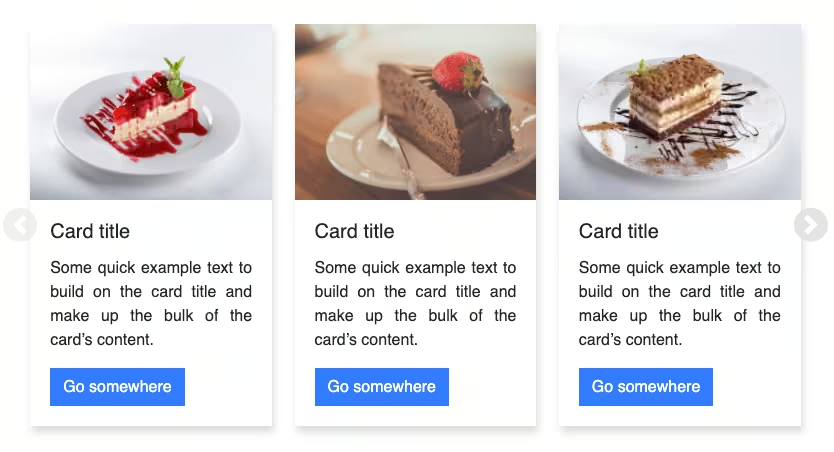
First slide label
Some representative placeholder content for the first slide.

Second slide label
Some representative placeholder content for the second slide.

Third slide label
Some representative placeholder content for the third slide.
1. Let’s start by adding the Bootstrap 5 carousel with captions.
<div id="carouselExampleCaptions" class="carousel slide">
<div class="carousel-indicators">
<button type="button" data-bs-target="#carouselExampleCaptions" data-bs-slide-to="0" class="active" aria-current="true" aria-label="Slide 1"></button>
<button type="button" data-bs-target="#carouselExampleCaptions" data-bs-slide-to="1" aria-label="Slide 2"></button>
<button type="button" data-bs-target="#carouselExampleCaptions" data-bs-slide-to="2" aria-label="Slide 3"></button>
</div>
<div class="carousel-inner">
<div class="carousel-item active">
<img src="..." class="d-block w-100" alt="...">
<div class="carousel-caption d-none d-md-block">
<h5>First slide label</h5>
<p>Some representative placeholder content for the first slide.</p>
</div>
</div>
<div class="carousel-item">
<img src="..." class="d-block w-100" alt="...">
<div class="carousel-caption d-none d-md-block">
<h5>Second slide label</h5>
<p>Some representative placeholder content for the second slide.</p>
</div>
</div>
<div class="carousel-item">
<img src="..." class="d-block w-100" alt="...">
<div class="carousel-caption d-none d-md-block">
<h5>Third slide label</h5>
<p>Some representative placeholder content for the third slide.</p>
</div>
</div>
</div>
<button class="carousel-control-prev" type="button" data-bs-target="#carouselExampleCaptions" data-bs-slide="prev">
<span class="carousel-control-prev-icon" aria-hidden="true"></span>
<span class="visually-hidden">Previous</span>
</button>
<button class="carousel-control-next" type="button" data-bs-target="#carouselExampleCaptions" data-bs-slide="next">
<span class="carousel-control-next-icon" aria-hidden="true"></span>
<span class="visually-hidden">Next</span>
</button>
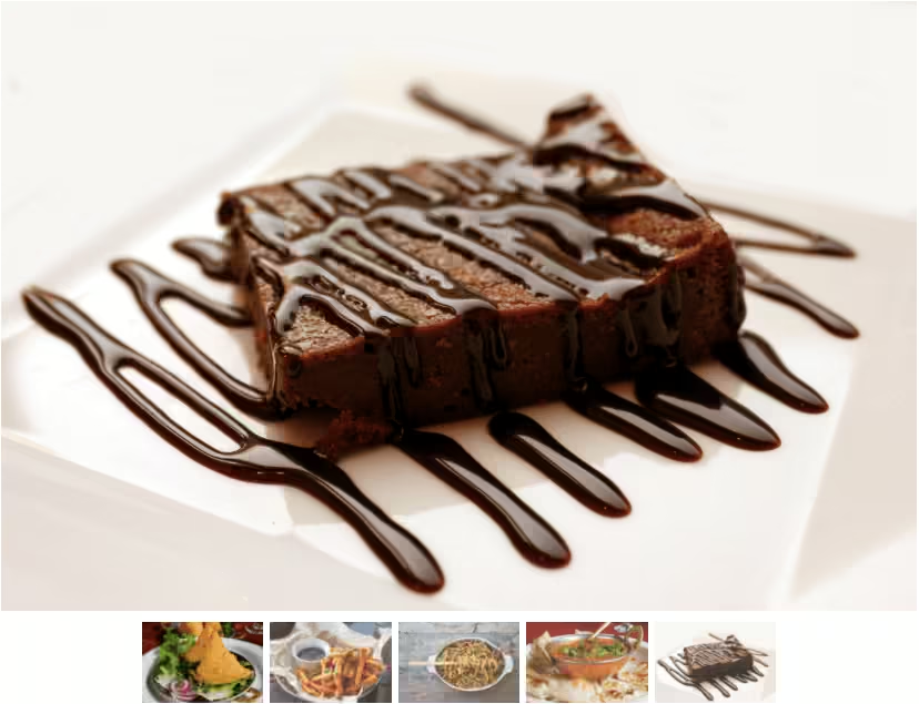
</div>2. Add your images to the carousel. Set the image height to 100vh when the width is greater than the height to get a full width(full screen) carousel. This will cover desktops and small devices in landscape mode.
@media screen and (orientation: landscape) {
  .carousel img {
    height: 100vh;
  }
}
Output:
First slide label
Some representative placeholder content for the first slide.
Second slide label
Some representative placeholder content for the second slide.
Third slide label
Some representative placeholder content for the third slide.
3. We’ll use flexbox to align the captions vertically and horizontally in the center. Use class d-flex to change the display property to flex.
Bootstrap uses the classes d-none and d-md-block on the captions to prevent it from displaying on the small screens.
You can keep the captions hidden by replacing d-md-block with d-md-flex. Or display the captions on small screens by removing the d-none class and using d-flex.
Use flex-column to change the flex-direction to column. Set the height to 100vh using class h-100 or CSS.
It sticks to the top, to place the captions in the center use classes align-items-center and justify-content-center.
<div class="carousel-inner">
    <div class="carousel-item active">
        <img src="..." class="d-block w-100" alt="...">
        <div class="carousel-caption d-flex flex-column h-100 align-items-center justify-content-center">
            <h2>First slide label</h2>
            <p>Some representative placeholder content for the first slide.</p>
        </div>
    </div>
    <div class="carousel-item">
        <img src="..." class="d-block w-100" alt="...">
        <div class="carousel-caption d-flex flex-column h-100 align-items-center justify-content-center">
            <h2>Second slide label</h2>
            <p>Some representative placeholder content for the second slide.</p>
        </div>
    </div>
    <div class="carousel-item">
        <img src="..." class="d-block w-100" alt="...">
        <div class="carousel-caption d-flex flex-column h-100 align-items-center justify-content-center">
            <h2>Third slide label</h2>
            <p>Some representative placeholder content for the third slide.</p>
        </div>
    </div>
</div>
Output:
First slide label
Some representative placeholder content for the first slide.
Second slide label
Some representative placeholder content for the second slide.
Third slide label
Some representative placeholder content for the third slide.
4. If your images make the captions difficult to read, you can add a background and opacity to make them more readable.
Use bg-dark and reduce the background opacity to 50%(bg-opacity-50). Add some padding.
<div class="carousel-inner">
    <div class="carousel-item active">
        <img src="..." class="d-block w-100" alt="...">
        <div class="carousel-caption d-flex flex-column h-100 align-items-center justify-content-center">
            <h2 class="bg-dark bg-opacity-50 py-2 px-4">First slide label</h2>
            <p class="bg-dark bg-opacity-50 py-2 px-4">Some representative placeholder content for the first slide.</p>
        </div>
    </div>
    <div class="carousel-item">
        <img src="..." class="d-block w-100" alt="...">
        <div class="carousel-caption d-flex flex-column h-100 align-items-center justify-content-center">
            <h2 class="bg-dark bg-opacity-50 py-2 px-4">Second slide label</h2>
            <p class="bg-dark bg-opacity-50 py-2 px-4">Some representative placeholder content for the second slide.</p>
        </div>
    </div>
    <div class="carousel-item">
        <img src="..." class="d-block w-100" alt="...">
        <div class="carousel-caption d-flex flex-column h-100 align-items-center justify-content-center">
            <h2 class="bg-dark bg-opacity-50 py-2 px-4">Third slide label</h2>
            <p class="bg-dark bg-opacity-50 py-2 px-4">Some representative placeholder content for the third slide.</p>
        </div>
    </div>
</div>
Output:
First slide label
Some representative placeholder content for the first slide.
Second slide label
Some representative placeholder content for the second slide.
Third slide label
Some representative placeholder content for the third slide.
5. You can also add a CTA button.
<div class="carousel-item">
    <img src="..." class="d-block w-100" alt="...">
    <div class="carousel-caption d-flex flex-column h-100 align-items-center justify-content-center">
        <h2>...</h2>
        <p>...</p>
        <a href="#" class="btn btn-outline-light px-4 py-2 rounded-0">Learn More</a>
    </div>
</div>
Output:
Video tutorial for Bootstrap 5 carousel full screen with captions in the center:
Final Output Code for Responsive Bootstrap carousel full width with captions in the center:
HTML
<div id="carouselExampleCaptions" class="carousel slide">
    <div class="carousel-indicators">
        <button type="button" data-bs-target="#carouselExampleCaptions" data-bs-slide-to="0" class="active"
            aria-current="true" aria-label="Slide 1"></button>
        <button type="button" data-bs-target="#carouselExampleCaptions" data-bs-slide-to="1"
            aria-label="Slide 2"></button>
        <button type="button" data-bs-target="#carouselExampleCaptions" data-bs-slide-to="2"
            aria-label="Slide 3"></button>
    </div>
    <div class="carousel-inner">
        <div class="carousel-item active">
            <img src="..." class="d-block w-100" alt="...">
            <div class="carousel-caption d-flex flex-column h-100 align-items-center justify-content-center">
                <h2 class="bg-dark bg-opacity-50 py-2 px-4">First slide label</h2>
                <p class="bg-dark bg-opacity-50 py-2 px-4">Some representative placeholder content for the first
                    slide.</p>
                <a href="#" class="btn btn-outline-light px-4 py-2 rounded-0">Learn More</a>
            </div>
        </div>
        <div class="carousel-item">
            <img src="..." class="d-block w-100" alt="...">
            <div class="carousel-caption d-flex flex-column h-100 align-items-center justify-content-center">
                <h2 class="bg-dark bg-opacity-50 py-2 px-4">Second slide label</h2>
                <p class="bg-dark bg-opacity-50 py-2 px-4">Some representative placeholder content for the second
                    slide.</p>
                <a href="#" class="btn btn-outline-light px-4 py-2 rounded-0">Learn More</a>
            </div>
        </div>
        <div class="carousel-item">
            <img src="..." class="d-block w-100" alt="...">
            <div class="carousel-caption d-flex flex-column h-100 align-items-center justify-content-center">
                <h2 class="bg-dark bg-opacity-50 py-2 px-4">Third slide label</h2>
                <p class="bg-dark bg-opacity-50 py-2 px-4">Some representative placeholder content for the third
                    slide.</p>
                <a href="#" class="btn btn-outline-light px-4 py-2 rounded-0">Learn More</a>
            </div>
        </div>
    </div>
    <button class="carousel-control-prev" type="button" data-bs-target="#carouselExampleCaptions" data-bs-slide="prev">
        <span class="carousel-control-prev-icon" aria-hidden="true"></span>
        <span class="visually-hidden">Previous</span>
    </button>
    <button class="carousel-control-next" type="button" data-bs-target="#carouselExampleCaptions" data-bs-slide="next">
        <span class="carousel-control-next-icon" aria-hidden="true"></span>
        <span class="visually-hidden">Next</span>
    </button>
</div>
CSS
@media screen and (orientation: landscape) {
  .carousel img {
    height: 100vh;
  }
}
If you have any doubts or stuck somewhere, you can reach out through Coding Yaar's Discord server.