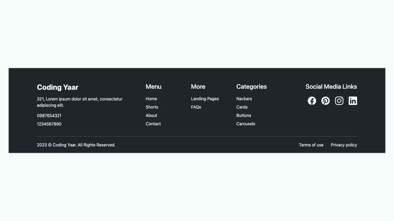
Simple, responsive footer built with HTML and CSS, featuring clear navigation links, categories, and social icons for a clean and user-friendly layout.
Final output:
Final Output Code for Responsive Footer HTML CSS:
HTML
<head>
    <link rel="stylesheet" href="https://cdn.jsdelivr.net/npm/bootstrap-icons@1.13.1/font/bootstrap-icons.min.css">
</head>
<footer>
    <div class="top">
        <div class="col">
            <h3>Coding Yaar</h3>
            <p>321, Lorem ipsum dolor sit amet, consectetur adipiscing elit.</p>
            <p>0987654321</p>
            <p>1234567890</p>
        </div>
        <div class="col">
            <h4>Menu</h4>
            <ul>
                <li><a>Home</a></li>
                <li><a>Shorts</a></li>
                <li><a>About</a></li>
                <li><a>Contact</a></li>
            </ul>
        </div>
        <div class="col">
            <h4>More</h4>
            <ul>
                <li><a>Landing Pages</a></li>
                <li><a>FAQs</a></li>
            </ul>
        </div>
        <div class="col">
            <h4>Categories</h4>
            <ul>
                <li><a>Navbars</a></li>
                <li><a>Cards</a></li>
                <li><a>Buttons</a></li>
                <li><a>Carousels</a></li>
            </ul>
        </div>
        <div class="col">
            <h4>Social Media Links</h4>
            <div class="social-media">
                <a href="#"><i class="bi bi-facebook"></i></a>
                <a href="#"><i class="bi bi-pinterest"></i></a>
                <a href="#"><i class="bi bi-instagram"></i></a>
                <a href="#"><i class=" bi bi-linkedin"></i></a>
            </div>
        </div>
    </div>
    <hr>
    <div class="bottom">
        <p>2026 © Coding Yaar. All Rights Reserved. </p>
        <p>
            <a href="#">Terms of use</a>
            <a href="#"> Privacy policy</a>
        </p>
    </div>
</footer>
CSS
* {
  margin: 0;
  box-sizing: border-box;
}

body {
  font-family: Arial, Helvetica, sans-serif;

  a {
    color: #ffffff;
    text-decoration: none;

    &:hover {
      color: gainsboro;
    }
  }

  footer {
    background-color: #2f3b52;
    color: #ffffff;
    padding: 2rem;

    h3 {
      font-weight: 700;
      font-size: 1.5rem;
    }

    h3,
    h4 {
      margin-bottom: 1.5rem;
    }

    .top {
      display: grid;
      grid-template-columns: 4fr 2fr 2fr 2fr 3fr;
      gap: 1rem;

      .col {
        padding: 1rem;


        ul {
          list-style: none;
          padding-left: 0;
        }

        p,
        li {
          margin-top: 1rem;

        }

        &:last-child {

          .social-media {
            display: flex;
            flex-wrap: wrap;
            gap: .5rem 1rem;

            a {
              font-size: 2rem;
            }
          }
        }
      }
    }

    .bottom {
      padding: 1rem 1rem 0 1rem;
      display: flex;
      justify-content: space-between;
    }
  }
}
If you have any doubts or stuck somewhere, you can reach out through Coding Yaar's Discord server.