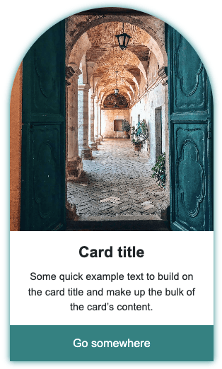
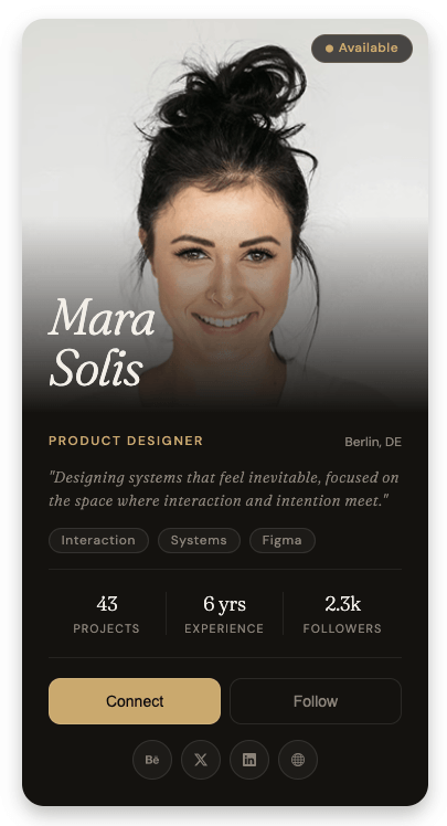
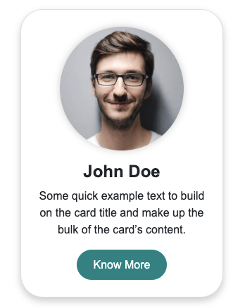
A simple card design using HTML CSS featuring a circular icon badge that overlaps the top edge, a bold title, description text, and a call-to-action link.
Final output:
1. Let’s start with a .card-with-icon div. Inside it, add a .card-icon div with an SVG icon, and a .card-body div below it. a .card-body div.
<div class="card-with-icon">
    <div class="card-icon">
        <svg xmlns="http://www.w3.org/2000/svg" width="50" height="50" fill="currentColor" viewBox="0 0 16 16">
            <path d="M10.478 1.647a.5.5 0 1 0-.956-.294l-4 13a.5.5 0 0 0 .956.294l4-13zM4.854 4.146a.5.5 0 0 1 0 .708L1.707 8l3.147 3.146a.5.5 0 0 1-.708.708l-3.5-3.5a.5.5 0 0 1 0-.708l3.5-3.5a.5.5 0 0 1 .708 0zm6.292 0a.5.5 0 0 0 0 .708L14.293 8l-3.147 3.146a.5.5 0 0 0 .708.708l3.5-3.5a.5.5 0 0 0 0-.708l-3.5-3.5a.5.5 0 0 0-.708 0z"></path>
        </svg>
    </div>
    <div class="card-body"></div>
</div>
Reset margins, set the font family, and style the card with a max-width, centered text, and a box-shadow. Set the position property to relative on the card so that the icon can be placed on top of it using absolute positioning later.
* {
    margin: 0;
    box-sizing: border-box;
}
body {
    font-family: Arial, Helvetica, sans-serif;
    margin: 3rem;
}
.card-with-icon {
    max-width: 20rem;
    text-align: center;
    margin-top: 3rem;
    position: relative;
    box-shadow: 0 .5rem 1rem rgba(0, 0, 0, .15);
}
Output:
2. Now style the .card-icon. Set the position property to absolute and use left: 50% with the transform property set to translate(-50%, -50%) to center it horizontally and pull it up so it sits halfway above the card. Give it a dark circular background with some padding, since the SVG needs breathing room inside the circle.
Add a top margin to the card body so it clears the icon above it. Then add extra top padding so the content inside doesn’t sit right below the icon edge.
.card-with-icon .card-icon {
    position: absolute;
    left: 50%;
    transform: translate(-50%, -50%);
    border-radius: 50%;
    background-color: #212529;
    color: #f8f9fa;
    padding: 1rem;
}
.card-with-icon .card-body {
    margin-top: 3rem;
    padding: 3.5rem 1rem 1rem;
}
Output:
3. To the .card-body, add your title, description, a horizontal rule, and a link.
<div class="card-body">
    <h3 class="card-title">Card With Icon</h3>
    <p class="card-text">Some quick example text to build on the card title and make up the bulk of the card's content.</p>
    <hr>
    <a href="#">Learn More</a>
</div>
Style the title and description with font sizes and spacing to create a clear visual hierarchy. Set the opacity property on the horizontal rule to 0.4 so it appears as a subtle divider rather than a heavy line.
.card-with-icon .card-body {
    margin-top: 3rem;
    padding: 3.5rem 1rem 1rem;
}
.card-with-icon .card-title {
    padding-top: .5rem;
    margin-bottom: .25rem;
    font-size: 1.3rem;
    line-height: 1.2;
    font-weight: 700;
}
.card-with-icon .card-text {
    padding: .5rem 0;
    margin-bottom: .75rem;
    letter-spacing: .25px;
    line-height: 1.5;
}
.card-with-icon hr {
    opacity: .4;
    margin-bottom: .75rem;
}
Output:
4. Finally, style the “Learn More” link. Set the display property to block so it stretches across the full card width and the padding applies correctly, since anchor tags are inline by default. Then add a hover state that reduces the opacity slightly so the user gets visual feedback when hovering over it.
.card-with-icon .card-body a {
    text-decoration: none;
    font-weight: 700;
    padding: .5rem;
    display: block;
    color: #212529;
    transition: opacity .3s;
}
.card-with-icon .card-body a:hover {
    opacity: .7;
}
Output:
Final Output Code for Card Design HTML CSS:
HTML
<div class="card-with-icon">
    <div class="card-icon">
        <svg xmlns="http://www.w3.org/2000/svg" width="50" height="50" fill="currentColor" viewBox="0 0 16 16">
            <path
                d="M10.478 1.647a.5.5 0 1 0-.956-.294l-4 13a.5.5 0 0 0 .956.294l4-13zM4.854 4.146a.5.5 0 0 1 0 .708L1.707 8l3.147 3.146a.5.5 0 0 1-.708.708l-3.5-3.5a.5.5 0 0 1 0-.708l3.5-3.5a.5.5 0 0 1 .708 0zm6.292 0a.5.5 0 0 0 0 .708L14.293 8l-3.147 3.146a.5.5 0 0 0 .708.708l3.5-3.5a.5.5 0 0 0 0-.708l-3.5-3.5a.5.5 0 0 0-.708 0z">
            </path>
        </svg>
    </div>
    <div class="card-body">
        <h3 class="card-title">Card With Icon</h3>
        <p class="card-text">Some quick example text to build on the card title and make up the bulk of the card's
            content.</p>
        <hr>
        <a href="#">Learn More</a>
    </div>
</div>
CSS
* {
    margin: 0;
    box-sizing: border-box;
}

body {
    font-family: Arial, Helvetica, sans-serif;
    margin: 3rem;
}

.card-with-icon {
    max-width: 20rem;
    text-align: center;
    margin-top: 3rem;
    position: relative;
    box-shadow: 0 .5rem 1rem rgba(0, 0, 0, .15);
}

.card-with-icon .card-icon {
    position: absolute;
    left: 50%;
    transform: translate(-50%, -50%);
    border-radius: 50%;
    background-color: #212529;
    color: #f8f9fa;
    padding: 1rem;
}

.card-with-icon .card-body {
    margin-top: 3rem;
    padding: 3.5rem 1rem 1rem;
}

.card-with-icon .card-body .card-title {
    padding-top: .5rem;
    margin-bottom: .25rem;
    font-size: 1.3rem;
    line-height: 1.2;
    font-weight: 700;
}

.card-with-icon .card-body .card-text {
    padding: .5rem 0;
    margin-bottom: .75rem;
    letter-spacing: .25px;
    line-height: 1.5;
}

.card-with-icon .card-body hr {
    opacity: .4;
    margin-bottom: .75rem;
}

.card-with-icon .card-body a {
    text-decoration: none;
    font-weight: 700;
    padding: .5rem;
    display: block;
    color: #212529;
    transition: opacity .3s;
}

.card-with-icon .card-body a:hover {
    opacity: .7;
}
If you have any doubts or stuck somewhere, you can reach out through Coding Yaar's Discord server.