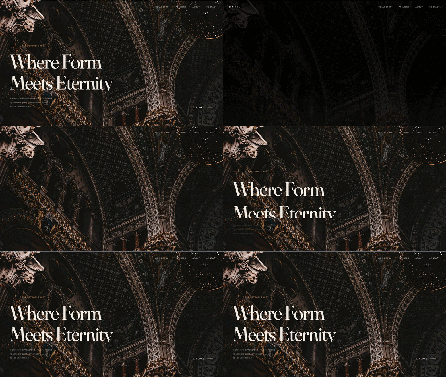
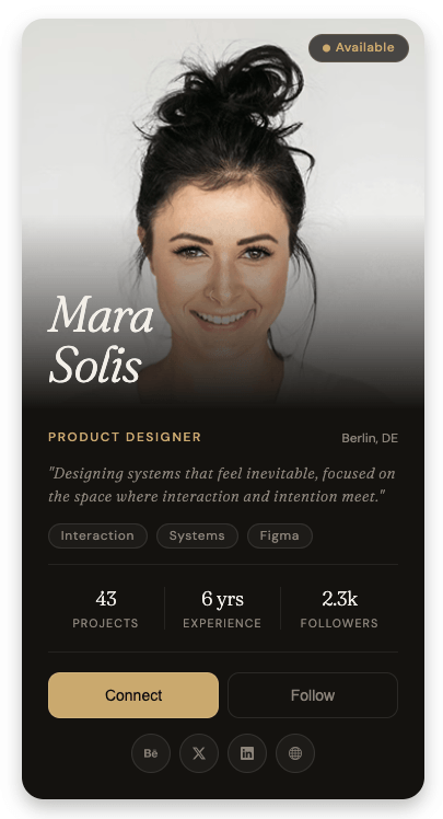
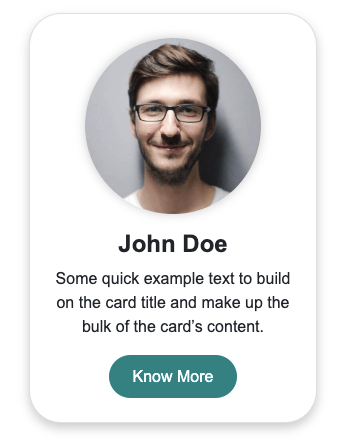
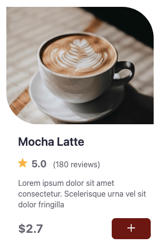
Simple arched card built with HTML and CSS. The arch shape is created using a large border-radius on the top two corners, with the image clipped inside using overflow hidden.
Final output:
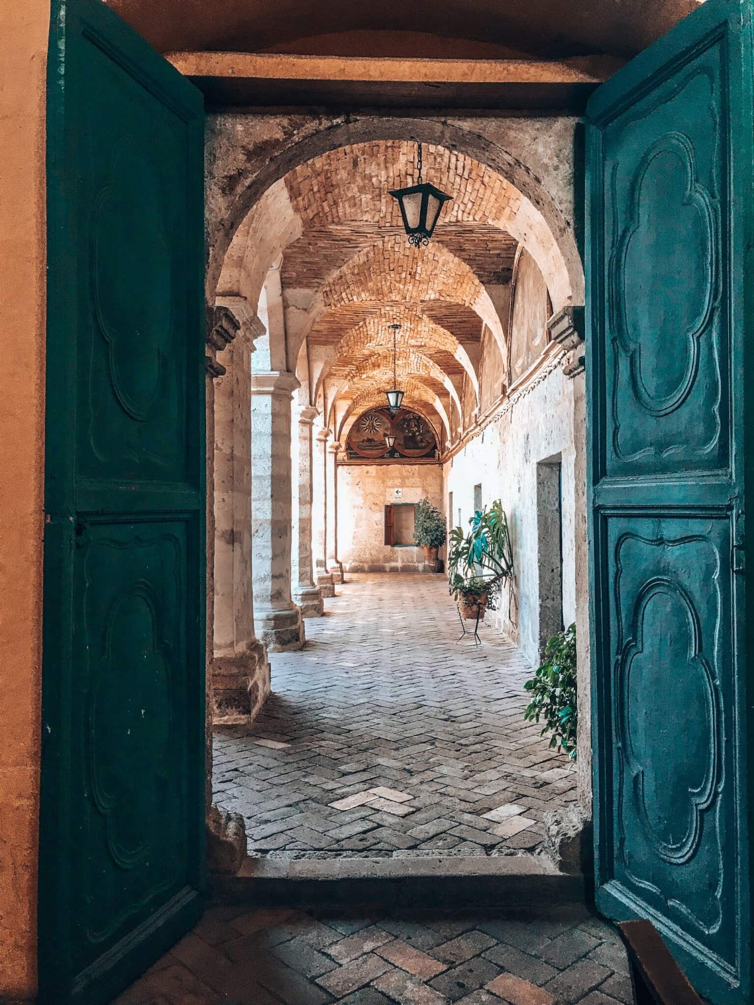
Card title
Some quick example text to build on the card title and make up the bulk of the card’s content.
1. Let’s start with a .card div. Add the image and a .card-body div inside it.
<div class="card">
    <img src="image.jpg">
    <div class="card-body">
        <h5 class="card-title">Card title</h5>
        <p class="card-text">Some quick example text to build on the card title and make up the bulk of the card's content.</p>
    </div>
    <a href="#" class="btn">Go somewhere</a>
</div>
Reset margins, set the font family, and style the card. The arched top is created using a large border-top-left-radius and border-top-right-radius. Set overflow: hidden so the image stays inside the arch shape.
* {
    margin: 0;
    box-sizing: border-box;
}
body {
    font-family: Arial, Helvetica, sans-serif;
}
.card {
    max-width: 20rem;
    overflow: hidden;
    background-color: #fff;
    text-align: center;
    border-top-left-radius: 10em;
    border-top-right-radius: 10em;
}
.card:nth-child(1) {
    box-shadow: 0 0 10px teal;
}
Output:
Card title
Some quick example text to build on the card title and make up the bulk of the card’s content.
2. Style the image with width: 100% and a max-height with object-fit: cover so it fills the arch without stretching.
.card img {
    width: 100%;
    max-height: 22rem;
    object-fit: cover;
}
Output:
Card title
Some quick example text to build on the card title and make up the bulk of the card’s content.
3. Style the card body, title, and paragraph with some padding and spacing.
.card .card-body {
    padding: 1rem 1.5rem;
}
.card .card-title {
    line-height: 1.5;
    font-size: 1.5rem;
    margin-bottom: .5rem;
    font-weight: 700;
}
.card .card-body p {
    font-size: 1em;
    line-height: 1.5;
}
Output:
Card title
Some quick example text to build on the card title and make up the bulk of the card’s content.
4. Style the button with a teal background and full width so it spans the entire card bottom. Set border-radius: 0 to keep the bottom corners square.
.card .btn {
    display: inline-block;
    font-weight: 400;
    font-size: 1.125rem;
    line-height: 1.5;
    text-decoration: none;
    border: 1px solid transparent;
    color: #fff;
    background-color: teal;
    border-color: teal;
    width: 100%;
    padding: .75em .5em;
    border-radius: 0;
    cursor: pointer;
}
Output:
Card title
Some quick example text to build on the card title and make up the bulk of the card’s content.
Final Output Code for Arched Card HTML CSS:
HTML
<div class="card">
    <img src="card-image.jpg">
    <div class="card-body">
        <h5 class="card-title">Card title</h5>
        <p class="card-text">Some quick example text to build on the card title and make up the bulk of the card's
            content.</p>
    </div>
    <a href="#" class="btn">Go somewhere</a>
</div>
CSS
* {
    margin: 0;
    box-sizing: border-box;
}
body {
    font-family: Arial, Helvetica, sans-serif;
}
.card {
    max-width: 20rem;
    overflow: hidden;
    background-color: #fff;
    text-align: center;
    border-top-left-radius: 10em;
    border-top-right-radius: 10em;
}
.card:nth-child(1) {
    box-shadow: 0 0 10px teal;
}
.card img {
    width: 100%;
    max-height: 22rem;
    object-fit: cover;
}
.card .card-body {
    padding: 1rem 1.5rem;
}
.card .card-title {
    line-height: 1.5;
    font-size: 1.5rem;
    margin-bottom: .5rem;
    font-weight: 700;
}
.card .card-body p {
    font-size: 1em;
    line-height: 1.5;
}
.card .btn {
    display: inline-block;
    font-weight: 400;
    font-size: 1.125rem;
    line-height: 1.5;
    text-decoration: none;
    border: 1px solid transparent;
    color: #fff;
    background-color: teal;
    border-color: teal;
    width: 100%;
    padding: .75em .5em;
    border-radius: 0;
    cursor: pointer;
}
If you have any doubts or stuck somewhere, you can reach out through Coding Yaar's Discord server.