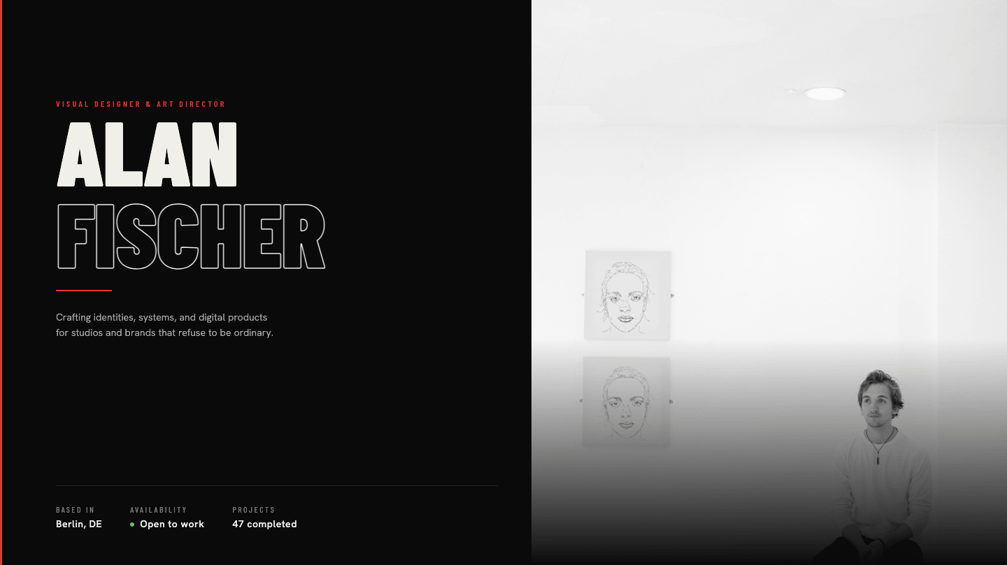
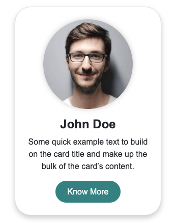
A modern responsive profile card built with HTML and CSS. It features a full-width profile image with a gradient overlay, availability badge, designer details, skill tags, stats, social links, and responsive action buttons.
Final output:
Mara
Solis
“Designing systems that feel inevitable, focused on the space where interaction and intention meet.”
Final Output Code for Responsive Profile Card HTML CSS #3:
1. Let’s start with a .profile-card div. Inside it, add a .profile-top div and a .profile-card-body div.
<div class="profile-card">
    <div class="profile-top"></div>
    <div class="profile-card-body"></div>
</div>
Link your fonts in the head. I am using the DM Sans and Fraunces fonts from Google Fonts. Also link Bootstrap Icons since we’ll be using them for the social links.
<link rel="preconnect" href="https://fonts.googleapis.com">
<link rel="preconnect" href="https://fonts.gstatic.com" crossorigin>
<link href="https://fonts.googleapis.com/css2?family=DM+Sans:ital,opsz,wght@0,9..40,100..1000;1,9..40,100..1000&family=Fraunces:ital,opsz,wght@0,9..144,100..900;1,9..144,100..900&display=swap"
    rel="stylesheet">
<link rel="stylesheet" href="https://cdn.jsdelivr.net/npm/bootstrap-icons@1.13.1/font/bootstrap-icons.min.css">
Then reset margins, set DM Sans as the font family, and define three CSS variables on :root for the gold color, the muted text gold color, and the Fraunces font so you can reuse them throughout without repeating yourself.
* {
    margin: 0;
    box-sizing: border-box;
}
body {
    font-family: "DM Sans", sans-serif;
}
:root {
    --gold: hsl(39, 46%, 61%);
    --text-gold: hsl(33, 7%, 51%);
    --fraunces-font: "Fraunces", serif;
}
Style the card with a max-width, rounded corners, and a box-shadow. Set the overflow property to hidden so the image and body content stay clipped inside the rounded corners.
.profile-card {
    max-width: 23rem;
    border-radius: 1.25rem;
    box-shadow: 0px 0px 0px 0.5px hsla(0, 0%, 100%, 0.04), 0px .5rem 1rem 0px hsla(0, 0%, 0%, 0.25);
    overflow: hidden;
}
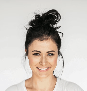
2. Fill in .profile-top with an .img-wrapper div with the profile image and the name heading.
<div class="profile-top">
    <div class="img-wrapper">
        <img src="profile.png" alt="">
    </div>
    <h3>Mara <br> Solis</h3>
</div>
Set the position property to relative on .profile-top so the tag and heading can be placed on top of the image using absolute positioning later.
.profile-card .profile-top {
    position: relative;
}
Output:
Mara
Solis
3. Style the image. Set the width property to 100% and the max height property to 22rem, then set the object fit property to cover so it fills the space without stretching. Set the position property to relative and the z-index property to -1 so the gradient overlay sits on top of it.
.profile-card .img-wrapper img {
    width: 100%;
    max-height: 22rem;
    object-fit: cover;
    position: relative;
    z-index: -1;
}
Add a dark gradient overlay on .img-wrapper that fades from transparent at the top to fully dark at the bottom. This is what lets the name heading sit on top of the image and remain readable.
.profile-card .img-wrapper {
    background: linear-gradient(180deg, hsla(30, 11%, 7%, 0) 50%, hsla(30, 11%, 7%, 0.55) 78%, hsla(30, 11%, 7%, 1) 100%);
}
Output:
Mara
Solis
4. Style the name heading. Set the position property to absolute and the bottom property to 0 so it sits at the bottom of the image area, right above the card body. Use the Fraunces font in a light italic style to give it an editorial feel.
.profile-card .profile-top h3 {
    padding: 0 1.5rem 1.125rem;
    font-family: var(--fraunces-font);
    font-weight: 300;
    font-style: italic;
    font-size: 2.875rem;
    line-height: 1;
    letter-spacing: -1.16px;
    color: hsl(35, 32%, 93%);
    position: absolute;
    bottom: 0;
}
Add an available tag to the profile-top div.
<div class="profile-tag">Available</div>Now style the .profile-tag. Set the position property to absolute with the top and right properties set to 0.875rem so it sits in the top right corner of the image. Give it a semi-transparent dark background with a gold border. Use a ::before pseudo-element to add the small gold dot on the left side of the tag.
.profile-card .profile-tag {
    position: absolute;
    top: .875rem;
    right: .875rem;
    font-weight: 500;
    font-size: .75rem;
    line-height: 1.3;
    letter-spacing: 0.42px;
    border: 1px solid hsla(39, 46%, 61%, 0.22);
    background: hsla(30, 20%, 4%, 0.72);
    color: var(--gold);
    padding: .25rem .75rem .25rem 1.5rem;
    border-radius: 100rem;
}
.profile-card .profile-tag::before {
    position: absolute;
    left: .75rem;
    top: 50%;
    transform: translateY(-50%);
    content: "";
    width: 0.438rem;
    height: 0.438rem;
    background-color: var(--gold);
    border-radius: 50%;
}
Output:
Mara
Solis
5. Fill in .profile-card-body with the title row.
<div class="profile-card-body">
    <div>
        <span class="profile-title">Product Designer</span>
        <span>Berlin, DE</span>
    </div>
    <p>"Designing systems that feel inevitable..."</p>
</div>
Give the card body a dark background and some padding. Set the color property to the muted text gold variable as the default text color for everything inside it.
.profile-card .profile-card-body {
    background-color: hsl(30, 11%, 7%);
    padding: 1.125rem 1.5rem 1.5rem;
    color: var(--text-gold);
}
Use flexbox with the justify content property set to space-between so the title and location sit at opposite ends. Set the profile title to the gold color and uppercase to make it stand out.
.profile-card .profile-card-body > div:first-of-type {
    display: flex;
    justify-content: space-between;
    align-items: center;
    flex-wrap: wrap;
    gap: .5rem;
    font-size: .75rem;
}
.profile-card .profile-title {
    font-weight: 500;
    line-height: 1.3;
    letter-spacing: 1.6px;
    text-transform: uppercase;
    color: var(--gold);
}
Style the bio quote with the Fraunces font in a light italic style. Add some top and bottom margin using the margin block property to give it breathing room between the title row and the badges.
.profile-card .profile-card-body p {
    font-family: var(--fraunces-font);
    font-weight: 300;
    font-style: italic;
    font-size: .875rem;
    line-height: 1.5;
    letter-spacing: .5px;
    color: var(--text-gold);
    margin-block: .875rem;
}
Output:
Mara
Solis
“Designing systems that feel inevitable, focused on the space where interaction and intention meet.”
6. Add the badges to the profile card body.
<div class="badges-wrapper">
    <span class="badge">Interaction</span>
    <span class="badge">Systems</span>
    <span class="badge">Figma</span>
</div>
To style these, use flexbox with the flex wrap property set to wrap so they wrap to the next line if they don’t all fit. Give each badge a subtle border, a very slightly lighter background than the card body, and a pill shape using a large border radius.
.profile-card .badges-wrapper {
    display: flex;
    flex-wrap: wrap;
    gap: .5rem;
}
.profile-card .badge {
    padding: .25rem .675rem;
    border: 1px solid hsla(0, 0%, 100%, 0.1);
    border-radius: 100rem;
    background-color: hsla(0, 0%, 100%, 0.04);
    color: var(--text-gold);
    font-size: .75rem;
    line-height: 1.1;
    letter-spacing: 0.6px;
}
Output:
Mara
Solis
“Designing systems that feel inevitable, focused on the space where interaction and intention meet.”
7. Next, add the stats to the profile card body.
<div class="stats-wrapper">
    <div class="stats-block">
        <span>43</span>
        <span>Projects</span>
    </div>
    <div class="stats-block">
        <span>6 yrs</span>
        <span>Experience</span>
    </div>
    <div class="stats-block">
        <span>2.3k</span>
        <span>Followers</span>
    </div>
</div>
Style the stats wrapper with top and bottom borders using the border block property to visually separate it from the badges above and buttons below. Use flexbox with the justify content property set to space-between to spread the three stat blocks evenly.
Add a right border on each block except the last using :not(:last-child) to create vertical dividers between them.
.profile-card .stats-wrapper {
    border-block: 1px solid hsla(0, 0%, 100%, 0.07);
    margin-block: .875rem;
    padding-block: 1.25rem;
    display: flex;
    justify-content: space-between;
    flex-wrap: wrap;
    row-gap: .675rem;
}
.profile-card .stats-block {
    display: flex;
    flex-flow: column wrap;
    justify-content: center;
    flex: 1 1 6rem;
    gap: .375rem;
    text-align: center;
}
.profile-card .stats-block > :first-child {
    color: hsla(35, 32%, 93%, 1);
    font-family: var(--fraunces-font);
    font-weight: 300;
    font-size: 1.125rem;
    line-height: 1.2;
    letter-spacing: -0.21px;
}
.profile-card .stats-block > :last-child {
    font-size: .675rem;
    line-height: 1;
    letter-spacing: 1.08px;
    text-transform: uppercase;
    color: var(--text-gold);
}
.profile-card .stats-block:not(:last-child) {
    border-right: 1px solid hsla(0, 0%, 100%, 0.07);
}
Output:
Mara
Solis
“Designing systems that feel inevitable, focused on the space where interaction and intention meet.”
8. Add the buttons to the profile card body.
<div class="buttons-wrapper">
    <button>Connect</button>
    <button>Follow</button>
</div>
Style the buttons wrapper. Use flexbox with the flex property set to 1 1 8rem on each button so they share the space equally and wrap if needed. Give the first button a solid gold background with dark text, and leave the second one transparent with a subtle border.
Add a scale transform on hover so both buttons feel interactive, and also change the color of the second button to gold on hover.
.profile-card .buttons-wrapper {
    margin-block: 1.125rem .875rem;
    display: flex;
    flex-wrap: wrap;
    gap: .5rem;
}
.profile-card .buttons-wrapper button {
    flex: 1 1 8rem;
    padding-block: .75rem;
    border-radius: .675rem;
    background-color: transparent;
    border: 1px solid hsla(0, 0%, 100%, 0.1);
    font-weight: 500;
    font-size: .875rem;
    line-height: 1.2;
    text-align: center;
    color: var(--text-gold);
    cursor: pointer;
    transition: color .3s, transform .3s;
}
.profile-card .buttons-wrapper button:hover {
    transform: scale(1.05);
}
.profile-card .buttons-wrapper button:last-child:hover {
    color: var(--gold);
}
.profile-card .buttons-wrapper button:first-of-type {
    background-color: var(--gold);
    color: hsla(30, 11%, 4%, 1);
}
Output:
Mara
Solis
“Designing systems that feel inevitable, focused on the space where interaction and intention meet.”
9. Finally, add the social media links to the profile card body.
<div class="social-links-wrapper">
    <a href="#"><i class="bi bi-behance"></i></a>
    <a href="#"><i class="bi bi-twitter-x"></i></a>
    <a href="#"><i class="bi bi-linkedin"></i></a>
    <a href="#"><i class="bi bi-globe"></i></a>
</div>
Let’s style the social links. Use flexbox with the justify content property set to center so the icons are centered in the row. Give each link a fixed circular shape using a width, height, and border radius set to 50%. Add a scale transform and a color change to gold on hover so each icon feels responsive when clicked.
.profile-card .social-links-wrapper {
    display: flex;
    justify-content: center;
    gap: .5rem;
}
.profile-card .social-links-wrapper a {
    width: 2.25rem;
    height: 2.25rem;
    text-align: center;
    align-content: center;
    border: 1px solid hsla(0, 0%, 100%, 0.1);
    border-radius: 50%;
    background-color: hsla(0, 0%, 100%, 0.04);
    color: var(--text-gold);
    font-size: .75rem;
    line-height: 1;
    text-decoration: none;
    transition: color .3s, transform .3s;
}
.profile-card .social-links-wrapper a:hover {
    color: var(--gold);
    transform: scale(1.2);
}
Output:
Mara
Solis
“Designing systems that feel inevitable, focused on the space where interaction and intention meet.”
Final Output Code for Responsive Profile Card HTML CSS #3:
Head
<link rel="preconnect" href="https://fonts.googleapis.com">
<link rel="preconnect" href="https://fonts.gstatic.com" crossorigin>
<link
    href="https://fonts.googleapis.com/css2?family=DM+Sans:ital,opsz,wght@0,9..40,100..1000;1,9..40,100..1000&family=Fraunces:ital,opsz,wght@0,9..144,100..900;1,9..144,100..900&display=swap"
    rel="stylesheet">
<link rel="stylesheet" href="https://cdn.jsdelivr.net/npm/bootstrap-icons@1.13.1/font/bootstrap-icons.min.css">
HTML
<div class="profile-card">
    <div class="profile-top">
        <div class="profile-tag">Available</div>
        <div class="img-wrapper">
            <img src="https://codingyaar.com/wp-content/uploads/Mara-Solis.png" alt="">
        </div>
        <h3>Mara <br> Solis</h3>
    </div>
    <div class="profile-card-body">
        <div>
            <span class="profile-title">Product Designer</span>
            <span>Berlin, DE</span>
        </div>
        <p>"Designing systems that feel inevitable, focused on the space where interaction and intention meet."</p>
        <div class="badges-wrapper">
            <span class="badge">Interaction</span>
            <span class="badge">Systems</span>
            <span class="badge">Figma</span>
        </div>
        <div class="stats-wrapper">
            <div class="stats-block">
                <span>43</span>
                <span>Projects</span>
            </div>
            <div class="stats-block">
                <span>6 yrs</span>
                <span>Experience</span>
            </div>
            <div class="stats-block">
                <span>2.3k</span>
                <span>Followers</span>
            </div>
        </div>
        <div class="buttons-wrapper">
            <button>Connect</button>
            <button>Follow</button>
        </div>
        <div class="social-links-wrapper">
            <a href="#"><i class="bi bi-behance"></i></a>
            <a href="#"><i class="bi bi-twitter-x"></i></a>
            <a href="#"><i class="bi bi-linkedin"></i></a>
            <a href="#"><i class="bi bi-globe"></i></a>
        </div>
    </div>
</div>
CSS
* {
    margin: 0;
    box-sizing: border-box;
}
body {
    font-family: "DM Sans", sans-serif;
}
:root {
    --gold: hsl(39, 46%, 61%);
    --text-gold: hsl(33, 7%, 51%);
    --fraunces-font: "Fraunces", serif;
}
.profile-card {
    max-width: 23rem;
    border-radius: 1.25rem;
    box-shadow: 0px 0px 0px 0.5px hsla(0, 0%, 100%, 0.04), 0px .5rem 1rem 0px hsla(0, 0%, 0%, 0.25);
    overflow: hidden;
}
.profile-card .profile-top {
    position: relative;
}
.profile-card .img-wrapper {
    background: linear-gradient(180deg, hsla(30, 11%, 7%, 0) 50%, hsla(30, 11%, 7%, 0.55) 78%, hsla(30, 11%, 7%, 1) 100%);
}
.profile-card .img-wrapper img {
    width: 100%;
    max-height: 22rem;
    object-fit: cover;
    position: relative;
    z-index: -1;
}
.profile-card .profile-top h3 {
    padding: 0 1.5rem 1.125rem;
    font-family: var(--fraunces-font);
    font-weight: 300;
    font-style: italic;
    font-size: 2.875rem;
    line-height: 1;
    letter-spacing: -1.16px;
    color: hsl(35, 32%, 93%);
    position: absolute;
    bottom: 0;
}
.profile-card .profile-tag {
    position: absolute;
    top: .875rem;
    right: .875rem;
    font-weight: 500;
    font-size: .75rem;
    line-height: 1.3;
    letter-spacing: 0.42px;
    border: 1px solid hsla(39, 46%, 61%, 0.22);
    background: hsla(30, 20%, 4%, 0.72);
    color: var(--gold);
    padding: .25rem .75rem .25rem 1.5rem;
    border-radius: 100rem;
    backdrop-filter: blur(10px);
}
.profile-card .profile-tag::before {
    position: absolute;
    left: .75rem;
    top: 50%;
    transform: translateY(-50%);
    content: "";
    width: 0.438rem;
    height: 0.438rem;
    background-color: var(--gold);
    border-radius: 50%;
}
.profile-card .profile-card-body {
    background-color: hsl(30, 11%, 7%);
    padding: 1.125rem 1.5rem 1.5rem;
    color: var(--text-gold);
}
.profile-card .profile-card-body > div:first-of-type {
    display: flex;
    justify-content: space-between;
    align-items: center;
    flex-wrap: wrap;
    gap: .5rem;
    font-size: .75rem;
}
.profile-card .profile-title {
    font-weight: 500;
    line-height: 1.3;
    letter-spacing: 1.6px;
    text-transform: uppercase;
    color: var(--gold);
}
.profile-card .profile-card-body p {
    font-family: var(--fraunces-font);
    font-weight: 300;
    font-style: italic;
    font-size: .875rem;
    line-height: 1.5;
    letter-spacing: .5px;
    color: var(--text-gold);
    margin-block: .875rem;
}
.profile-card .badges-wrapper {
    display: flex;
    flex-wrap: wrap;
    gap: .5rem;
}
.profile-card .badge {
    padding: .25rem .675rem;
    border: 1px solid hsla(0, 0%, 100%, 0.1);
    border-radius: 100rem;
    background-color: hsla(0, 0%, 100%, 0.04);
    color: var(--text-gold);
    font-size: .75rem;
    line-height: 1.1;
    letter-spacing: 0.6px;
}
.profile-card .stats-wrapper {
    border-block: 1px solid hsla(0, 0%, 100%, 0.07);
    margin-block: .875rem;
    padding-block: 1.25rem;
    display: flex;
    justify-content: space-between;
    flex-wrap: wrap;
    row-gap: .675rem;
}
.profile-card .stats-block {
    display: flex;
    flex-flow: column wrap;
    justify-content: center;
    flex: 1 1 6rem;
    gap: .375rem;
    text-align: center;
}
.profile-card .stats-block > :first-child {
    color: hsla(35, 32%, 93%, 1);
    font-family: var(--fraunces-font);
    font-weight: 300;
    font-size: 1.125rem;
    line-height: 1.2;
    letter-spacing: -0.21px;
}
.profile-card .stats-block > :last-child {
    font-size: .675rem;
    line-height: 1;
    letter-spacing: 1.08px;
    text-transform: uppercase;
    color: var(--text-gold);
}
.profile-card .stats-block:not(:last-child) {
    border-right: 1px solid hsla(0, 0%, 100%, 0.07);
}
.profile-card .buttons-wrapper {
    margin-block: 1.125rem .875rem;
    display: flex;
    flex-wrap: wrap;
    gap: .5rem;
}
.profile-card .buttons-wrapper button {
    flex: 1 1 8rem;
    padding-block: .75rem;
    border-radius: .675rem;
    background-color: transparent;
    border: 1px solid hsla(0, 0%, 100%, 0.1);
    font-weight: 500;
    font-size: .875rem;
    line-height: 1.2;
    text-align: center;
    color: var(--text-gold);
    cursor: pointer;
    transition: color .3s, transform .3s;
}
.profile-card .buttons-wrapper button:hover {
    transform: scale(1.05);
}
.profile-card .buttons-wrapper button:last-child:hover {
    color: var(--gold);
}
.profile-card .buttons-wrapper button:first-of-type {
    background-color: var(--gold);
    color: hsla(30, 11%, 4%, 1);
}
.profile-card .social-links-wrapper {
    display: flex;
    justify-content: center;
    gap: .5rem;
}
.profile-card .social-links-wrapper a {
    width: 2.25rem;
    height: 2.25rem;
    text-align: center;
    align-content: center;
    border: 1px solid hsla(0, 0%, 100%, 0.1);
    border-radius: 50%;
    background-color: hsla(0, 0%, 100%, 0.04);
    color: var(--text-gold);
    font-size: .75rem;
    line-height: 1;
    text-decoration: none;
    transition: color .3s, transform .3s;
}
.profile-card .social-links-wrapper a:hover {
    color: var(--gold);
    transform: scale(1.2);
}
If you have any doubts or stuck somewhere, you can reach out through Coding Yaar's Discord server.