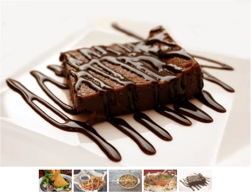
Product image carousel built with HTML, CSS, and Swiper JS. This carousel features circular images that scale up and zoom in when they become the active slide. It also includes fraction pagination, a draggable scrollbar, and prev/next navigation buttons for full control. The active slide is always centered, while the inactive ones scale down on either side for a clean focus effect.
Final output:
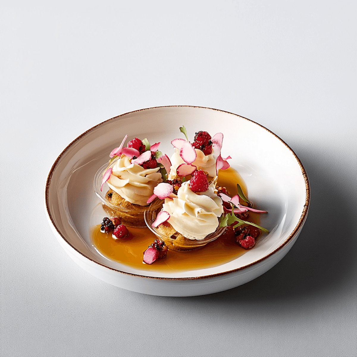




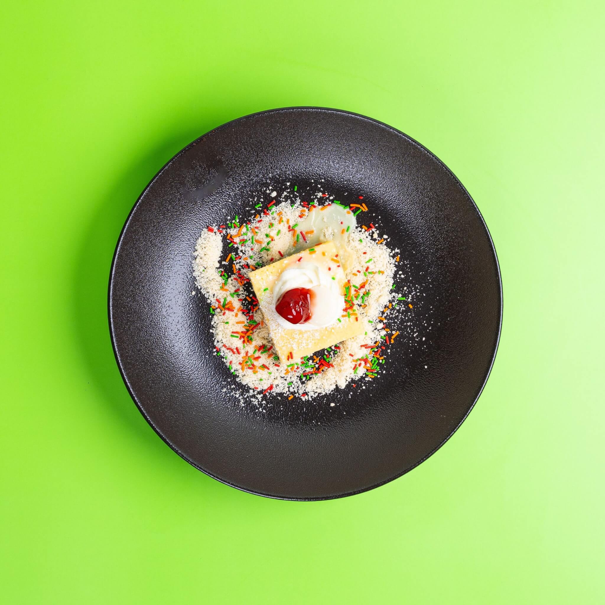


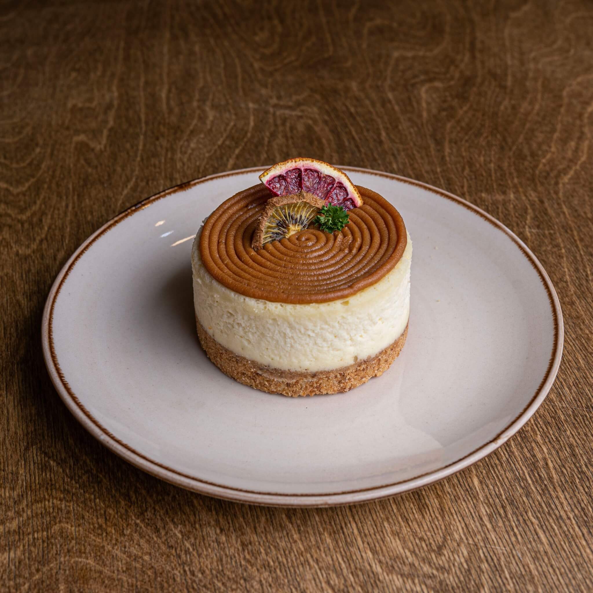
1. Let’s start with a .products-carousel div. Inside it, add a .swiper div with a .swiper-wrapper inside it. Swiper needs this exact structure to work.
<div class="products-carousel">
    <div class="swiper">
        <div class="swiper-wrapper">
        </div>
    </div>
</div>
Next, link the Swiper CSS in the head and the Swiper JS just before the closing tag.
<!-- in head -->
<link rel="stylesheet" href="https://cdn.jsdelivr.net/npm/swiper@12/swiper-bundle.min.css" />

<!-- before closing body -->
<script src="https://cdn.jsdelivr.net/npm/swiper@12/swiper-bundle.min.js"></script>
Reset margins, set the font family, and add a radial gradient background to .products-carousel. Add padding to the swiper. On landscape screens, use a viewport-based padding so that it scales with the screen size.
* {
    margin: 0;
    box-sizing: border-box;
}
body {
    font-family: Arial, Helvetica, sans-serif;
}
.products-carousel {
    background: radial-gradient(circle, #FFF3C8 0%, #0081a7 100%);
}
.products-carousel .swiper {
    padding: 1rem 0;
}
@media screen and (orientation: landscape) {
    .products-carousel .swiper {
        padding: 8vw 0;
    }
}
Output:
2. Now add the slides inside .swiper-wrapper. Each slide is a .swiper-slide div with an .image-wrapper div and an image inside it.
<div class="swiper-wrapper">
    <div class="swiper-slide">
        <div class="image-wrapper">
            <img src="images/image-1.jpg" alt="">
        </div>
    </div>
    <div class="swiper-slide">
        <div class="image-wrapper">
            <img src="images/image-2.jpg" alt="">
        </div>
    </div>
    <!-- add more slides -->
</div>
Style the .image-wrapper to fill the slide height and center the image inside it using flexbox. Then make the image circular with border-radius: 50%.
Use viewport-based width and height so that the image size scales with the screen size. The inactive slides start at scale(.6) and scale up to scale(1) when active, creating the focus/zoom effect. Now add a transition so the scaling animates smoothly.
.products-carousel .swiper-slide {
    height: 100%;
}
.products-carousel .image-wrapper {
    height: 100%;
    display: flex;
    justify-content: center;
    align-items: center;
}
.products-carousel .image-wrapper img {
    width: 30vw;
    height: 30vw;
    border-radius: 50%;
    transform: scale(.6);
    transition: transform .3s ease;
}
@media screen and (max-width: 768px) {
    .products-carousel .image-wrapper img {
        width: 45vw;
        height: 45vw;
    }
}
.products-carousel .swiper-slide-active img {
    transform: scale(1);
}
Output:
3. Initialize Swiper so the slides actually render. Add a script.js file and link it before the closing body tag, after the Swiper JS link.
Use DOMContentLoaded to make sure the page is fully loaded before the script runs. Set centeredSlides to true so the active slide is always in the center. Also, use breakpoints to show 2 slides on mobile and 3 on larger screens.
document.addEventListener("DOMContentLoaded", (event) => {
    const swiper = new Swiper('.products-carousel .swiper', {
        slidesPerView: 3,
        spaceBetween: 20,
        centeredSlides: true,
        loop: true,
        parallax: true,
        autoHeight: true,
        breakpoints: {
            0: {
                slidesPerView: 2,
            },
            800: {
                slidesPerView: 3,
            },
        },
        autoplay: true
    });
});
Output:
4. Next, add the .swiper-controls div after .swiper-wrapper. Inside it, add .swiper-controls-left with the pagination and scrollbar, and .swiper-controls-right with the prev and next buttons.
<div class="swiper-controls">
    <div class="swiper-controls-left">
        <div class="swiper-pagination"></div>
        <div class="swiper-scrollbar"></div>
    </div>
    <div class="swiper-controls-right">
        <div class="swiper-button-prev"></div>
        <div class="swiper-button-next"></div>
    </div>
</div>
Position .swiper-controls absolutely at the bottom center of the swiper. Then use flexbox with justify-content: space-between to push the left controls and right controls to opposite ends.
.products-carousel .swiper-controls {
    position: absolute;
    bottom: 1rem;
    left: 50%;
    transform: translateX(-50%);
    width: 85%;
    display: flex;
    align-items: center;
    justify-content: space-between;
}
.products-carousel .swiper-controls-left,
.products-carousel .swiper-controls-right {
    display: flex;
    gap: 1rem;
}
.products-carousel .swiper-controls-left {
    flex-direction: column;
    align-items: flex-start;
}
Output:
5. Let’s wire up the controls by adding the navigation, pagination, and scrollbar options to the Swiper instance. The pagination with type: “fraction” shows the current slide number out of the total. The scrollbar with draggable: true lets users drag it to scrub through slides.
navigation: {
    nextEl: ".swiper-button-next",
    prevEl: ".swiper-button-prev"
},
pagination: {
    el: ".swiper-pagination",
    type: "fraction",
    clickable: true
},
scrollbar: {
    el: ".swiper-scrollbar",
    draggable: true
},
Output:
6. By default, Swiper positions the pagination, scrollbar, and navigation buttons absolutely. Set their position to static to place them inside the custom controls layout instead.
Use filter to invert(1) to flip the colors to white since the background is dark. Style the prev and next buttons as circular dark buttons.
.products-carousel .swiper .swiper-controls .swiper-pagination,
.products-carousel .swiper .swiper-controls .swiper-scrollbar,
.products-carousel .swiper .swiper-controls .swiper-button-prev,
.products-carousel .swiper .swiper-controls .swiper-button-next {
    position: static;
    margin: 0;
    filter: invert(1);
    width: auto;
}
.products-carousel .swiper .swiper-controls .swiper-scrollbar {
    width: 10rem;
}
.products-carousel .swiper .swiper-controls .swiper-button-prev,
.products-carousel .swiper .swiper-controls .swiper-button-next {
    width: 2.5rem;
    height: 2.5rem;
    background: #00000030;
    border-radius: 50%;
    border: 1px solid #00000015;
    transition: background .3s ease;
}
.products-carousel .swiper .swiper-controls .swiper-button-prev:hover,
.products-carousel .swiper .swiper-controls .swiper-button-next:hover {
    background: #00000060;
}
Output:
Final Output Code for Product Image Carousel using Swiper JS:
HTML
<div class="products-carousel">
    <div class="swiper">
        <div class="swiper-wrapper">
            <div class="swiper-slide">
                <div class="image-wrapper">
                    <img src="images/image-1.jpg" alt="">
                </div>
            </div>
            <div class="swiper-slide">
                <div class="image-wrapper">
                    <img src="images/image-2.jpg" alt="">
                </div>
            </div>
            <div class="swiper-slide">
                <div class="image-wrapper">
                    <img src="images/image-3.jpg" alt="">
                </div>
            </div>
            <div class="swiper-slide">
                <div class="image-wrapper">
                    <img src="images/image-4.jpg" alt="">
                </div>
            </div>
            <div class="swiper-slide">
                <div class="image-wrapper">
                    <img src="images/image-5.jpg" alt="">
                </div>
            </div>
            <div class="swiper-slide">
                <div class="image-wrapper">
                    <img src="images/image-6.jpg" alt="">
                </div>
            </div>
        </div>
        <div class="swiper-controls">
            <div class="swiper-controls-left">
                <div class="swiper-pagination"></div>
                <div class="swiper-scrollbar"></div>
            </div>
            <div class="swiper-controls-right">
                <div class="swiper-button-prev"></div>
                <div class="swiper-button-next"></div>
            </div>
        </div>
    </div>
</div>
CSS
* {
    margin: 0;
    box-sizing: border-box;
}
body {
    font-family: Arial, Helvetica, sans-serif;
}
.products-carousel {
    background: radial-gradient(circle, #FFF3C8 0%, #0081a7 100%);
}
.products-carousel .swiper {
    padding: 1rem 0;
}
@media screen and (orientation: landscape) {
    .products-carousel .swiper {
        padding: 8vw 0;
    }
}
.products-carousel .swiper-slide {
    height: 100%;
}
.products-carousel .image-wrapper {
    height: 100%;
    display: flex;
    justify-content: center;
    align-items: center;
}
.products-carousel .image-wrapper img {
    width: 30vw;
    height: 30vw;
    border-radius: 50%;
    transform: scale(.6);
    transition: transform .3s ease;
}
@media screen and (max-width: 768px) {
    .products-carousel .image-wrapper img {
        width: 45vw;
        height: 45vw;
    }
}
.products-carousel .swiper-slide-active img {
    transform: scale(1);
}
.products-carousel .swiper-controls {
    position: absolute;
    bottom: 1rem;
    left: 50%;
    transform: translateX(-50%);
    width: 85%;
    display: flex;
    align-items: center;
    justify-content: space-between;
}
.products-carousel .swiper-controls-left,
.products-carousel .swiper-controls-right {
    display: flex;
    gap: 1rem;
}
.products-carousel .swiper-controls-left {
    flex-direction: column;
    align-items: flex-start;
}
.products-carousel .swiper .swiper-controls .swiper-pagination,
.products-carousel .swiper .swiper-controls .swiper-scrollbar,
.products-carousel .swiper .swiper-controls .swiper-button-prev,
.products-carousel .swiper .swiper-controls .swiper-button-next {
    position: static;
    margin: 0;
    filter: invert(1);
    width: auto;
}
.products-carousel .swiper .swiper-controls .swiper-scrollbar {
    width: 10rem;
}
.products-carousel .swiper .swiper-controls .swiper-button-prev,
.products-carousel .swiper .swiper-controls .swiper-button-next {
    width: 2.5rem;
    height: 2.5rem;
    background: #00000030;
    border-radius: 50%;
    border: 1px solid #00000015;
    transition: background .3s ease;
}
.products-carousel .swiper .swiper-controls .swiper-button-prev:hover,
.products-carousel .swiper .swiper-controls .swiper-button-next:hover {
    background: #00000060;
}
JS:
document.addEventListener("DOMContentLoaded", (event) => {
    const swiper = new Swiper('.products-carousel .swiper', {
        slidesPerView: 3,
        spaceBetween: 20,
        centeredSlides: true,
        loop: true,
        parallax: true,
        autoHeight: true,
        breakpoints: {
            0: {
                slidesPerView: 2,
            },
            800: {
                slidesPerView: 3,
            },
        },
        navigation: {
            nextEl: ".swiper-button-next",
            prevEl: ".swiper-button-prev"
        },
        pagination: {
            el: ".swiper-pagination",
            type: "fraction",
            clickable: true
        },
        scrollbar: {
            el: ".swiper-scrollbar",
            draggable: true
        },
        autoplay: true
    });
});
If you have any doubts or stuck somewhere, you can reach out through Coding Yaar's Discord server.