This hero section HTML CSS portfolio tutorial shows you how to build a full-viewport dark hero layout with a two-column grid. The left side has a red accent label, a large outlined text heading using -webkit-text-stroke, a short description, and a stats row pinned to the bottom with an availability dot indicator. The right side has a full-height image with a gradient overlay that fades into the dark background. A red left border on the section ties the whole design together.
Final output:
ALAN
FISCHER
Crafting identities, systems, and digital products for studios and brands that refuse to be ordinary.
Steps for Portfolio Hero Section HTML CSS:
1. First, link the Hanken Grotesk and Barlow Condensed fonts from Google Fonts in the head.
<link rel="preconnect" href="https://fonts.googleapis.com">
<link rel="preconnect" href="https://fonts.gstatic.com" crossorigin>
<link href="https://fonts.googleapis.com/css2?family=Barlow+Condensed:ital,wght@0,100;0,200;0,300;0,400;0,500;0,600;0,700;0,800;0,900;1,100;1,200;1,300;1,400;1,500;1,600;1,700;1,800;1,900&family=Hanken+Grotesk:ital,wght@0,100..900;1,100..900&display=swap" rel="stylesheet">
Let’s start with a section element with the class hero-section. Inside it, add a .hero-wrapper div with a .hero-content and a .hero-image-wrapper div.
<section class="hero-section">
    <div class="hero-wrapper">
        <div class="hero-content"></div>
        <div class="hero-image-wrapper"></div>
    </div>
</section>
Then reset margins, set Hanken Grotesk as the font family, and define the Barlow Condensed font as a CSS variable on :root. Give the section a near-black background, a warm cream text color, and a red left border so it frames the whole section with a strong accent. Set the height property to 100dvh so it fills the full viewport.
* {
    margin: 0;
    box-sizing: border-box;
}
body {
    font-family: "Hanken Grotesk", sans-serif;
}
:root {
    --heading-font: "Barlow Condensed", sans-serif;
}
.hero-section {
    height: 100dvh;
    background-color: hsl(0, 0%, 4%);
    color: hsl(38, 21%, 93%);
    border-left: 3px solid hsl(357, 100%, 45%);
}
Style .hero-wrapper with a two-column grid so the content and image sit side by side. Set the height property to 100% so it fills the section. Use margin-left: auto instead of margin-inline: auto so the wrapper hugs the right edge while the red border on the section stays visible on the left. On tablet and below, collapse to a single column.
.hero-section .hero-wrapper {
    display: grid;
    grid-template-columns: 1fr 1fr;
    gap: 3rem;
    height: 100%;
    max-width: 88rem;
    margin-left: auto;
}
@media screen and (max-width: 992px) {
    .hero-section .hero-wrapper {
        grid-template-columns: 1fr;
        gap: 1rem;
    }
}
2. Fill in .hero-content with the section label, heading, description, and a .hero-content-bottom div with the stats.
<div class="hero-content">
    <span class="section-label">VISUAL DESIGNER & ART DIRECTOR</span>
    <h1>ALAN<br><span>FISCHER</span></h1>
    <p>Crafting identities, systems, and digital products for studios and brands that refuse to be ordinary.</p>
    <div class="hero-content-bottom">
        <div>
            <span>BASED IN</span>
            <span>Berlin, DE</span>
        </div>
        <div>
            <span>AVAILABILITY</span>
            <span>Open to work</span>
        </div>
        <div>
            <span>PROJECTS</span>
            <span>47 completed</span>
        </div>
    </div>
</div>
Use flexbox with the flex direction property set to column on .hero-content so everything stacks vertically. Use clamp() on the top padding so it scales with the screen.
.hero-section .hero-content {
    padding-top: clamp(3.75rem, calc(1rem + 7.22vw), 7.5rem);
    height: 100%;
    display: flex;
    flex-direction: column;
    padding-left: 3rem;
}
Output:
ALAN
FISCHER
Crafting identities, systems, and digital products for studios and brands that refuse to be ordinary.
3. Style the section label with the Barlow Condensed font in red uppercase text and a wide letter spacing so it reads as a job title tag above the name.
.hero-section .section-label {
    font-family: var(--heading-font);
    font-weight: 600;
    font-size: .75rem;
    line-height: 1.3;
    letter-spacing: 3.3px;
    color: hsl(357, 100%, 45%);
    margin-top: 1.5rem;
}
Style the heading with the Barlow Condensed font at a very large size using clamp() so it scales smoothly. Set the line height property to 0.9 so the two lines feel tight and impactful.
The span inside gets a transparent fill with a white stroke using -webkit-text-stroke, so the second line appears as an outlined version of the name rather than a solid color.
Set the position property to relative on the heading so the short red underline can be placed below it using a ::after pseudo-element.
.hero-section h1 {
    font-family: var(--heading-font);
    font-weight: 900;
    font-size: clamp(4rem, calc(1rem + 7.92vw), 8.125rem);
    line-height: .9;
    letter-spacing: -1.3px;
    position: relative;
    padding-bottom: 1.625rem;
    margin-bottom: 1.625rem;
}
.hero-section h1 span {
    color: transparent;
    -webkit-text-stroke: 1.5px rgb(240, 237, 232);
}
.hero-section h1::after {
    content: "";
    position: absolute;
    bottom: 0;
    left: 0;
    width: 5rem;
    height: 2px;
    background-color: hsl(357, 100%, 45%);
}
Style the description with a light font weight and a semi-transparent color so it reads as supporting content rather than competing with the heading above it.
.hero-section p {
    font-weight: 300;
    font-size: .875rem;
    line-height: 1.6;
    letter-spacing: 0.14px;
    color: hsla(38, 21%, 93%, 0.7);
    max-width: 19.5rem;
    margin-bottom: 1.625rem;
}
Output:
ALAN
FISCHER
Crafting identities, systems, and digital products for studios and brands that refuse to be ordinary.
4. Style .hero-content-bottom. Set the margin top property to auto so it pushes to the bottom of the flex column, and add a top border to visually separate it from the content above. Use flexbox with flex-wrap: wrap to lay the three stat blocks in a row.
Each block stacks its label and value using flexbox with the flex direction property set to column. The second block gets a small green dot before the value using a ::before pseudo-element to indicate availability status.
.hero-section .hero-content-bottom {
    margin-top: auto;
    margin-bottom: 3rem;
    padding-top: 1.625rem;
    border-top: 1px solid hsla(38, 21%, 93%, 0.12);
    display: flex;
    flex-wrap: wrap;
    gap: 2.5rem;
}
.hero-section .hero-content-bottom div {
    display: flex;
    flex-direction: column;
    gap: .25rem;
}
.hero-section .hero-content-bottom div span:first-child {
    font-family: var(--heading-font);
    font-size: .75rem;
    line-height: 1.3;
    letter-spacing: 2.52px;
    color: hsla(38, 21%, 93%, 0.5);
}
.hero-section .hero-content-bottom div span:last-child {
    font-weight: 500;
    font-size: .875rem;
    line-height: 1.4;
    letter-spacing: 0.52px;
}
.hero-section .hero-content-bottom div:nth-child(2) span:last-child {
    position: relative;
    padding-left: .875rem;
}
.hero-section .hero-content-bottom div:nth-child(2) span:last-child::before {
    position: absolute;
    left: 0;
    top: 50%;
    transform: translateY(-50%);
    content: "";
    width: 6px;
    height: 6px;
    border-radius: 50%;
    background-color: hsl(142, 71%, 45%);
}
Output:
ALAN
FISCHER
Crafting identities, systems, and digital products for studios and brands that refuse to be ordinary.
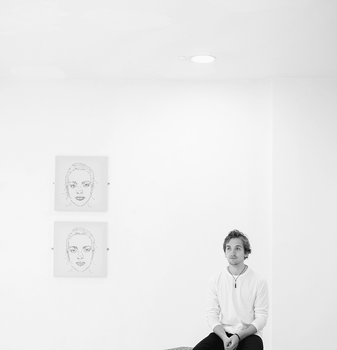
5. Fill in .hero-image-wrapper with the hero image.
<div class="hero-image-wrapper">
    <img src="alan-fischer.png" alt="">
</div>
Set the width and height properties to 100% so the wrapper fills its grid column. Set the position property to relative so the dark gradient overlay can be placed inside it using absolute positioning. The ::after pseudo-element adds a gradient that fades from the section background color at the bottom to transparent at the top, so the image blends naturally into the dark background below it. On tablet, cap the height so the image doesn’t take up too much vertical space when stacked.
.hero-section .hero-image-wrapper {
    width: 100%;
    height: 100%;
    position: relative;
}
@media screen and (max-width: 992px) {
    .hero-section .hero-image-wrapper {
        max-height: 30rem;
    }
}
.hero-section .hero-image-wrapper img {
    width: 100%;
    height: 100%;
    object-fit: cover;
    z-index: 1;
}
.hero-section .hero-image-wrapper::after {
    background: linear-gradient(0deg, hsl(0, 0%, 4%) 0%, rgba(10, 10, 10, 0) 40%, rgba(10, 10, 10, 0) 100%);
    z-index: 9;
    position: absolute;
    width: 100%;
    height: 100%;
    inset: 0;
    content: "";
}
Output:
ALAN
FISCHER
Crafting identities, systems, and digital products for studios and brands that refuse to be ordinary.
Final Output Code for Responsive Portfolio Hero Section HTML CSS:
Head
<link rel="preconnect" href="https://fonts.googleapis.com">
<link rel="preconnect" href="https://fonts.gstatic.com" crossorigin>
<link href="https://fonts.googleapis.com/css2?family=Barlow+Condensed:ital,wght@0,100;0,200;0,300;0,400;0,500;0,600;0,700;0,800;0,900;1,100;1,200;1,300;1,400;1,500;1,600;1,700;1,800;1,900&family=Hanken+Grotesk:ital,wght@0,100..900;1,100..900&display=swap" rel="stylesheet">
HTML
<section class="hero-section">
        <div class="hero-wrapper">
            <div class="hero-content">
                <span class="section-label">VISUAL DESIGNER & ART DIRECTOR</span>
                <h1>
                    ALAN<br>
                    <span>FISCHER</span>
                </h1>
                <p>Crafting identities, systems, and digital products
                    for studios and brands that refuse to be ordinary.</p>
                <div class="hero-content-bottom">
                    <div>
                        <span>BASED IN</span>
                        <span>Berlin, DE</span>
                    </div>
                    <div>
                        <span>AVAILABILITY</span>
                        <span>Open to work</span>
                    </div>
                    <div>
                        <span>PROJECTS</span>
                        <span>47 completed</span>
                    </div>
                </div>
            </div>
            <div class="hero-image-wrapper">
                <img src="Alan-Fischer.png" alt="">
            </div>
        </div>
    </section>
CSS
* {
    margin: 0;
    box-sizing: border-box;
}
body {
    font-family: "Hanken Grotesk", sans-serif;
}
:root {
    --heading-font: "Barlow Condensed", sans-serif;
}
.hero-section {
    height: 100dvh;
    background-color: hsl(0, 0%, 4%);
    color: hsl(38, 21%, 93%);
    border-left: 3px solid hsl(357, 100%, 45%);
}
.hero-section .hero-wrapper {
    display: grid;
    grid-template-columns: 1fr 1fr;
    gap: 3rem;
    height: 100%;
    max-width: 88rem;
    margin-left: auto;
}
@media screen and (max-width: 992px) {
    .hero-section .hero-wrapper {
        grid-template-columns: 1fr;
        gap: 1rem;
    }
}
.hero-section .hero-content {
    padding-top: clamp(3.75rem, calc(1rem + 7.22vw), 7.5rem);
    height: 100%;
    display: flex;
    flex-direction: column;
    padding-left: 3rem;
}
.hero-section .section-label {
    font-family: var(--heading-font);
    font-weight: 600;
    font-size: .75rem;
    line-height: 1.3;
    letter-spacing: 3.3px;
    color: hsl(357, 100%, 45%);
    margin-top: 1.5rem;
}
.hero-section h1 {
    font-family: var(--heading-font);
    font-weight: 900;
    font-size: clamp(4rem, calc(1rem + 7.92vw), 8.125rem);
    line-height: .9;
    letter-spacing: -1.3px;
    position: relative;
    padding-bottom: 1.625rem;
    margin-bottom: 1.625rem;
}
.hero-section h1 span {
    color: transparent;
    -webkit-text-stroke: 1.5px rgb(240, 237, 232);
}
.hero-section h1::after {
    content: "";
    position: absolute;
    bottom: 0;
    left: 0;
    width: 5rem;
    height: 2px;
    background-color: hsl(357, 100%, 45%);
}
.hero-section p {
    font-weight: 300;
    font-size: .875rem;
    line-height: 1.6;
    letter-spacing: 0.14px;
    color: hsla(38, 21%, 93%, 0.7);
    max-width: 19.5rem;
    margin-bottom: 1.625rem;
}
.hero-section .hero-content-bottom {
    margin-top: auto;
    margin-bottom: 3rem;
    padding-top: 1.625rem;
    border-top: 1px solid hsla(38, 21%, 93%, 0.12);
    display: flex;
    flex-wrap: wrap;
    gap: 2.5rem;
}
.hero-section .hero-content-bottom div {
    display: flex;
    flex-direction: column;
    gap: .25rem;
}
.hero-section .hero-content-bottom div span:first-child {
    font-family: var(--heading-font);
    font-size: .75rem;
    line-height: 1.3;
    letter-spacing: 2.52px;
    color: hsla(38, 21%, 93%, 0.5);
}
.hero-section .hero-content-bottom div span:last-child {
    font-weight: 500;
    font-size: .875rem;
    line-height: 1.4;
    letter-spacing: 0.52px;
}
.hero-section .hero-content-bottom div:nth-child(2) span:last-child {
    position: relative;
    padding-left: .875rem;
}
.hero-section .hero-content-bottom div:nth-child(2) span:last-child::before {
    position: absolute;
    left: 0;
    top: 50%;
    transform: translateY(-50%);
    content: "";
    width: 6px;
    height: 6px;
    border-radius: 50%;
    background-color: hsl(142, 71%, 45%);
}
.hero-section .hero-image-wrapper {
    width: 100%;
    height: 100%;
    position: relative;
}
@media screen and (max-width: 992px) {
    .hero-section .hero-image-wrapper {
        max-height: 30rem;
    }
}
.hero-section .hero-image-wrapper img {
    width: 100%;
    height: 100%;
    object-fit: cover;
    z-index: 1;
}
.hero-section .hero-image-wrapper::after {
    background: linear-gradient(0deg, hsl(0, 0%, 4%) 0%, rgba(10, 10, 10, 0) 40%, rgba(10, 10, 10, 0) 100%);
    z-index: 9;
    position: absolute;
    width: 100%;
    height: 100%;
    inset: 0;
    content: "";
}
If you have any doubts or stuck somewhere, you can reach out through Coding Yaar's Discord server.