This contact form section HTML CSS JavaScript tutorial shows you how to build a clean dark-themed contact form with a floating label animation. The submit button stays disabled until all required fields are filled in, giving users clear feedback before they send.
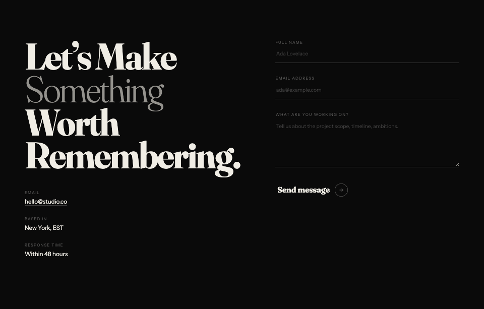
Final output:
Let’s work
together.
Have a project in mind? Drop a message and we’ll get back to you within 24 hours.
Step-by-step guide for HTML CSS Contact Form #2:
1. Let’s start with a section element with the class section_contact. Inside it, add a .contact-wrapper div with a .contact-header and a .contact-form-wrapper inside it.
<section class="section_contact">
    <div class="contact-wrapper">
        <div class="contact-header"></div>
        <div class="contact-form-wrapper"></div>
    </div>
</section>
Link the Inter font from Google Fonts in the head. Then set the font family and a dark background on the section. Center the .contact-wrapper with margin-inline: auto and a max-width, and add some padding.
* {
    margin: 0;
    box-sizing: border-box;
}
:root {
    --lime: #C8FF4D;
}
.section_contact {
    font-family: "Inter", sans-serif;
    background-color: #0C0C0C;
}
.section_contact .contact-wrapper {
    padding: 4rem 5%;
    color: #8b8b8b;
    max-width: 42rem;
    margin-inline: auto;
}
Output:
2. Now, add your section label, heading, and description to .contact-header.
<div class="contact-header">
    <span class="section-label">Get in touch</span>
    <h2>Let's work <br> <span>together.</span></h2>
    <p>Have a project in mind? Drop a message and we'll get back to you within 24 hours.</p>
</div>
Style the .section-label with a lime color and a small dot before it using a ::before pseudo-element. Use position: absolute on the dot and position: relative on the label so the dot sits neatly to the left of the text.
.section_contact .section-label {
    font-weight: 600;
    font-size: .75rem;
    line-height: 1.2;
    letter-spacing: 2.08px;
    text-transform: uppercase;
    color: var(--lime);
    position: relative;
    padding-left: 1.125rem;
}
.section_contact .section-label::before {
    position: absolute;
    top: 50%;
    left: 0;
    transform: translateY(-50%);
    content: '';
    width: 0.375rem;
    height: 0.375rem;
    border-radius: 50%;
    background-color: var(--lime);
}
Style the heading and description. Use clamp() on the heading font size so it scales smoothly between screen sizes. The span inside the heading gets the lime color to highlight the word “together”.
.section_contact .contact-header h2 {
    margin-top: 1.5rem;
    font-weight: 700;
    font-size: clamp(2rem, calc(8vw + 1rem), 3rem);
    line-height: 1.15;
    letter-spacing: -1.2px;
    color: #fff;
}
.section_contact .contact-header h2 span {
    color: var(--lime);
}
.section_contact .contact-header p {
    margin-top: .875rem;
    max-width: 20rem;
    font-weight: 300;
    font-size: .875rem;
    line-height: 1.5;
}
Output:
Let’s work
together.
Have a project in mind? Drop a message and we’ll get back to you within 24 hours.
3. Now, add the form inside .contact-form-wrapper. Use a form-row div for each row of fields. The first row has two fields side by side, the name and email. The second and third rows each have a single field for the subject and message. The last row has the required fields note and the submit button.
<div class="contact-form-wrapper">
    <form action="" method="get" class="contact-form">
        <div class="form-row">
            <div class="form-field">
                <input type="text" name="name" id="name" required />
                <label for="name">Full name<span> *</span></label>
            </div>
            <div class="form-field">
                <input type="email" name="email" id="email" required />
                <label for="email">Email address<span> *</span></label>
            </div>
        </div>
        <div class="form-row">
            <div class="form-field">
                <input type="text" name="subject" id="subject" />
                <label for="subject">Subject</label>
            </div>
        </div>
        <div class="form-row">
            <div class="form-field">
                <textarea name="message" rows="3" id="message" required></textarea>
                <label for="message">Your message <span>*</span></label>
            </div>
        </div>
        <div class="form-row">
            <span class="required-fields">* Required fields</span>
            <button type="submit" class="contact-submit-btn" disabled>
                <span>Send Message</span>
                <svg width="14" height="14" viewBox="0 0 14 14" fill="none" xmlns="http://www.w3.org/2000/svg">
                    <path d="M2 7H12M8 11L12 7L8 3" stroke="#4A4A4A" stroke-width="1.5" stroke-linecap="round" stroke-linejoin="round" />
                </svg>
            </button>
        </div>
    </form>
</div>
Style the form with flex-direction: column and a gap to space the rows out. Use flexbox on each .form-row to lay the fields side by side. On mobile, stack them vertically.
.section_contact .contact-form-wrapper {
    margin-top: 3.5rem;
}
.section_contact .contact-form {
    display: flex;
    flex-direction: column;
    gap: 2.5rem;
}
.section_contact .form-row {
    display: flex;
    align-items: center;
    justify-content: space-between;
    gap: 2.5rem;
}
@media screen and (max-width: 576px) {
    .section_contact .form-row {
        flex-direction: column;
        align-items: flex-start;
    }
}
Output:
Let’s work
together.
Have a project in mind? Drop a message and we’ll get back to you within 24 hours.
4. Style each .form-field with position: relative so the label can be placed on top of the input using position: absolute. The label starts centered vertically over the input, then moves up and shrinks when the field is focused or has a value.
.section_contact .form-field {
    position: relative;
    width: 100%;
}
.section_contact .form-field label {
    position: absolute;
    top: 50%;
    left: 0;
    transform: translateY(-50%);
    font-size: .875rem;
    line-height: 1.2;
    transition: all .3s ease;
}
.section_contact .form-field label span {
    color: var(--lime);
}
Output:
Let’s work
together.
Have a project in mind? Drop a message and we’ll get back to you within 24 hours.
5. Style the inputs and textarea with a transparent background and only a bottom border so they blend into the dark background. When focused or when they have a value, change the border color to lime and move the label up using the .has-value class, which gets added by JavaScript later.
.section_contact .form-field input,
.section_contact .form-field textarea {
    font-size: 1rem;
    width: 100%;
    min-height: 3rem;
    background: none;
    border: 0;
    border-bottom: 1px solid #FFFFFF26;
    transition: border-bottom .3s ease;
    color: #ececec;
}
.section_contact .form-field input:focus,
.section_contact .form-field input.has-value,
.section_contact .form-field textarea:focus,
.section_contact .form-field textarea.has-value {
    outline: none;
    border-bottom: 1px solid var(--lime);
}
.section_contact .form-field input:focus + label,
.section_contact .form-field input.has-value + label,
.section_contact .form-field textarea:focus + label,
.section_contact .form-field textarea.has-value + label {
    text-transform: uppercase;
    color: var(--lime);
    top: 0;
    font-size: .75rem;
}
.section_contact .form-field textarea {
    padding-left: 0;
    padding-top: 1rem;
}
Output:
Let’s work
together.
Have a project in mind? Drop a message and we’ll get back to you within 24 hours.
6. Style the required fields note and the submit button. The button starts disabled with opacity: .2 and cursor: not-allowed. When it becomes enabled, the opacity goes back to 1 using the :not(:disabled) selector.
.section_contact .required-fields {
    font-size: .875rem;
    line-height: 1.2;
}
.section_contact .contact-submit-btn {
    width: fit-content;
    padding: .875rem 1.75rem;
    border-radius: 2px;
    background: var(--lime);
    color: #4A4A4A;
    border: 0;
    font-weight: 600;
    font-size: .875rem;
    line-height: 1.2;
    letter-spacing: 0.84px;
    display: flex;
    align-items: center;
    gap: .75rem;
    cursor: not-allowed;
    opacity: .2;
    transition: opacity .3s ease;
}
.section_contact .contact-submit-btn:not(:disabled) {
    cursor: pointer;
    opacity: 1;
}
.section_contact .contact-submit-btn svg {
    width: .875rem;
    height: .875rem;
}
Output:
Let’s work
together.
Have a project in mind? Drop a message and we’ll get back to you within 24 hours.
7. Now for the JavaScript. Add a script.js file and link it before the closing body tag. Wait for the page to load with DOMContentLoaded, then select the form, the submit button, and all required fields.
document.addEventListener('DOMContentLoaded', () => {
    const form = document.querySelector('form');
    const sendBtn = document.querySelector('.contact-submit-btn');
    const requiredFields = form.querySelectorAll('[required]');
});
Define a checkForm function that checks if all required fields are valid using checkValidity(). If they all pass, it enables the submit button by setting disabled to false. Then attach this function to the input event on each required field so it runs every time the user types. Also run it once on page load so the button state is correct from the start.
function checkForm() {
    const allValid = Array.from(requiredFields).every(field => field.checkValidity());
    sendBtn.disabled = !allValid;
}

requiredFields.forEach(field => {
    field.addEventListener('input', checkForm);
});

checkForm();
Finally, loop through all inputs and textareas and add the .has-value class whenever the field has content. This is what triggers the label to move up in the CSS from step 5. The toggle function runs on every input event and also once immediately, so fields that are pre-filled on page load are handled correctly.
document.querySelectorAll('.form-field input, .form-field textarea').forEach(field => {
    const toggle = () => field.classList.toggle('has-value', field.value.trim() !== '');
    field.addEventListener('input', toggle);
    toggle();
});
Output:
Let’s work
together.
Have a project in mind? Drop a message and we’ll get back to you within 24 hours.
Final Output Code for Responsive Contact Form HTML CSS JavaScript #2:
HTML
<section class="section_contact">
    <div class="contact-wrapper">
        <div class="contact-header">
            <span class="section-label">Get in touch</span>
            <h2>Let's work <br> <span>together.</span></h2>
            <p>Have a project in mind? Drop a message and we'll get back to you within 24 hours.</p>
        </div>
        <div class="contact-form-wrapper">
            <form action="" method="get" class="contact-form">
                <div class="form-row">
                    <div class="form-field">
                        <input type="text" name="name" id="name" required />
                        <label for="name">Full name<span> *</span></label>
                    </div>
                    <div class="form-field">
                        <input type="email" name="email" id="email" required />
                        <label for="email">Email address<span> *</span></label>
                    </div>
                </div>
                <div class="form-row">
                    <div class="form-field">
                        <input type="text" name="subject" id="subject" />
                        <label for="subject">Subject</label>
                    </div>
                </div>
                <div class="form-row">
                    <div class="form-field">
                        <textarea name="message" rows="3" id="message" required></textarea>
                        <label for="message">Your message <span>*</span></label>
                    </div>
                </div>
                <div class="form-row">
                    <span class="required-fields">* Required fields</span>
                    <button type="submit" class="contact-submit-btn" disabled>
                        <span>Send Message</span>
                        <svg width="14" height="14" viewBox="0 0 14 14" fill="none" xmlns="http://www.w3.org/2000/svg">
                            <path d="M2 7H12M8 11L12 7L8 3" stroke="#4A4A4A" stroke-width="1.5" stroke-linecap="round" stroke-linejoin="round" />
                        </svg>
                    </button>
                </div>
            </form>
        </div>
    </div>
</section>
CSS
* {
    margin: 0;
    box-sizing: border-box;
}
:root {
    --lime: #C8FF4D;
}
.section_contact {
    font-family: "Inter", sans-serif;
    background-color: #0C0C0C;
}
.section_contact .contact-wrapper {
    padding: 4rem 5%;
    color: #8b8b8b;
    max-width: 42rem;
    margin-inline: auto;
}
.section_contact .section-label {
    font-weight: 600;
    font-size: .75rem;
    line-height: 1.2;
    letter-spacing: 2.08px;
    text-transform: uppercase;
    color: var(--lime);
    position: relative;
    padding-left: 1.125rem;
}
.section_contact .section-label::before {
    position: absolute;
    top: 50%;
    left: 0;
    transform: translateY(-50%);
    content: '';
    width: 0.375rem;
    height: 0.375rem;
    border-radius: 50%;
    background-color: var(--lime);
}
.section_contact .contact-header h2 {
    margin-top: 1.5rem;
    font-weight: 700;
    font-size: clamp(2rem, calc(8vw + 1rem), 3rem);
    line-height: 1.15;
    letter-spacing: -1.2px;
    color: #fff;
}
.section_contact .contact-header h2 span {
    color: var(--lime);
}
.section_contact .contact-header p {
    margin-top: .875rem;
    max-width: 20rem;
    font-weight: 300;
    font-size: .875rem;
    line-height: 1.5;
}
.section_contact .contact-form-wrapper {
    margin-top: 3.5rem;
}
.section_contact .contact-form {
    display: flex;
    flex-direction: column;
    gap: 2.5rem;
}
.section_contact .form-row {
    display: flex;
    align-items: center;
    justify-content: space-between;
    gap: 2.5rem;
}
@media screen and (max-width: 576px) {
    .section_contact .form-row {
        flex-direction: column;
        align-items: flex-start;
    }
}
.section_contact .form-field {
    position: relative;
    width: 100%;
}
.section_contact .form-field label {
    position: absolute;
    top: 50%;
    left: 0;
    transform: translateY(-50%);
    font-size: .875rem;
    line-height: 1.2;
    transition: all .3s ease;
}
.section_contact .form-field label span {
    color: var(--lime);
}
.section_contact .form-field input,
.section_contact .form-field textarea {
    font-size: 1rem;
    width: 100%;
    min-height: 3rem;
    background: none;
    border: 0;
    border-bottom: 1px solid #FFFFFF26;
    transition: border-bottom .3s ease;
    color: #ececec;
}
.section_contact .form-field input:focus,
.section_contact .form-field input.has-value,
.section_contact .form-field textarea:focus,
.section_contact .form-field textarea.has-value {
    outline: none;
    border-bottom: 1px solid var(--lime);
}
.section_contact .form-field input:focus + label,
.section_contact .form-field input.has-value + label,
.section_contact .form-field textarea:focus + label,
.section_contact .form-field textarea.has-value + label {
    text-transform: uppercase;
    color: var(--lime);
    top: 0;
    font-size: .75rem;
}
.section_contact .form-field textarea {
    padding-left: 0;
    padding-top: 1rem;
}
.section_contact .required-fields {
    font-size: .875rem;
    line-height: 1.2;
}
.section_contact .contact-submit-btn {
    width: fit-content;
    padding: .875rem 1.75rem;
    border-radius: 2px;
    background: var(--lime);
    color: #4A4A4A;
    border: 0;
    font-weight: 600;
    font-size: .875rem;
    line-height: 1.2;
    letter-spacing: 0.84px;
    display: flex;
    align-items: center;
    gap: .75rem;
    cursor: not-allowed;
    opacity: .2;
    transition: opacity .3s ease;
}
.section_contact .contact-submit-btn:not(:disabled) {
    cursor: pointer;
    opacity: 1;
}
.section_contact .contact-submit-btn svg {
    width: .875rem;
    height: .875rem;
}
JS
document.addEventListener('DOMContentLoaded', () => {
    const form = document.querySelector('.section_contact form');
    const sendBtn = document.querySelector('.section_contact .contact-submit-btn');
    const requiredFields = form.querySelectorAll('[required]');

    function checkForm() {
        const allValid = Array.from(requiredFields).every(field => field.checkValidity());
        sendBtn.disabled = !allValid;
    }

    requiredFields.forEach(field => {
        field.addEventListener('input', checkForm);
    });

    checkForm();

    document.querySelectorAll('.form-field input, .form-field textarea').forEach(field => {
        const toggle = () => field.classList.toggle('has-value', field.value.trim() !== '');
        field.addEventListener('input', toggle);
        toggle();
    });
});
If you have any doubts or stuck somewhere, you can reach out through Coding Yaar's Discord server.