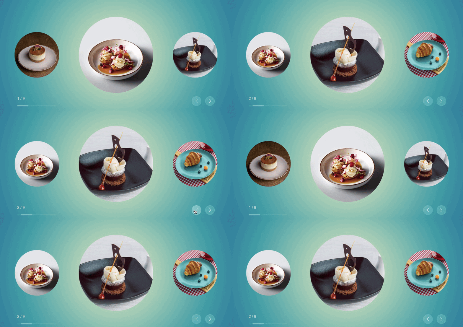
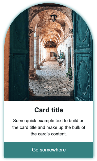
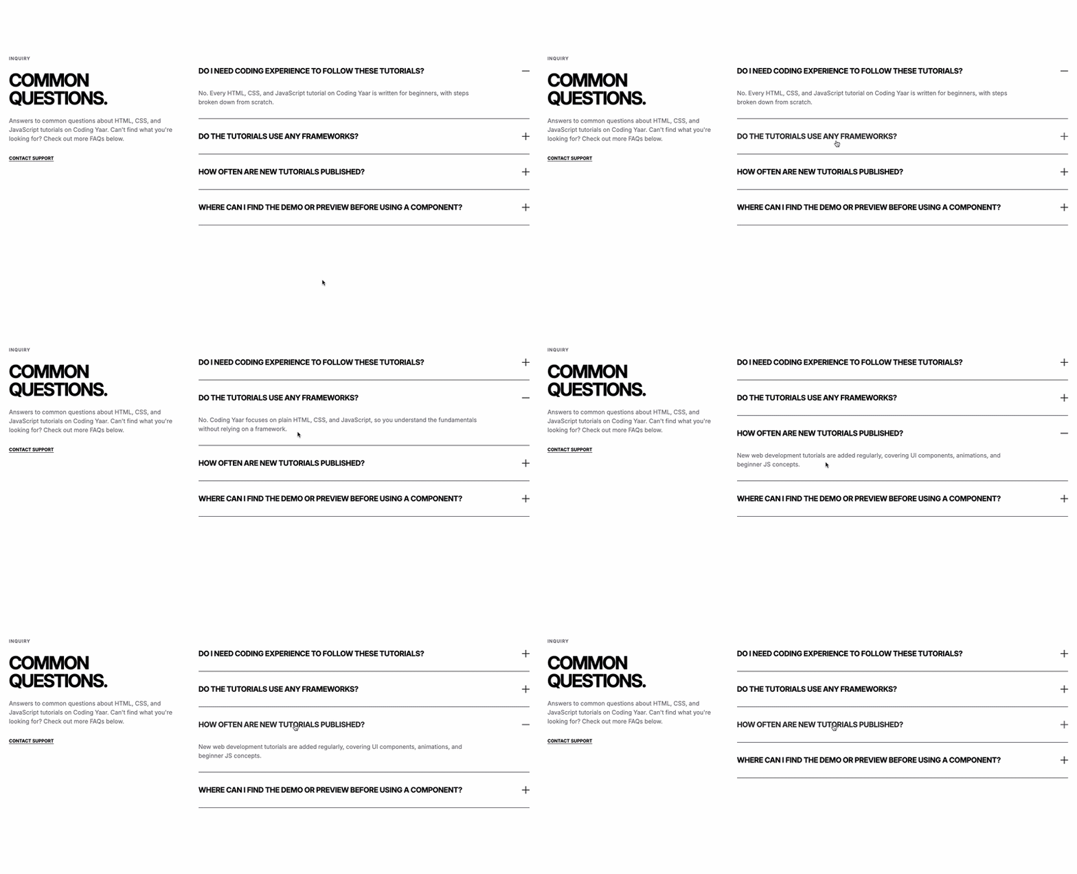
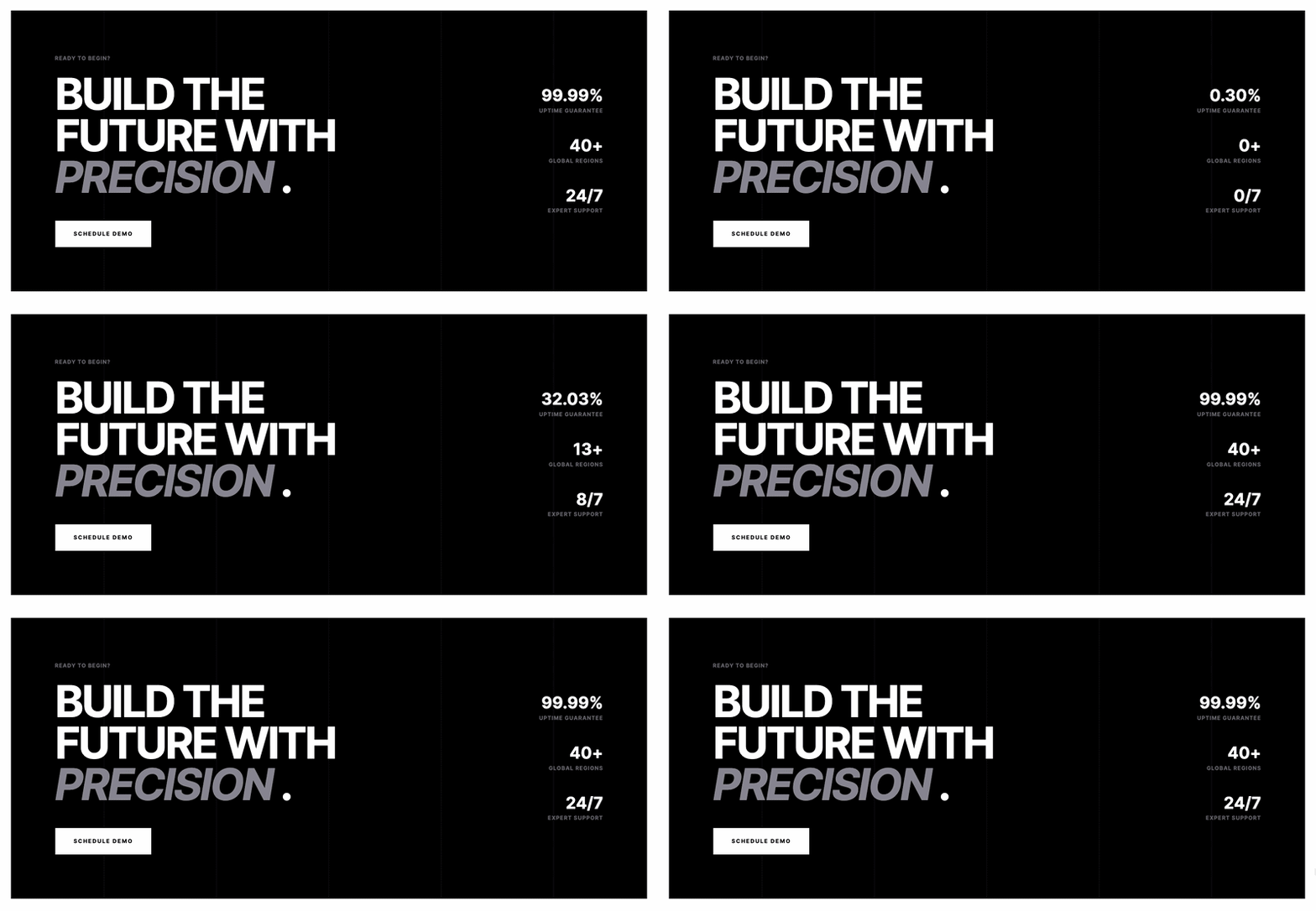
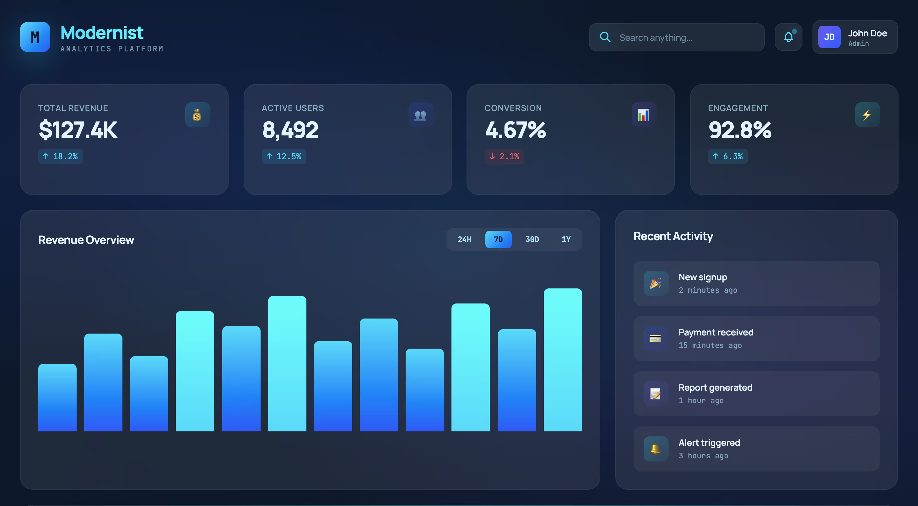
This animated hero section HTML CSS GSAP tutorial shows you how to build a bold two-column hero layout with a word-by-word heading animation powered by GSAP SplitText.
The section includes a grayscale image with a color reveal on hover, a feature list with arrow bullets, and a staggered entrance animation that brings each element in one after the other.
Final output:
THE MODERN Standard of Performance
Built for SaaS teams that ship fast and scale with precision.
Every decision is intentional. Modernist removes the excess so your product loads faster, scales cleaner, and communicates clearly from day one.

1. Let’s start with a section element with the class section-hero. Inside it, add a .container-large div with a .hero-header and a .hero-image-grid div.
<section class="section-hero">
    <div class="container-large">
        <div class="hero-header"></div>
        <div class="hero-image-grid"></div>
    </div>
</section>
Link the Inter font from Google Fonts in the head.
<link rel="preconnect" href="https://fonts.googleapis.com">
    <link rel="preconnect" href="https://fonts.gstatic.com" crossorigin>
    <link href="https://fonts.googleapis.com/css2?family=Inter:ital,opsz,wght@0,14..32,100..900;1,14..32,100..900&display=swap" rel="stylesheet">
Reset margins, set the font family, and style the section with some padding. Center the .container-large with margin-inline: auto and a max-width so it doesn’t stretch too wide on large screens.
* {
    margin: 0;
    box-sizing: border-box;
}
body {
    font-family: "Inter", sans-serif;
}
.section-hero {
    padding: 5rem 1.5rem;
    line-height: 1.5;
}
.section-hero .container-large {
    max-width: 100rem;
    margin-inline: auto;
}
2. Add your heading to the .hero-header and fill in the .hero-description-wrapper div with the label and description paragraph.
<div class="hero-header">
    <h1 class="hero-heading">
        THE MODERN <span>Standard</span> of Performance
    </h1>
    <div class="hero-description-wrapper">
        <div class="tiny-label">CORE / STABLE</div>
        <p><strong>Built for SaaS teams that ship fast and scale with precision.</strong></p>
    </div>
</div>
Implement a two-column grid on .hero-header with align-items: end, ensuring the description lines up with the bottom of the heading instead of the top. For tablet and smaller devices, switch to a single column layout.
.section-hero .hero-header {
    display: grid;
    grid-template-columns: 2fr 1fr;
    align-items: end;
}
@media screen and (max-width: 991px) {
    .section-hero .hero-header {
        grid-row-gap: 2rem;
        grid-template-columns: 2fr;
    }
}
Output:
THE MODERN Standard of Performance
Built for SaaS teams that ship fast and scale with precision.
3. Style the heading using clamp() to ensure the font size scales smoothly across different screen sizes. A tight line-height of 0.9 and a large negative letter-spacing make the big uppercase text feel more compact and impactful. The span inside gets a muted gray color to contrast with the bold black text. On tablet, loosen the letter-spacing slightly so the text doesn’t feel too cramped.
.section-hero .hero-heading {
    font-size: clamp(3rem, 6vw + 1rem, 6.75rem);
    line-height: .9;
    font-weight: 700;
    letter-spacing: -4.32px;
    text-transform: uppercase;
}
.section-hero .hero-heading span {
    color: #909099;
}
@media screen and (max-width: 991px) {
    .section-hero .hero-heading {
        max-width: 40rem;
        line-height: 1;
        letter-spacing: -2px;
    }
}
Style the .hero-description-wrapper by adding a top border to visually separate it from the heading. Create a large gap between the label and the description to ensure they appear as two distinct pieces of information rather than a single block of text. On desktop, add a left margin to prevent it from sitting directly against the edge of the heading column.
.section-hero .hero-description-wrapper {
    display: flex;
    flex-flow: column;
    gap: 3.125rem;
    padding-top: 1.5rem;
    max-width: 40rem;
    border-top: 1px solid #000;
}
@media screen and (min-width: 992px) {
    .section-hero .hero-description-wrapper {
        margin-left: 2rem;
    }
}
.section-hero .tiny-label {
    color: #71717a;
    letter-spacing: 1px;
    text-transform: uppercase;
    font-size: .75rem;
    font-weight: 700;
}
.section-hero .hero-description-wrapper p {
    max-width: 16rem;
    font-weight: 500;
}
Output:
THE MODERN Standard of Performance
Built for SaaS teams that ship fast and scale with precision.
4. Add your hero image to the .hero-image-grid div and a .hero-details-wrapper div.
<div class="hero-image-grid">
    <div class="hero-image-wrapper">
        <img class="hero-image" src="hero-image.jpg">
    </div>
    <div class="hero-details-wrapper">
    </div>
</div>
For a two-column layout, apply CSS grid to .hero-image-grid using place-items: start stretch, ensuring both columns stretch to the same height. On mobile, collapse to a single column. Add filter: grayscale(1) on the image with a hover state that removes it for a subtle color reveal effect.
.section-hero .hero-image-grid {
    margin-top: 3rem;
    display: grid;
    grid-template-columns: 2fr 1fr;
    place-items: start stretch;
}
@media screen and (max-width: 992px) {
    .section-hero .hero-image-grid {
        grid-template-columns: 1fr;
    }
}
.section-hero .hero-image-wrapper {
    width: 100%;
    height: 100%;
}
.section-hero .hero-image {
    filter: grayscale(1);
    object-fit: cover;
    width: 100%;
    height: 100%;
    transition: filter .3s cubic-bezier(.645, .045, .355, 1);
}
.section-hero .hero-image:hover {
    filter: none;
}
Output:
THE MODERN Standard of Performance
Built for SaaS teams that ship fast and scale with precision.
5. Add the dots, heading, description, and feature list to the .hero-details-wrapper div.
<div class="hero-details-wrapper">
    <div class="dots-wrapper">
        <div class="dot"></div>
        <div class="dot"></div>
        <div class="dot"></div>
        <div class="dot"></div>
        <div class="dot"></div>
    </div>
    <div class="hero-details-heading">Precision over complexity.</div>
    <p>Every decision is intentional. Modernist removes the excess so your product loads faster, scales cleaner, and communicates clearly from day one.</p>
    <div class="list-with-arrow-bullets">
        <div class="list-item-with-arrow">
            <img src="right-arrow-icon.png" alt="" class="right-arrow">
            <div>REAL-TIME ANALYTICS</div>
        </div>
        <div class="list-item-with-arrow">
            <img src="right-arrow-icon.png" alt="" class="right-arrow">
            <div>Global Edge CDN</div>
        </div>
        <div class="list-item-with-arrow">
            <img src="right-arrow-icon.png" alt="" class="right-arrow">
            <div>Auto-scaling Core</div>
        </div>
    </div>
</div>
Give the wrapper a light gray background and use flex-flow: column to stack everything vertically. Style the dots as tiny black circles using border-radius: 50%. Add margin and font styles to the heading and description.
.section-hero .hero-details-wrapper {
    background-color: #fafafa;
    padding: 2rem;
    display: flex;
    align-self: stretch;
    flex-flow: column;
}
.section-hero .dots-wrapper {
    display: flex;
    justify-content: flex-start;
    align-items: center;
    gap: .25rem;
}
.section-hero .dot {
    border-radius: 50%;
    background-color: #000;
    width: .25rem;
    height: .25rem;
}
.section-hero .hero-details-heading {
    letter-spacing: -.6px;
    font-size: 1.5rem;
    font-weight: 700;
    line-height: 1.33333;
    margin-top: 2rem;
}
.section-hero .hero-details-wrapper p {
    margin-top: .5rem;
    font-size: 1rem;
    color: #71717a;
}
Output:
THE MODERN Standard of Performance
Built for SaaS teams that ship fast and scale with precision.
Every decision is intentional. Modernist removes the excess so your product loads faster, scales cleaner, and communicates clearly from day one.
6. Style the feature list. Each list item has a small arrow icon and uppercase text with a bottom border. Use flexbox with align-items: center to keep the arrow and text aligned on the same line.
.section-hero .list-with-arrow-bullets {
    display: flex;
    flex-flow: column;
    gap: 1rem;
    margin: 2rem 0;
}
.section-hero .list-item-with-arrow {
    letter-spacing: 1.1px;
    text-transform: uppercase;
    padding-bottom: .5rem;
    font-size: .75rem;
    font-weight: 700;
    display: flex;
    justify-content: flex-start;
    align-items: center;
    gap: .75rem;
    border-bottom: 1px solid #0000000d;
}
.section-hero .right-arrow {
    object-fit: contain;
    width: .75rem;
    height: .75rem;
}
Output:
THE MODERN Standard of Performance
Built for SaaS teams that ship fast and scale with precision.
Every decision is intentional. Modernist removes the excess so your product loads faster, scales cleaner, and communicates clearly from day one.
7. Add the CTA button after the feature list inside .hero-details-wrapper.
<a role="button" href="#pricing" class="button-with-arrow">
    <span>Start Building</span>
    <img src="right-arrow-icon.png" alt="" class="right-arrow">
</a>
Style it with a black background and white text. Use justify-content: space-between to push the text and arrow to opposite ends. Set the margin-top to auto so it always stays at the bottom of the right column, regardless of the content above it. Use filter: invert() on the arrow image to flip it from black to white.
.section-hero .button-with-arrow {
    background-color: #000;
    color: #fff;
    letter-spacing: 2px;
    display: flex;
    text-transform: uppercase;
    justify-content: space-between;
    gap: 1rem;
    align-items: center;
    padding: 1.5rem;
    font-size: .625rem;
    font-weight: 700;
    line-height: 1.5;
    text-decoration: none;
    transition: opacity .2s cubic-bezier(.645, .045, .355, 1);
    margin-top: auto;
}
.section-hero .button-with-arrow:hover {
    opacity: .8;
}
@media screen and (max-width: 992px) {
    .section-hero .button-with-arrow {
        padding: 1.25rem 1.5rem;
    }
}
.section-hero .button-with-arrow img {
    filter: invert(1);
}
Output:
THE MODERN Standard of Performance
Built for SaaS teams that ship fast and scale with precision.
Every decision is intentional. Modernist removes the excess so your product loads faster, scales cleaner, and communicates clearly from day one.
8. Now for the GSAP animation. Include the GSAP and SplitText libraries just before the closing body tag, and then link your script.js file after them. SplitText divides your heading into individual words, allowing each to animate separately.
<script src="https://cdn.jsdelivr.net/npm/gsap@3.15/dist/gsap.min.js"></script>
<script src="https://cdn.jsdelivr.net/npm/gsap@3.15/dist/SplitText.min.js"></script>
<script src="script.js"></script>
In script.js, wait for the page to load completely by using the DOMContentLoaded event. Next, register the ScrollTrigger and SplitText plugins, and then split the .hero-heading element into individual words using SplitText.create(). This will wrap each word in its own element, allowing GSAP to animate them one at a time.
document.addEventListener("DOMContentLoaded", (event) => {
    gsap.registerPlugin( SplitText);

    const split = SplitText.create(".hero-heading", {
        types: "words"
    });
});
Create a GSAP timeline with gsap.timeline(). Setting defaults on the timeline means every animation inside it shares the same ease by default, so you don’t have to repeat it on each one.
const tl = gsap.timeline({
    defaults: {
        ease: "power3.out"
    }
});
Add the heading animation to the timeline first. Use tl.from() targeting split.words to animate each word up from below using yPercent: 100, starting fully transparent. The stagger option makes each word start slightly after the previous one, creating the cascading word reveal effect.
tl.from(split.words, {
    yPercent: 100,
    opacity: 0,
    stagger: 0.05,
    duration: 1,
    ease: "power4.out"
}, "-=0.2")
Chain the remaining animations onto the timeline. The negative offset values like “-=0.3” and “-=0.8” mean each animation starts before the previous one finishes, so the whole sequence feels smooth and overlapping rather than one thing waiting for another to fully finish.
.from(".hero-description-wrapper", {
    opacity: 0,
    duration: 0.6
}, "-=0.3")

.from(".hero-image-wrapper", {
    opacity: 0,
    duration: 1.2,
    ease: "power4.out"
}, "-=0.3")

.from(".hero-details-wrapper", {
    opacity: 0,
    duration: 0.7
}, "-=0.8")
Output:
THE MODERN Standard of Performance
Built for SaaS teams that ship fast and scale with precision.
Every decision is intentional. Modernist removes the excess so your product loads faster, scales cleaner, and communicates clearly from day one.
Final Output Code for Responsive Animated Hero Section HTML CSS GSAP #2:
Head
<link rel="preconnect" href="https://fonts.googleapis.com">
<link rel="preconnect" href="https://fonts.gstatic.com" crossorigin>
<link href="https://fonts.googleapis.com/css2?family=DM+Serif+Display:ital@0;1&display=swap" rel="stylesheet">
HTML
<section class="section-hero">
    <div class="container-large">
        <div class="hero-header">
            <h1 class="hero-heading">
                THE MODERN <span>Standard</span> of Performance
            </h1>
            <div class="hero-description-wrapper">
                <div class="tiny-label">CORE / STABLE</div>
                <p><strong>Built for SaaS teams that ship fast and scale with precision.</strong></p>
            </div>
        </div>
        <div class="hero-image-grid">
            <div class="hero-image-wrapper">
                <img class="hero-image" src="hero-image.jpg">
            </div>
            <div class="hero-details-wrapper">
                <div class="dots-wrapper">
                    <div class="dot"></div>
                    <div class="dot"></div>
                    <div class="dot"></div>
                    <div class="dot"></div>
                    <div class="dot"></div>
                </div>
                <div class="hero-details-heading">Precision over complexity.</div>
                <p>Every decision is intentional. Modernist removes the excess so your product loads faster, scales cleaner, and communicates clearly from day one.</p>
                <div class="list-with-arrow-bullets">
                    <div class="list-item-with-arrow">
                        <img src="right-arrow-icon.png" alt="" class="right-arrow">
                        <div>REAL-TIME ANALYTICS</div>
                    </div>
                    <div class="list-item-with-arrow">
                        <img src="right-arrow-icon.png" alt="" class="right-arrow">
                        <div>Global Edge CDN</div>
                    </div>
                    <div class="list-item-with-arrow">
                        <img src="right-arrow-icon.png" alt="" class="right-arrow">
                        <div>Auto-scaling Core</div>
                    </div>
                </div>
                <a role="button" href="#pricing" class="button-with-arrow">
                    <span>Start Building</span>
                    <img src="right-arrow-icon.png" alt="" class="right-arrow">
                </a>
            </div>
        </div>
    </div>
</section>
CSS
* {
    margin: 0;
    box-sizing: border-box;
}
body {
    font-family: "Inter", sans-serif;
}
.section-hero {
    padding: 5rem 1.5rem;
    line-height: 1.5;
}
.section-hero .container-large {
    max-width: 100rem;
    margin-inline: auto;
}
.section-hero .hero-header {
    display: grid;
    grid-template-columns: 2fr 1fr;
    align-items: end;
}
@media screen and (max-width: 991px) {
    .section-hero .hero-header {
        grid-row-gap: 2rem;
        grid-template-columns: 2fr;
    }
}
.section-hero .hero-heading {
    font-size: clamp(3rem, 6vw + 1rem, 6.75rem);
    line-height: .9;
    font-weight: 700;
    letter-spacing: -4.32px;
    text-transform: uppercase;
}
.section-hero .hero-heading span {
    color: #909099;
}
@media screen and (max-width: 991px) {
    .section-hero .hero-heading {
        max-width: 40rem;
        line-height: 1;
        letter-spacing: -2px;
    }
}
.section-hero .hero-description-wrapper {
    display: flex;
    flex-flow: column;
    gap: 3.125rem;
    padding-top: 1.5rem;
    max-width: 40rem;
    border-top: 1px solid #000;
}
@media screen and (min-width: 992px) {
    .section-hero .hero-description-wrapper {
        margin-left: 2rem;
    }
}
.section-hero .tiny-label {
    color: #71717a;
    letter-spacing: 1px;
    text-transform: uppercase;
    font-size: .75rem;
    font-weight: 700;
}
.section-hero .hero-description-wrapper p {
    max-width: 16rem;
    font-weight: 500;
}
.section-hero .hero-image-grid {
    margin-top: 3rem;
    display: grid;
    grid-template-columns: 2fr 1fr;
    place-items: start stretch;
}
@media screen and (max-width: 992px) {
    .section-hero .hero-image-grid {
        grid-template-columns: 1fr;
    }
}
.section-hero .hero-image-wrapper {
    width: 100%;
    height: 100%;
}
.section-hero .hero-image {
    filter: grayscale(1);
    object-fit: cover;
    width: 100%;
    height: 100%;
    transition: filter .3s cubic-bezier(.645, .045, .355, 1);
}
.section-hero .hero-image:hover {
    filter: none;
}
.section-hero .hero-details-wrapper {
    background-color: #fafafa;
    padding: 2rem;
    display: flex;
    align-self: stretch;
    flex-flow: column;
}
.section-hero .dots-wrapper {
    display: flex;
    justify-content: flex-start;
    align-items: center;
    gap: .25rem;
}
.section-hero .dot {
    border-radius: 50%;
    background-color: #000;
    width: .25rem;
    height: .25rem;
}
.section-hero .hero-details-heading {
    letter-spacing: -.6px;
    font-size: 1.5rem;
    font-weight: 700;
    line-height: 1.33333;
    margin-top: 2rem;
}
.section-hero .hero-details-wrapper p {
    margin-top: .5rem;
    font-size: 1rem;
    color: #71717a;
}
.section-hero .list-with-arrow-bullets {
    display: flex;
    flex-flow: column;
    gap: 1rem;
    margin: 2rem 0;
}
.section-hero .list-item-with-arrow {
    letter-spacing: 1.1px;
    text-transform: uppercase;
    padding-bottom: .5rem;
    font-size: .75rem;
    font-weight: 700;
    display: flex;
    justify-content: flex-start;
    align-items: center;
    gap: .75rem;
    border-bottom: 1px solid #0000000d;
}
.section-hero .right-arrow {
    object-fit: contain;
    width: .75rem;
    height: .75rem;
}
.section-hero .button-with-arrow {
    background-color: #000;
    color: #fff;
    letter-spacing: 2px;
    display: flex;
    text-transform: uppercase;
    justify-content: space-between;
    gap: 1rem;
    align-items: center;
    padding: 1.5rem;
    font-size: .625rem;
    font-weight: 700;
    line-height: 1.5;
    text-decoration: none;
    transition: opacity .2s cubic-bezier(.645, .045, .355, 1);
    margin-top: auto;
}
.section-hero .button-with-arrow:hover {
    opacity: .8;
}
@media screen and (max-width: 992px) {
    .section-hero .button-with-arrow {
        padding: 1.25rem 1.5rem;
    }
}
.section-hero .button-with-arrow img {
    filter: invert(1);
}
Footer(before </body>):
<script src="https://cdn.jsdelivr.net/npm/gsap@3.15/dist/gsap.min.js"></script>
<script src="https://cdn.jsdelivr.net/npm/gsap@3.15/dist/SplitText.min.js"></script>
<script src="script.js"></script>
JS:
document.addEventListener("DOMContentLoaded", (event) => {
    gsap.registerPlugin(SplitText);

    const split = SplitText.create(".hero-heading", {
        types: "words"
    });

    const tl = gsap.timeline({
        defaults: {
            ease: "power3.out"
        }
    });

    tl.from(split.words, {
        yPercent: 100,
        opacity: 0,
        stagger: 0.05,
        duration: 1,
        ease: "power4.out"
    }, "-=0.2")

    .from(".hero-description-wrapper", {
        opacity: 0,
        duration: 0.6
    }, "-=0.3")

    .from(".hero-image-wrapper", {
        opacity: 0,
        duration: 1.2,
        ease: "power4.out"
    }, "-=0.3")

    .from(".hero-details-wrapper", {
        opacity: 0,
        duration: 0.7
    }, "-=0.8")
});
If you have any doubts or stuck somewhere, you can reach out through Coding Yaar's Discord server.