This team section HTML CSS tutorial shows you how to build a dark team grid with a hover reveal animation. Each team member card has a gradient overlay and a text panel that starts partially hidden below the card edge. On hover, the panel slides up to reveal the full description, the image zooms in, and the designation turns gold. The first team member spans two rows on desktop using grid placement, so it reads as the featured member of the team.
Final output:
About
The people
behind the work.
We’re a small team of designers, engineers, and strategists who believe that the best products come from people who care deeply about the details, and the people using them.
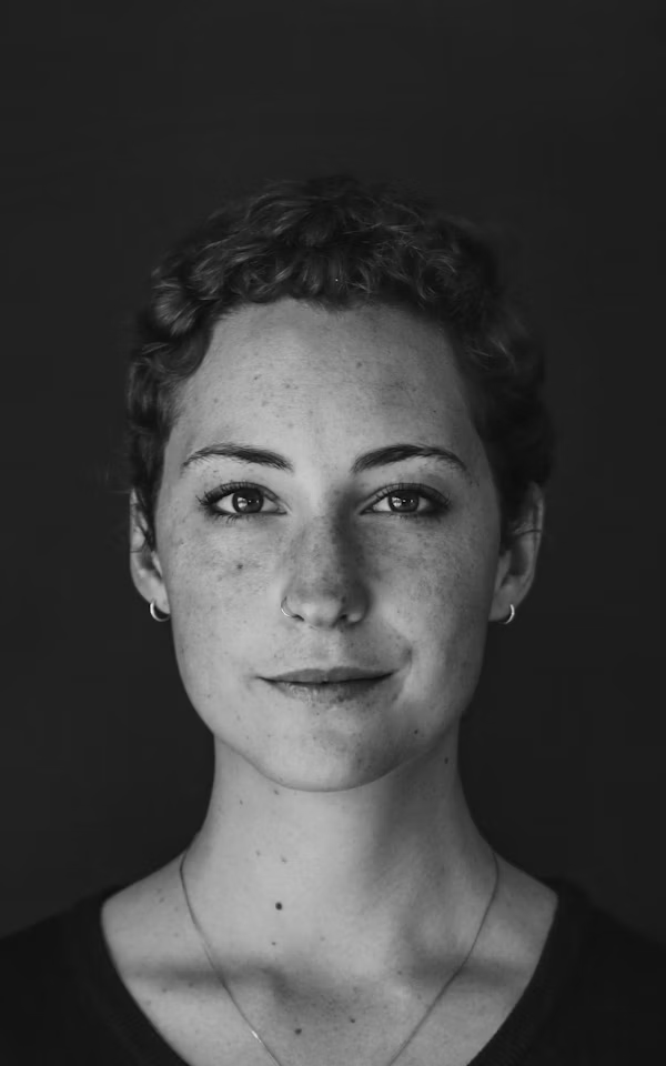
Creative Director
Elena Vasquez
Shapes the visual language of everything we make. Formerly at Pentagram and Nike Brand Design.

Engineering Lead
James Okafor
Turns ambitious ideas into production systems. Twelve years building infrastructure at scale.

Design Systems
Priya Nair
Builds the foundations that make quality repeatable and fast.

Product Strategy
Darius Holloway
Connects what users need to what we can actually build, and keeps those two things close.

Head of Research
Erica Vasquez
Asks the questions worth asking. Trained in cognitive science, working at the edge of product.
1. First, link the Outfit and Fraunces fonts from Google Fonts in the head.
<link rel="preconnect" href="https://fonts.googleapis.com">
<link rel="preconnect" href="https://fonts.gstatic.com" crossorigin>
<link href="https://fonts.googleapis.com/css2?family=Fraunces:ital,opsz,wght@0,9..144,100..900;1,9..144,100..900&family=Outfit:wght@100..900&display=swap"
    rel="stylesheet">
Let’s start with a section element with the class about-section. Inside it, add a .section-container div with an .about-header and an .about-team-wrapper div.
<section class="about-section">
    <div class="section-container">
        <div class="about-header"></div>
        <div class="about-team-wrapper"></div>
    </div>
</section>
Then reset margins, set Outfit as the font family, and define the gold color and Fraunces font as CSS variables on :root. Give the section a near-black background. Use clamp() on the padding so it scales with the screen. Center .section-container with the margin inline property set to auto and a max-width.
* {
    margin: 0;
    box-sizing: border-box;
}
body {
    font-family: "Outfit", sans-serif;
}
:root {
    --gold: hsl(39, 45%, 61%);
    --heading-font: "Fraunces", serif;
}
.about-section {
    padding: clamp(3.5rem, calc(1rem + 7.78vw), 8rem) 5%;
    background-color: hsl(0, 0%, 4%);
}
.about-section .section-container {
    max-width: 77rem;
    margin-inline: auto;
}
2. Fill in .about-header with an .about-header-left div containing the label and heading, and an .about-header-right div containing the description paragraph.
<div class="about-header">
    <div class="about-header-left">
        <p class="section-label">About</p>
        <h2>The people <br> <span>behind the work.</span></h2>
    </div>
    <div class="about-header-right">
        <p>We're a small team of designers, engineers, and strategists who believe that the best products come from people who care deeply about the details, and the people using them.</p>
    </div>
</div>
Use a two-column grid on .about-header with the left column taking up more space than the right. Set the align items property to end so the description aligns to the bottom of the heading. Add a bottom border and some bottom margin to visually separate the header from the team grid below. On mobile, collapse to a single column.
.about-section .about-header {
    display: grid;
    grid-template-columns: 2.75fr 1fr;
    align-items: end;
    gap: 2rem;
    padding-bottom: 2rem;
    margin-bottom: 5rem;
    border-bottom: 1px solid hsla(38, 21%, 93%, 0.2);
}
@media screen and (max-width: 768px) {
    .about-section .about-header {
        grid-template-columns: 1fr;
    }
}
Output:
About
The people
behind the work.
We’re a small team of designers, engineers, and strategists who believe that the best products come from people who care deeply about the details, and the people using them.
3. Style the .section-label. Set the position property to relative and add some left padding so the decorative gold line has room to sit to the left of the text. The ::before pseudo-element creates that line, positioned absolutely on the left edge of the label.
.about-section .section-label {
    font-size: .75rem;
    line-height: 1.3;
    letter-spacing: 2.4px;
    text-transform: uppercase;
    color: var(--gold);
    position: relative;
    padding-left: 3rem;
}
.about-section .section-label::before {
    position: absolute;
    top: 50%;
    left: 0;
    content: "";
    width: 2rem;
    height: 1px;
    background-color: var(--gold);
}
Style the heading with the Fraunces font in a light weight and use clamp() on the font size so it scales smoothly. The span inside gets the gold color and switches to the Outfit font in italic so the second line reads as a stylistic contrast against the serif above it.
.about-section .about-header-left h2 {
    margin-top: 2rem;
    font-family: var(--heading-font);
    font-weight: 300;
    font-size: clamp(3.5rem, calc(1rem + 7.11vw), 6.5rem);
    line-height: 1;
    letter-spacing: -0.025em;
    color: hsl(38, 21%, 93%);
}
.about-section .about-header-left h2 span {
    color: var(--gold);
    font-family: "Outfit", sans-serif;
    font-style: italic;
}
Style the description with a light font weight and a semi-transparent muted color so it reads as supporting content rather than competing with the heading.
.about-section .about-header-right p {
    font-weight: 300;
    font-size: .875rem;
    line-height: 1.5;
    color: hsla(38, 21%, 93%, 0.55);
    max-width: 20rem;
}
Output:
About
The people
behind the work.
We’re a small team of designers, engineers, and strategists who believe that the best products come from people who care deeply about the details, and the people using them.
4. Fill in .about-team-wrapper with five .team-member divs. Each has an image and a div containing the designation, name, and description. The first team member spans two rows on desktop since it’s the featured member.
<div class="about-team-wrapper">
    <div class="team-member">
        <img src="elena.avif" alt="">
        <div>
            <p class="team-member-designation">Creative Director</p>
            <h3 class="team-member-name">Elena Vasquez</h3>
            <p class="team-member-description">Shapes the visual language of everything we make. Formerly at Pentagram and Nike Brand Design.</p>
        </div>
    </div>
    <!-- add for remaining 4 members -->
</div>
Use a three-column grid on .about-team-wrapper with a small gap between cards. On tablet, switch to two columns. On mobile, collapse to a single column.
.about-section .about-team-wrapper {
    display: grid;
    grid-template-columns: 1fr 1fr 1fr;
    gap: .25rem;
}
@media screen and (max-width: 768px) {
    .about-section .about-team-wrapper {
        grid-template-columns: 1fr 1fr;
    }
}
@media screen and (max-width: 576px) {
    .about-section .about-team-wrapper {
        grid-template-columns: 1fr;
    }
}
Output:
About
The people
behind the work.
We’re a small team of designers, engineers, and strategists who believe that the best products come from people who care deeply about the details, and the people using them.
Creative Director
Elena Vasquez
Shapes the visual language of everything we make. Formerly at Pentagram and Nike Brand Design.
Engineering Lead
James Okafor
Turns ambitious ideas into production systems. Twelve years building infrastructure at scale.
Design Systems
Priya Nair
Builds the foundations that make quality repeatable and fast.
Product Strategy
Darius Holloway
Connects what users need to what we can actually build, and keeps those two things close.
Head of Research
Erica Vasquez
Asks the questions worth asking. Trained in cognitive science, working at the edge of product.
5. Style each .team-member. Set the position property to relative so the text overlay and gradient can be placed inside it using absolute positioning. Set the overflow property to hidden so the image scale on hover stays clipped inside the card. Give it a minimum height so shorter cards don’t collapse. The first member gets grid-row: 1/3 so it spans two rows on desktop, and grid-column: 1/3 on tablet so it spans the full width instead.
.about-section .team-member {
    position: relative;
    overflow: hidden;
    min-height: 30rem;
}
.about-section .team-member:nth-child(1) {
    grid-row: 1/3;
}
@media screen and (max-width: 768px) {
    .about-section .team-member:nth-child(1) {
        grid-column: 1/3;
        max-height: 30rem;
    }
}
Style the image with object-fit: cover so it fills the card without stretching. Add a scale transform transition so the image zooms in smoothly on hover. The ::after pseudo-element adds a dark gradient from fully opaque at the bottom to transparent at the top, so the text overlay is always readable against the image.
.about-section .team-member img {
    width: 100%;
    height: 100%;
    object-fit: cover;
    transition: transform .5s;
}
.about-section .team-member::after {
    content: "";
    position: absolute;
    z-index: 1;
    inset: 0;
    width: 100%;
    height: 100%;
    background: linear-gradient(0deg, rgba(0, 0, 0, 0.92) 0%, rgba(0, 0, 0, 0.3) 45%, rgba(0, 0, 0, 0) 100%);
}
Output:
About
The people
behind the work.
We’re a small team of designers, engineers, and strategists who believe that the best products come from people who care deeply about the details, and the people using them.
Creative Director
Elena Vasquez
Shapes the visual language of everything we make. Formerly at Pentagram and Nike Brand Design.
Engineering Lead
James Okafor
Turns ambitious ideas into production systems. Twelve years building infrastructure at scale.
Design Systems
Priya Nair
Builds the foundations that make quality repeatable and fast.
Product Strategy
Darius Holloway
Connects what users need to what we can actually build, and keeps those two things close.
Head of Research
Erica Vasquez
Asks the questions worth asking. Trained in cognitive science, working at the edge of product.
6. Style the text overlay div inside each card. Set the position property to absolute with the bottom property set to 0 so it sits at the bottom of the image. Set the z-index property to 2 so it sits above the gradient overlay. Start it translated 40% downward using translateY(40%) so only the designation and name are visible by default. On hover, translate it back to 0 so the full description slides up into view. Add a transition on both the transform and the description opacity for a smooth reveal effect.
.about-section .team-member div {
    position: absolute;
    bottom: 0;
    z-index: 2;
    padding: 1.25rem 1.25rem 1.75rem;
    transform: translateY(40%);
    transition: transform .5s;
}
.about-section .team-member-designation {
    font-weight: 500;
    font-size: .75rem;
    line-height: 1.3;
    letter-spacing: 2.16px;
    text-transform: uppercase;
    color: hsl(0, 0%, 53%);
    transition: color .5s;
}
.about-section .team-member-name {
    margin-top: .25rem;
    font-family: var(--heading-font);
    font-weight: 300;
    font-size: 1.25rem;
    line-height: 1.25;
    color: hsl(0, 0%, 100%);
}
.about-section .team-member-description {
    margin-top: .5rem;
    font-size: .875rem;
    line-height: 1.5;
    color: hsla(38, 21%, 93%, 0.7);
    overflow: hidden;
    opacity: 0;
}
.about-section .team-member:hover div {
    transform: translateY(0%);
}
.about-section .team-member:hover img {
    transform: scale(1.1);
}
.about-section .team-member:hover .team-member-designation {
    color: var(--gold);
}
.about-section .team-member:hover .team-member-description {
    opacity: 1;
}
Output:
About
The people
behind the work.
We’re a small team of designers, engineers, and strategists who believe that the best products come from people who care deeply about the details, and the people using them.
Creative Director
Elena Vasquez
Shapes the visual language of everything we make. Formerly at Pentagram and Nike Brand Design.
Engineering Lead
James Okafor
Turns ambitious ideas into production systems. Twelve years building infrastructure at scale.
Design Systems
Priya Nair
Builds the foundations that make quality repeatable and fast.
Product Strategy
Darius Holloway
Connects what users need to what we can actually build, and keeps those two things close.
Head of Research
Erica Vasquez
Asks the questions worth asking. Trained in cognitive science, working at the edge of product.
Final Output Code for Responsive HTML CSS About Us Section:
HTML
<section class="about-section">
    <div class="section-container">
        <div class="about-header">
            <div class="about-header-left">
                <p class="section-label">About</p>
                <h2>The people <br>
                    <span>behind the work.</span>
                </h2>
            </div>
            <div class="about-header-right">
                <p>We're a small team of designers, engineers, and
                    strategists who believe that the best products come
                    from people who care deeply about the details,
                    and the people using them.</p>
            </div>
        </div>
        <div class="about-team-wrapper">
            <div class="team-member">
                <img src="elena.png" alt="">
                <div>
                    <p class="team-member-designation">Creative Director</p>
                    <h3 class="team-member-name">Elena Vasquez</h3>
                    <p class="team-member-description">Shapes the visual language of everything we make. Formerly at
                        Pentagram and Nike Brand Design.</p>
                </div>
            </div>
            <div class="team-member">
                <img src="james.png" alt="">
                <div>
                    <p class="team-member-designation">Engineering Lead</p>
                    <h3 class="team-member-name">James Okafor</h3>
                    <p class="team-member-description">Turns ambitious ideas into production systems. Twelve years
                        building infrastructure at scale.

                    </p>
                </div>
            </div>
            <div class="team-member">
                <img src="priya.png" alt="">
                <div>
                    <p class="team-member-designation">Design Systems</p>
                    <h3 class="team-member-name">Priya Nair</h3>
                    <p class="team-member-description">Builds the foundations that make quality repeatable and fast.
                    </p>
                </div>
            </div>
            <div class="team-member">
                <img src="darius.png" alt="">
                <div>
                    <p class="team-member-designation">Product Strategy</p>
                    <h3 class="team-member-name">Darius Holloway</h3>
                    <p class="team-member-description">Connects what users need to what we can actually build, and
                        keeps those two things close.</p>
                </div>
            </div>
            <div class="team-member">
                <img src="erica.png" alt="">
                <div>
                    <p class="team-member-designation">Head of Research</p>
                    <h3 class="team-member-name">Erica Vasquez</h3>
                    <p class="team-member-description">Asks the questions worth asking. Trained in cognitive
                        science, working at the edge of product.
                    </p>
                </div>
            </div>
        </div>
    </div>
</section>
CSS
* {
    margin: 0;
    box-sizing: border-box;
}
body {
    font-family: "Outfit", sans-serif;
}
:root {
    --gold: hsl(39, 45%, 61%);
    --heading-font: "Fraunces", serif;
}
.about-section {
    padding: clamp(3.5rem, calc(1rem + 7.78vw), 8rem) 5%;
    background-color: hsl(0, 0%, 4%);
}
.about-section .section-container {
    max-width: 77rem;
    margin-inline: auto;
}
.about-section .about-header {
    display: grid;
    grid-template-columns: 2.75fr 1fr;
    align-items: end;
    gap: 2rem;
    padding-bottom: 2rem;
    margin-bottom: 5rem;
    border-bottom: 1px solid hsla(38, 21%, 93%, 0.2);
}
@media screen and (max-width: 768px) {
    .about-section .about-header {
        grid-template-columns: 1fr;
    }
}
.about-section .section-label {
    font-size: .75rem;
    line-height: 1.3;
    letter-spacing: 2.4px;
    text-transform: uppercase;
    color: var(--gold);
    position: relative;
    padding-left: 3rem;
}
.about-section .section-label::before {
    position: absolute;
    top: 50%;
    left: 0;
    content: "";
    width: 2rem;
    height: 1px;
    background-color: var(--gold);
}
.about-section .about-header-left h2 {
    margin-top: 2rem;
    font-family: var(--heading-font);
    font-weight: 300;
    font-size: clamp(3.5rem, calc(1rem + 7.11vw), 6.5rem);
    line-height: 1;
    letter-spacing: -0.025em;
    color: hsl(38, 21%, 93%);
}
.about-section .about-header-left h2 span {
    color: var(--gold);
    font-family: "Outfit", sans-serif;
    font-style: italic;
}
.about-section .about-header-right p {
    font-weight: 300;
    font-size: .875rem;
    line-height: 1.5;
    color: hsla(38, 21%, 93%, 0.55);
    max-width: 20rem;
}
.about-section .about-team-wrapper {
    display: grid;
    grid-template-columns: 1fr 1fr 1fr;
    gap: .25rem;
}
@media screen and (max-width: 768px) {
    .about-section .about-team-wrapper {
        grid-template-columns: 1fr 1fr;
    }
}
@media screen and (max-width: 576px) {
    .about-section .about-team-wrapper {
        grid-template-columns: 1fr;
    }
}
.about-section .team-member {
    position: relative;
    overflow: hidden;
    min-height: 30rem;
}
.about-section .team-member:nth-child(1) {
    grid-row: 1/3;
}
@media screen and (max-width: 768px) {
    .about-section .team-member:nth-child(1) {
        grid-column: 1/3;
        max-height: 30rem;
    }
}
.about-section .team-member img {
    width: 100%;
    height: 100%;
    object-fit: cover;
    transition: transform .5s;
}
.about-section .team-member::after {
    content: "";
    position: absolute;
    z-index: 1;
    inset: 0;
    width: 100%;
    height: 100%;
    background: linear-gradient(0deg, rgba(0, 0, 0, 0.92) 0%, rgba(0, 0, 0, 0.3) 45%, rgba(0, 0, 0, 0) 100%);
}
.about-section .team-member div {
    position: absolute;
    bottom: 0;
    z-index: 2;
    padding: 1.25rem 1.25rem 1.75rem;
    transform: translateY(40%);
    transition: transform .5s;
}
.about-section .team-member-designation {
    font-weight: 500;
    font-size: .75rem;
    line-height: 1.3;
    letter-spacing: 2.16px;
    text-transform: uppercase;
    color: hsl(0, 0%, 53%);
    transition: color .5s;
}
.about-section .team-member-name {
    margin-top: .25rem;
    font-family: var(--heading-font);
    font-weight: 300;
    font-size: 1.25rem;
    line-height: 1.25;
    color: hsl(0, 0%, 100%);
}
.about-section .team-member-description {
    margin-top: .5rem;
    font-size: .875rem;
    line-height: 1.5;
    color: hsla(38, 21%, 93%, 0.7);
    overflow: hidden;
    opacity: 0;
}
.about-section .team-member:hover div {
    transform: translateY(0%);
}
.about-section .team-member:hover img {
    transform: scale(1.1);
}
.about-section .team-member:hover .team-member-designation {
    color: var(--gold);
}
.about-section .team-member:hover .team-member-description {
    opacity: 1;
}
If you have any doubts or stuck somewhere, you can reach out through Coding Yaar's Discord server.