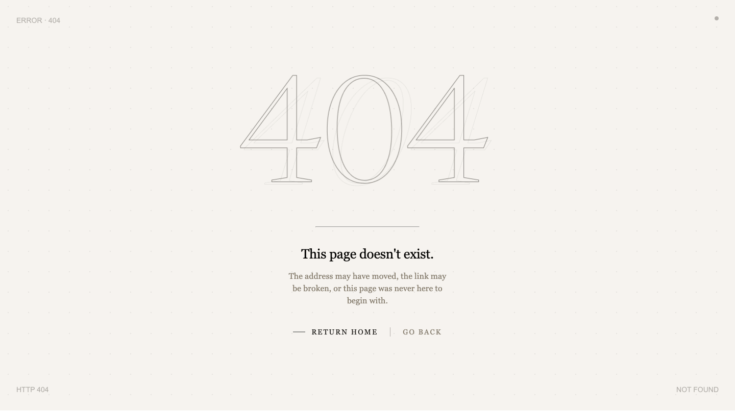
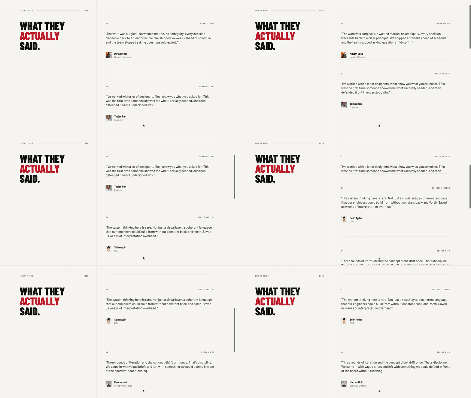
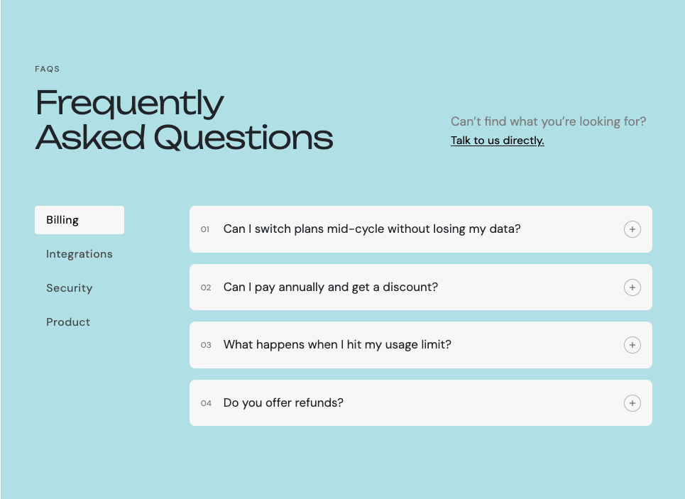
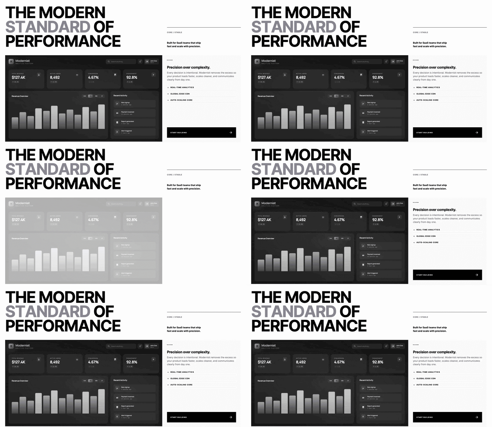
This 404 page HTML CSS tutorial shows you how to build a clean and friendly error page with a two-column layout. The left side has the 404 heading, an error message, a description, a back to homepage button, and a small error label. The right side has an illustration image that stays vertically centered. The layout collapses to a single column on mobile.
Final output:
404
Oops! Page not found.
Looks like this page wandered off the map. Our little explorer has been searching the dunes, but came back with nothing but a crumpled “?”.
Go back to homepage → Error 404 · Page missing
Steps for 404 Page HTML CSS:
1. Let’s start with a section element with the class section-not-found. Inside it, add a .not-found-grid div with .not-found-left and .not-found-right divs inside it.
<section class="section-not-found">
    <div class="not-found-grid">
        <div class="not-found-left"></div>
        <div class="not-found-right"></div>
    </div>
</section>
Link your fonts in the head. I am using the Fraunces and DM Sans fonts from Google Fonts.
Reset margins, set DM Sans as the font family, and give the section a warm cream background with generous padding. On mobile, reduce the padding so it doesn’t feel too spaced out.
* {
    margin: 0;
    box-sizing: border-box;
}
body {
    font-family: "DM Sans", serif;
}
.section-not-found {
    padding: 10rem 2rem;
    background-color: #FEF8EE;
}
@media screen and (max-width: 768px) {
    .section-not-found {
        padding: 5rem 2rem;
    }
}
Output:
2. Style .not-found-grid with a two-column grid, a max-width, and set the inline margin to auto to center it on the page. On mobile, collapse to a single column and center the text.
.section-not-found .not-found-grid {
    display: grid;
    grid-template-columns: 1fr 1fr;
    gap: 4rem;
    max-width: 64rem;
    margin-inline: auto;
}
@media screen and (max-width: 768px) {
    .section-not-found .not-found-grid {
        grid-template-columns: 1fr;
        text-align: center;
    }
}
Fill in .not-found-left with the 404 heading, the error message, description, a back to homepage link, and a small error label at the bottom.
<div class="not-found-left">
    <h1>404</h1>
    <h2>Oops! Page not found.</h2>
    <p>Looks like this page wandered off the map. Our little explorer has been searching the dunes, but came back with nothing but a crumpled "?".</p>
    <a href="#" role="button">Go back to homepage →</a>
    <span>Error 404  ·  Page missing</span>
</div>
Use flexbox with the flex direction set to column and a gap to space all the elements out evenly.
.section-not-found .not-found-left {
    display: flex;
    flex-direction: column;
    gap: 1.5rem;
}
Output:
404
Oops! Page not found.
Looks like this page wandered off the map. Our little explorer has been searching the dunes, but came back with nothing but a crumpled “?”.
Go back to homepage → Error 404 · Page missing3. Style the h1 with the Fraunces font. Use clamp() on the font size so it scales smoothly between screen sizes. Set the letter spacing to a large negative value and the color to a deep brown to make it stand out as the hero number on the page.
.section-not-found .not-found-left h1 {
    font-family: "Fraunces", serif;
    font-weight: 700;
    font-size: clamp(5rem, calc(9vw + 1rem), 9rem);
    line-height: 1;
    letter-spacing: -2.88px;
    color: #2D1B0E;
}
Style the h2 with the same Fraunces font but with a lighter font weight so it reads as a subtitle rather than competing with the h1. Also use clamp() here so the size scales down on smaller screens.
.section-not-found .not-found-left h2 {
    font-family: "Fraunces", serif;
    font-weight: 400;
    font-size: clamp(1.25rem, calc(2vw + 1rem), 2rem);
    line-height: 1.3;
    color: #2D1B0E;
}
Output:
404
Oops! Page not found.
Looks like this page wandered off the map. Our little explorer has been searching the dunes, but came back with nothing but a crumpled “?”.
Go back to homepage → Error 404 · Page missing4. Style the description paragraph with a muted brown color and a max-width so it doesn’t stretch too wide. On mobile, set the inline margin to auto to keep it centered under the heading.
.section-not-found .not-found-left p {
    font-size: 1rem;
    line-height: 1.5;
    max-width: 24rem;
    color: #7A5540;
}
@media screen and (max-width: 768px) {
    .section-not-found .not-found-left p {
        margin-inline: auto;
    }
}
Style the link as a button with a warm orange background and a subtle box-shadow to lift it off the page. Set the width to fit-content so it only takes up as much space as the text inside it. Add an opacity transition on hover for feedback. On mobile, set the inline margin to auto to keep it centered.
.section-not-found .not-found-left a {
    width: fit-content;
    margin-top: .5rem;
    font-weight: 500;
    font-size: 1rem;
    line-height: 1.2;
    letter-spacing: 0.14px;
    padding: .75rem 1.5rem;
    border-radius: .5rem;
    background-color: #C4704A;
    color: #FEF8EE;
    text-decoration: none;
    box-shadow: 0px 2px 12px 0px #8C3C1438;
    transition: opacity .3s ease;
}
@media screen and (max-width: 768px) {
    .section-not-found .not-found-left a {
        margin-inline: auto;
    }
}
.section-not-found .not-found-left a:hover {
    opacity: .85;
}
Output:
404
Oops! Page not found.
Looks like this page wandered off the map. Our little explorer has been searching the dunes, but came back with nothing but a crumpled “?”.
Go back to homepage → Error 404 · Page missing5. Style the error label span at the bottom with a small uppercase font, wide letter spacing, and a light muted color so it reads as a subtle footer note rather than main content.
.section-not-found .not-found-left span {
    font-size: .75rem;
    line-height: 1.2;
    letter-spacing: 0.9px;
    text-transform: uppercase;
    color: #B09070;
}
Fill in .not-found-right with the illustration image. Set the align content to center so the image stays vertically centered in the column even if the left side is taller. Set the max width to 100% on the image so it never overflows its column.
<div class="not-found-right">
    <img src="404.png" alt="">
</div>
.section-not-found .not-found-right {
align-content: center;
}
.section-not-found .not-found-right img {
max-width: 100%;
}Output:
404
Oops! Page not found.
Looks like this page wandered off the map. Our little explorer has been searching the dunes, but came back with nothing but a crumpled “?”.
Go back to homepage → Error 404 · Page missing
Final Output Code for Responsive HTML CSS FAQ Page:
HTML
<section class="section-not-found">
<div class="not-found-grid">
<div class="not-found-left">
<h1>404</h1>
<h2>Oops! Page not found.</h2>
<p>Looks like this page wandered off the map. Our little explorer has been searching the dunes, but came
back with nothing but a crumpled "?".</p>
<a href="#" role="button">Go back to homepage →</a>
<span>Error 404 · Page missing</span>
</div>
<div class="not-found-right">
<img src="404.png" alt="">
</div>
</div>
</section>CSS
* {
margin: 0;
box-sizing: border-box;
}
body {
font-family: "DM Sans", serif;
}
.section-not-found {
padding: 10rem 2rem;
background-color: #FEF8EE;
}
@media screen and (max-width: 768px) {
.section-not-found {
padding: 5rem 2rem;
}
}
.section-not-found .not-found-grid {
display: grid;
grid-template-columns: 1fr 1fr;
gap: 4rem;
max-width: 64rem;
margin-inline: auto;
}
@media screen and (max-width: 768px) {
.section-not-found .not-found-grid {
grid-template-columns: 1fr;
text-align: center;
}
}
.section-not-found .not-found-left {
display: flex;
flex-direction: column;
gap: 1.5rem;
}
.section-not-found .not-found-left h1 {
font-family: "Fraunces", serif;
font-weight: 700;
font-size: clamp(5rem, calc(15vw + 1rem), 9rem);
line-height: 1;
letter-spacing: -2.88px;
color: #2D1B0E;
}
.section-not-found .not-found-left h2 {
font-family: "Fraunces", serif;
font-weight: 400;
font-size: clamp(1.25rem, calc(2vw + 1rem), 2rem);
line-height: 1.3;
color: #2D1B0E;
}
.section-not-found .not-found-left p {
font-size: 1rem;
line-height: 1.5;
max-width: 24rem;
color: #7A5540;
}
@media screen and (max-width: 768px) {
.section-not-found .not-found-left p {
margin-inline: auto;
}
}
.section-not-found .not-found-left a {
width: fit-content;
margin-top: .5rem;
font-weight: 500;
font-size: 1rem;
line-height: 1.2;
letter-spacing: 0.14px;
padding: .75rem 1.5rem;
border-radius: .5rem;
background-color: #C4704A;
color: #FEF8EE;
text-decoration: none;
box-shadow: 0px 2px 12px 0px #8C3C1438;
transition: opacity .3s ease;
}
@media screen and (max-width: 768px) {
.section-not-found .not-found-left a {
margin-inline: auto;
}
}
.section-not-found .not-found-left a:hover {
opacity: .85;
}
.section-not-found .not-found-left span {
font-size: .75rem;
line-height: 1.2;
letter-spacing: 0.9px;
text-transform: uppercase;
color: #B09070;
}
.section-not-found .not-found-right {
    align-content: center;
}
.section-not-found .not-found-right img {
    max-width: 100%;
}If you have any doubts or stuck somewhere, you can reach out through Coding Yaar's Discord server.