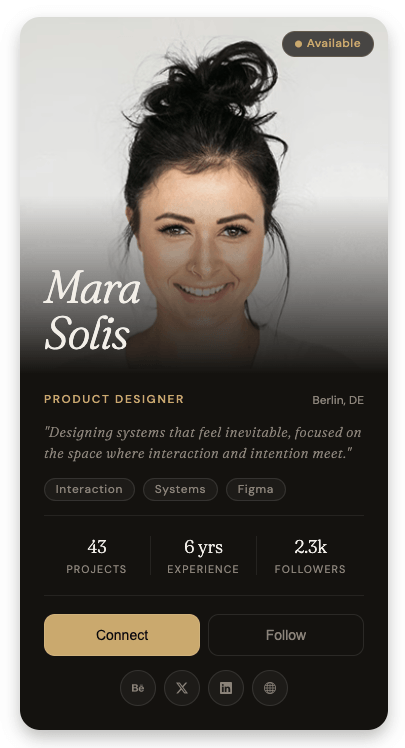
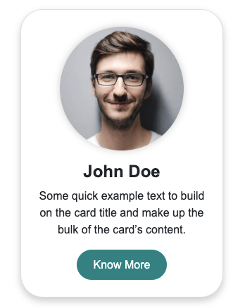
Responsive profile card built with HTML and CSS, featuring a gradient header, avatar, user details, skill tags, contact info, and clean call-to-action buttons.
Final output:

Sarah Anderson
Senior Product Designer
Passionate about creating user-centered designs that solve real problems. 5+ years of experience in SaaS and fintech.
1. Let’s start with a .profile-card div. Add a .header-bg div for the gradient banner and a .profile-card-content-wrapper div for everything below it.
<div class="profile-card">
    <div class="header-bg"></div>
    <div class="profile-card-content-wrapper">
    </div>
</div>
Reset margins, set the font family, and style the card with a max-width, border-radius, box-shadow, and overflow: hidden so the gradient banner stays inside the rounded corners.
* {
    margin: 0;
    box-sizing: border-box;
}
body {
    font-family: system-ui, -apple-system, BlinkMacSystemFont, 'Segoe UI', Roboto, Oxygen, Ubuntu, Cantarell, 'Open Sans', 'Helvetica Neue', sans-serif;
}
.profile-card {
    max-width: 28rem;
    border-radius: 1rem;
    box-shadow: 0 10px 15px -3px rgb(0 0 0 / 0.1), 0 4px 6px -4px rgb(0 0 0 / 0.1);
    overflow: hidden;
}
Give the .header-bg a fixed height and a blue-to-purple gradient.
.profile-card .header-bg {
    width: 100%;
    height: 8rem;
    background: linear-gradient(to right, #5c9cfc, #8910fa);
}
Output:
2. Inside the .profile-card-content-wrapper, add a .profile-headshot-wrapper div with the profile image inside it.
<div class="profile-card-content-wrapper">
    <div class="profile-headshot-wrapper">
        <img src="sarah.jpg" alt="">
    </div>
</div>
Set the padding on the content wrapper and a negative margin-top to pull it up and overlap the gradient banner. This is what creates the effect of the profile image sitting on top of the banner.
.profile-card .profile-card-content-wrapper {
    padding: 0 2rem 2rem 2rem;
    margin-top: -4rem;
}
Make the headshot wrapper a fixed circle using border-radius: 50% and overflow: hidden. Add a white border and a box-shadow to lift it off the background.
.profile-card .profile-headshot-wrapper {
    width: 8rem;
    height: 8rem;
    border-radius: 50%;
    border: 4px solid #fff;
    overflow: hidden;
    margin-bottom: 1rem;
    box-shadow: 0 10px 15px -3px rgb(0 0 0 / 0.1), 0 4px 6px -4px rgb(0 0 0 / 0.1);
}
.profile-card .profile-headshot-wrapper img {
    width: 100%;
    object-fit: cover;
}
Output:
3. Add the .profile-card-body div with the name, designation, and description.
<div class="profile-card-body">
    <h3 class="name">Sarah Anderson</h3>
    <p class="designation">Senior Product Designer</p>
    <p class="description">Passionate about creating user-centered designs that solve real problems. 5+ years of experience in SaaS and fintech.</p>
</div>
Style each with different font sizes and colors to create a clear visual hierarchy.
.profile-card .profile-card-body {
    margin-bottom: 1rem;
}
.profile-card .name {
    margin-bottom: .25rem;
    font-size: 1.5rem;
    line-height: 1.3;
    font-weight: 500;
    color: #101828;
}
.profile-card .designation {
    margin-bottom: .75rem;
    color: #4a5565;
    line-height: 1.5;
}
.profile-card .description {
    color: #6a7282;
    font-size: .875rem;
    line-height: 1.625;
}
Output:
Sarah Anderson
Senior Product Designer
Passionate about creating user-centered designs that solve real problems. 5+ years of experience in SaaS and fintech.
4. Add the .badges-wrapper div with skill badge spans inside it.
<div class="badges-wrapper">
    <span class="badge">UX Design</span>
    <span class="badge">Figma</span>
    <span class="badge">Design Systems</span>
    <span class="badge">Prototyping</span>
</div>
Use flexbox with flex-wrap: wrap so the badges wrap to the next line if they don’t all fit. Give each badge a light grey background and a small border-radius.
.profile-card .badges-wrapper {
    display: flex;
    flex-wrap: wrap;
    gap: .5rem;
    margin-bottom: 1.5rem;
}
.profile-card .badge {
    color: #030213;
    background-color: #eeeef0;
    font-size: .75rem;
    font-weight: 500;
    line-height: 1.3;
    padding: 4px 8px;
    border-radius: .5rem;
}
Output:
Sarah Anderson
Senior Product Designer
Passionate about creating user-centered designs that solve real problems. 5+ years of experience in SaaS and fintech.
5. Link Bootstrap Icons in the head for the contact and social icons.
<link rel="stylesheet" href="https://cdn.jsdelivr.net/npm/bootstrap-icons@1.13.1/font/bootstrap-icons.min.css">Add the .contact-info-wrapper div with three .contact-info divs inside it, each with a Bootstrap icon and a text span.
<div class="contact-info-wrapper">
    <div class="contact-info">
        <i class="bi bi-envelope"></i>
        <span>sarah.anderson@email.com</span>
    </div>
    <div class="contact-info">
        <i class="bi bi-telephone"></i>
        <span>+1 (555) 123-4567</span>
    </div>
    <div class="contact-info">
        <i class="bi bi-geo-alt"></i>
        <span>San Francisco, CA</span>
    </div>
</div>
Use flex-direction: column with a gap to stack the contact rows. Use flexbox on each .contact-info to align the icon and text side by side.
.profile-card .contact-info-wrapper {
    display: flex;
    flex-direction: column;
    gap: .75rem;
    margin-bottom: 1.5rem;
}
.profile-card .contact-info {
    display: flex;
    gap: .75rem;
    align-items: center;
    font-size: .875rem;
    color: #4a5565;
}
.profile-card .contact-info i {
    color: #99a1af;
    width: 1rem;
    height: 1rem;
}
Output:
Sarah Anderson
Senior Product Designer
Passionate about creating user-centered designs that solve real problems. 5+ years of experience in SaaS and fintech.
6. Add the .button-wrapper with two links styled as buttons.
<div class="button-wrapper">
    <a href="#" class="button button-primary">Contact</a>
    <a href="#" class="button button-secondary">Download CV</a>
</div>
Use flexbox on the wrapper. Set flex: 1 1 200px on each button so they share space equally and wrap on smaller screens. Style the primary button with a dark background and the secondary with a white background and a light border.
.profile-card .button-wrapper {
    display: flex;
    gap: .75rem;
    margin-bottom: 1.5rem;
}
.profile-card .button {
    flex: 1 1 200px;
    text-decoration: none;
    font-size: .875rem;
    font-weight: 500;
    line-height: 1.4;
    padding: .5rem 1rem;
    border-radius: .5rem;
    text-align: center;
    border: 1px solid transparent;
}
.profile-card .button-primary {
    background-color: #030213;
    color: #fff;
}
.profile-card .button-secondary {
    background-color: #fff;
    color: #0a0a0a;
    border-color: rgba(0, 0, 0, .1);
}
Output:
Sarah Anderson
Senior Product Designer
Passionate about creating user-centered designs that solve real problems. 5+ years of experience in SaaS and fintech.
7. Lastly, add the .social-wrapper with social icon links at the bottom.
<div class="social-wrapper">
    <a href="#" class="social-icon">
        <i class="bi bi-behance"></i>
    </a>
    <a href="#" class="social-icon">
        <i class="bi bi-linkedin"></i>
    </a>
    <a href="#" class="social-icon">
        <i class="bi bi-github"></i>
    </a>
</div>
Use flexbox with justify-content: center to center the icons. Give each .social-icon a fixed width and height, border-radius: 50% to make it circular, and flexbox to center the icon inside it.
.profile-card .social-wrapper {
    display: flex;
    flex-wrap: wrap;
    justify-content: center;
    gap: 1rem;
}
.profile-card .social-icon {
    background-color: #f6f3f4;
    color: #4a5565;
    border-radius: 50%;
    width: 40px;
    height: 40px;
    display: flex;
    align-items: center;
    justify-content: center;
}
Output:
Sarah Anderson
Senior Product Designer
Passionate about creating user-centered designs that solve real problems. 5+ years of experience in SaaS and fintech.
Final Output Code for Profile Card HTML CSS:
HTML
<head>
    <link rel="stylesheet" href="https://cdn.jsdelivr.net/npm/bootstrap-icons@1.13.1/font/bootstrap-icons.min.css">
</head>
<div class="profile-card">
    <div class="header-bg">

    </div>
    <div class="profile-card-content-wrapper">
        <div class="profile-headshot-wrapper">
            <img src="sarah.jpg" alt="">

        </div>
        <div class="profile-card-body">
            <h3 class="name">Sarah Anderson</h3>
            <p class="designation">Senior Product Designer</p>
            <p class="description">Passionate about creating user-centered designs that solve real problems. 5+
                years of experience in SaaS and fintech.</p>
        </div>
        <div class="badges-wrapper">
            <span class="badge"> UX Design</span>
            <span class="badge"> Figma</span>
            <span class="badge">Design Systems</span>
            <span class="badge">Prototyping</span>
        </div>
        <div class="contact-info-wrapper">
            <div class="contact-info">
                <i class="bi bi-envelope"></i>
                <span>sarah.anderson@email.com</span>
            </div>
            <div class="contact-info">
                <i class="bi bi-telephone"></i>
                <span>+1 (555) 123-4567</span>
            </div>
            <div class="contact-info">
                <i class="bi bi-geo-alt"></i>
                <span>San Francisco, CA</span>
            </div>
        </div>
        <div class="button-wrapper">
            <a href="#" class="button button-primary">Contact</a>
            <a href="#" class="button button-secondary">Download CV</a>
        </div>
        <div class="social-wrapper">
            <a href="#" class="social-icon">
                <i class="bi bi-behance"></i>
            </a>
            <a href="#" class="social-icon">
                <i class="bi bi-linkedin"></i>
            </a>
            <a href="#" class="social-icon">
                <i class="bi bi-github"></i>
            </a>
        </div>
    </div>
</div>
CSS
* {
    margin: 0;
    box-sizing: border-box;
}
body {
    font-family: system-ui, -apple-system, BlinkMacSystemFont, 'Segoe UI', Roboto, Oxygen, Ubuntu, Cantarell, 'Open Sans', 'Helvetica Neue', sans-serif;
}
.profile-card {
    max-width: 28rem;
    border-radius: 1rem;
    box-shadow: 0 10px 15px -3px rgb(0 0 0 / 0.1), 0 4px 6px -4px rgb(0 0 0 / 0.1);
    overflow: hidden;
}
.profile-card .header-bg {
    width: 100%;
    height: 8rem;
    background: linear-gradient(to right, #5c9cfc, #8910fa);
}
.profile-card .profile-card-content-wrapper {
    padding: 0 2rem 2rem 2rem;
    margin-top: -4rem;
}
.profile-card .profile-headshot-wrapper {
    width: 8rem;
    height: 8rem;
    border-radius: 50%;
    border: 4px solid #fff;
    overflow: hidden;
    margin-bottom: 1rem;
    box-shadow: 0 10px 15px -3px rgb(0 0 0 / 0.1), 0 4px 6px -4px rgb(0 0 0 / 0.1);
}
.profile-card .profile-headshot-wrapper img {
    width: 100%;
    object-fit: cover;
}
.profile-card .profile-card-body {
    margin-bottom: 1rem;
}
.profile-card .name {
    margin-bottom: .25rem;
    font-size: 1.5rem;
    line-height: 1.3;
    font-weight: 500;
    color: #101828;
}
.profile-card .designation {
    margin-bottom: .75rem;
    color: #4a5565;
    line-height: 1.5;
}
.profile-card .description {
    color: #6a7282;
    font-size: .875rem;
    line-height: 1.625;
}
.profile-card .badges-wrapper {
    display: flex;
    flex-wrap: wrap;
    gap: .5rem;
    margin-bottom: 1.5rem;
}
.profile-card .badge {
    color: #030213;
    background-color: #eeeef0;
    font-size: .75rem;
    font-weight: 500;
    line-height: 1.3;
    padding: 4px 8px;
    border-radius: .5rem;
}
.profile-card .contact-info-wrapper {
    display: flex;
    flex-direction: column;
    gap: .75rem;
    margin-bottom: 1.5rem;
}
.profile-card .contact-info {
    display: flex;
    gap: .75rem;
    align-items: center;
    font-size: .875rem;
    color: #4a5565;
}
.profile-card .contact-info i {
    color: #99a1af;
    width: 1rem;
    height: 1rem;
}
.profile-card .button-wrapper {
    display: flex;
    gap: .75rem;
    margin-bottom: 1.5rem;
}
.profile-card .button {
    flex: 1 1 200px;
    text-decoration: none;
    font-size: .875rem;
    font-weight: 500;
    line-height: 1.4;
    padding: .5rem 1rem;
    border-radius: .5rem;
    text-align: center;
    border: 1px solid transparent;
}
.profile-card .button-primary {
    background-color: #030213;
    color: #fff;
}
.profile-card .button-secondary {
    background-color: #fff;
    color: #0a0a0a;
    border-color: rgba(0, 0, 0, .1);
}
.profile-card .social-wrapper {
    display: flex;
    flex-wrap: wrap;
    justify-content: center;
    gap: 1rem;
}
.profile-card .social-icon {
    background-color: #f6f3f4;
    color: #4a5565;
    border-radius: 50%;
    width: 40px;
    height: 40px;
    display: flex;
    align-items: center;
    justify-content: center;
}
If you have any doubts or stuck somewhere, you can reach out through Coding Yaar's Discord server.