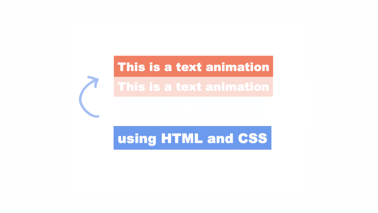
This animated hero section HTML CSS GSAP tutorial shows you how to build a full-screen hero layout with a line-by-line heading reveal animation powered by GSAP.
The section includes a dark gradient overlay on the hero image, a section label with a line-draw effect, and a staggered entrance animation that brings the header, image, label, heading, and description in one after the other.
Final output:
Where Form Meets Eternity
Handcrafted interiors where material and light hold a quiet conversation. Each space, unrepeatable.
ExploreSteps for Hero Section Animation GSAP HTML CSS #3:
1. First, link the Instrument Sans and Fraunces fonts from Google Fonts in the head.
<link rel="preconnect" href="https://fonts.googleapis.com">
<link rel="preconnect" href="https://fonts.gstatic.com" crossorigin>
<link href="https://fonts.googleapis.com/css2?family=Fraunces:ital,opsz,wght@0,9..144,100..900;1,9..144,100..900&family=Instrument+Sans:ital,wght@0,400..700;1,400..700&display=swap"
    rel="stylesheet">
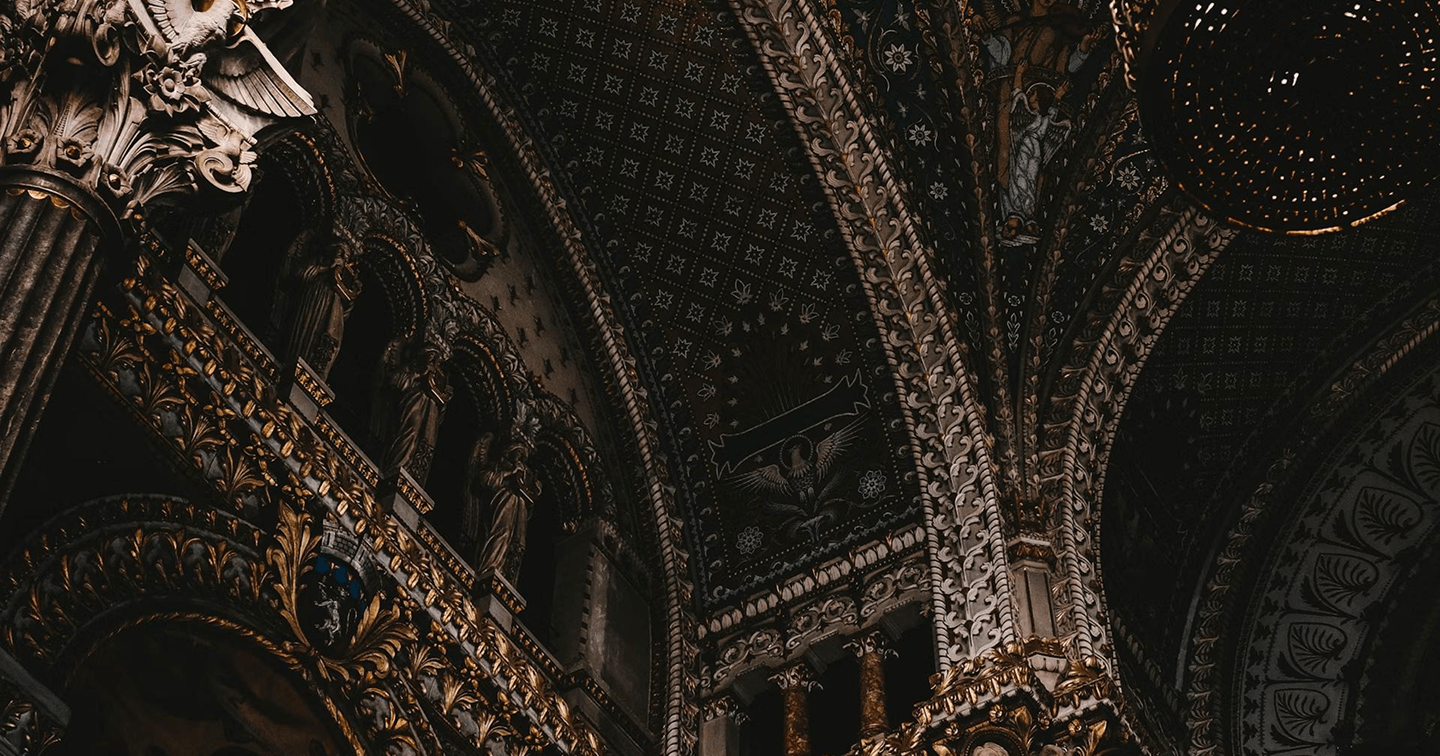
Let’s start with a section element with the class hero-section. Inside it, add an .img-wrapper div with the hero image.
<section class="hero-section">
    <div class="img-wrapper">
        <img src="hero-image.png" alt="">
    </div>
</section>
Reset margins, set Instrument Sans as the font family, and define a CSS variable for the Fraunces heading font. Set the width to 100% and the height to 100vh so the section fills the full viewport.
Set the overflow property to hidden so the image doesn’t spill outside the section during the scale animation later. Give it a black background so there’s no flash of white before the image loads.
* {
    margin: 0;
    box-sizing: border-box;
}
body {
    font-family: "Instrument Sans", sans-serif;
}
:root {
    --heading-font: "Fraunces", serif;
}
.hero-section {
    width: 100%;
    height: 100vh;
    overflow: hidden;
    position: relative;
    background-color: hsl(0, 0%, 0%);
}
.hero-section .img-wrapper {
    position: relative;
    width: 100%;
    height: 100%;
}
.hero-section .img-wrapper img {
    width: 100%;
    height: 100%;
    object-fit: cover;
}
Output:
2. Now add the header above the section. Inside it, add a nav with a logo link and a ul with the nav links.
<header>
    <nav>
        <a href="#" class="navbar-logo">Maison</a>
        <ul>
            <li><a href="#">Collection</a></li>
            <li><a href="#">Ateliers</a></li>
            <li><a href="#">About</a></li>
            <li><a href="#">Contact</a></li>
        </ul>
    </nav>
</header>
Now set the position to absolute on the header and the top to 0 so it sits at the very top of the page over the hero image. Add a high z-index so it stays above everything else.
Use flexbox with the justify content property set to space-between on the nav to push the logo and links to opposite ends. Style all links with uppercase text and a warm cream color. I am hiding the nav links on mobile since this tutorial focuses on the hero section animation rather than a full responsive navbar.
header {
    position: absolute;
    top: 0;
    width: 100%;
    padding: 2.25rem 2.5rem;
    z-index: 9;
}
header nav {
    display: flex;
    justify-content: space-between;
    flex-wrap: wrap;
    gap: .5rem;
}
header nav a {
    text-decoration: none;
    text-transform: uppercase;
    color: hsl(39, 35%, 92%);
}
header .navbar-logo {
    font-size: .875rem;
    line-height: 1.3;
    letter-spacing: 3.14px;
}
header nav ul {
    font-size: .75rem;
    line-height: 1.3;
    letter-spacing: 1.52px;
    display: flex;
    gap: 2.5rem;
    list-style: none;
    padding: 0;
}
@media screen and (max-width: 767px) {
    header nav ul {
        display: none;
    }
}
header nav ul li {
    opacity: .7;
    transition: opacity .3s;
}
header nav ul li:hover {
    opacity: 1;
}
Output:
3. Add the dark gradient overlay on .img-wrapper using a ::before pseudo-element. Set the position property to absolute and use inset: 0 to stretch it across the full image. This overlay is what makes the text readable over the image. So set its z-index to 1 so it sits above the image.
.hero-section .img-wrapper::before {
    content: "";
    position: absolute;
    inset: 0;
    background: linear-gradient(0deg, hsla(60, 7%, 3%, 0.85) 0%, hsla(60, 7%, 3%, 0.2) 50%, hsla(60, 7%, 3%, 0.3) 100%);
    z-index: 1;
}
Output:
4. Add the .hero-content-wrapper div after .img-wrapper. Inside it, add the section label, the title wrapper with the heading, and a .hero-bottom div with the description and a link.
<div class="hero-content-wrapper">
    <span class="section-label">Collection 2026</span>
    <div class="hero-title-wrapper">
        <h1 class="hero-title">
            <span class="line-mask">
                <span class="line-text">Where Form</span>
            </span>
            <span class="line-mask">
                <span class="line-text">Meets Eternity</span>
            </span>
        </h1>
    </div>
    <div class="hero-bottom">
        <p>Handcrafted interiors where material and light hold a quiet conversation. Each space, unrepeatable.</p>
        <a href="#">Explore</a>
    </div>
</div>
Set the position property of .hero-content-wrapper to absolute and the bottom to 7rem so that the content sits near the bottom of the hero. Use clamp() on the inline padding so it scales with the screen size. Set the z-index property to 2 so it sits above the gradient overlay.
.hero-section .hero-content-wrapper {
    width: 100%;
    position: absolute;
    bottom: 7rem;
    left: 0;
    z-index: 2;
    padding-inline: clamp(2rem, calc(3.5vw + 1rem), 4rem);
}
Style the .section-label. Use the Fraunces font with a wide letter spacing and uppercase text. Give it a warm gold color. Set the position property to relative and add some left padding so the decorative line has room to sit to the left of the text. The –line-scale CSS variable controls the line’s width, since GSAP will animate it from 0 to 1 to create a line-drawing effect on page load.
.hero-section .section-label {
    font-family: var(--heading-font);
    font-size: .75rem;
    line-height: 1.3;
    letter-spacing: 3.12px;
    text-transform: uppercase;
    color: hsl(38, 40%, 54%);
    position: relative;
    padding-left: 4rem;
    --line-scale: 1;
}
.hero-section .section-label::before {
    position: absolute;
    top: 50%;
    left: 0;
    content: "";
    width: 2.75rem;
    height: 1px;
    background-color: hsl(38, 40%, 54%);
    transform: scaleX(var(--line-scale)) translateY(-50%);
    transform-origin: left center;
}
Output:
Where Form Meets Eternity
Handcrafted interiors where material and light hold a quiet conversation. Each space, unrepeatable.
Explore5. Style the heading. Use clamp() on the font size so it scales smoothly. Set the line height property to 1 and a large negative letter spacing to make the big text feel tight and intentional.
Each line of the heading is wrapped in a .line-mask span with the overflow property set to hidden. This is what makes the line reveal animation possible since GSAP slides each .line-text up from below, and the mask clips it so it appears to emerge from nothing.
.hero-section .hero-title-wrapper {
    margin-block: 1.75rem;
}
.hero-section h1 {
    font-family: var(--heading-font);
    font-weight: 400;
    font-size: clamp(3rem, calc(8vw + 1rem), 8rem);
    line-height: 1;
    letter-spacing: -3.2px;
    color: hsl(39, 35%, 92%);
}
.hero-section .line-mask {
    display: block;
    overflow: hidden;
    margin-block: .5rem;
}
.hero-section .line-text {
    display: block;
}
Output:
Where Form Meets Eternity
Handcrafted interiors where material and light hold a quiet conversation. Each space, unrepeatable.
Explore6. Style .hero-bottom. Use flexbox with the justify content property set to space-between and the align items property set to flex-end so the description and link sit at opposite ends with the link anchored to the bottom. Style the description with a muted semi-transparent color and a max-width so it doesn’t stretch too wide.
Style the link with wide letter spacing and a decorative line to the right using a ::before pseudo-element. On hover, extend the right padding and animate the line to full width for a smooth expanding effect.
.hero-section .hero-bottom {
    width: 100%;
    display: flex;
    justify-content: space-between;
    align-items: flex-end;
    flex-wrap: wrap;
    gap: 1rem 1.75rem;
}
.hero-section .hero-bottom p {
    font-size: .875rem;
    line-height: 1.8;
    letter-spacing: 0.26px;
    color: hsla(39, 35%, 92%, 0.5);
    max-width: 17.5rem;
}
.hero-section .hero-bottom a {
    font-size: .75rem;
    line-height: 1.2;
    letter-spacing: 3.05px;
    text-transform: uppercase;
    color: hsl(39, 35%, 92%);
    text-decoration: none;
    position: relative;
    padding-right: 3.5rem;
    transition: padding-right .3s;
}
.hero-section .hero-bottom a::before {
    position: absolute;
    top: 50%;
    right: 0;
    transform: translateY(-50%) scaleX(0.5);
    transform-origin: right;
    content: "";
    width: 4.5rem;
    height: 1px;
    background-color: hsl(39, 35%, 92%);
    transition: transform .3s;
}
.hero-section .hero-bottom a:hover {
    padding-right: calc(3.5rem + 2.25rem);
}
.hero-section .hero-bottom a:hover::before {
    transform: translateY(-50%) scaleX(1);
}
Output:
Where Form Meets Eternity
Handcrafted interiors where material and light hold a quiet conversation. Each space, unrepeatable.
Explore7. Now let’s add the entrance animation. Link the GSAP library just before the closing body tag, then link your script.js file after it.
<script src="https://cdn.jsdelivr.net/npm/gsap@3.15/dist/gsap.min.js"></script>
<script src="script.js"></script>
In script.js, wait for the page to fully load using DOMContentLoaded. Then create a GSAP timeline, so all the animations run in sequence one after the other.
Start by fading the header in from slightly below its natural position. Then scale the hero image down from 1.15 to 1 as it fades in, so it feels like the scene is slowly coming into focus.
document.addEventListener("DOMContentLoaded", (event) => {
    let tl = gsap.timeline();

    tl.from("header", { opacity: 0, y: 15, duration: .3, delay: .5 })
      .from(".hero-section img", { opacity: 0, scale: 1.15, duration: .7, ease: "power.in", zIndex: -1 })
});
Chain the remaining animations onto the timeline. The section label animates in while its –line-scale CSS variable goes from 0 to 1, which draws the decorative line from left to right.
Each heading line slides up from below using yPercent: 100, which works because the .line-mask clips the overflow so the text appears to emerge from behind the line above it.
The description and the CTA link fade in last.
.from(".hero-section .section-label", { opacity: 0, "--line-scale": 0, duration: .8 })
      .from(".hero-section h1 .line-text", { yPercent: 100, duration: .8, stagger: .15 }, "-=.5")
      .from(".hero-section .hero-bottom p", { opacity: 0, y: 10, duration: .5 }, "-=.5")
      .from(".hero-section .hero-bottom a", { opacity: 0, duration: .3 })
Output:
Where Form Meets Eternity
Handcrafted interiors where material and light hold a quiet conversation. Each space, unrepeatable.
ExploreFinal Output Code for Responsive GSAP Hero Section Animation HTML CSS #3:
Head
<link rel="preconnect" href="https://fonts.googleapis.com">
<link rel="preconnect" href="https://fonts.gstatic.com" crossorigin>
<link href="https://fonts.googleapis.com/css2?family=Fraunces:ital,opsz,wght@0,9..144,100..900;1,9..144,100..900&family=Instrument+Sans:ital,wght@0,400..700;1,400..700&display=swap"
    rel="stylesheet">
HTML
<header>
    <nav>
        <a href="#" class="navbar-logo">Maison</a>
        <ul>
            <li><a href="#">Collection</a></li>
            <li><a href="#">Ateliers</a></li>
            <li><a href="#">About</a></li>
            <li><a href="#">Contact</a></li>
        </ul>
    </nav>
</header>
<section class="hero-section">
    <div class="img-wrapper">
        <img src="hero-image-maison.png" alt="">
    </div>
    <div class="hero-content-wrapper">
        <span class="section-label">Collection 2026</span>
        <div class="hero-title-wrapper">
            <h1 class="hero-title">
                <span class="line-mask">
                    <span class="line-text">Where Form</span>
                </span>
                <span class="line-mask">
                    <span class="line-text">Meets Eternity</span>
                </span>
            </h1>
        </div>
        <div class="hero-bottom">
            <p>Handcrafted interiors where material and light
                hold a quiet conversation. Each space,
                unrepeatable.</p>
            <a href="#">Explore</a>
        </div>
    </div>
</section>
CSS
* {
    margin: 0;
    box-sizing: border-box;
}

body {
    font-family: "Instrument Sans", sans-serif;
}

:root {
    --heading-font: "Fraunces", serif;
}

header {
    position: absolute;
    top: 0;
    width: 100%;
    padding: 2.25rem 2.5rem;
    z-index: 9;
}

header nav {
    display: flex;
    justify-content: space-between;
    flex-wrap: wrap;
    gap: .5rem;
}

header nav a {
    text-decoration: none;
    text-transform: uppercase;
    color: hsl(39, 35%, 92%);
}

header nav .navbar-logo {
    font-size: .875rem;
    line-height: 1.3;
    letter-spacing: 3.14px;
}

header nav ul {
    font-size: .75rem;
    line-height: 1.3;
    letter-spacing: 1.52px;
    display: flex;
    gap: 2.5rem;
}

header nav ul li {
    opacity: .7;
    transition: opacity .3s;
}

header nav ul li:hover {
    opacity: 1;
}

@media screen and (max-width: 767px) {
    header nav ul {
        display: none;
    }
}

.hero-section {
    width: 100%;
    height: 100vh;
    overflow: hidden;
    position: relative;
    background-color: hsl(0, 0%, 0%);
}

.hero-section .img-wrapper {
    position: relative;
    width: 100%;
    height: 100%;
}

.hero-section .img-wrapper::before {
    content: "";
    position: absolute;
    inset: 0;
    background: linear-gradient(0deg, hsla(60, 7%, 3%, 0.85) 0%, hsla(60, 7%, 3%, 0.3) 50%, hsla(60, 7%, 3%, 0.4) 100%);
    z-index: 1;
}

.hero-section .img-wrapper img {
    width: 100%;
    height: 100%;
    object-fit: cover;
}

.hero-section .hero-content-wrapper {
    width: 100%;
    position: absolute;
    bottom: 7rem;
    left: 0;
    z-index: 2;
    padding-inline: clamp(2rem, calc(3.5vw + 1rem), 4rem);
}

.hero-section .hero-content-wrapper .section-label {
    font-family: var(--heading-font);
    font-size: .75rem;
    line-height: 1.3;
    letter-spacing: 3.12px;
    text-transform: uppercase;
    color: hsl(38, 40%, 54%);
    position: relative;
    padding-left: 4rem;
    --line-scale: 1;
}

.hero-section .hero-content-wrapper .section-label::before {
    position: absolute;
    top: 50%;
    left: 0;
    content: "";
    width: 2.75rem;
    height: 1px;
    background-color: hsl(38, 40%, 54%);
    transform: scaleX(var(--line-scale)) translateY(-50%);
    transform-origin: left center;
}

.hero-section .hero-content-wrapper .hero-title-wrapper {
    margin-block: 1.75rem;
}

.hero-section .hero-content-wrapper .hero-title-wrapper h1 {
    font-family: var(--heading-font);
    font-weight: 400;
    font-size: clamp(3rem, calc(8vw + 1rem), 8rem);
    line-height: 1;
    letter-spacing: -3.2px;
    color: hsl(39, 35%, 92%);
    margin: 0;
}

.hero-section .hero-content-wrapper .hero-title-wrapper h1 .line-mask {
    display: block;
    overflow: hidden;
    margin-block: .5rem;
}

.hero-section .hero-content-wrapper .hero-title-wrapper h1 .line-text {
    display: block;
    margin: 0;
}

.hero-section .hero-content-wrapper .hero-bottom {
    width: 100%;
    display: flex;
    justify-content: space-between;
    align-items: flex-end;
    flex-wrap: wrap;
    gap: 1rem 1.75rem;
}

.hero-section .hero-content-wrapper .hero-bottom p {
    font-size: .875rem;
    line-height: 1.8;
    letter-spacing: 0.26px;
    color: hsla(39, 35%, 92%, 0.5);
    max-width: 17.5rem;
}

.hero-section .hero-content-wrapper .hero-bottom a {
    font-size: .75rem;
    line-height: 1.2;
    letter-spacing: 3.05px;
    text-transform: uppercase;
    color: hsl(39, 35%, 92%);
    text-decoration: none;
    position: relative;
    padding-right: 3.5rem;
    transition: padding-right .3s;
}

.hero-section .hero-content-wrapper .hero-bottom a::before {
    position: absolute;
    top: 50%;
    right: 0;
    transform: translateY(-50%) scaleX(0.5);
    transform-origin: right;
    content: "";
    width: 4.5rem;
    height: 1px;
    background-color: hsl(39, 35%, 92%);
    transition: transform .3s;
}

.hero-section .hero-content-wrapper .hero-bottom a:hover {
    padding-right: calc(3.5rem + 2.25rem);
}

.hero-section .hero-content-wrapper .hero-bottom a:hover::before {
    transform: translateY(-50%) scaleX(1);
}
Footer(before </body>):
<script src="https://cdn.jsdelivr.net/npm/gsap@3.15/dist/gsap.min.js"></script>
<script src="script.js"></script>
JS:
document.addEventListener("DOMContentLoaded", (event) => {
    let tl = gsap.timeline();

    tl.from("header", { opacity: 0, y: 15, duration: .3, delay: .5 })
        .from(".hero-section img", { opacity: 0, scale: 1.15, duration: .7, ease: "power.in", zIndex: -1 })
        .from(".hero-section .section-label", { opacity: 0, "--line-scale": 0, duration: .8 })
        .from(".hero-section h1 .line-text", { yPercent: 100, duration: .8, stagger: .15 }, "-=.5")
        .from(".hero-section .hero-bottom p", { opacity: 0, y: 10, duration: .5 }, "-=.5")
        .from(".hero-section .hero-bottom a", { opacity: 0, duration: .3 })
});
If you have any doubts or stuck somewhere, you can reach out through Coding Yaar's Discord server.