Responsive scroll animation for feature cards using HTML, CSS, and GSAP. Cards animate into view as you scroll, sliding in from an offset position with a staggered entrance effect. The two-column layout adapts cleanly across screen sizes, making it a good fit for landing pages, SaaS websites, portfolios, and agency sites.
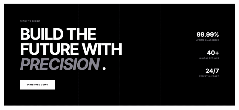
Final output:
Built for the
Technical Elite.
Infrastructure engineered for teams who measure in milliseconds and deploy without hesitation. Precise. Observable. Resilient by default.

Instant Latency

Immutable Security

Real-time Metrics

Modular Scaling

Global Reach

Neural Compute
1. Let’s start with a section element with the class section_capabilities. Inside it, add a .container-large div, then a .capabilities-wrapper div inside that.
<section class="section_capabilities">
    <div class="container-large">
        <div class="capabilities-wrapper">
        </div>
    </div>
</section>
Reset margins, set the font family, and style the section with some padding. Set overflow to hidden on the section so the cards don’t cause a horizontal scrollbar when they animate in from off-screen during the scroll animation. Center the .container-large with margin-inline: auto and a max-width. Use a two-column grid on .capabilities-wrapper to place the header and cards side by side.
* {
    margin: 0;
    padding: 0;
    box-sizing: border-box;
}
body {
    font-family: Inter, sans-serif;
}
.section_capabilities {
    max-width: 100vw;
    overflow: hidden;
    padding: 6rem 1.5rem;
}
.section_capabilities .container-large {
    max-width: 100rem;
    margin-left: auto;
    margin-right: auto;
}
.section_capabilities .capabilities-wrapper {
    grid-column-gap: 1rem;
    grid-row-gap: 2rem;
    grid-template-columns: 1fr 1fr;
    display: grid;
}
@media screen and (max-width: 767px) {
    .section_capabilities .capabilities-wrapper {
        grid-template-columns: 1fr;
    }
}
I am using Inter font here.
<link rel="preconnect" href="https://fonts.googleapis.com">
<link rel="preconnect" href="https://fonts.gstatic.com" crossorigin>
<link href="https://fonts.googleapis.com/css2?family=Inter:ital,opsz,wght@0,14..32,100..900;1,14..32,100..900&display=swap"
        rel="stylesheet">
2. Add the .capabilities-header div inside .capabilities-wrapper. Inside it, add a div with the label and heading, then a description paragraph below it.t.
<div class="capabilities-header">
    <div>
        <div class="tiny-label">CAPABILITIES</div>
        <h2>Built for the<br><span class="is-gray-italic">Technical</span> Elite.</h2>
    </div>
    <p>Infrastructure engineered for teams who measure in milliseconds and deploy without hesitation. Precise. Observable. Resilient by default.</p>
</div>
Use flexbox with flex-flow: column on the header to stack the heading block and paragraph vertically with a gap between them. Use clamp() on the heading font size so it scales smoothly between screen sizes. Give the italic span a gray color to create the contrast with the bold uppercase text.
.section_capabilities .capabilities-header {
    grid-column-gap: 2rem;
    grid-row-gap: 2rem;
    flex-flow: column;
    justify-content: flex-start;
    align-items: flex-start;
    display: flex;
}
.section_capabilities .capabilities-header .tiny-label {
    color: #71717a;
    letter-spacing: 1px;
    text-transform: uppercase;
    font-size: .75rem;
    font-weight: 700;
}
.section_capabilities .capabilities-header h2 {
    margin-top: 1rem;
    font-size: clamp(2.5rem, calc(3vw + 1rem), 4.5rem);
    line-height: .95;
    font-weight: 700;
    letter-spacing: -3px;
    text-transform: uppercase;
}
.section_capabilities .capabilities-header h2 .is-gray-italic {
    color: #909099;
    font-style: italic;
}
.section_capabilities .capabilities-header p {
    width: 100%;
    max-width: 32rem;
    font-size: 1.25rem;
    line-height: 1.55556;
    color: #71717a;
}
Output:
Built for the
Technical Elite.
Infrastructure engineered for teams who measure in milliseconds and deploy without hesitation. Precise. Observable. Resilient by default.
3. Add the .features-wrapper div after .capabilities-header. Inside it, add the six .capability-card divs. Each card has a .capability-card-icon div with an image and a .capability-card-body div with a title and description.
<div class="features-wrapper">
    <div class="capability-card">
        <div class="capability-card-icon">
            <img src="capability-1.png" alt="">
        </div>
        <div class="capability-card-body">
            <h3 class="capability-card-title">Instant Latency</h3>
            <div class="capability-card-description">Sub-millisecond response times across our global edge network.</div>
        </div>
    </div>
    <!-- repeat for remaining 5 cards -->
</div>
Use flexbox with flex-flow: column on .features-wrapper to stack the cards. Cap the width to 40vw on desktop so the cards stay in the right column and don’t stretch across the full grid.
.section_capabilities .features-wrapper {
    grid-column-gap: 2rem;
    grid-row-gap: 2rem;
    flex-flow: column;
    display: flex;
}
@media screen and (min-width: 769px) {
    .section_capabilities .features-wrapper {
        max-width: 40vw;
    }
}
Output:
Built for the
Technical Elite.
Infrastructure engineered for teams who measure in milliseconds and deploy without hesitation. Precise. Observable. Resilient by default.
Instant Latency
Immutable Security
Real-time Metrics
4. Let’s style each .capability-card with a border, white background, and padding. Add a subtle background-color transition so the hover state feels smooth.
.section_capabilities .capability-card {
    border: 1px solid #00000099;
    background-color: #fff;
    padding: 2.5rem;
    transition: background-color .2s cubic-bezier(.645, .045, .355, 1);
}
.section_capabilities .capability-card:hover {
    background-color: #fafafa;
}
Fix the icon size and add some bottom margin to space it away from the card body. Use flexbox with flex-flow: column on .capability-card-body to stack the title and description with a gap.
.section_capabilities .capability-card-icon {
    margin-bottom: 2rem;
    width: 1.25rem;
    height: 1.25rem;
}
.section_capabilities .capability-card-body {
    grid-column-gap: .75rem;
    grid-row-gap: .75rem;
    flex-flow: column;
    display: flex;
}
.section_capabilities .capability-card-title {
    letter-spacing: -.5px;
    text-transform: uppercase;
    font-size: 1.25rem;
    line-height: 1.5;
}
.section_capabilities .capability-card-description {
    color: #71717a;
    font-size: .875rem;
    line-height: 1.625;
}
Output:
Built for the
Technical Elite.
Infrastructure engineered for teams who measure in milliseconds and deploy without hesitation. Precise. Observable. Resilient by default.
Instant Latency
Immutable Security
Real-time Metrics
5. Now for the scroll animation. Link the GSAP and ScrollTrigger libraries just before the closing body tag. GSAP handles the animation, and ScrollTrigger is a GSAP plugin that ties animations to the scroll position, letting us create scroll-triggered animations.
<script src="https://cdn.jsdelivr.net/npm/gsap@3.15/dist/gsap.min.js"></script>
<script src="https://cdn.jsdelivr.net/npm/gsap@3.15/dist/ScrollTrigger.min.js"></script>
Inside a script tag or an external JS file, do the following.
Wait for the page to fully load using <strong>DOMContentLoaded</strong>, then register the ScrollTrigger plugin with GSAP. This needs to happen before any scroll-based animations are set up.
document.addEventListener("DOMContentLoaded", (event) => {
    gsap.registerPlugin(ScrollTrigger);
});
6. Now use gsap.fromTo() to create a card entrance animation for all the .capability-card elements. The first argument is the target element, the second is the from state, and the third is the to state. The from state starts each card shifted 100px to the right, 100px down, and rotated -15 degrees. The to state brings them back to their natural position at x: 0, y: 0, and rotation: 0.
gsap.fromTo(
    ".capability-card",
    {
        x: 100,
        y: 100,
        rotation: -15,
    },
    {
        x: 0,
        y: 0,
        rotation: 0,
        duration: 0.5,
        ease: "power1.inOut",
    }
);
Output:
Note: Refresh the page while being on this point to play the animation.
Built for the
Technical Elite.
Infrastructure engineered for teams who measure in milliseconds and deploy without hesitation. Precise. Observable. Resilient by default.
Instant Latency
Immutable Security
Real-time Metrics
7. Add the stagger option inside the to state. Without it, all six cards animate at the exact same time. Setting stagger to 0.25 makes each card start its animation 0.25 seconds after the previous one, which creates that cascading entrance effect.
{
    x: 0,
    y: 0,
    rotation: 0,
    duration: 0.5,
    ease: "power1.inOut",
    stagger: 0.25,
}
Output:
Note: Refresh the page while being on this point to play the animation.
Built for the
Technical Elite.
Infrastructure engineered for teams who measure in milliseconds and deploy without hesitation. Precise. Observable. Resilient by default.
Instant Latency
Immutable Security
Real-time Metrics
8. Finally, add the scrollTrigger option to tie the animation to the scroll position. The trigger tells ScrollTrigger which element to watch.
The start and end values define when the animation plays relative to the viewport. Setting toggleActions to “play none none reset” means the animation plays when the section enters the viewport and resets when it leaves, so it replays every time the user scrolls back to it.
The scrub option links the animation progress directly to the scroll position so it feels like the cards are being pulled into place as you scroll.
scrollTrigger: {
    trigger: ".section_capabilities",
    start: "top 90%",
    end: "bottom 75%",
    toggleActions: "play none none reset",
    scrub: true
}
Output:
Built for the
Technical Elite.
Infrastructure engineered for teams who measure in milliseconds and deploy without hesitation. Precise. Observable. Resilient by default.
Instant Latency
Immutable Security
Real-time Metrics
Final Output Code for GSAP Scroll Animation Feature Cards HTML CSS:
Head
<link rel="preconnect" href="https://fonts.googleapis.com">
<link rel="preconnect" href="https://fonts.gstatic.com" crossorigin>
<link href="https://fonts.googleapis.com/css2?family=Inter:ital,opsz,wght@0,14..32,100..900;1,14..32,100..900&display=swap"
        rel="stylesheet">
HTML
<section class="section_capabilities">
    <div class="container-large">
        <div class="capabilities-wrapper">
            <div class="capabilities-header">
                <div>
                    <div class="tiny-label">CAPABILITIES</div>
                    <h2>Built for the<br><span class="is-gray-italic">Technical</span> Elite.
                    </h2>
                </div>
                <p>Infrastructure engineered for teams who
                    measure in milliseconds and deploy without hesitation. Precise. Observable. Resilient by
                    default.</p>
            </div>
            <div class="features-wrapper">
                <div class="capability-card">
                    <div class="capability-card-icon">
                        <img src="capability-1.png" alt="">
                    </div>
                    <div class="capability-card-body">
                        <h3 class="capability-card-title">Instant Latency</h3>
                        <div class="capability-card-description">Sub-millisecond response times across
                            our global edge network.</div>
                    </div>
                </div>
                <div class="capability-card">
                    <div class="capability-card-icon">
                        <img src="capability-2.png" alt="">
                    </div>
                    <div class="capability-card-body">
                        <h3 class="capability-card-title">Immutable Security</h3>
                        <div class="capability-card-description">Hardened infrastructure built with modern security
                            protocols.</div>
                    </div>
                </div>
                <div class="capability-card">
                    <div class="capability-card-icon">
                        <img src="capability-3.png" alt="">
                    </div>
                    <div class="capability-card-body">
                        <h3 class="capability-card-title">Real-time Metrics</h3>
                        <div class="capability-card-description">Visualize every request and interaction as they
                            happen.</div>
                    </div>
                </div>
                <div class="capability-card">
                    <div class="capability-card-icon">
                        <img src="capability-4.png" alt="">
                    </div>
                    <div class="capability-card-body">
                        <h3 class="capability-card-title">Modular Scaling</h3>
                        <div class="capability-card-description">Scale individual services without affecting system
                            integrity.</div>
                    </div>
                </div>
                <div class="capability-card">
                    <div class="capability-card-icon">
                        <img src="capability-5.png" alt="">
                    </div>
                    <div class="capability-card-body">
                        <h3 class="capability-card-title">Global Reach</h3>
                        <div class="capability-card-description">Deploy to 40+ regions worldwide with a single
                            click.</div>
                    </div>
                </div>
                <div class="capability-card">
                    <div class="capability-card-icon">
                        <img src="capability-6.png" alt="">
                    </div>
                    <div class="capability-card-body">
                        <h3 class="capability-card-title">Neural Compute</h3>
                        <div class="capability-card-description">AI-driven resource allocation for maximum
                            efficiency.</div>
                    </div>
                </div>
            </div>
        </div>
    </div>
</section>
CSS
* {
    margin: 0;
    padding: 0;
    box-sizing: border-box;
}
body {
    font-family: Inter, sans-serif;
}
.section_capabilities {
    max-width: 100vw;
    overflow: hidden;
    padding: 6rem 1.5rem;
}
.section_capabilities .container-large {
    max-width: 100rem;
    margin-left: auto;
    margin-right: auto;
}
.section_capabilities .capabilities-wrapper {
    grid-column-gap: 1rem;
    grid-row-gap: 2rem;
    grid-template-columns: 1fr 1fr;
    display: grid;
}
@media screen and (max-width: 767px) {
    .section_capabilities .capabilities-wrapper {
        grid-template-columns: 1fr;
    }
}
.section_capabilities .capabilities-header {
    grid-column-gap: 2rem;
    grid-row-gap: 2rem;
    flex-flow: column;
    justify-content: flex-start;
    align-items: flex-start;
    display: flex;
}
.section_capabilities .capabilities-header .tiny-label {
    color: #71717a;
    letter-spacing: 1px;
    text-transform: uppercase;
    font-size: .75rem;
    font-weight: 700;
}
.section_capabilities .capabilities-header h2 {
    margin-top: 1rem;
    font-size: clamp(2.5rem, calc(3vw + 1rem), 4.5rem);
    line-height: .95;
    font-weight: 700;
    letter-spacing: -3px;
    text-transform: uppercase;
}
.section_capabilities .capabilities-header h2 .is-gray-italic {
    color: #909099;
    font-style: italic;
}
.section_capabilities .capabilities-header p {
    width: 100%;
    max-width: 32rem;
    font-size: 1.25rem;
    line-height: 1.55556;
    color: #71717a;
}
.section_capabilities .features-wrapper {
    grid-column-gap: 2rem;
    grid-row-gap: 2rem;
    flex-flow: column;
    display: flex;
}
@media screen and (min-width: 769px) {
    .section_capabilities .features-wrapper {
        max-width: 40vw;
    }
}
.section_capabilities .capability-card {
    border: 1px solid #00000099;
    background-color: #fff;
    padding: 2.5rem;
    transition: background-color .2s cubic-bezier(.645, .045, .355, 1);
}
.section_capabilities .capability-card:hover {
    background-color: #fafafa;
}
.section_capabilities .capability-card-icon {
    margin-bottom: 2rem;
    width: 1.25rem;
    height: 1.25rem;
}
.section_capabilities .capability-card-body {
    grid-column-gap: .75rem;
    grid-row-gap: .75rem;
    flex-flow: column;
    display: flex;
}
.section_capabilities .capability-card-title {
    letter-spacing: -.5px;
    text-transform: uppercase;
    font-size: 1.25rem;
    line-height: 1.5;
}
.section_capabilities .capability-card-description {
    color: #71717a;
    font-size: .875rem;
    line-height: 1.625;
}
Footer(before </body>):
<script src="https://cdn.jsdelivr.net/npm/gsap@3.15/dist/gsap.min.js"></script>
<script src="https://cdn.jsdelivr.net/npm/gsap@3.15/dist/ScrollTrigger.min.js"></script>
JS:
document.addEventListener("DOMContentLoaded", (event) => {
    gsap.registerPlugin(ScrollTrigger)

    gsap.fromTo(
        ".capability-card",
        {
            x: 100,
            y: 100,
            rotation: -15,
        },
        {
            x: 0,
            y: 0,
            rotation: 0,
            duration: 0.5,
            ease: "power1.inOut",
            stagger: 0.25,
            scrollTrigger: {
                trigger: ".section_capabilities",
                start: "top 90%",
                end: "bottom 75%",
                toggleActions: "play none none reset",
                // markers: true,
                scrub: true
            },
        }
    );
});
If you have any doubts or stuck somewhere, you can reach out through Coding Yaar's Discord server.


