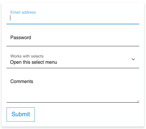
Here’s a simple responsive Bootstrap Login Form with a dark background.
Final output:
Login Form
1. Let’s start with the form on the Bootstrap 5 forms page.
<form>
  <div class="mb-3">
    <label for="exampleInputEmail1" class="form-label">Email address</label>
    <input type="email" class="form-control" id="exampleInputEmail1" aria-describedby="emailHelp">
    <div id="emailHelp" class="form-text">We'll never share your email with anyone else.</div>
  </div>
  <div class="mb-3">
    <label for="exampleInputPassword1" class="form-label">Password</label>
    <input type="password" class="form-control" id="exampleInputPassword1">
  </div>
  <div class="mb-3 form-check">
    <input type="checkbox" class="form-check-input" id="exampleCheck1">
    <label class="form-check-label" for="exampleCheck1">Check me out</label>
  </div>
  <button type="submit" class="btn btn-primary">Submit</button>
</form>
Output:
2. I’ve removed the checkbox and form text, added a Title, and wrapped all of it in a div with class name myform. To add a background color, I used the Bootstrap class bg-dark.
<div class="myform bg-dark">
    <h1 class="text-center">Login Form</h1>
    <form>
        ...
    </form>
</div>
Also, added some basic styling.
.myform{
  padding: 2em;
  max-width: 43%;
  color: #fff;
}
h1 {
  font-size: 2.3em;
  font-weight: bold;
}
Output:
Login Form
3. Change the background color of the input boxes to the form color(inherit will do that). To convert the input box into a line, remove all the borders except the bottom border.
.form-control {
  background-color: inherit;
  color: #fff;
  padding-left: 0;
  border: 0;
  border-radius: 0;
  border-bottom: 1px solid #fff;
}
Remove that ugly blue border that shows up on focus(clicking on an input field) by setting the box-shadow.
  .form-control:focus {
    box-shadow: inset 0 -1px 0 #7e7e7e;
  }
Output:
Login Form
4. Replace the class btn-primary with btn-light to change the button color.
<button type="submit" class="btn btn-light">LOGIN</button>Let’s make the button full width and style it a bit. I’ve also changed the colors on hover.
.btn {
  width: 100%;
  font-weight: 800;
  border-radius: 0;
  padding: 0.5em 0;
}
.btn:hover {
  background-color: inherit;
  color: #fff;
  border-color: #fff;
}
Output:
Login Form
5. You can also add a signup link like this.
<p>Not a member? <a href="#">Signup now</a></p>Add some styles to the signup link.
p {
  text-align: center;
  padding-top: 2em;
  color: grey;
}

p a {
  color: #e1e1e1;
  text-decoration: none;
}

p a:hover {
  color: #fff;
}
I’ve also changed the login button color to white as bg-light gives an off white color.
.btn {
  background-color: #fff;
}
Output:
Login Form
6. Let’s adjust the vertical spacing between the elements. Add class mt-4 to the email field to add some top margin.
<div class="mb-3 mt-4">
    <label for="exampleInputEmail1" class="form-label">Email address</label>
    <input type="email" class="form-control" id="exampleInputEmail1" aria-describedby="emailHelp">
</div>
Similarly, add some top margin for the login button as well.
<button type="submit" class="btn btn-light mt-3">LOGIN</button>Output:
Login Form
7. Lastly, to make it responsive, I’m setting the width to 90% and center aligning the login form for smaller screens.
@media (min-width: 576px) {
  .myform {
    max-width: 90%;
    margin: 0 auto;
  }
}
Some box shadow for the entire login form.
.myform {
  box-shadow: 10px 10px 10px rgba(192, 192, 192, 0.5);
}
Output:
Login Form
Final Output Code for Responsive Bootstrap Login Form #1:
HTML
<div class="myform bg-dark">
    <h1 class="text-center">Login Form</h1>
    <form>
        <div class="mb-3 mt-4">
            <label for="exampleInputEmail1" class="form-label">Email address</label>
            <input type="email" class="form-control" id="exampleInputEmail1" aria-describedby="emailHelp">
        </div>
        <div class="mb-3">
            <label for="exampleInputPassword1" class="form-label">Password</label>
            <input type="password" class="form-control" id="exampleInputPassword1">
        </div>
        <button type="submit" class="btn btn-light mt-3">LOGIN</button>
        <p>Not a member? <a href="#">Signup now</a></p>
    </form>
</div>
CSS
h1 {
  font-size: 2.3em;
  font-weight: bold;
}
.myform {
  padding: 2em;
  max-width: 43%;
  color: #fff;
  box-shadow: 10px 10px 10px rgba(192, 192, 192, 0.5);
}
@media (max-width: 576px) {
  .myform {
    max-width: 90%;
    margin: 0 auto;
  }
}
.form-control:focus {
  box-shadow: inset 0 -1px 0 #7e7e7e;
}
.form-control {
  background-color: inherit;
  color: #fff;
  padding-left: 0;
  border: 0;
  border-radius: 0;
  border-bottom: 1px solid #fff;
}
.btn {
  width: 100%;
  font-weight: 800;
  background-color: #fff;
  border-radius: 0;
  padding: 0.5em 0;
}
.btn:hover {
  background-color: inherit;
  color: #fff;
  border-color: #fff;
}
p {
  text-align: center;
  padding-top: 2em;
  color: grey;
}
p a {
  color: #e1e1e1;
  text-decoration: none;
}
p a:hover {
  color: #fff;
}
If you have any doubts or stuck somewhere, you can reach out through Coding Yaar's Discord server.