Bootstrap provides form elements with floating labels. Using those, there is no need to write extensive CSS code for the material design look. You can easily create material design form elements with very little CSS. Follow these steps to create the Bootstrap material design form:
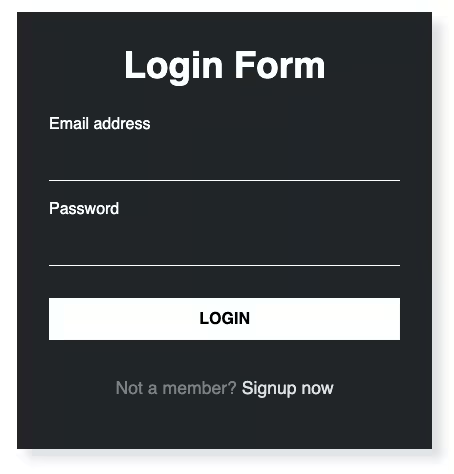
Final output:
1. Let’s start with form elements from the Bootstrap Floating Labels page. I’ve added class mb-3 to add some bottom margin to the elements.
<div class="form-floating mb-3">
  <input type="email" class="form-control" id="floatingInput" placeholder="name@example.com">
  <label for="floatingInput">Email address</label>
</div>
<div class="form-floating mb-3">
  <input type="password" class="form-control" id="floatingPassword" placeholder="Password">
  <label for="floatingPassword">Password</label>
</div>
<div class="form-floating mb-3">
  <select class="form-select" id="floatingSelect" aria-label="Floating label select example">
    <option selected>Open this select menu</option>
    <option value="1">One</option>
    <option value="2">Two</option>
    <option value="3">Three</option>
  </select>
  <label for="floatingSelect">Works with selects</label>
</div>
<div class="form-floating mb-3">
  <textarea class="form-control" placeholder="Leave a comment here" id="floatingTextarea" style="height: 100px"></textarea>
  <label for="floatingTextarea">Comments</label>
</div>
Output:
2. To change it from Bootstrap floating labels to Bootstrap material design form, remove the rectangular box of the form fields to a simple line on the bottom by modifying the border property.
.form-select, .form-control {
    border: none;
    border-bottom: 1px solid #000000;
    border-radius: 0;
}
Output:
3. Remove that ugly blue border that shows up on focus(clicking on a particular field) and change the line color instead.
.form-select:focus, .form-control:focus {
    box-shadow: none;
    border-bottom-color: #2196f3;
}
Output:
4. Let’s change the placeholder color too (on focus).
Adjacent sibling selector(+), as the name suggests selects the adjacent element, i.e. label in our case.
.form-select:focus + label, .form-control:focus + label{
  color: #2196f3;
}
Output:
5. For the final output, I’ve wrapped all the form fields in a div with class form. And, added a form submit button. And, also a box-shadow for some depth effect.
.form {
  padding: 1em;
  border: 1px solid #f1f1f1;
  box-shadow: 0 4px 6px 0 rgba(22, 22, 26, 0.18);
}
@media only screen and (min-width: 768px) {
  .form {
    width: 50%;
  }
}
All the CSS used for styling the submit button:
input[type="submit"]{
  color: #2196f3;
  border-color: #2196f3;
}
input[type="submit"]:hover,
input[type="submit"]:focus {
  color: #ffffff;
  background-color: #2196f3;
  outline: none;
  box-shadow: 0 4px 6px 0 rgba(22, 22, 26, 0.18);
}
It’s not a working form, just the frontend part.
Output:
Final Output Code for Bootstrap 5 Material Design Form Responsive:
HTML
<div class="form">
  <div class="form-floating mb-3">
      <input type="email" class="form-control" id="floatingInput" placeholder="name@example.com">
      <label for="floatingInput">Email address</label>
  </div>
  <div class="form-floating mb-3">
    <input type="password" class="form-control" id="floatingPassword" placeholder="Password">
    <label for="floatingPassword">Password</label>
  </div>
  <div class="form-floating mb-3">
    <select class="form-select" id="floatingSelect">
    <option selected="">Open this select menu</option>
    <option value="1">One</option>
    <option value="2">Two</option>
    <option value="3">Three</option>
    </select>
    <label for="floatingSelect">Works with selects</label>
  </div>
  <div class="form-floating mb-3">
    <textarea class="form-control" placeholder="Leave a comment here" id="floatingTextarea2" style="height: 100px"></textarea>
    <label for="floatingTextarea2">Comments</label>
  </div>
  <div>
    <input type="submit" class="btn btn-lg btn-outline-primary">
  </div>
</div>
CSS
.form {
  padding: 1em;
  border: 1px solid #f1f1f1;
  box-shadow: 0 4px 6px 0 rgba(22, 22, 26, 0.18);
}
@media only screen and (min-width: 768px) {
  .form {
    width: 50%;
  }
}
.form-select, .form-control {
  border: none;
  border-bottom: 1px solid #000000;
  border-radius: 0;
}
.form-select:focus, .form-control:focus {
  box-shadow: none;
  border-bottom-color: #2196f3;
}
.form-select:focus + label, .form-control:focus + label{
    color: #2196f3;
}
input[type="submit"]{
  color: #2196f3;
  border-color: #2196f3;
}
input[type="submit"]:hover,
input[type="submit"]:focus {
  color: #ffffff;
  background-color: #2196f3;
  outline: none;
  box-shadow: 0 4px 6px 0 rgba(22, 22, 26, 0.18);
}
If you have any doubts or stuck somewhere, you can reach out through Coding Yaar's Discord server.