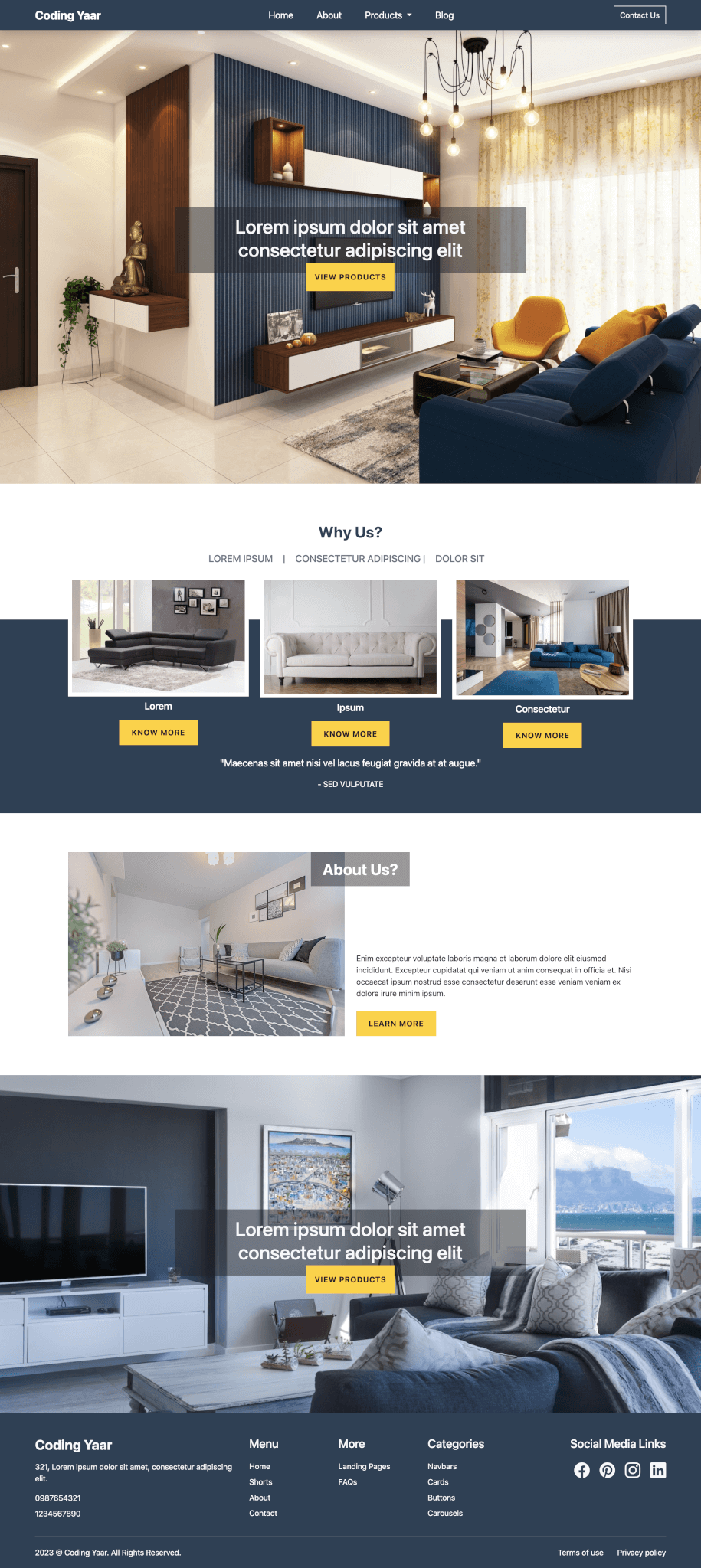
I am not sure what you would call this section. I was thinking to name it Bootstrap header or hero section or banner. Decided to go with Bootstrap banner. So, here’s how you can create a very simple banner with some text and an image.
Final output:
Tomato
You don’t need to read this. Now that you hav decided to read it anyways, its just some random dummy text to fill up the space for Bootstrap banner or hero section.
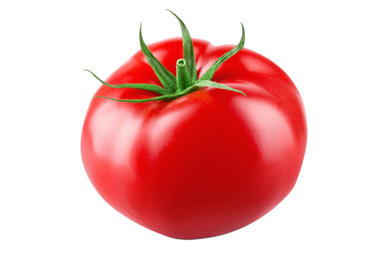
1. As you can see in the final output above, there are two columns. On the right, we have an image. On the left, there is the main title, description, and a call to action.
Bootstrap has its grid system. Let’s use it to make those columns.
Create an outer div to wrap everything. I am giving it a class name banner. Add all the elements in respective columns.
<div class="banner">
    <div class="container">
        <div class="row">
            <div class="col-sm-5">
                <h1>Tomato</h1>
                <p>You don't need to read this. Now that you hav decided to read it anyways, its just some random dummy text to fill up the space for Bootstrap banner or hero section.</p>
                <button class="btn btn-success">Learn More</button>
            </div>
            <div class="col-sm-7">
                <img class="img-fluid" src="..." alt="">
            </div>
        </div>
    </div>
</div>
Output:
Tomato
You don’t need to read this. Now that you hav decided to read it anyways, its just some random dummy text to fill up the space for Bootstrap banner or hero section.

2. The Banner would come right after the navbar. You might want it to take full screen(100vh) or specify the height. Because of the sidebar, I have less width to work with. So, I’m fine with the height it’s getting from the image.
Since the default display type of row is flex, to vertically align elements in the center, set the align-items property to center.
I’m also adding a background color to make it more prominent.
.banner{
    background-color: #F8D49D;
}
.row{
    align-items:center;
}
Output:
Tomato
You don’t need to read this. Now that you hav decided to read it anyways, its just some random dummy text to fill up the space for Bootstrap banner or hero section.

3. To syle the title, add classes display-4 and fw-bold. Depending on the height and width, you can use the appropriate display heading to make the title stand out.
<h1 class="display-4 fw-bold">Tomato</h1>You can also add a text-shadow.
h1{
    text-shadow: 1px 1px 2px #7c7c7c;
}
Output:
Tomato
You don’t need to read this. Now that you hav decided to read it anyways, its just some random dummy text to fill up the space for Bootstrap banner or hero section.

4. To style the button, make the edges rounded and add a shadow.
.btn{
    padding: .5em 1.5em;
    border-radius: 2em;
    box-shadow: 5px 5px 5px rgba(105, 73, 73, 0.15);
}
Output:
Tomato
You don’t need to read this. Now that you hav decided to read it anyways, its just some random dummy text to fill up the space for Bootstrap banner or hero section.

5. Let’s check for responsiveness.
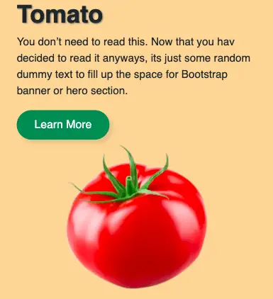
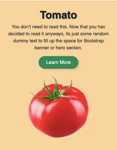
Okay, not that bad, add some top and bottom padding for the entire banner. For smaller screens, center align all the elements.
.banner{
    padding: 2em 0;
}
@media screen and (max-width:567px){
    .banner{
        text-align: center;
    }
}
Use CSS or add classes mt-3 and mt-sm-0 to add a top margin for the image on smaller screens.
Output:
Tomato
You don’t need to read this. Now that you hav decided to read it anyways, its just some random dummy text to fill up the space for Bootstrap banner or hero section.

Output on smaller screens:
Final Output Code for Bootstrap Banner #1:
HTML
<div class="banner">
    <div class="container">
        <div class="row">
            <div class="col-sm-5">
                <h1 class="display-4 fw-bold">Tomato</h1>
                <p>You don't need to read this. Now that you hav decided to read it anyways, its just some random dummy text to fill up the space for Bootstrap banner or hero section.</p>
                <button class="btn btn-success">Learn More</button>
            </div>
            <div class="col-sm-7">
                <img class="img-fluid" src="..." alt="">
            </div>
        </div>
    </div>
</div>
CSS
.banner {
  background-color: #f8d49d;
  width: 100%;
  padding: 2em 0;
}
.row {
  align-items: center;
}
h1 {
  text-shadow: 1px 1px 2px #7c7c7c;
}
.btn {
  padding: 0.5em 1.5em;
  border-radius: 2em;
  box-shadow: 5px 5px 5px rgba(105, 73, 73, 0.15);
}
@media screen and (max-width: 567px) {
  .banner {
    text-align: center;
  }
}
Video explanation for Bootstrap Hero section:
If you have any doubts or stuck somewhere, you can reach out through Coding Yaar's Discord server.
