Infinite scrolling partners/clients logo marquee built with HTML and CSS. Two rows of logos scroll in opposite directions on a continuous loop, with a fade effect on the edges to keep it looking clean. No JavaScript needed. Easy to customize with your own logos and works across all screen sizes.
Final output:
Built alongside industry leaders
Integrated into the workflows of companies that move fast and build at scale.
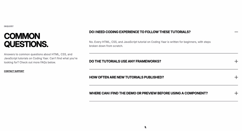
1. Let’s start with a section element with the class our-clients. Inside it, add a .clients-header div with a span, heading, and paragraph.
<section class="our-clients">
    <div class="clients-header">
        <span>Our Partners</span>
        <h2>Built alongside industry leaders</h2>
        <p>Integrated into the workflows of companies that move fast and build at scale.</p>
    </div>
</section>
Link the Outfit font from Google Fonts in the head. Reset margins, set the font family, and add padding and text-align: center on the section. On mobile, reduce the padding so the section doesn’t feel too spaced out.
* {
    margin: 0;
    padding: 0;
    box-sizing: border-box;
}
body {
    font-family: "Outfit", sans-serif;
}
.our-clients {
    padding: 6rem;
    text-align: center;
}
@media screen and (max-width: 768px) {
    .our-clients {
        padding: 3rem 2rem;
    }
}
Output:
Built alongside industry leaders
Integrated into the workflows of companies that move fast and build at scale.
2. Style the header with a max-width and margin-inline: auto to keep it centered and readable. Set overflow: hidden on it so nothing spills outside.
.our-clients .clients-header {
    max-width: 32rem;
    margin-inline: auto;
    overflow: hidden;
}
Style the span, heading, and paragraph with different font sizes and colors to create a clear visual hierarchy.
.our-clients .clients-header span {
    font-weight: 500;
    font-size: 0.75rem;
    line-height: 1;
    letter-spacing: 2.4px;
    text-transform: uppercase;
    color: #717182;
}
.our-clients .clients-header h2 {
    font-weight: 600;
    font-size: 2.25rem;
    letter-spacing: -0.9px;
    margin-block: 1rem;
    color: #0A0A0A;
}
.our-clients .clients-header p {
    font-weight: 400;
    font-size: 1rem;
    color: #717182;
}
Output:
Built alongside industry leaders
Integrated into the workflows of companies that move fast and build at scale.
3. Add the .clients-marquee-wrapper div after .clients-header. Inside it, add two rows for .clients-marquee-top and .clients-marquee-bottom. Each row needs two identical .clients-wrapper divs with the same logos inside them. Having two copies is what makes the infinite scrolling marquee loop seamlessly. As the first set scrolls out, the second set takes its place.
<div class="clients-marquee-wrapper">
    <div class="clients-marquee-top">
        <div class="clients-wrapper">
            <div class="logo-wrapper"><img src="logo-1.png" alt=""></div>
            <div class="logo-wrapper"><img src="logo-2.png" alt=""></div>
            <!-- add more logos -->
        </div>
        <div class="clients-wrapper">
            <!-- repeat the above logos -->
        </div>
    </div>
    <div class="clients-marquee-bottom">
        <div class="clients-wrapper">
            <!-- add different or same logos -->
        </div>
        <div class="clients-wrapper">
            <!-- repeat the above logos -->
        </div>
    </div>
</div>
Set position: relative and overflow: hidden on the wrapper to contain the scrolling logos.
.our-clients .clients-marquee-wrapper {
    position: relative;
    overflow: hidden;
    white-space: nowrap;
    margin-top: 3.5rem;
}
Output:
Built alongside industry leaders
Integrated into the workflows of companies that move fast and build at scale.
4. Style each .clients-wrapper with flexbox to align the logos in a row. Give each .logo-wrapper a border, border-radius, and padding using clamp() so the padding scales with the screen size. On mobile, cap the logo height so they don’t overflow on smaller screens.
.our-clients .clients-wrapper {
    display: flex;
    gap: 1.5rem;
}
.our-clients .logo-wrapper {
    min-width: 200px;
    padding: clamp(.5rem, 3vw, 1.5rem);
    border-radius: .875rem;
    border: 1px solid #0000001A;
}
@media screen and (max-width: 768px) {
    .our-clients .logo-wrapper {
        min-width: 150px;
    }
    .our-clients .logo-wrapper img {
        max-height: 1.75rem;
    }
}Built alongside industry leaders
Integrated into the workflows of companies that move fast and build at scale.
5. The ::before and ::after pseudo-elements create a fade effect on the left and right edges using a white-to-transparent gradient. This makes the CSS marquee look like it fades out naturally instead of cutting off abruptly at the edges.
.our-clients .clients-marquee-wrapper::before,
.our-clients .clients-marquee-wrapper::after {
    content: "";
    position: absolute;
    top: 0;
    z-index: 9;
    width: 3vw;
    height: 100%;
    background: linear-gradient(90deg, #ffffff 0%, rgba(255, 255, 255, 0) 100%);
}
.our-clients .clients-marquee-wrapper::before {
    left: 0;
}
.our-clients .clients-marquee-wrapper::after {
    right: 0;
    background: linear-gradient(-90deg, #ffffff 0%, rgba(255, 255, 255, 0) 100%);
}
Output:
Built alongside industry leaders
Integrated into the workflows of companies that move fast and build at scale.
6. Let’s style both marquee rows to create the infinite logo slider effect with flexbox and shared animation properties. The top row uses marquee-animation, which scrolls left, and the bottom row uses marquee-animation-alt, which scrolls right. Setting flex-direction: row-reverse on the bottom .clients-wrapper reverses the logo order so the two rows scroll in opposite directions.
.our-clients .clients-marquee-top,
.our-clients .clients-marquee-bottom {
    display: flex;
    gap: 1.5rem;
    animation-duration: 40s;
    animation-iteration-count: infinite;
    animation-timing-function: linear;
}
.our-clients .clients-marquee-top {
    animation-name: marquee-animation;
}
.our-clients .clients-marquee-bottom {
    margin-top: 1.5rem;
    animation-name: marquee-animation-alt;
}
.our-clients .clients-marquee-bottom .clients-wrapper {
    flex-direction: row-reverse;
}
Finally, add the two CSS keyframe animations that power the scrolling effect. marquee-animation moves the logos from their natural position all the way to -100% on the x-axis, scrolling them to the left. marquee-animation-alt does the opposite, starting at -100% and moving back to 0%, scrolling them to the right.
@keyframes marquee-animation {
    from {
        transform: translateX(0%);
    }
    to {
        transform: translateX(-100%);
    }
}
@keyframes marquee-animation-alt {
    from {
        transform: translateX(-100%);
    }
    to {
        transform: translateX(0%);
    }
}Built alongside industry leaders
Integrated into the workflows of companies that move fast and build at scale.
Final Output Code for Responsive Partners Logo Marquee HTML CSS:
HTML
<section class="our-clients">
    <div class="clients-header">
        <span>Our Partners</span>
        <h2>Built alongside industry leaders</h2>
        <p>Integrated into the workflows of companies that move fast and build at
            scale.</p>
    </div>
    <div class="clients-marquee-wrapper">
        <div class="clients-marquee-top">
            <div class="clients-wrapper">
                <div class="logo-wrapper">
                    <img src="logo-1.png" alt="">
                </div>
                <div class="logo-wrapper">
                    <img src="logo 2.png" alt="">
                </div>
                <div class="logo-wrapper">
                    <img src="logo 3.png" alt="">
                </div>
                <div class="logo-wrapper">
                    <img src="logo 4.png" alt="">
                </div>
                <div class="logo-wrapper">
                    <img src="logo 5.png" alt="">
                </div>
                <div class="logo-wrapper">
                    <img src="logo 6.png" alt="">
                </div>
                <div class="logo-wrapper">
                    <img src="logo 7.png" alt="">
                </div>
                <div class="logo-wrapper">
                    <img src="logo 8.png" alt="">
                </div>
                <div class="logo-wrapper">
                    <img src="logo 9.png" alt="">
                </div>
            </div>
        </div>
        <div class="clients-marquee-bottom">
            <div class="clients-wrapper">
                <div class="logo-wrapper">
                    <img src="logo-1.png" alt="">
                </div>
                <div class="logo-wrapper">
                    <img src="logo 2.png" alt="">
                </div>
                <div class="logo-wrapper">
                    <img src="logo 3.png" alt="">
                </div>
                <div class="logo-wrapper">
                    <img src="logo 4.png" alt="">
                </div>
                <div class="logo-wrapper">
                    <img src="logo 5.png" alt="">
                </div>
                <div class="logo-wrapper">
                    <img src="logo 6.png" alt="">
                </div>
                <div class="logo-wrapper">
                    <img src="logo 7.png" alt="">
                </div>
                <div class="logo-wrapper">
                    <img src="logo 8.png" alt="">
                </div>
                <div class="logo-wrapper">
                    <img src="logo 9.png" alt="">
                </div>
            </div>
        </div>
    </div>
</section>
CSS
* {
    margin: 0;
    padding: 0;
    box-sizing: border-box;
}
body {
    font-family: "Outfit", sans-serif;
}
.our-clients {
    padding: 6rem;
    text-align: center;
}
@media screen and (max-width: 768px) {
    .our-clients {
        padding: 3rem 2rem;
    }
}
.our-clients .clients-header {
    max-width: 32rem;
    margin-inline: auto;
    overflow: hidden;
}
.our-clients .clients-header span {
    font-weight: 500;
    font-size: 0.75rem;
    line-height: 1;
    letter-spacing: 2.4px;
    text-transform: uppercase;
    color: #717182;
}
.our-clients .clients-header h2 {
    font-weight: 600;
    font-size: 2.25rem;
    letter-spacing: -0.9px;
    margin-block: 1rem;
    color: #0A0A0A;
}
.our-clients .clients-header p {
    font-weight: 400;
    font-size: 1rem;
    color: #717182;
}
.our-clients .clients-marquee-wrapper {
    position: relative;
    overflow: hidden;
    white-space: nowrap;
    margin-top: 3.5rem;
}
.our-clients .clients-marquee-wrapper::before,
.our-clients .clients-marquee-wrapper::after {
    content: "";
    position: absolute;
    top: 0;
    z-index: 9;
    width: 3vw;
    height: 100%;
    background: linear-gradient(90deg, #ffffff 0%, rgba(255, 255, 255, 0) 100%);
}
.our-clients .clients-marquee-wrapper::before {
    left: 0;
}
.our-clients .clients-marquee-wrapper::after {
    right: 0;
    background: linear-gradient(-90deg, #ffffff 0%, rgba(255, 255, 255, 0) 100%);
}
.our-clients .clients-marquee-top,
.our-clients .clients-marquee-bottom {
    display: flex;
    gap: 1.5rem;
    animation-duration: 40s;
    animation-iteration-count: infinite;
    animation-timing-function: linear;
}
.our-clients .clients-marquee-top {
    animation-name: marquee-animation;
}
.our-clients .clients-marquee-bottom {
    margin-top: 1.5rem;
    animation-name: marquee-animation-alt;
}
.our-clients .clients-marquee-bottom .clients-wrapper {
    flex-direction: row-reverse;
}
.our-clients .clients-wrapper {
    display: flex;
    justify-content: center;
    align-items: center;
    gap: 1.5rem;
}
.our-clients .logo-wrapper {
    min-width: 200px;
    padding: clamp(.5rem, 3vw, 1.5rem);
    border-radius: .875rem;
    border: 1px solid #0000001A;
}
@media screen and (max-width: 768px) {
    .our-clients .logo-wrapper {
        min-width: 150px;
    }
    .our-clients .logo-wrapper img {
        max-height: 1.75rem;
    }
}
@keyframes marquee-animation {
    from {
        transform: translateX(0%);
    }
    to {
        transform: translateX(-100%);
    }
}
@keyframes marquee-animation-alt {
    from {
        transform: translateX(-100%);
    }
    to {
        transform: translateX(0%);
    }
}
If you have any doubts or stuck somewhere, you can reach out through Coding Yaar's Discord server.